Our Verdict
An already excellent app gets even better thanks to a significant technological overhaul beneath the hood, along with a litany of improvements both dramatic (wet paint) and subtle (elegantly redesigned menus), in time for iOS 11’s new file system.
For
- Layer masking finally introduced
- Much easier to organise files
- Wet paint opens up creative possibilities
Against
- Layer masking very basic (for now)
- Canvases still can’t be resized
- Undo aside, adjustments to colour and effects permanently alter the art on a layer
Why you can trust Creative Bloq
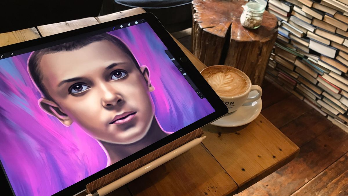
I've been enjoying using Procreate since getting the first iPad Pro and the Apple Pencil back in 2015. All the best art apps for painting and sketching on Apple’s powerful tablet have their strengths and weaknesses, but Procreate is the one I often gravitate back to.
- Engine drastically rebuilt, moving from OpenGL to Apple’s Metal (four times faster in some cases)
- Engine updates have led to big improvements in smudging, and enabled Wet Paint
- Blend modes can be applied to individual brushstrokes
- Now supports P3 Wide colour on applicable device
- Layer masking introduced
- Drag and drop added
- Redesigned gallery and brushes menu
- Over 200 new features/refinements
This is because I've found that the interface feels more carefully designed and intuitive to use than rival apps, the features are extensive, the brushes are excellent and varied, and of course most crucially, the painting itself is fantastic.
Other features include a Quick Menu that you can open with a quick tap or flick to manipulate layers and transform the canvas – without breaking your workflow.
Another feature lets you export a time-lapse video of your artwork creation from start to finish, which you can use for everything from self-promo to client presentations.
Tools like these highlight how developer Savage is truly focused on making the very best painting app for tablets.
Procreate 4: drawing experience
The act of painting and drawing in Procreate 4 is even more delightful than previous versions, which is no surprise seeing as version 4 is built on Metal, making it up to four times faster.
I had never found Procreate to be sluggish before, but certainly the continuous act of zooming in and out and rotating artwork feels especially immediate and precise.
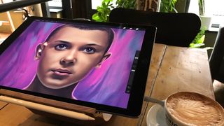
Having experienced the incredibly slow and unreliable touch controls on the otherwise fantastic Wacom Cintiq 24HD, for example, this is where the hardware and software trifecta of the iPad Pro, Apple Pencil and Procreate really come into their own.
Procreate 4: new features
When you first open Procreate, you land on the gallery page, effectively a thumbnail grid of the files you’ve worked on. Previously you could only open an existing artwork or add a new one. You could import from services such as Dropbox, but it was buried within the ‘add’ menu.
Importing is now available at a tap from that top screen, so combined with iOS 11’s new file structure system, you’re immediately aware that both Procreate and iOS 11 have evolved to help you be more productive.
You can also now create ‘stacks’ of images on the gallery page, which is a simple but very welcome way to organise files.
Evolutions to the interface are numerous, and the software has clearly been through lots of user experience testing from top to bottom. These updates tend to be quite subtle, such as better groupings of headings and contents in menus.
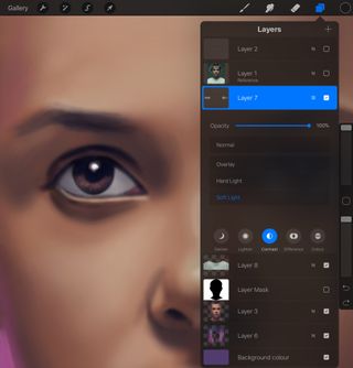
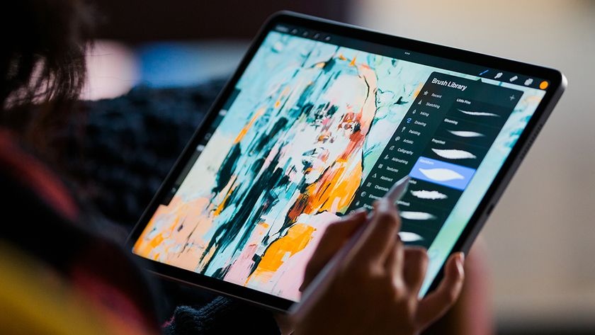
To make note of a more obvious example, previously you couldn’t see all of the brush categories at once. They were aligned horizontally and you had to swipe through them.
The categories are now in a vertical list, so as well as having the breadth of brushes clear at a glance, it’s also much faster to switch between them.
Procreate 4: layer masks
There is one key feature that’s been missing from Procreate, and that’s layer masks. Being able to control the edges of where you want brush marks to show is such a crucial feature in desktop software such as Photoshop and Illustrator.
Finally seeing them in Procreate 4 is a real step forward, even if at the moment they’re very basic. For instance, you can’t create a mask from a selection and you have to paint them from scratch. You’re not able to invert a mask, either, so you certainly need to plan them carefully.
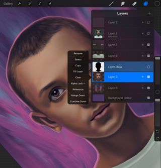
Procreate developer Savage has stated that this is very much Layer Masks 101, and it has much more planned in this area. An obvious next step would be to enable clipping masks, where attached layers are also confined to the base shape.
Alpha Lock, which was in fact in the previous version, but fairly hidden and therefore easily missed, is now an option when you tap a layer thumbnail, and is another useful feature in this area.
Procreate 4: wet brushes
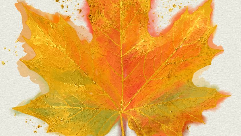
With masking being an exciting new addition on the practical/workflow side of things, the new wet brushes are the biggest inclusion on the creative side.
Admittedly this is the kind of feature I enjoyed in Corel Painter on my desktop several years ago. (Though I’ve found myself spending much more time with Adobe’s more fully featured application of late, largely thanks to Kyle T. Webster’s brilliant Photoshop brushes.) Even so, drawing on the iPad is so comfortable and fluid, it’s fantastic to be able to work in this way on a tablet.
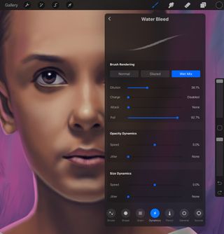
Simply tap on a brush to bring up the customisation options, switch to the ‘wet mix’ option and you’re up and running. It finally means you can work like a ‘real’ painter on a tablet, with all the other benefits that multi-touch enables.
Speaking of the customisation options, as before there’s a huge amount you can do to adjust brushes beyond their default settings, and it’s absolutely worth setting some time aside to experiment with the effects you can achieve, whether you’re trying to find something dramatically different, or simply wanting to subtly tweak a brush.
This includes adjusting how brushes respond to tilting the Apple Pencil. You can also create your own brushes and import those created by others.
Procreate 4 and iOS 11
Procreate 4 has of course been designed with iOS 11 in mind, and with its full file system and drag and drop feature, suddenly the possibilities have really opened up in terms of workflow.
If the lack of a proper file system had put you off drawing on the iPad before, this may be the feature that finally converts you.
Another way in which iOS 11 can work with Procreate (and all apps for that matter) is the brand new Dock. A swipe up from the bottom brings your apps into view, so you can jump around much more easily.
If, like me, you’re often working from a reference image of some kind, you can easily drag the Photos app icon out of the doc, and turn it into a Split View, or the new Slide Over.
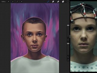
I was looking forward to trying out Slide Over, thinking it would give me more flexibility with reference images, but the window can’t be resized, and it can only move to the left or ride. Really this just then obfuscates the ProCreate interface, so I found that Split View remains the best option. Perhaps iOS12 will let us resize the window and float it wherever we like.
So while further iterations of Procreate and iOS will no doubt further streamline workflow, there’s a lot here to appreciate, from relatively simple additions such as a customisable perspective guide to the endless possibilities of the aforementioned brush customisations and wet, truly blending paint.
Is Procreate 4 worth buying?
The Pro in Procreate means that this app is clearly designed with professional creatives in mind, and the Savage team is clearly focused on improving the application as much as possible.
That said, priced at just $9.99 / £9.99 it’s not prohibitive to a student, an amateur or a hobbyist who wants to check it out and either start painting digitally, or take it further.
While this tablet app has some way to go to match a desktop application such as Photoshop for features, it’s powerful, fast and intuitive and enables you to create large, complex works of art on your iPad Pro.
Related articles:

Thank you for reading 5 articles this month* Join now for unlimited access
Enjoy your first month for just £1 / $1 / €1
*Read 5 free articles per month without a subscription

Join now for unlimited access
Try first month for just £1 / $1 / €1
out of 10
An already excellent app gets even better thanks to a significant technological overhaul beneath the hood, along with a litany of improvements both dramatic (wet paint) and subtle (elegantly redesigned menus), in time for iOS 11’s new file system.
