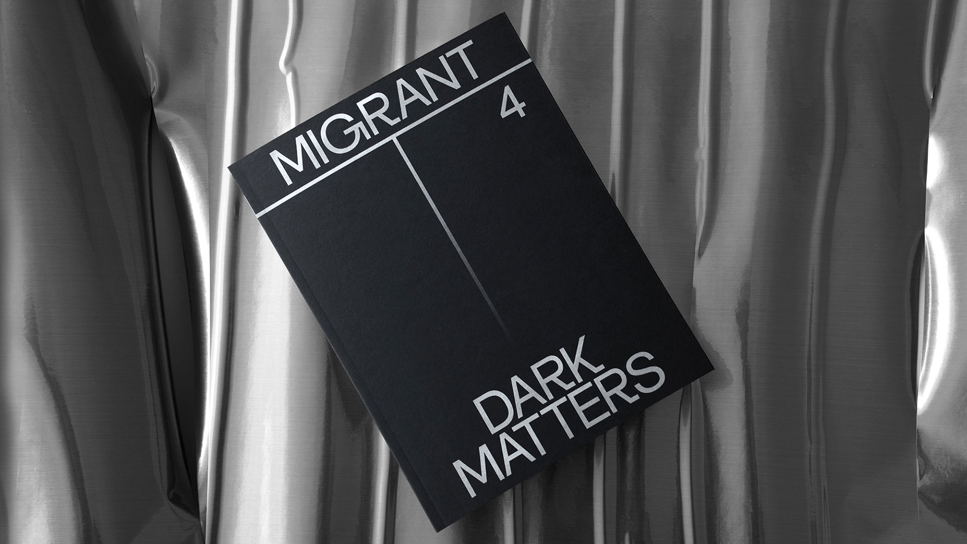
Our Verdict
The new issue of indie mag Migrant Journal is a triumph of impeccable design.
For
- Great design
- Beautiful production values
- Incredible value for money
Against
- The six-issue format means it can never have bold reinvention
Why you can trust Creative Bloq
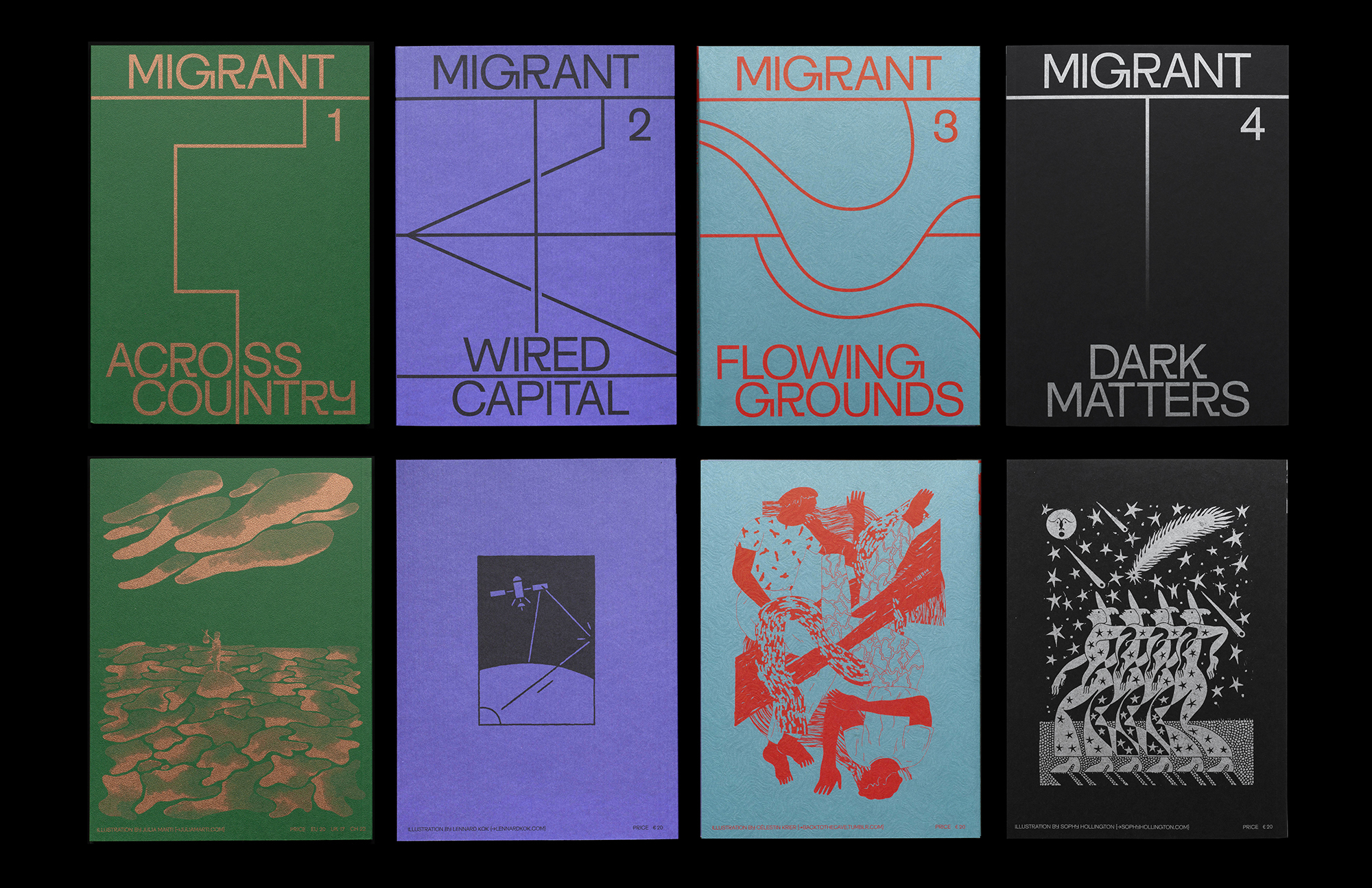
As Migrant Journal's six-volume mission to change the way we view migration passes the halfway mark; it's not just the stark, black and silver cover that feels subdued. "Night, the moment of illegitimacy and illegality," warns the opening editorial. "Drama, sins, crimes. The time for desperate actions and bad decisions. Surrender."
While previous issues have traversed physical and political borders, issue four travels down, both literally and psychologically, to identify the human casualties of fake news (Abyssal theory), black money (Hundi & Hawala), "kamikaze" oil smuggling (Essence du Bénin) and sexual exploitation (They Fuck It Up).
"We've had the desire to produce a 'night issue' since the very beginning," editor Justinien Tribillon told us. "The way people move and travel at night, the kind of activity you do then." Certainly this issue more any other highlights the fascinating dichotomy at the heart of Migrant Journal, which somehow remains optimistic and exhilarating as it uncovers a dangerous, deteriorating world. "Darkness leaves less room for humour and light topics, that's for sure," Tribillon admits.
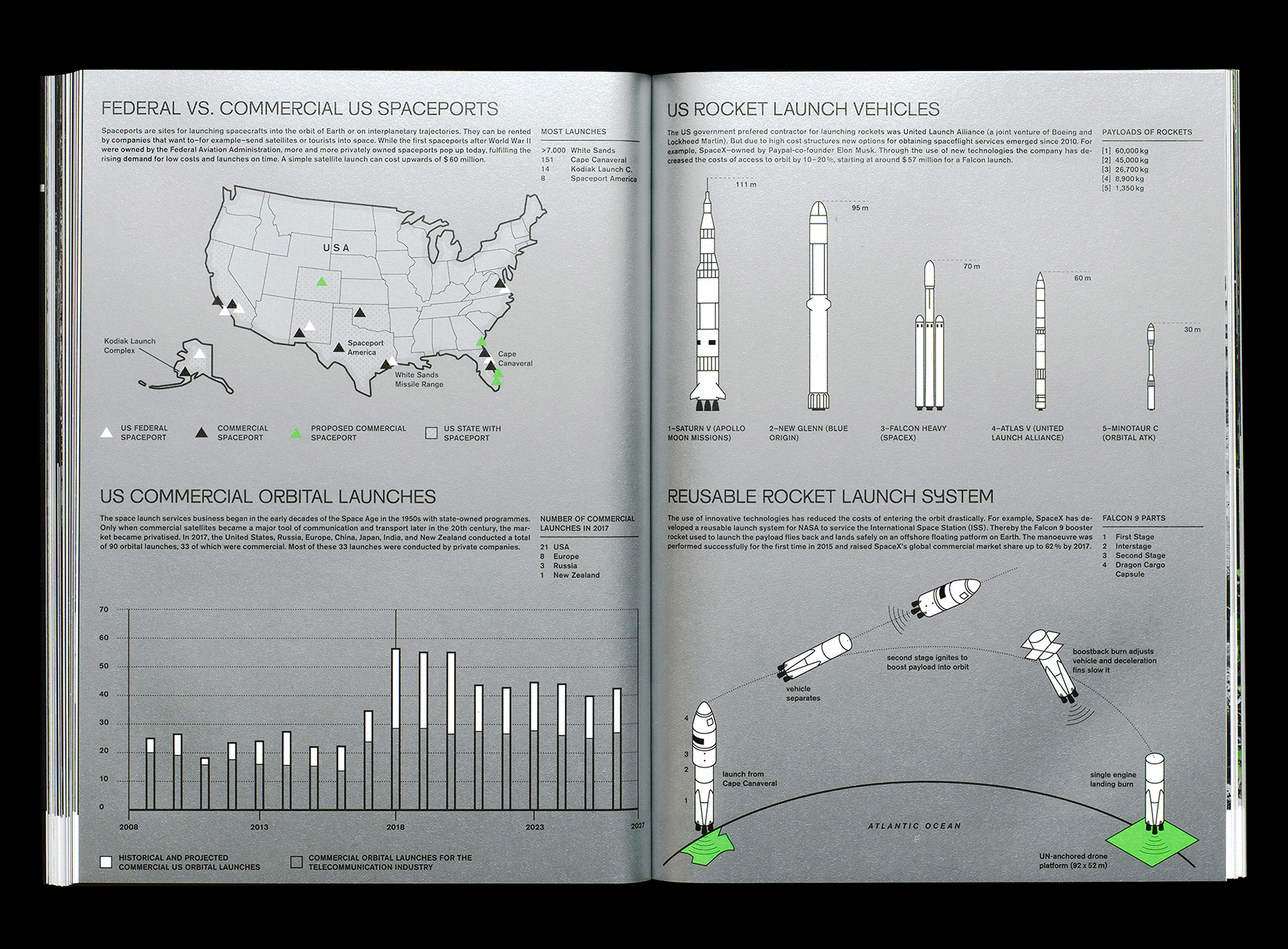
Scattered with footnotes and annotations, Migrant Journal is undeniably heavy going, but the pitch-perfect design, stunning photography and crisp infographics (Migrant Journal loves infographics) present stories in the clearest, cleanest fashion – there's not a pixel or point out of place. The luxuriantly weighty 152 pages all exhibit the magazine's unique aesthetic, a curious hybrid of academic journal and superior travelogue, almost an atlas with a conscience.
"You can call us any way you like: magazine, book, periodical, journal," says Tribillon, "as long as you don't take these categories too seriously, we're fine with them." As with everything Migrant Journal tackles, boundaries and definitions are ambiguous and, ultimately, reductive.
Black beauty
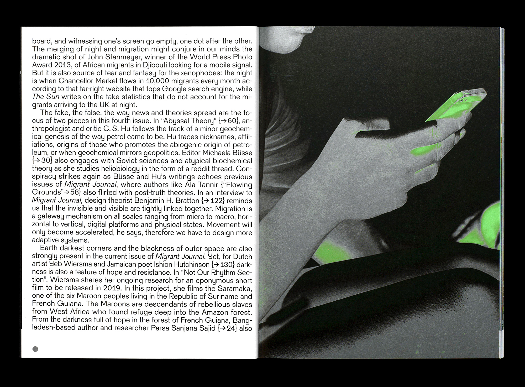
Migrant Journal is a favourite among designers, and even elsewhere, its superior aesthetics have probably been praised as much as its content. While opportunities for design revolution are inevitably curtailed by its part-work format, designers Isabel Seiffert and Christoph Miler – of Offshore Studio – take every opportunity for subtle evolution and refinement.
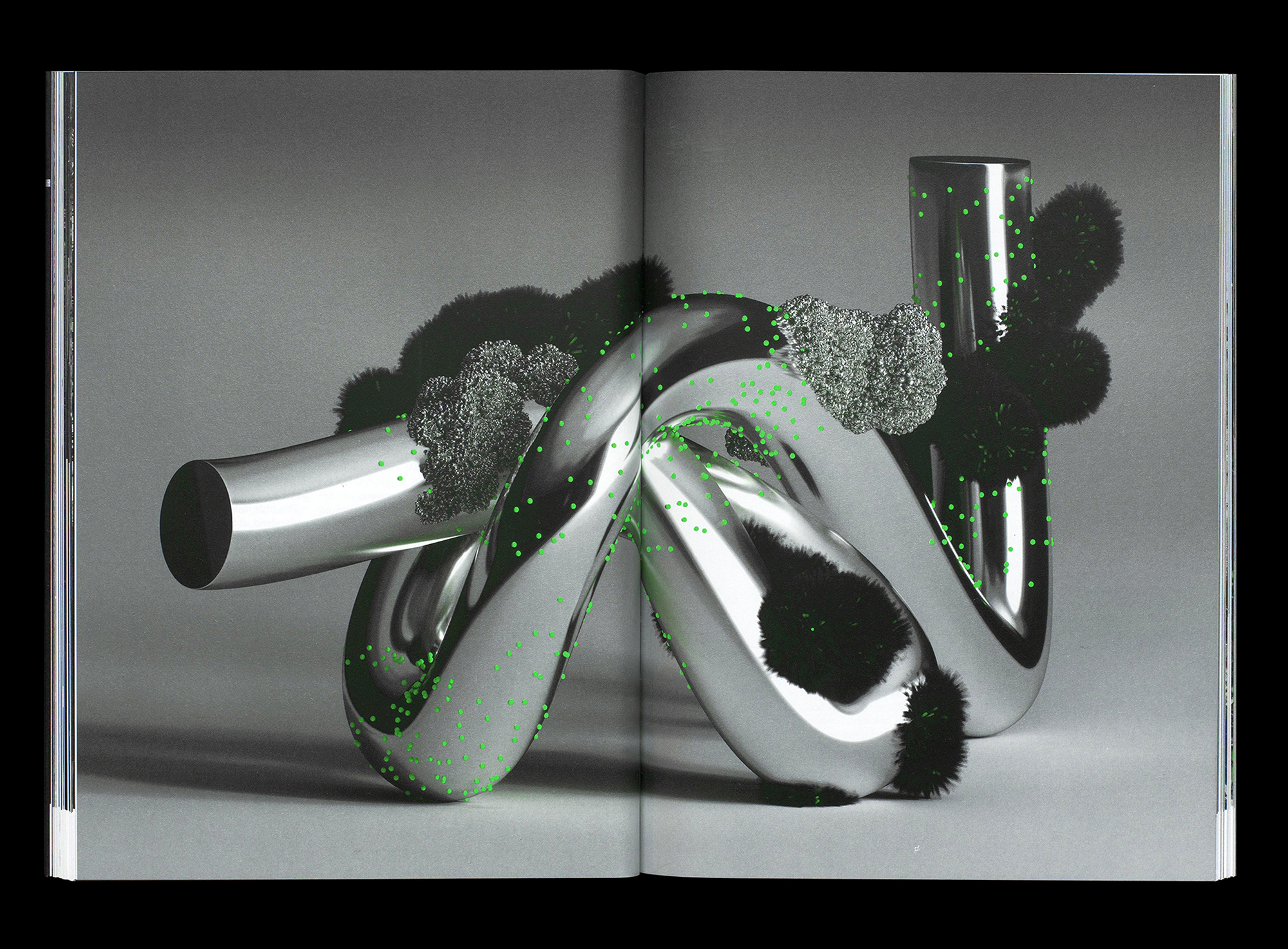
Particularly outstanding this issue is the use of fifth colour, a vibrant (and emotive) acid green flouro. While most designers would be content to use this for aesthetic flourish, Seiffert and Miler brilliantly integrate the spot colour to enhance editorial content and increase emotional resonance.
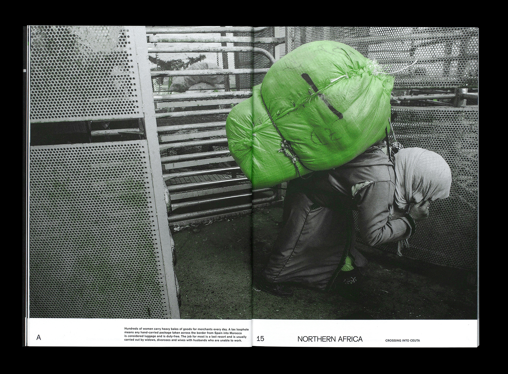
It follows, then, that the huge sacks of luggage strapped to fleeing migrants in Northern Africa are carefully highlighted in green, emphasising the weight and scale of their cargo. Elsewhere, a streetlamp outside an Amsterdam brothel glows weakly from the stark, black and white photography, while in a scorched South American desert, the desolation is accentuated by highlighted wisps of grass clinging to a rock. As well as being technically extremely accomplished – integrating fifth colours in print is notoriously difficult – the ingenuity and variety of Migrant Journal's execution is frequently breathtaking.
And the title's signature font – Migrant Grotesk – is still a thing of wonder. Seemingly endlessly adaptable, it has the enviable quality of looking amazing whatever the circumstances. If the glacial beauty of the magazine is still marred by occasional baffling idiosyncrasies (page numbers on the inside gutters?), the design team have more than earned the right to do whatever the hell they like. The design of Migrant Journal is as utterly unique and seductive as ever.
Exit strategy
Migrant Journal's phenomenal success makes it easy to forget its modest origins. What is now an iconic indie title – with an international audience and influence far beyond its print run – began its own migration from concept to reality as a Kickstarter project back in 2016, when just 224 backers pledged a modest €11,203 to help launch issue one.
As the team admitted in their initial pitch, "None of us live in the country we hold a passport of." Yet their ability to harness such a wide range of talents to create this singularly impressive publication demonstrates their own ethos: the individual and creative rewards enabled by free movement. It may seem like an obvious principle, but as Migrant Journal continues to show, the smaller the world becomes, the greater the duty to explore and celebrate – not demonise – the "new spaces" of migration.
With just two issues left before this project ends, it will be fascinating to see where Tribillon, Seiffert and Miler next direct their formidable skills, but Migrant Journal's legacy as a beacon of indie publishing is assured – whether they care for the categorisation or not.
- Buy the latest issue of Migrant Journal here for €20.00.
- Read more: 10 ways to make your magazine cover stand out

Thank you for reading 5 articles this month* Join now for unlimited access
Enjoy your first month for just £1 / $1 / €1
*Read 5 free articles per month without a subscription

Join now for unlimited access
Try first month for just £1 / $1 / €1
out of 10
The new issue of indie mag Migrant Journal is a triumph of impeccable design.

Mark Wynne is an art director and designer with more than 20 years' experience in the publishing industry. He's been responsible for art directing and rebranding several popular magazine titles, including Official PlayStation Magazine and cult videogame title EDGE, and he was also Art Editor for Computer Arts magazine. Mark is one of Creative Bloq's go-to experts for all things related to design and branding.

