Our Verdict
Truly, there are no reasons to not give this wonderful program a try. It is virtually feature-equivalent to Photoshop, and even surpasses Adobe's app in a number of ways. Add in powerful AI that can be rendered locally for free, and that it's open source and totally free, and Krita is evolving into a best-in-class application.
For
- A powerful PhotoShop alt
- Excellent tools and brushes
- Powerful AI plugins
Against
- AI is trained on Stable Diffusion
- Needs some refinements
Why you can trust Creative Bloq
If you’ve been following my takes on why Krita is the new Photoshop and my comparison of Kirta and Photoshop, you may ask, why a Krita review now? This is partly due to my journey trying to find an alternative to Photoshop, but also Krita has come on a long way since version Krita 5.0 released in 2021.
I’ve been making the journey from decades of using Adobe products to the world of open source apps and and Linux software. A large part of that journey was deciding between Krita and GIMP. And at one point I determined that I probably needed both in order to replace Photoshop. But since thinking that way I’ve learned a lot more about Krita, and I now realise how capable it really is, and why it can be the best alternative to Photoshop.
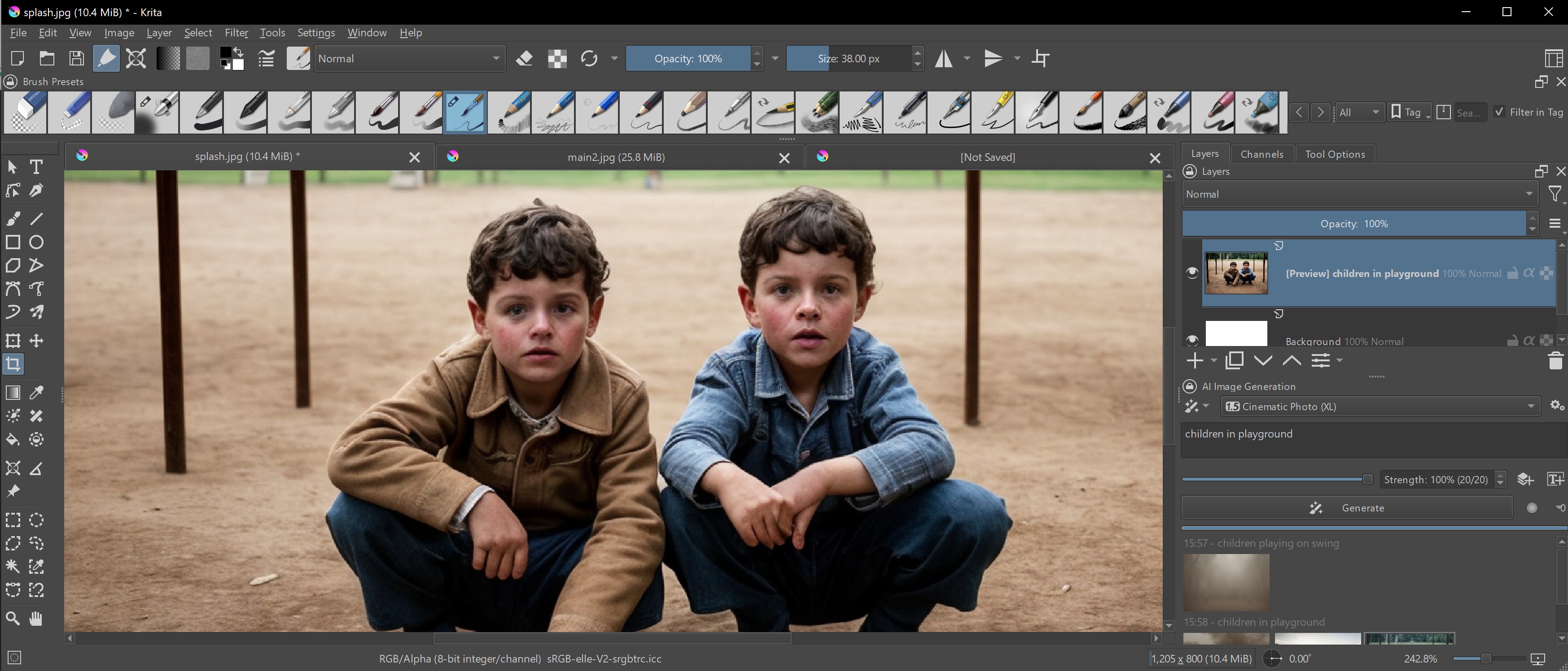
In this Krita 5.2.6 review I cover the new tools and features that have been added since the main numbered release, which include new AI tools. For more comparisons to other apps, read our guides to the best digital art software and the best free animation software, but read on to see why I think Krita is one of the best.
Krita 5.2.6 review: what we said before
In our Krita 5.0 review we compared this free software to GIMP, which makes sense, as it's also free, and I've done the same in my article Krita versus GIMP. But it's telling that in 2025, with Krita 5.2.6, I'm now comparing this app to Photoshop. It really has closed the gap on Adobe's paid-for software.
In our preview review for Krita 5.0 we praised it as a powerful piece of free software for digital painters and illustrators. We shared how Krita is ideal for hobbyists and art enthusiasts who want a comprehensive toolbox without the price tag. At the time, back in 2021-22, Photoshop was more advanced and GIMP more versatile, but Krita was seen as more user-friendly and intuitive than both, and its enthusiastic community will welcome you with open arms.
With Krita 5.0 the dev introduced a number of core features that still impress, including 2-point perspective assistance to make drawing perspective much easier. Create/rotate shapes holding Ctrl-Alt to rotate the shape with the stylus as you’re drawing it. Krita 5.0 enabled you drag a colour straight from the Docker (Toolbar) to an element or layer. The hugely customisable Krita Brushes library was boosted, and remains a key advantage to using this app.
In the intervening years Krita 5.0 has had myriad updates that have brought it closer to Photoshop. Below I go into the new features and plugins that make Krita 5.2.6 a true Photoshop alternative.
Krita 5.2.6 review: getting started
One of the beautiful things about working with open source applications like Krita is the omission of security and copy-protection headaches. No serial numbers, or verification codes, or dongles. Just surf over to the krita website, and click the download link. (And while it’s downloading, consider making a donation. We want to keep these good folks fed and caffeinated.)
Installation is very straightforward. You can install as many copies as you want. You can install it at work. You can install it at home. You can install it on your kids computers. Heck, you can hire 100 people, open a big studio, and install it on everyone’s workstation. There are few, if any, limitations.
Krita runs on every major platform, Mac, Windows, Linux, and even on Android and ChromeOS – and all with free downloads and regular updates.
Krita 5.2.6 review: new features
Everything in life is a comparison. And nobody expects an open source program to be as full-featured as a commercial one, like for example, Affinity Photo. Let alone the industry gorilla, Photoshop.
So how surprised would you be if I told you that Krita can go nearly feature-for-feature with Photoshop? I’ll take a guess that you would be about as surprised as I was when I began to realise this.
I don’t want to overstate this. Yes, Photoshop does have a few things that Krita doesn’t. But not nearly as many as one would expect. And yes, Photoshop probably implements some of these features a bit better. But again, not by much.
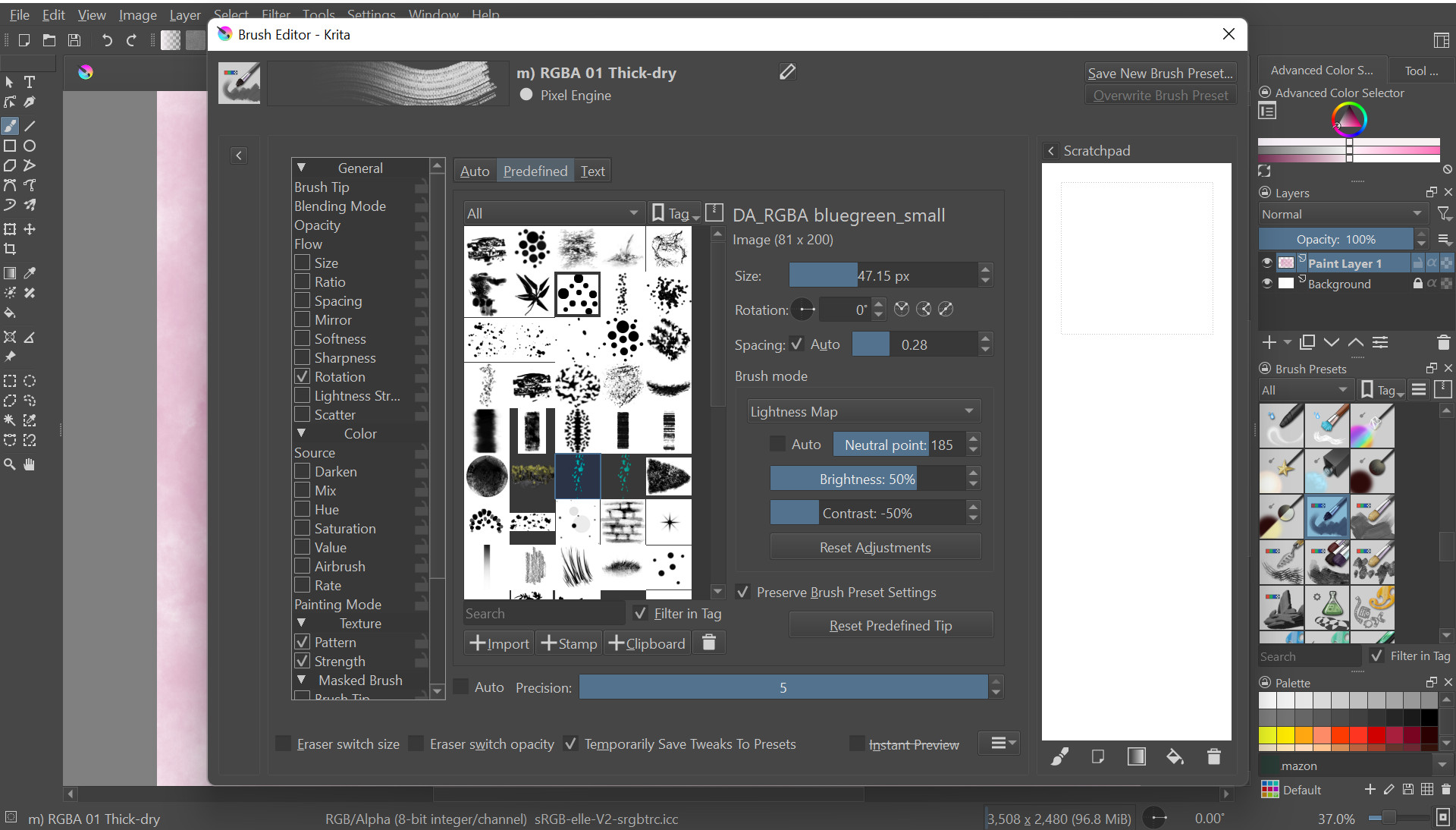
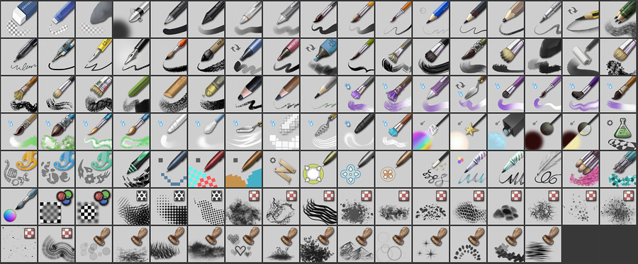
Let’s go down a list of features. Focusing on features that many don’t realize that Krita has, starting with the app's brushes. Krita has a vast range of brushes, over 100, and the sophisticated controls that they have is amazing. Krita’s focus is on digital artists, so its brush selection reminds me of digital painting software like Corel Painter and Rebelle 7.
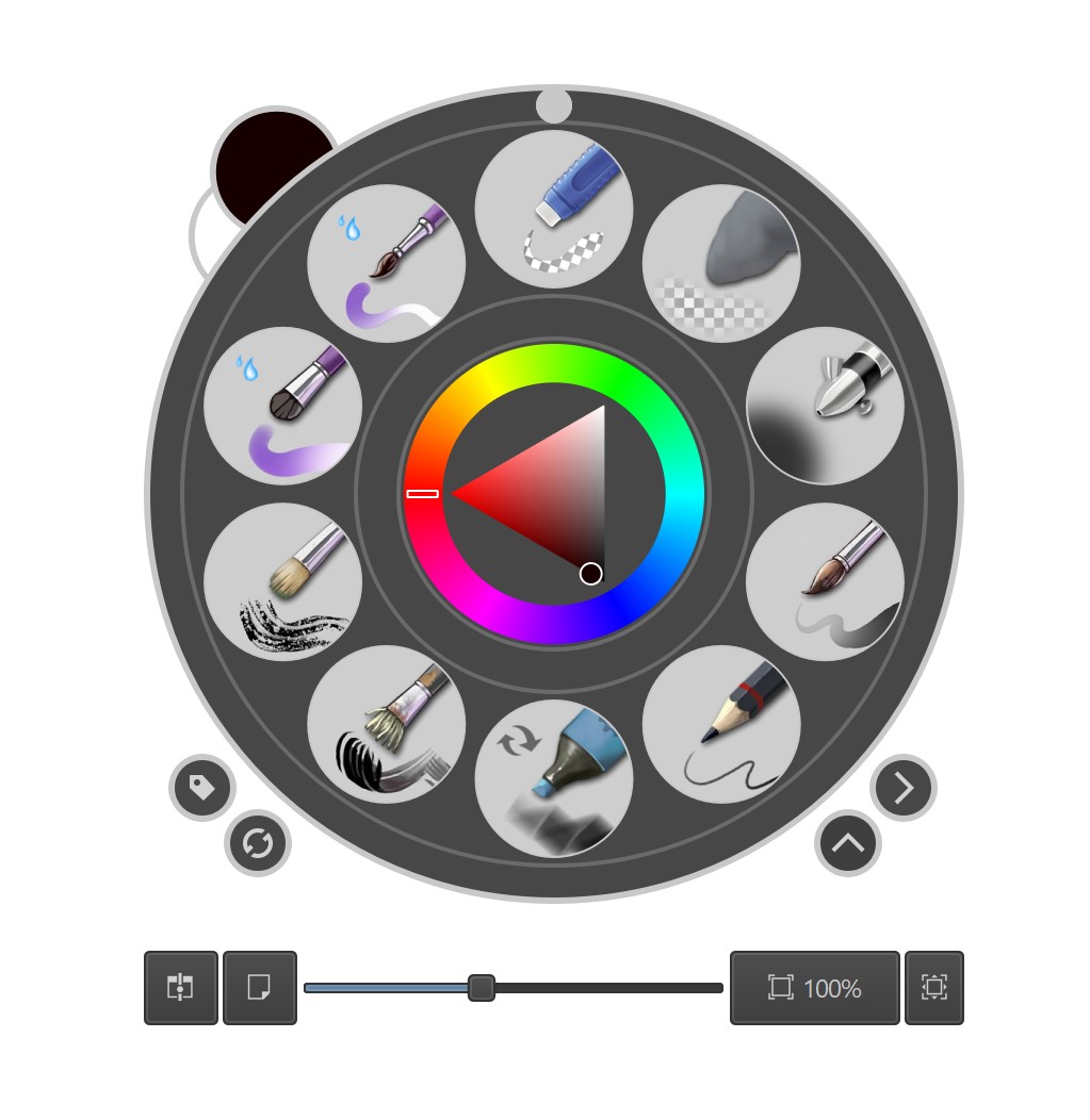
Krita offers pencils, chalk, watercolor, charcoal, bristles, rollers, painting knives, markers, technical pens, airbrushes, textures, sprays, stamps, hair brushes, halftone brushes and more. You get the idea. For more, on what Krita offers read the presets documentation on the Krita website and you can download more brush packs for specific uses.
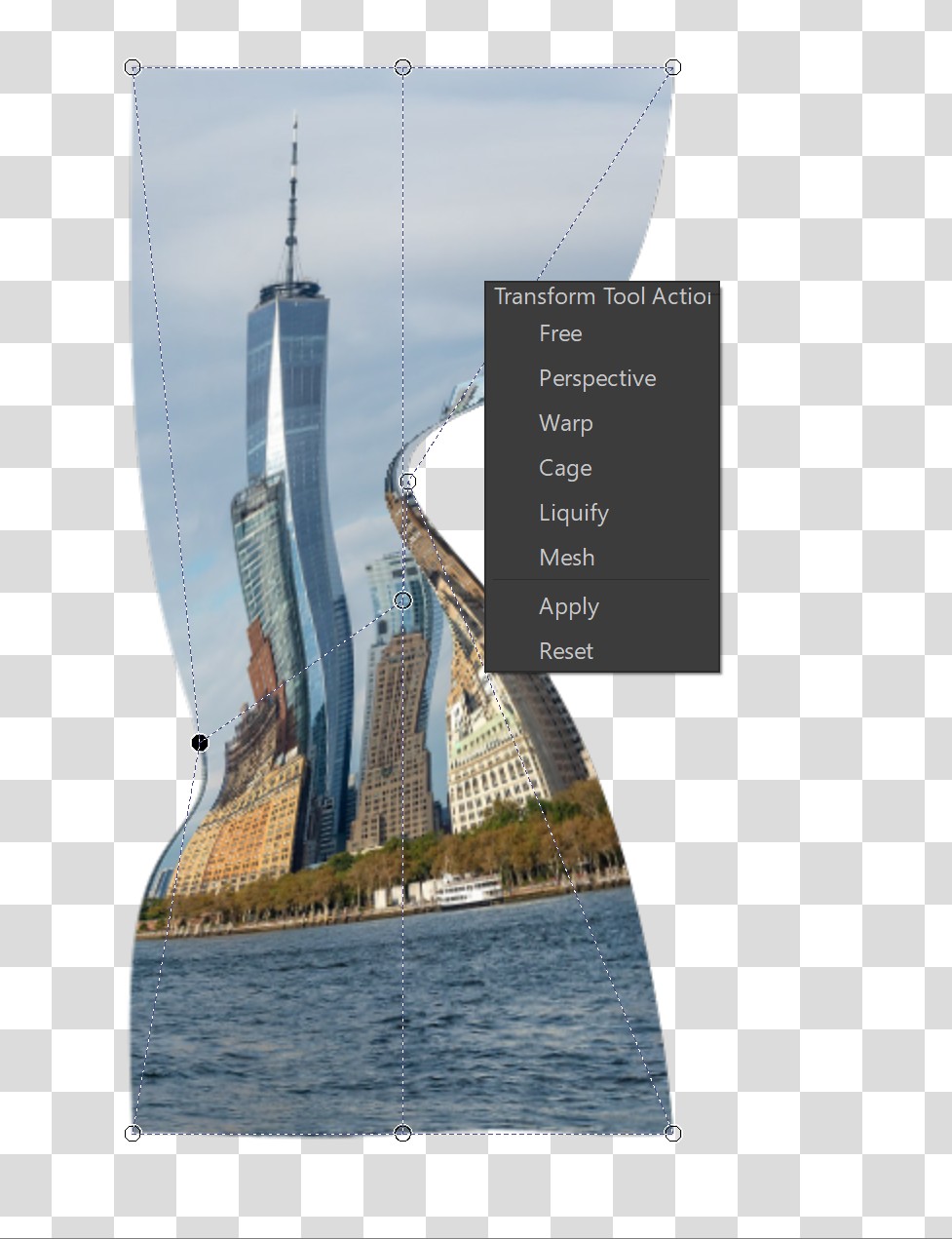
Kirta's distortion tools are excellent too. These are an important part of image manipulation. Krita not only has every option we might find in Photoshop, but also implements them in familiar and easy to use ways. There are six options, plus Transform tools.
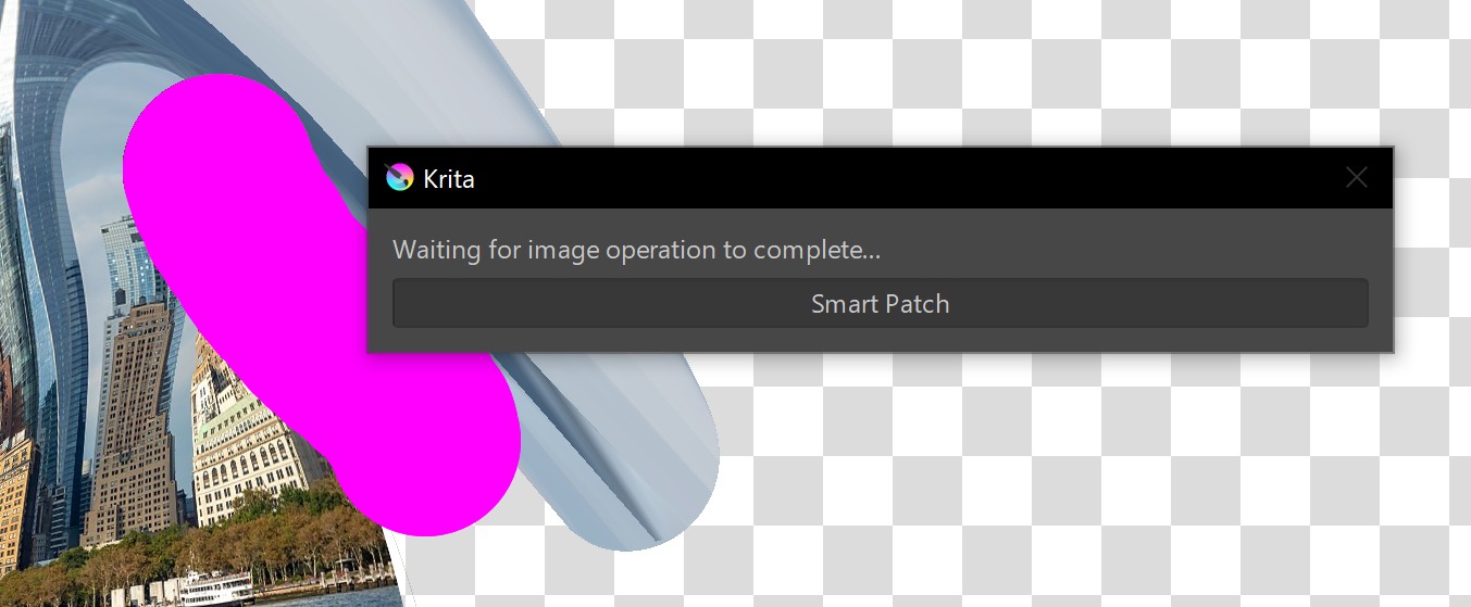
Known as the Healing Tool in Photoshop, it’s called the Smart Patch Tool in Krita. Photoshop's version is superior, but Krita’s will usually get the job done too, though it tends to have too much blurring. Also, Krita’s version is much slower than Adobe's, so if you use this tool a lot in Photoshop you may find Krita lacking.
Fully non-destructive workflows are another crucial part of digital art, and while Krita’s versions of non-destructive editing tools work differently to those in Photoshop, they appear to work every bit as well. Some of the toolsets include File Layers that are similar to Smart Objects, Adjustment Layers in Photoshop are called Filter Layers in Krita, and are even more versatile.
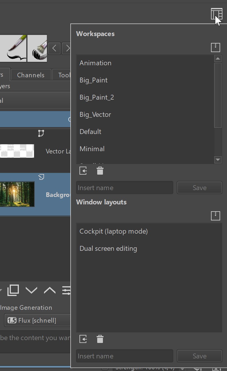
Krita apes Photoshop in other ways too, particularly its UI. For example, much like Photoshop there is a Workspaces dialog on the upper right corner of the interface. Most of the pallets in Krita can be 'torn off' and placed wherever you like within the workspace too, just like Adobe's software.
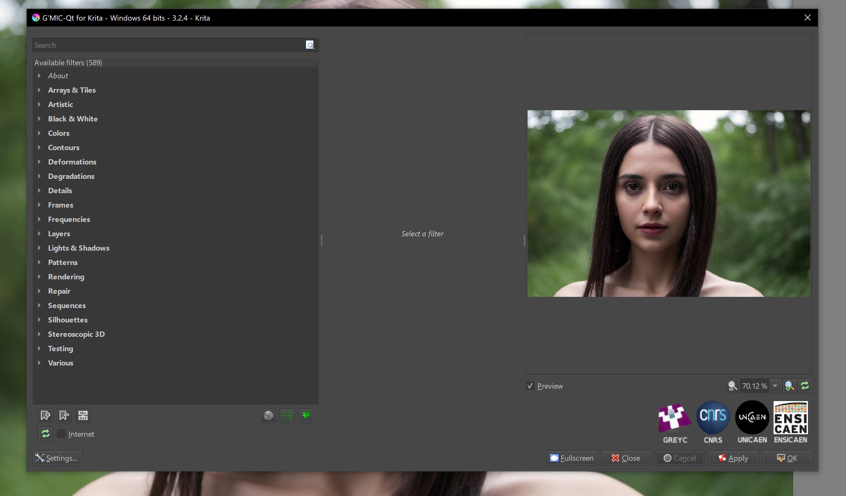
Until the most recent version, you would be forgiven for assuming that Krita’s plugin options were lacking. It simply has not been the focus of their development. And while you could load up third-party plugins before, Krita recently started to bundle a great suite of plugins called G’MIC, which includes over 500 functions. Largely bringing Krita in line with other programs.
AI is another area that the core Krita dev team does not invest in. But thankfully a third-party team has developed AI tools you can download if it's something you want (unlike Photoshop where AI tools are a default). This AI plugin does, however, bring a lot of very important functionality to Krita.
The plugin is called Krita AI Diffusion; it's another open source project that brings support for both the Stable Diffusion and Flux AI libraries. This adds the following to Krita, including some that feel very similar to Adobe's recent AI additions.
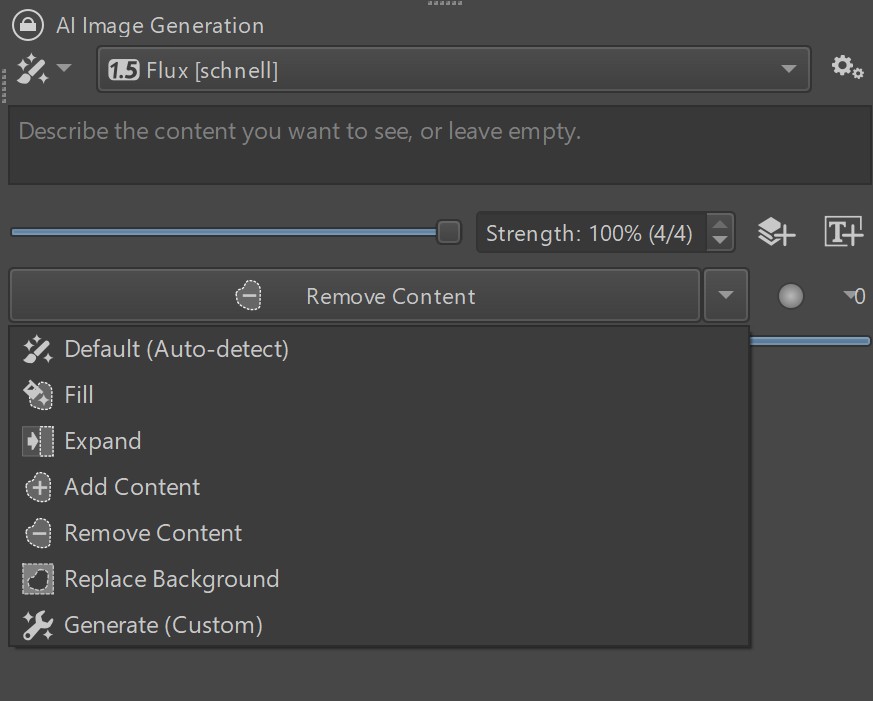
Like in Photoshop, and with this AI plugin, Krita gains a Content Aware Fill tool. You can select an area of your image and use one of the generative options for removing unwanted content, or expanding the canvas and its content.
It also gives Krita pure AI image generation, rather than just being used to 'patch' existing imagery. We can use the AI plugin to generate entirely new content. Or entirely new elements that get added to an existing image.
One area that Krita falls a bit behind is in tools that can effortlessly isolate elements of the image. For example, like Photoshop's Auto Select tool. Another plugin from the same folks that brought us the Krita AI plugin, is called Krita Segmentation Tools, which provide similar functionality.
All of Krita's AI tools have the option of running locally, which means you will not be paying for Adobe or other cloud services to render. Note that the plugin uses Stable Diffusion which has been trained on the open web via scraping. Ethics on using such resources are a personal call. It also offers Flux, should you prefer that alternative.
Krita 5.2.6 review: user experience
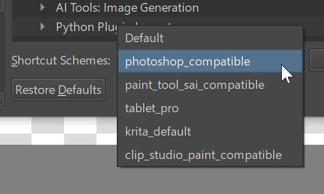
Coming from a Photoshop background, as most of us do, the Krita team has made the transition amazingly easy. You will feel right at home. Not only is the layout similar enough, but so are many of the keyboard commands. And yet, they even have presets to allow the key-commands to match Photoshop even more. Overall, working in Krita is a very enjoyable experience.
What is truly impressive is how little Krita actually needs. And most of these items are refinements rather than new features. For example, Krita has text generation, but the controls need work.
Also, levels need tweaking. Krita seems to be missing the Black Point, White Point and Midtone buttons, though it does have Auto-Levels. Also, the previews for individual channels (R, G, B, etc.) seem to be wrong.
The HSB dialog (Hue, Saturation and Brightness) is missing some controls. In Photoshop we can choose to select and work on narrow bands of colours, using a number of tools like the presets, the colour spectrum slider at the bottom, or the eye dropper. None of these are available in Krita.
The Sharpen, Blur, Dodge, and Burn functions are all available as Tools in Photoshop, whereas in Krita they are implemented as Brushes. Nothing wrong with this, and they work almost identically, but in practice this means that if I want to quickly use any of them, I have to hunt for that Brush in the brushes pallet. Remember, there are over 100 brushes! Having them in the Tools pallet allows for a much faster workflow.
Krita could do with better OpenGL and GPU acceleration; it does indeed have this, I was mistaken in a previous article. But the reason I got it wrong was partly because some functions that use GPU acceleration are still very slow. Improving this hardware integration would mean a big boost in productivity for some tools.
A more accessible cross-hairs Hot Key would be a good addition. With my less than perfect vision, Photoshop's CAPS LOCK hotkey to change the brush cursor into a cross-hair streamlines my workflow when I use a very narrow brush. Krita’s cross hair option is buried in the preferences dialogs.
The ability to print to a desktop printer does not exist in Krita. Because most content goes to the web today, it took me a while to even notice this. It is a glaring omission, but can be resolved by exporting and printing with another application. Scribus, GIMP and LibreOffice Write are the open source tools that come to mind.
I’m optimistic that it can handle whatever I throw at it, much as Photoshop has done for decades
Most, if not all, of my views on what can be improved are small items. The overall experience of using this digital art tool is excellent.
Over the years I’ve used Photoshop to create 40-foot billboards in Times Square. I’ve created images for advertising that required dozens and dozens of layers. Can Krita do all of that? Can it withstand such gruelling work demands? I don’t know.
So far I’ve used it to create a fair number of layers on some fairly large images (100MP photo files), and it’s been just fine. So I’m optimistic that it can handle whatever I throw at it, much as Photoshop has done for decades.
Give it a download and kick the tires. The only thing you risk losing is a $240 annual subscription. And if you do end up canceling a subscription, donate a bit of that Krita. This is a project we want to see continue.
Krita 5.2.6 review: price
Krita is free to download and use. This is an open source software, which means it is developed by the Krita community of artists and programmers, who create new features based on artist needs. While it is free, you're encouraged to contribute a small fee as a donation to help fund development.
While the base software is free, and there are free Krita plugins, there are also some paid-for plugins. All of these are helpful, as plugins offer new tools and features, whether that's for AI, animation or digital painting.
Krita 5.2.6 review: who is it for?
Krita is a powerful and flexible digital art software that can be used for almost all forms of art. It can be used to create illustrations, comics, animation, concept art and storyboards. It features workflows and tools for traditional onion-skinning animation as well as comic book project management tools. With its core tools and mix of plugins, Krita really can do it all.
Krita 5.2.6 review: get it if
- You want a powerful digital art app
- You don't mind that it is free ;-)
- You need its excellent Brush and Tablet support
Krita 5.2.6 review: don't get it if
- You need more tools out of the box
- You need better PSD compatibility
- You need interoperability with other Adobe products

Thank you for reading 5 articles this month* Join now for unlimited access
Enjoy your first month for just £1 / $1 / €1
*Read 5 free articles per month without a subscription

Join now for unlimited access
Try first month for just £1 / $1 / €1
out of 10
Truly, there are no reasons to not give this wonderful program a try. It is virtually feature-equivalent to Photoshop, and even surpasses Adobe's app in a number of ways. Add in powerful AI that can be rendered locally for free, and that it's open source and totally free, and Krita is evolving into a best-in-class application.

Lance Evans is creative director of Graphlink Media, a boutique creative marketing agency that specialises in building brands and has worked with such high-profile clients as Olive Garden, Miller Beer and AMEX. Lance was an early adopter of digital tools, and was on the original beta team for Photoshop. Lance has written for Creative Bloq on a wide range of topics, from technical photography tips to the ins and outs of branding.
You must confirm your public display name before commenting
Please logout and then login again, you will then be prompted to enter your display name.
