Our Verdict
Figma is the most popular UI design tool, and for good reason. It’s available on all platforms (Windows, macOS, web) and not only covers more of the design process compared to similar tools, but is constantly innovating with new features and improvements too. In particular, Figma’s collaboration features makes working in a product team fun and energising.
For
- Unrivalled collaboration features
- Facilitates everything from ideation to handoff
- Auto Layout (create dynamic, flex-based layouts)
Against
- Permissions for sharing can be a little confusing
Why you can trust Creative Bloq
While Figma isn’t able to convert designs into code beyond having fairly standard handoff features, offering a separate tool (FigJam) for tasks that might require a whiteboard, and design system documentation features to ensure that styles and components can live on long after they’ve been created, makes Figma otherwise feel like a truly end-to-end product design solution.
With audio and spotlighting functionality, product teams can have real conversations directly in Figma, and even present to stakeholders.
The latest version of Figma was released in May 2022 to coincide with Config 2022, where Figma live-shipped a range of new features and improvements including dark mode, component properties, variable fonts, spotlighting, branch reviews, and more.
Get a free trial of Figma today.
FigJam
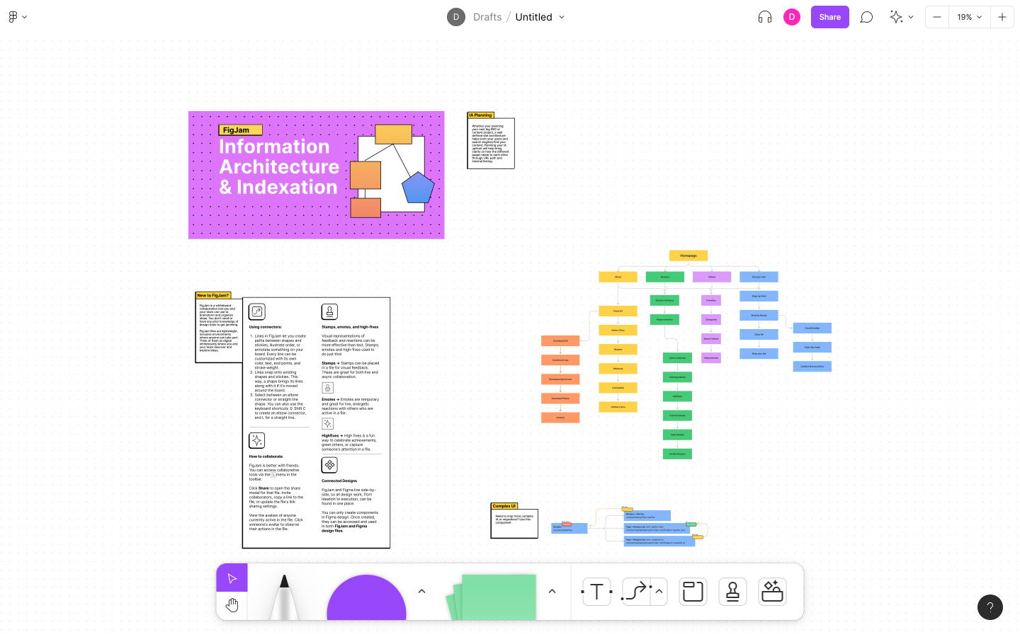
Before we dive into Figma itself, FigJam deserves a special mention.
Users of Sketch, Adobe XD, and other UI design tools must subscribe to a totally separate whiteboard tool such as Miro or Mural in order to plan user flows, conduct design sprints, and carry out various other product design-y things. FigJam, however, is part of the Figma ecosystem and it’s just nice to have all tools and files under one umbrella.
To fully understand what FigJam is capable of, take a look at these FigJam templates.
Mockups
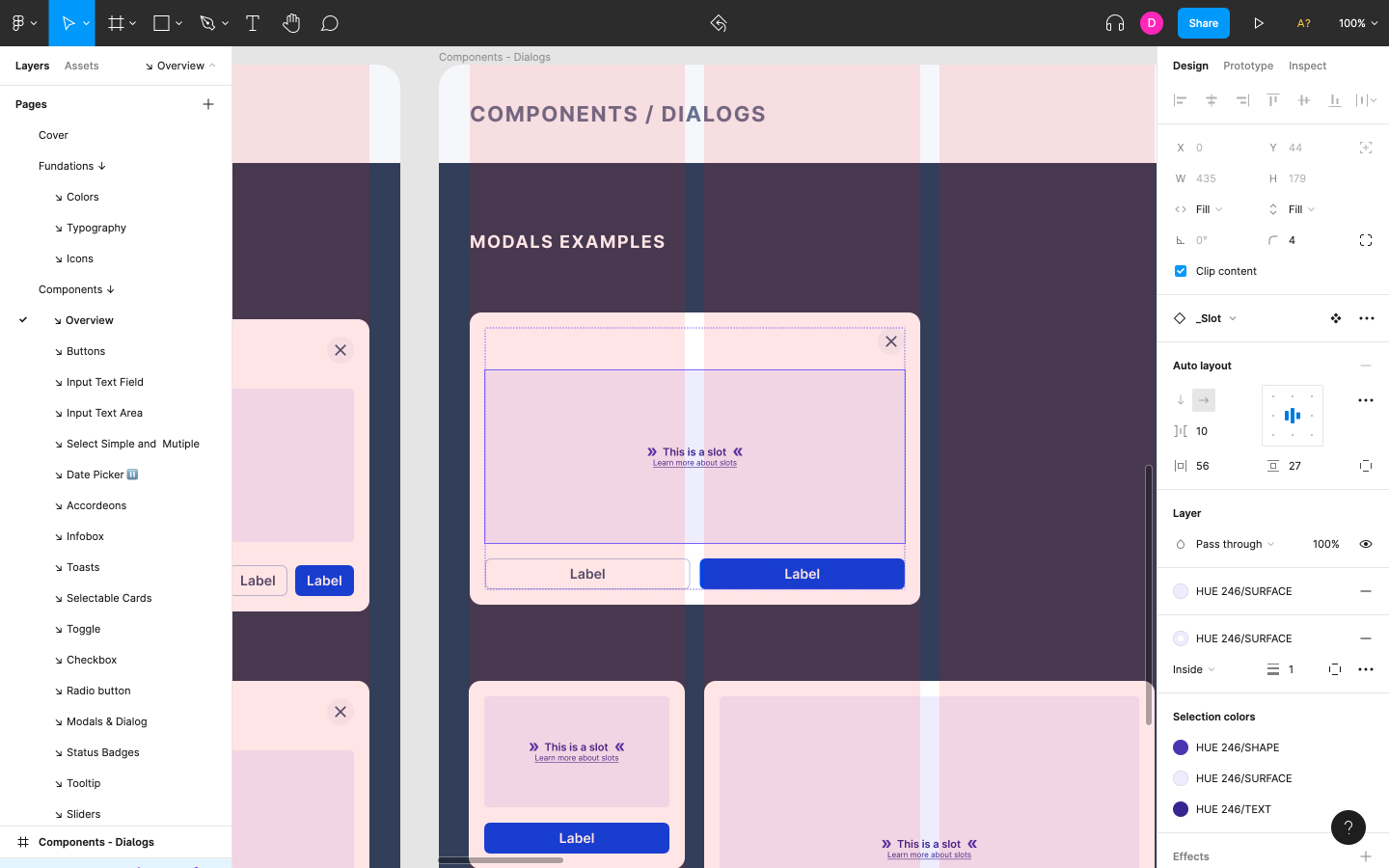
Frames (artboards), shape layers, text layers, smart guides, intuitive keyboard shortcuts, and so on — UI design tools have matured enough that it’s rather difficult to mess up these basic tools and concepts, which enable designers to quickly mock up static designs and wireframes. In Figma, these tools work exactly as you’d expect them to.
However, one particular feature that you may not be familiar with is what Figma calls Auto Layout, which allows designers to create dynamic layouts using intelligent alignment, padding, and spacing rules. Figma users tend to be quite divided on Auto Layout, finding its results to be unpredictable. This is possibly because Auto Layout is flex-based, so if you’re not familiar with modern CSS practices, you might feel inclined to give Auto Layout a miss and make do with classic resizing rules.
Prototyping
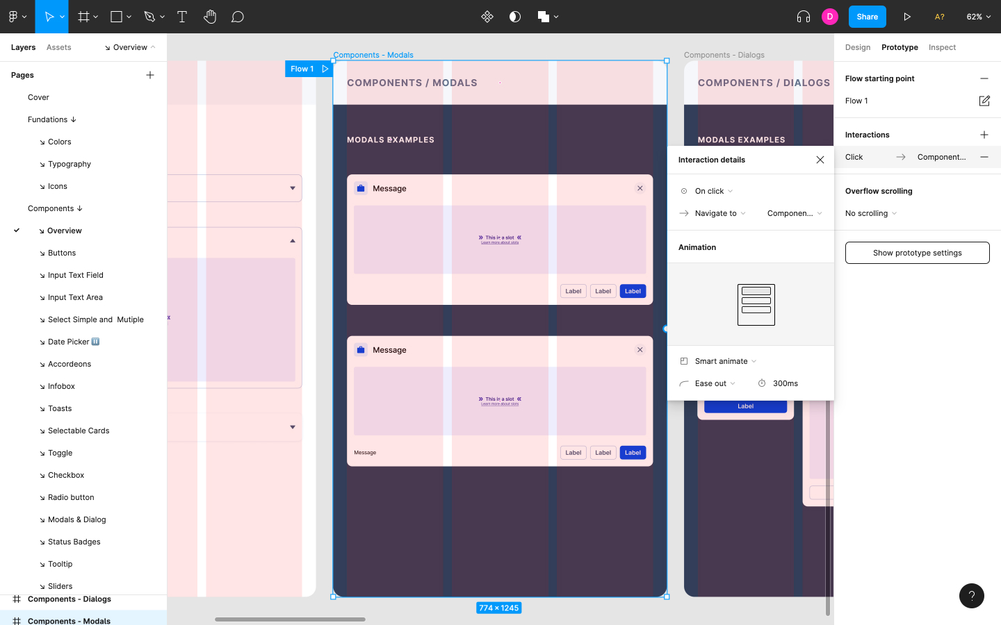
In terms of prototyping, Figma pretty much does what you’d expect it to. I’d very much like to see functional components such as interactive form controls and so on, but the same could be said for any modern UI design tool.
Instead you’ll see the standard gestures (click, drag, hover, and delay, to name a few) and page transitions (dissolve/move/push/slide). Those combined can be used to transition to a new frame, switch component variants, open/swap/close overlays, go back, ‘scroll to’, and open links — nothing extraordinary but other UI design tools are rarely this complete in terms of interaction possibilities (e.g. Adobe XD doesn’t have ‘hover’).
Most of the time you’ll be using ‘smart animate’ anyway, a feature that takes the guesswork out of prototyping animations.
Handoff
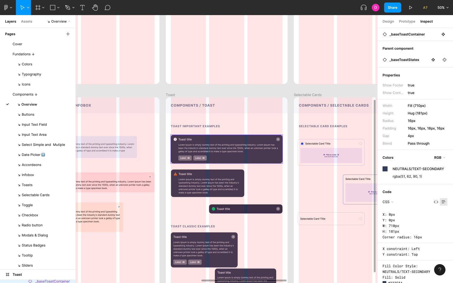
Figma is able to translate styles into CSS, iOS, and Android code, with the option to specify the color format as either Hex, RGB, HSL, HSB, or CSS (CSS Colors Level 3 only). This is fairly standard.
However, one aspect of Figma’s handoff features that really impresses is the fact that it’s built into the core Figma app rather than inconveniently outsourced to a separate web-based interface.
Design systems
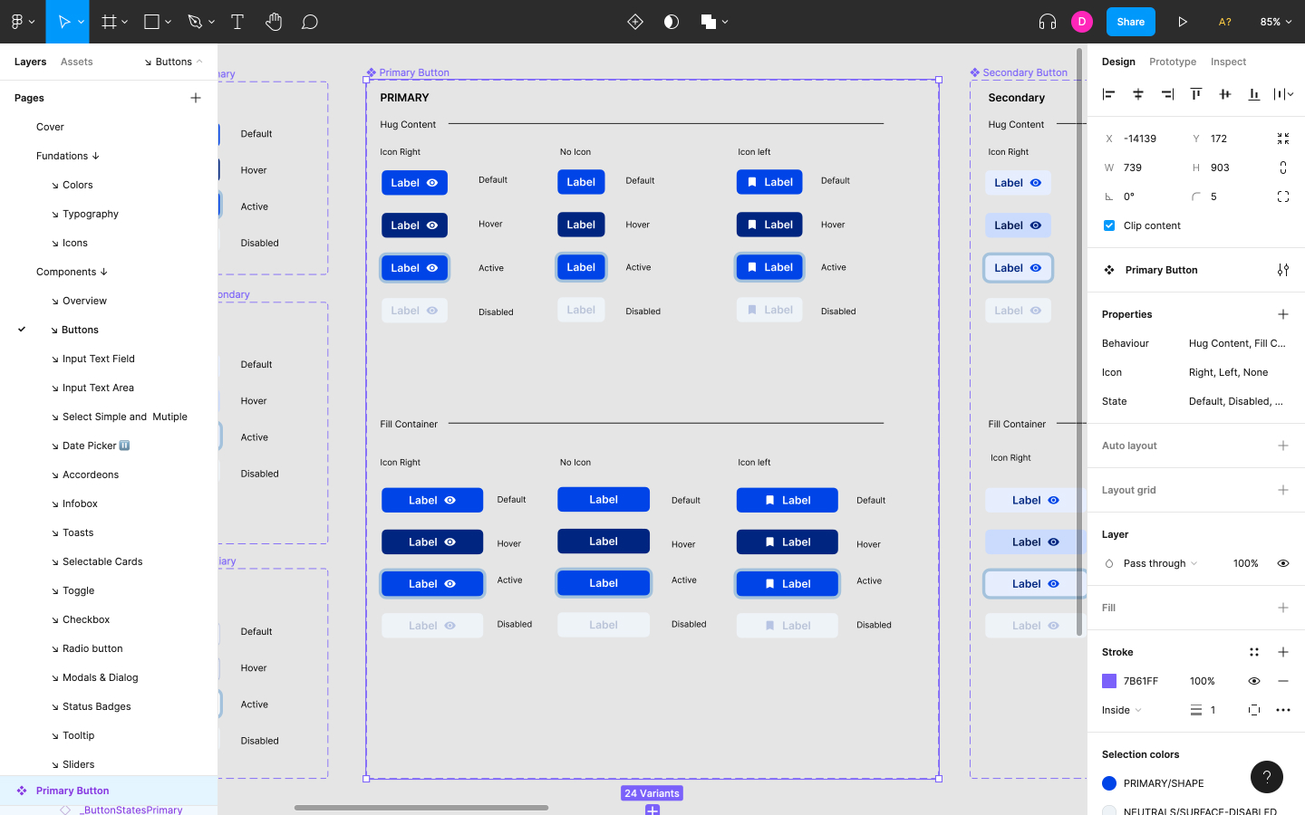
Most modern UI design tools have shared styles and components, but Figma is the only major tool to let you attach design system documentation to them.
Additionally, Component Variants and Properties can make components more flexible while still being able to maintain visual consistency. Not only does this put Figma way ahead of the competition but the execution of these features finally makes managing a design system less confusing, rather than more so.
Version control
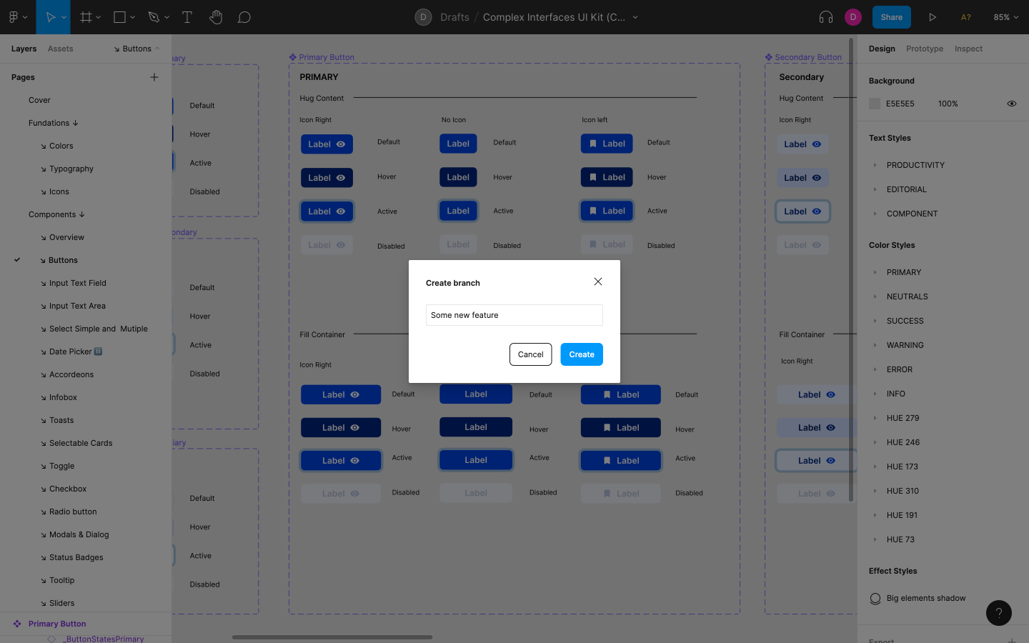
Having version control means being able to ‘fork’ designs into branches that can be independently and non-destructively worked on, tested, and handed off before being reviewed and merged into the branch’s main Figma document. This feature alone makes Figma more suitable for iterative design methodologies such as design sprints, a first for a UI design tool.
Collaboration
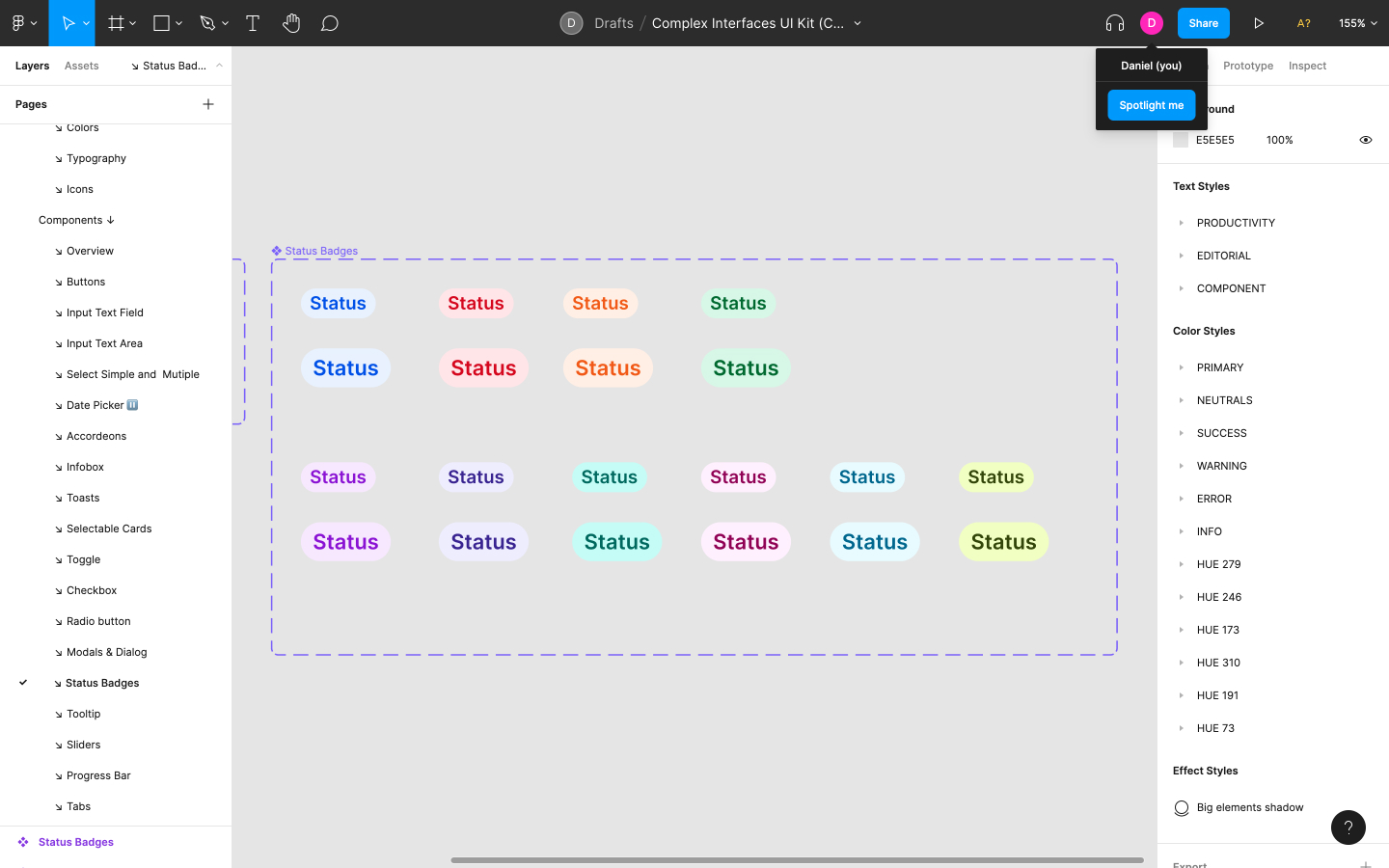
Collaboration is where Figma truly shines.
After innovating live collaboration features (referred to by Figma as ‘multiplayer’), it became clear that collaboration was going to be a huge part of what makes Figma great. Since then, Figma has more than delivered on this promise despite other UI design tools also implementing live collaboration features.
One of Figma’s other collaboration features (that hasn’t been adopted by other tools…yet) is audio conversations, allowing stakeholders to discuss feedback, ask questions, run workshops, or simply co-work. In Figma’s newest release we also saw the introduction of ‘spotlighting’, which is essentially a “follow me around the file” button for those that need to present work.
And of course, for asynchronous work, the standard ‘comment and resolve’ features are there too.
Figma system requirements - desktop apps
- Windows 8.1 or later
- macOS 10.12 (macOS Sierra) or later
Figma system requirements - web app
- Chrome 64+
- Firefox 78+
- Safari 13+
- Microsoft Edge 79+
Figma pricing
The biggest differences are that Professional will get you unlimited files plus access to team libraries and audio conversations, whereas Organization will get you branching and merging too. See Figma’s pricing page for a more detailed breakdown.
Figma: should I buy it?
Figma is, without a doubt, the best value for money at this moment in time, especially if you and/or your team is taking designOps seriously by branching, testing, creating design systems, and also leveraging both synchronous and asynchronous work as needed.
Despite these serious features, Figma still manages to make design collaboration fun with its multiplayer features and audio conversations.
Finally, it remains competitive with other UI design tools in terms of features and platform support, and yet always manages to innovate without adding more feature bloat, which we’ve seen become the downfall of many tools in the past.

Thank you for reading 5 articles this month* Join now for unlimited access
Enjoy your first month for just £1 / $1 / €1
*Read 5 free articles per month without a subscription

Join now for unlimited access
Try first month for just £1 / $1 / €1
out of 10
Figma is the most popular UI design tool, and for good reason. It’s available on all platforms (Windows, macOS, web) and not only covers more of the design process compared to similar tools, but is constantly innovating with new features and improvements too. In particular, Figma’s collaboration features makes working in a product team fun and energising.
Previously a design blog editor at Toptal and SitePoint, and before that a freelance product/UX designer and web developer for several years, Daniel Schwarz now advocates for better UX design alongside industry leaders such as InVision, Adobe, Net Magazine, and more. In his free time, Daniel loves gaming, café culture and Wikipedia, and also travels perpetually when there isn’t a pandemic.

