Our Verdict
Despite focussing mainly on the 20th century, Design: The Whole story does an admirable job of explaining design history in a way that's sure to make readers keep coming back for more.
For
- Wealth of information
- Easily accessible
- Beautiful images
- Clean layout
Against
- Twentieth century focus
Why you can trust Creative Bloq
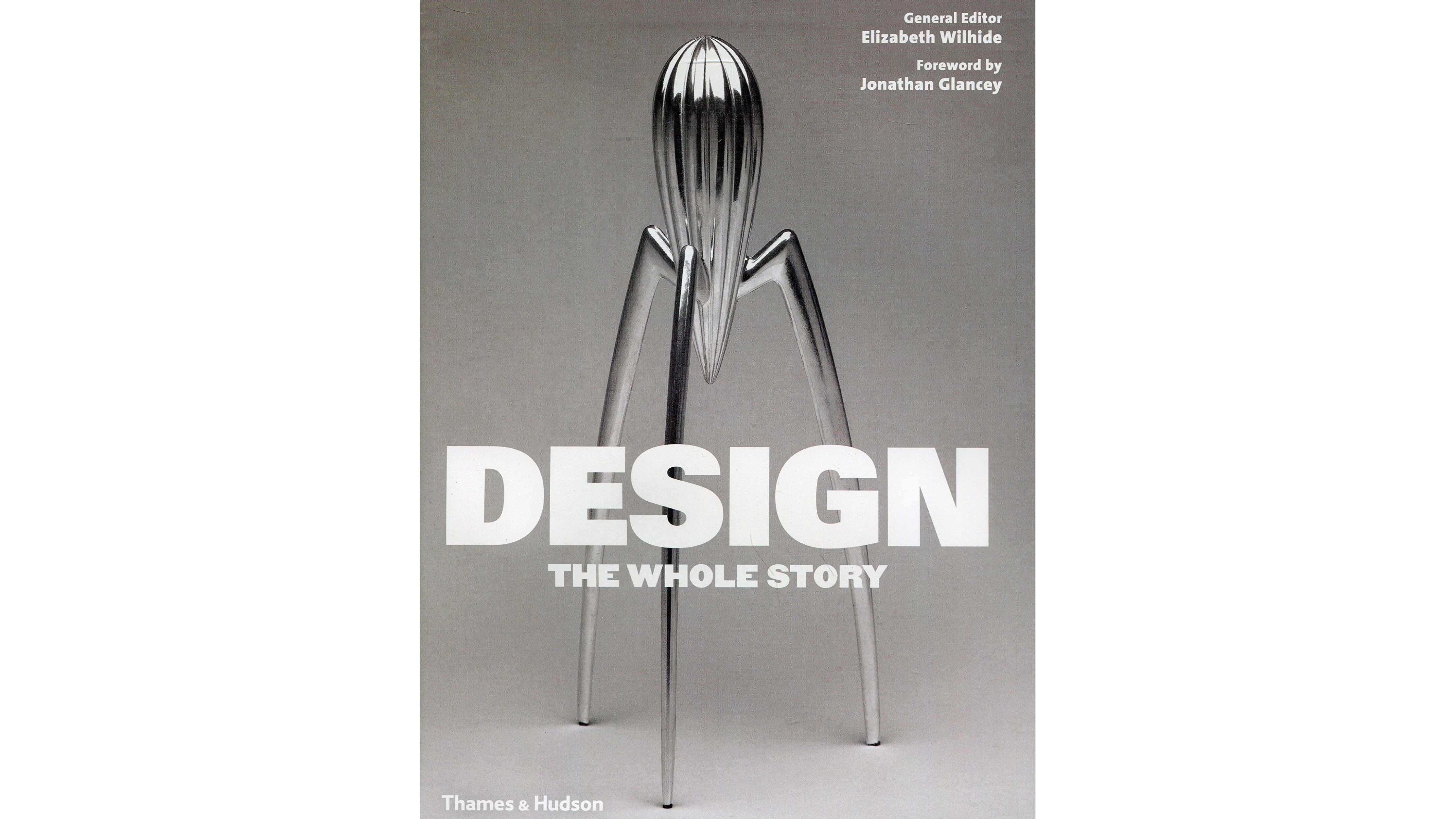
Having already covered architecture, fashion and art in their 'Whole Story' series, publishers Thames & Hudson are back with a weighty new edition that aims to tackle the entire history of design. Edited by seasoned design author Elizabeth Wilhide, Design: The Whole Story breaks down the past 300 years of design by looking at the branding, products and innovations that have shaped the way we live.
And this is where some artists and creative directors might start splitting hairs. As the book takes it upon itself to define when design began (described in this case as 'a specialist process, or a practice that is distinct from making') it's bound to overlook some areas and influences that some could argue formed the foundation of modern living.
But if you can put this to one side, what's left is a book that does an admirable job of rattling through over three centuries worth of design. No easy feat, even when spread over more than 500 pages.

Split into six sections, Design: The Whole Story tracks the emergence of design from the Industrial Revolution onwards, with the majority of the book's pages set detailing designs from the twentieth century.
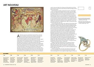
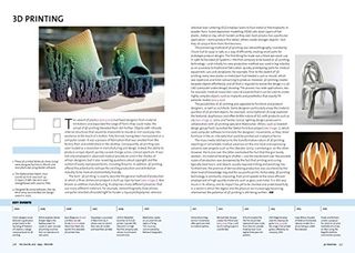
Each chapter is broken down further into sections focussing on landmark events, development and philosophies. These range from the classical revivals all the way through to sustainability, with every section represented by famous or noteworthy examples .
Running through every section is a timeline that gives the reader an overall idea of the shape of these incidents. This makes it easy to grasp different periods of design history, effectively giving you a crash course on the key events.

Thanks to this layout it's easy to dip into the book at any point. There's no need to read through in order as each section is clearly explained and relatively self-contained.
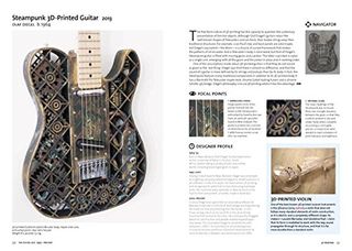
However this doesn't mean you won't discover something new. Regular focal points puts famous design works under the microscope and offer tantalising insights into the history of the subject. Whether it's a Routemaster bus or a Quaglino ashtray, there's something new to learn on every page.

Appropriately, each page in the book is beautifully presented with lavish imagery and functional typography that doesn't detract or get in the way of the story being told.
And while there are bound to be pieces of design work that some will be pained to find are missing, Design: The Whole Story is both the perfect primer for those with cursory design knowledge, as well as proving to be suitably informative for those with more of a trained eye.

Thank you for reading 5 articles this month* Join now for unlimited access
Enjoy your first month for just £1 / $1 / €1
*Read 5 free articles per month without a subscription

Join now for unlimited access
Try first month for just £1 / $1 / €1
out of 10
Despite focussing mainly on the 20th century, Design: The Whole story does an admirable job of explaining design history in a way that's sure to make readers keep coming back for more.

Dom Carter is a freelance writer who specialises in art and design. Formerly a staff writer for Creative Bloq, his work has also appeared on Creative Boom and in the pages of ImagineFX, Computer Arts, 3D World, and .net. He has been a D&AD New Blood judge, and has a particular interest in picture books.
