Responsively retrofit older sites
You can use responsive techniques on older sites as a first step toward better small-screen experiences. Check your idealism at the door, says Ben Callahan
This article first appeared in issue 235 of .net magazine – the world's best-selling magazine for web designers and developers.
A word of warning: this tutorial may be a bit controversial. Especially if you, like me, are a firm believer in web standards, semantics, and just plain doing things right. But if you also share a desire to build great experiences for the users of the sites you work on, you may find these techniques useful when you just can’t start from scratch.
Most of us probably agree that the web is never really done. The real-time nature of the beast is what makes our medium unique, yet we often choose ‘File > New’ over a steady evolution of our sites. The truth is, we don’t always get to start over. And, as Kristopher Layon argues in Mobilizing Web Sites: Strategies for Mobile Web Implementation (Develop and Design), “doing something is better than doing nothing”.
Responsive retrofitting defined
For the sake of this article, I’d like to define ‘responsive retrofitting’ as ‘finding the fastest and lowest-risk approach to creating a better experience for users of any size screen’.
The key words here are ‘fastest’, ‘lowest-risk’, and ‘any’. We are trying to do this quickly, efficiently, with minimal risk to the existing ‘desktop-resolution’ (whatever that is) site. And, these techniques could be used to provide a better experience at smaller resolutions or at larger.
Retrofitting a fluid grid
When we’re approached by someone interested in a retrofit, we almost always start in the browser playing with the inspector. The very nature of a retrofit implies that the site already exists somewhere; the inspector gives you an opportunity to experiment with current markup and styles.
Let’s take a look at an existing site – we’re going to use the Responsive Design Twitter account – and start to experiment with the grid itself. Fire up your browser (in my case this is Chrome), head over to twitter.com/rwd, and open the inspector. You should now see something along the lines of Figure A.
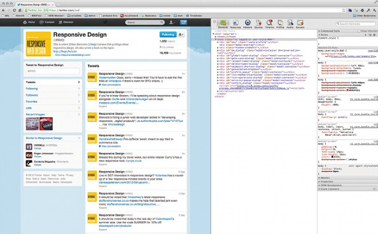
Next, let’s drill into the markup a bit. In the body tag, you’ll see a div with an ID of doc. Inside that are two divs, one with an ID of page-outer. Generally, I start off looking for fixed-width containers.
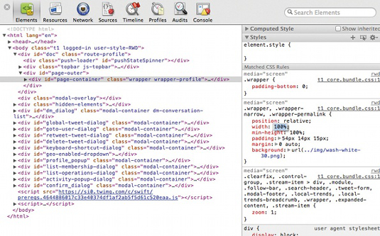
The #page-outer element doesn’t have a width specified in the CSS, so drill down one level further to the div with an ID of page-container. You’ll notice that this has a width of 837 pixels set in the CSS. We’re going to change it to 100% simply by clicking on 837px in the inspector and replacing that with 100% (see Figure B).
Immediately, the two columns of content shift to the left and right of the screen. However, because they are both fixed-width columns, there is a bit of space left between them (see Figure C).
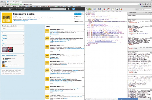
Also, because this element has a padding set:
Get the Creative Bloq Newsletter
Daily design news, reviews, how-tos and more, as picked by the editors.
.wrapper, .wrapper-narrow, .wrapper-permalink {
…
width: 100%; /* was 837px */
padding: 54px 14px 15px;
…
}
… its total width is now more than 100% (28px more, to be precise). This introduces a bit of left/right scrolling in the browser window. We can alleviate this by adding a new style with the inspector. If you’re using Chrome, click the + symbol (the New Style Rule button) at the top of the Styles palette. If you have the #page-container element selected still, it will pre-populate the new style rule’s selector with that ID. We’re just going to add the box-sizing property and set it to border-box.
#page-container {
box-sizing: border-box;
}
The box-sizing property forces any padding or borders of the element to be laid out and drawn inside the specified width and height. See Paul Irish’s article on this property for cross-browser compatibility and performance concerns.
With this rule applied, you’ll see that the browser no longer requires any horizontal scroll. The 28 pixels of padding (14 pixels on each side of #page-container) is now counted inside the 100% width – exactly what we need in this case. Now, let’s get those columns flexing a bit.
Inside the #page-container div is a div with a class of dashboard, which contains the entire left-hand column. Upon inspection, you’ll see that it has a width of 302 pixels specified. 302 divided by 837 gives the relative width that the .dashboard element took up when the layout was locked at 837 pixels. It’s approximately 36%, so we’ll set that in the inspector.
.dashboard {
width: 36%; /* 302/837 = 36ish% */
float: left;
}
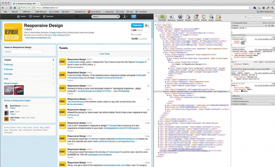
Taking the same approach with the right column (with a class of content-main), which has a width of 522 pixels, gives us about 63%. This leaves us a 1% gutter between the columns, which looks about right in this layout (see Figure D).
.content-main {
width: 63%; /* 522/837 = 63ish% */
float: right;
}
I love this kind of experimentation because it gives you a very good feel for what’s actually possible. As you can see, within just a few minutes and with only a handful of styles, we’re able to get the Twitter site flexing pretty well. Obviously, I selected Twitter because it’s a fairly simple layout and has clean markup to work with. You may not be so lucky on your project. Remember this doesn’t mean you can’t be successful! However, you will want to try this kind of in-browser experimentation before you sign a contract.
We don’t generally use grid-systems in our HTML/CSS work. However, there are cases where it makes sense, particularly when you’re handing templates off to be managed by another organisation. In scenarios where you need to use a grid-system and you already have a CSS preprocessor in your workflow, you may be able to use one of the semantic grid systems out there. Two that we’ve used and had great success with are The Semantic Grid System and Susy. These tools don’t require non-semantic class names (which break down in responsive web design). Generally, they use mixins or functions to re-define the widths at various breakpoints.
Retrofitting flexible content
In the same way you would approach a greenfield responsive project, once we have the foundation of our site flexing (using ratios instead of fixed-width declarations) we need to consider how the content that lives inside that fluid grid will respond. Text generally does this without much issue, but other content types can be a bit more of a hassle – especially when you’re retrofitting. Oftentimes, we find that a legacy CMS is writing width and/or height attributes on the img tag itself. Sometimes we even see inline styles being set. How are we supposed to handle these kinds of challenges?
Images
After spending some time fighting with inline styles, I’ve landed on a few tricks to help you out. In cases where width and height attributes are specified, you can actually override these with a simple width or height declaration in your CSS. If you are dealing with inline styles, you can always use the !important keyword in CSS to override these declarations. Obviously, be careful where and when you do this, but it does work.
Another trick is to use min-width and/or max-width instead of !important. Perhaps you want to set an image to fill 100% of its container and to maintain its aspect ratio. You can do this even if there are inline styles specified, by setting the min-width and/or max-width to 100%.
<div class="column">
<img src="/i/image.png" alt="alt text" style="width: 200px; height: 100px;">
</div>
In a scenario like this, you could force the image to be flexible by using both min-width and max-width, like so:
.column {
width: 50%;
}
column img {
min-width: 100%;
max-width: 100%;
height: auto !important;
}
Essentially, the min-width and max-width rules combine to force the image to 100%, regardless of the inline widths. Because the height is also specified inline, we still need to override that with an !important keyword to maintain the aspect ratio.
This seems to work really well in all modern browsers. IE8 and older give a bit of trouble with the auto rule on the height. The real point of this exercise is to encourage the level of exploration that’s needed for retrofitting. It’s not until you attempt something you’ve never done with CSS that you begin to realise how powerful it can be.
Check out the /Images folder to see some tests I’ve been running to override inline styles with CSS. These are by no means exhaustive, so make sure you combine overriding efforts like this with a healthy dose of testing.
Tables
Tables of data are always a challenge in responsive web design. Particularly in retrofitting, where you often can’t touch the markup, they can make for a difficult time. Let’s look at an example. Here is a pretty standard table, with some attributes specified to apply style (see Figure E):
<table border="0" bgcolor="#eeeeee">
<thead bgcolor="#000000" style="color: #fff">
<tr>
<th width="100"></th>
<th width="81">Today</th>
<th width="81">Sep 28</th>
...
<th width="81">Jun 28</th>
</tr>
</thead>
<tr>
<th width="100">11 Payments</th>
<td width="81">$27.00</td>
<td width="81">$18.00</td>
...
<td width="81">$18.00</td>
</tr>
...
</table>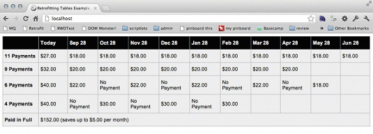
This table represents a list of payment schedules and it’s based on an actual retrofit project that we worked on at Sparkbox. At the end of a series of questions, this was presented to the user, in a modal dialog. Initially, I thought there was no way. After a few minutes in the inspector, I was able to get this responding fairly easily.
Here are just a few styles that shift the table around to make it much more digestible on small screens:
/* make browsers include padding and border inside the width */
* {
-moz-box-sizing: border-box;
-webkit-box-sizing: border-box;
box-sizing: border-box;
}
/* table cells get "display: block" and "float: left" */
th, td {
display: block;
float: left;
text-align: center;
border: 0;
border-bottom: 1px solid #aaa;
}
/* the far left column will be full-width and called out */
th {
width: 100%;
background-color: #000;
color: #fff;
}
/* each inner table cell will fit four-across (25%) */
td {
width: 25%;
min-height: 3em;
border-right: 1px solid #aaa;
}
/* hide the header row */
thead {
display: none;
}
/* the last option only has one inner cell, make it 100% */
tr:nth-child(5) td {
width: 100%;
}
Just these few styles enable us to turn this table on its head and produce a much more usable experience for those viewing on small screens. In this case, I’m essentially just setting the individual table cells to display: block and floating them left. Giving the first cell in a row 100% width and each of the remaining cells 25% stacks them nicely together (see Figure F).
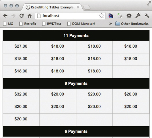
If you really paid attention, you’ll notice that I’ve just completely hidden the top row of data. In the actual project, these column headers were generated dynamically on the server based on the current day. Obviously, we can’t do that with CSS. Instead, I actually used nth-child selectors and CSS generated content to create some more generic headers (Today, Month 2, Month 3, and so on).
This isn’t an optimal approach, but in a retrofit project it may represent a valid temporary solution (see the /Tables folder in the example files). We’re doing everything we can to improve the experience as quickly as possible. Then, we’re helping our client understand what the next, long-term step should be.
Wrap up
Remember our focus with a retrofit is really on the user. We’re using the power of responsive CSS techniques to quickly create a better experience. This isn’t long-term solution, but there can be real benefits to a phased approach.
Thanks to Stephanie Rieger for her peer review of this tutorial

Thank you for reading 5 articles this month* Join now for unlimited access
Enjoy your first month for just £1 / $1 / €1
*Read 5 free articles per month without a subscription

Join now for unlimited access
Try first month for just £1 / $1 / €1

The Creative Bloq team is made up of a group of art and design enthusiasts, and has changed and evolved since Creative Bloq began back in 2012. The current website team consists of eight full-time members of staff: Editor Georgia Coggan, Deputy Editor Rosie Hilder, Ecommerce Editor Beren Neale, Senior News Editor Daniel Piper, Editor, Digital Art and 3D Ian Dean, Tech Reviews Editor Erlingur Einarsson, Ecommerce Writer Beth Nicholls and Staff Writer Natalie Fear, as well as a roster of freelancers from around the world. The ImagineFX magazine team also pitch in, ensuring that content from leading digital art publication ImagineFX is represented on Creative Bloq.
