Web conference site's responsive makeover
We take a look at how web design event An Event Apart has redesigned its site for 2013 according to the principles of responsive web design.

'For people who make websites', An Event Apart is an annual series of conferences founded by web luminaries Jeffrey Zeldman and Eric Meyer. The fixed layout of their previous website made it difficult to promote the growing number of events, and prevented it from becoming a destination where videos and other educational content could be presented suitably.
By making the site responsive those problems have been solved - as well as bringing it into line with the kind of web design thinking being promoted at the events themselves.

Designed by Mike Pick at Monkey Do and developed by Tim Murtaugh, the redesign also provided an opportunity to evolve An Event Apart’s brand identity - more clearly separating it from its parent, online web design magazine A List Apart.
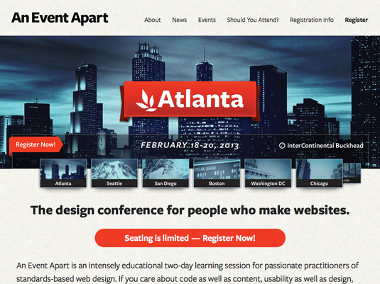
Typography and imagery
When it comes to typography, the bold sans serif Freight Sans Pro gives a less literary feel, offset by Pacifico, a playful cursive font.
Location imagery is cropped abstractly and given monotone blue washes, and an orange accent colour is used for headings, links and buttons.
Responsive carousel
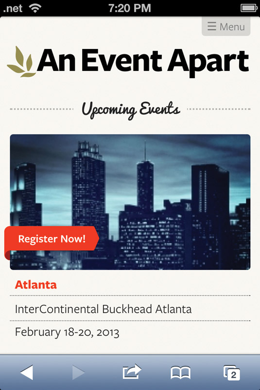
A key feature of the new design is a responsive carousel on the homepage that showcases upcoming events, expanding or contracting as the page is resized or as new events are added.
Use of RESS (Responsive Web Design and Server Side Components) means users of smaller devices can avoid downloading components they don’t need.
Homepage requests/size: 31/488kB mobile, 38/468kB desktop
This showcase was originally published in .net magazine issue 237.
Liked this? Read these!
- How to create an app: try these great tutorials
- Brilliant Wordpress tutorial selection
- Download the best free fonts
Have you seen a great example of a personal site? Let us know about it in the comments!

Thank you for reading 5 articles this month* Join now for unlimited access
Enjoy your first month for just £1 / $1 / €1
*Read 5 free articles per month without a subscription

Join now for unlimited access
Try first month for just £1 / $1 / €1
Get the Creative Bloq Newsletter
Daily design news, reviews, how-tos and more, as picked by the editors.
The Creative Bloq team is made up of a group of design fans, and has changed and evolved since Creative Bloq began back in 2012. The current website team consists of eight full-time members of staff: Editor Georgia Coggan, Deputy Editor Rosie Hilder, Ecommerce Editor Beren Neale, Senior News Editor Daniel Piper, Editor, Digital Art and 3D Ian Dean, Tech Reviews Editor Erlingur Einarsson, Ecommerce Writer Beth Nicholls and Staff Writer Natalie Fear, as well as a roster of freelancers from around the world. The ImagineFX magazine team also pitch in, ensuring that content from leading digital art publication ImagineFX is represented on Creative Bloq.
