Skinny Ties smartens up its responsive site
This responsive ecommerce website offers a fantastic customer experience. Whether you actually want to buy a tie or not, it's worth checking out...

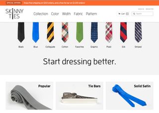
Skinny Ties has been producing and selling neckties since 1971, and is now one of the largest retailers in the US. Pennsylvania-based designer Brendan Falkowski was asked to reinvent the brand’s identity and develop a future-friendly platform to ensure the continued success of the business.
With a design centred squarely around the range of ties, coupled with a performant and responsive implementation, it’s easy to browse and purchase products quickly on any device. "All interactive elements were built with touch-and-click usage in mind, which keeps the interface consistent and compact," says Falkowski.

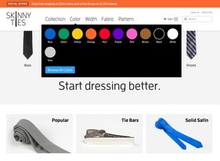
The homepage is clean and focused, with the minimum of fuss (although mousing over the ties produces a fun little ripple effect). The numerous options involved in choosing your tie - the different colours, fabrics, patterns, etc - are all hidden away in large, image-led dropdown menus, which appear on mouseover of the main nav.
Revenue boost
It’s not surprising to learn that revenue has increased by 43.4% since the new site went live - increasing by an astonishing 377.6% on the iPhone alone. It just goes to show that responsive web design isn't just a 'cool' fad among web designers - it's increasingly a cold, hard business requirement for ecommerce websites.
Homepage requests/size: 56/663 kB mobile, 58/669 kB desktop
Liked this? Read these!
- How to make an app: try these great tutorials
- The best Photoshop plugins
- The best Wordpress tutorials on the web
Have you seen a great example of responsive web design? Let us know about it in the comments!

Thank you for reading 5 articles this month* Join now for unlimited access
Enjoy your first month for just £1 / $1 / €1
*Read 5 free articles per month without a subscription

Join now for unlimited access
Try first month for just £1 / $1 / €1
Get the Creative Bloq Newsletter
Daily design news, reviews, how-tos and more, as picked by the editors.
The Creative Bloq team is made up of a group of design fans, and has changed and evolved since Creative Bloq began back in 2012. The current website team consists of eight full-time members of staff: Editor Georgia Coggan, Deputy Editor Rosie Hilder, Ecommerce Editor Beren Neale, Senior News Editor Daniel Piper, Editor, Digital Art and 3D Ian Dean, Tech Reviews Editor Erlingur Einarsson, Ecommerce Writer Beth Nicholls and Staff Writer Natalie Fear, as well as a roster of freelancers from around the world. The ImagineFX magazine team also pitch in, ensuring that content from leading digital art publication ImagineFX is represented on Creative Bloq.
