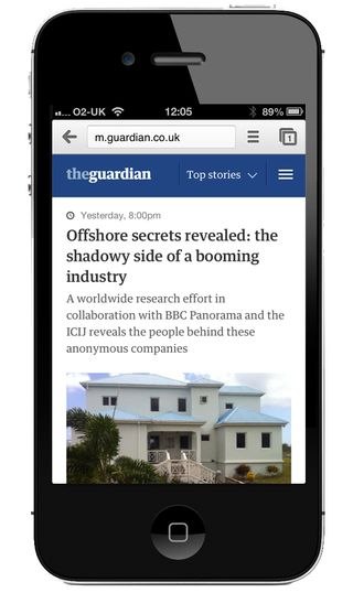
The Guardian newspaper website goes responsive
One of the world's top five newspaper sites, The Guardian has unveiled a new responsive design.

The Guardian is a UK newspaper but is keen to expand its international audience through digital innovation. Over the last few years it's been at the forefront of the transformation from old to new media, with its website becoming one of the top five newspaper websites in the world. And now the media company has given its mobile website a responsive web design. Want to design your own site? Try our list of the best website builders.
Technical innovations
A major technical plank of the redesign is 'swimlaning'; the process of structuring a web application in such a way that if one part of it fails, the rest of the app carries on as normal - decoupling unrelated parts so that they can be released and updated independently.
The development team used Scala framework Play to power the new website, citing the flexibility and power of Scala over its internal predecessor, Java. Using the Guardian's own Open Platform Content API meant that they'll never have to write a database query - all the code communicates with the API to receive its data.
Client side
On the client-side, the app is heavily structured around the AMD JavaScript pattern, with use of RequireJS to load distinct modules which are then combined together at build time. CSS is organised according to Jonathan Snook's SMACSS standards and the site also makes use of Pasteup, the Guardian's in-house style guide and baseline CSS library, to manage some of the styling.
Try it out by heading to m.guardian.co.uk - or users accessing guardian.co.uk on mobile phones and tablets up to 7in will automatically be redirected to the mobile optimised site. And for more details on the build, check out this article and interview on our sister site netmagazine.com.
- Technical details courtesy of Matt Andrews' Guardian Developer Blog
What do you think of the Guardian's new mobile site? Tell us in the comments section below!
Now read:
Get the Creative Bloq Newsletter
Daily design news, reviews, how-tos and more, as picked by the editors.

Thank you for reading 5 articles this month* Join now for unlimited access
Enjoy your first month for just £1 / $1 / €1
*Read 5 free articles per month without a subscription

Join now for unlimited access
Try first month for just £1 / $1 / €1
The Creative Bloq team is made up of a group of design fans, and has changed and evolved since Creative Bloq began back in 2012. The current website team consists of eight full-time members of staff: Editor Georgia Coggan, Deputy Editor Rosie Hilder, Ecommerce Editor Beren Neale, Senior News Editor Daniel Piper, Editor, Digital Art and 3D Ian Dean, Tech Reviews Editor Erlingur Einarsson and Ecommerce Writer Beth Nicholls and Staff Writer Natalie Fear, as well as a roster of freelancers from around the world. The 3D World and ImagineFX magazine teams also pitch in, ensuring that content from 3D World and ImagineFX is represented on Creative Bloq.
