8 steps to gettin’ flexy in responsive web design
Dave Rupert, lead developer at Paravel, gives essential tips and tricks on becoming flexible in responsive web design.
For Paravel, the most difficult and interesting aspect of responsive web design has been the flexible nature of it. We’ve constantly in the process of trading in our tenacity for pixel perfection and embracing the web for what it really is; fluid. Here we’ll cover some steps to help you transition towards flexible web design, or as I like to call it, 'Gettin’ Flexy'.
Responsive web design, as introduced by Ethan Marcotte (@beep on Twitter), has three core principles:
- Flexible grids: percentage-based fluid columns of content.
- Media queries: a magical tool to change your CSS based on the browser’s current state.
- Flexible media: content such as images and video should scale with the browser’s dimensions.
You’ll notice that two of those ingredients have the phrase 'flexible'. This is the key differentiator of responsive web design versus other web design approaches. Let’s look at how to become flexible.
Never use maximum-scale
Occasionally, in an attempt to override an orientation bug in iOS, web developers will add maximum-scale=1 to their meta name="viewport" tag. Don’t do this. The unfortunate result is that users are unable zoom the page (using a pinch-zoom gesture). This is a bad practice and a huge accessiblility concern. If you want your site to be 'flexy', it has to be zoomable.
Do this: you win the internet!
<meta name="viewport" content="width=device-width, initial-scale=1">
This will inform the browser to set the window width to the device’s width without overriding any user needs. Then in your CSS, add this brand new at-rule:
/* You'll need prefixes. @-ms-viewport, @-o-viewport, etc... */
@viewport {
width: device-width;
}
Get the Creative Bloq Newsletter
Daily design news, reviews, how-tos and more, as picked by the editors.
This is an in-progress W3C spec written to move this viewport information over to CSS. IE10 and Opera browsers support this. Go ahead and start rolling this into production sites.
01. Surrender control
Fun Fact: At Paravel, we hated responsive web design when it first came out. We thought it was a huge misstep for the web. “What about image sizes? How do you sell this to clients? People don’t want this, people like tap-to-zoom!” – we had every hesitation in the book … then we got over ourselves.
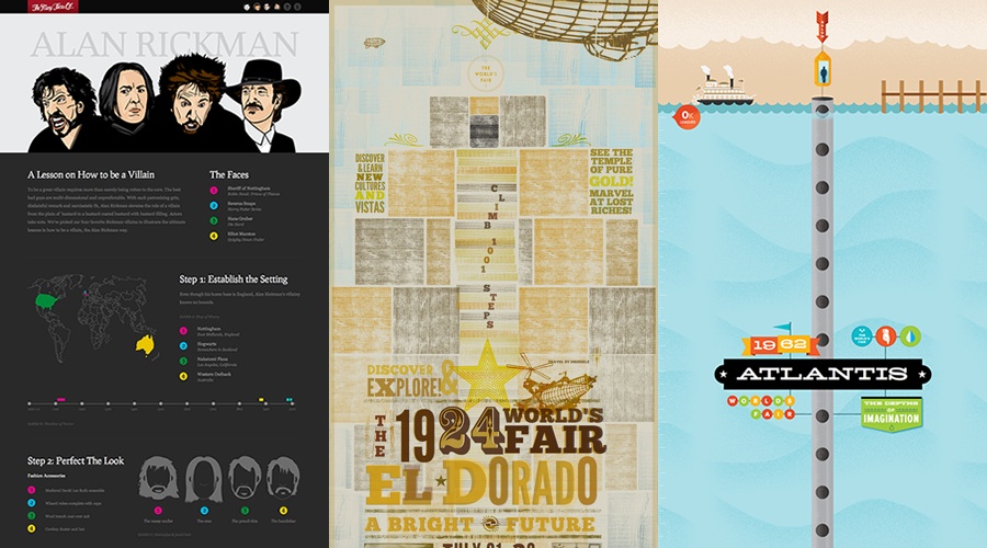
We prided ourselves on pixel perfect CSS. This is still evident on sites like The Many Faces Of or The Lost World’s Fairs where we coded up massive 18,000px PSDs side-by-side with the browser.

The main reason we rejected responsive web design was because it threatened business as usual. As we experimented with responsive design on side projects, it gradually became clear that this was a really useful technique. It wasn’t until we started working with a conference in Wales that we learned to surrender control.

The Do Lectures people approached us with the idea of a responsive, HTML5 video site to highlight their amazing conference. When planning and building the website, we started with an adaptive approach. We built out three different fixed-width breakpoints, assuming flexible grids were overkill and only for 'showoff' designers.
In the browser, however, the design seemed schizophrenic: it suddenly changed its mind at various breakpoints. Our desire to control the design at every step resulted in disorienting the user should they resize the browser. So we put our content on a fluid grid and established a more cohesive user experience in browser.
02. Embrace fluidity
We’ve been chasing these popular device resolutions for ages. First it was 800x600. Then some blogger came along and declared 1024x768 as the offcial 'average' screen resolution, so we all made our sites a safe 960px wide. Then the iPhone came out, so we made separate 320px wide sites … then the iPad came out and we all made 768px wide versions of our sites. The result being that you now had three separate versions of one website to update and maintain.
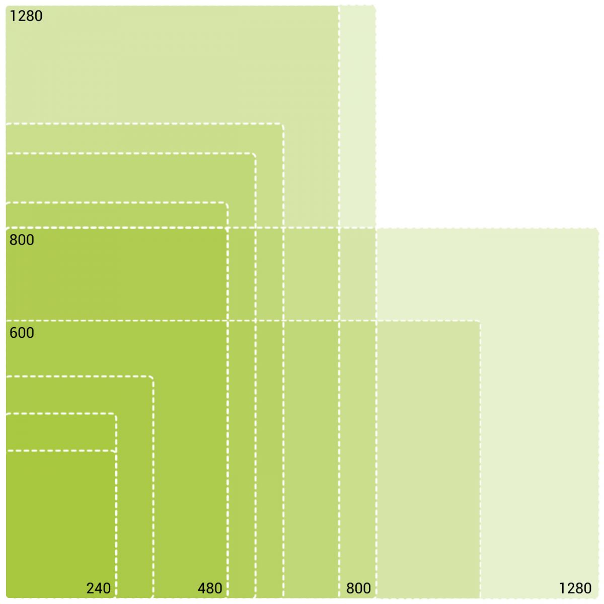
The idea of 'common breakpoints' is a lie and chasing after them is, as we like to say in Texas, “spittin’ into the wind”. Take a look at just some of the Android device resoltuions available for purchase today:

Things change so fast in this industry there’s no guarantee on pixels or pixel densities. It’s better to think fluidly and develop a flexible system that can handle all devices no matter their creed.
03. Think proportionally
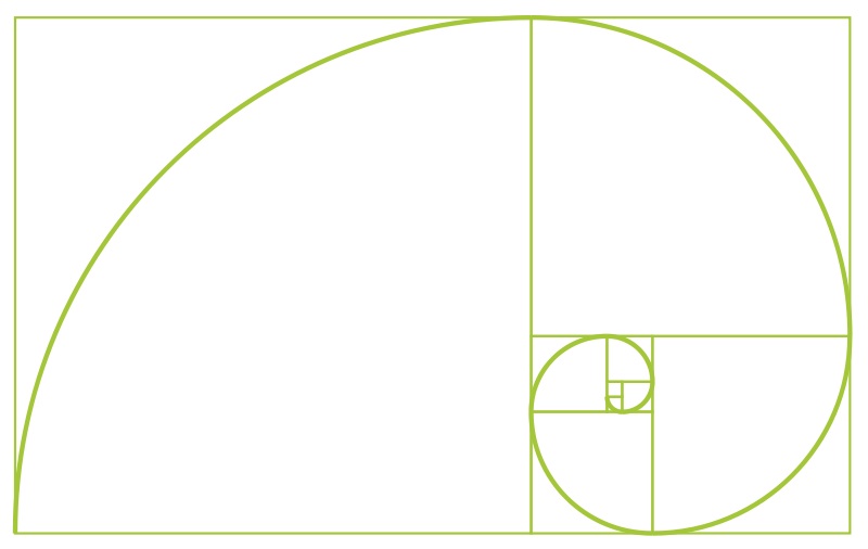
Concepts like the Golden Ratio have been around in design for a long time, and ratio-based designing is not foreign in static-width web design. My co-worker, Trent Walton, says it best:
“To think about the web responsively is to think in proportions, not pixels.” – Trent Walton, Redefined
In responsive design your design is not just pixel-perfect renderings, but a system of relative proportions. Spend time to think about the how elements in the design relate to each other and how those relationships can change.

04. Use min-width
The type of media query you choose will ultimately affect the scalability of your code. I highly recommend 'mobile first' when approaching responsive web design, but have worked up a handy chart for you to make your own decision.
| 'Desktop down' | 'Mobile first' |
| Start large, dig down | Start small, build up |
| Good for legacy sites | Future friendly |
I’m not your boss, so I can’t tell you what to do, but we now live in a world where more mobile devices are sold than PCs. Mobile first is really just progressive enhancement rebranded. Start small and progressively enhance upwards, treating pixels as a feature that some devices have and others do not.
Regardless of your min/max-width approach it’s important for your code’s readability to be consistent. I recommend going in only one direction on your build and if you’re going to break that rule, use it just for awkward exceptions and document the heck out of it.
05. Don’t use px units, use em units
The px vs em debate is a long one but em units have proven themselves useful in responsive web design. Using em units should be familiar to most web developers, but worth reviewing. An em unit is a relative unit of measurement based on the parent element.
The most common example is font-size, if you wanted to set a heading font-size (20px) based on your body font-size (10px) in em units:
20px ÷ 10px = 2em
target ÷ context = result
The em unit calculation formula is the same as the percentage grid calcualtion formula because they are both proportions and relative to the parent.
06. Keep it relative: typography
Setting your type in em units enables you to use the power of CSS to build a scalable typographic system that grows with the viewport.
body { font: 100%/1.5 serif; /* 16px */ }
h1 { font-size: 2em; /* 32px */ }
@media (min-width: 600px) {
body { font: 112.5%; /* 18px */ }
h1 { /* Do nothing! I'll automatically be 36px */ }
}
Based on personal experience, this will save you hours per project versus going through and updating pixel values. Also, it has an accessibility benefit when a user adjusts their font size.
07. Keep it relative: whitespace
Additionally, using em units for padding and margin helps create a vertical base for your design. At larger screen dimensions you can insert more whitespace into your design in a healthy, consistent manner without too much labour.
#hero { margin-bottom: 1em; }
@media (min-width: 600px) {
#hero { margin-bottom: 2em; }
}
Using em units will help you preserve a balanced system of relative proportions. For a more advanced approach on relative sizing, I recommend reading Jonathan Snook’s article Font size with REM.
08. Go forth and be flexy!
These are just the basics on the path towards fluid width nirvana. It’s important to remember that we’re all learning and it’s OK to make mistakes. I encourage you, if you haven’t already, to take the plunge and build out your own responsive design. The day when most websites sit on a flexible frame and are universally accessible by any device is hopefully fast approaching. Help the web become a better place.
Dave Rupert is the lead developer for Paravel and the host of the ATX Web Show, a podcast all about the web design and development community in Austin, TX. On the internets he's davatron5000.
Liked this? Read these!
- How to build an app
- Useful and inspiring flyer templates
- The best 3D movies of 2013
- Discover what's next for Augmented Reality

Thank you for reading 5 articles this month* Join now for unlimited access
Enjoy your first month for just £1 / $1 / €1
*Read 5 free articles per month without a subscription

Join now for unlimited access
Try first month for just £1 / $1 / €1

The Creative Bloq team is made up of a group of design fans, and has changed and evolved since Creative Bloq began back in 2012. The current website team consists of eight full-time members of staff: Editor Georgia Coggan, Deputy Editor Rosie Hilder, Ecommerce Editor Beren Neale, Senior News Editor Daniel Piper, Editor, Digital Art and 3D Ian Dean, Tech Reviews Editor Erlingur Einarsson, Ecommerce Writer Beth Nicholls and Staff Writer Natalie Fear, as well as a roster of freelancers from around the world. The ImagineFX magazine team also pitch in, ensuring that content from leading digital art publication ImagineFX is represented on Creative Bloq.
