CRACK magazine goes responsive
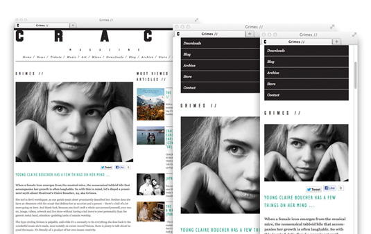
Cutting-edge print magazine CRACK now has a responsive site. We chat to the people behind it and find out how it was built.

CRACK Magazine is a monthly paper publication and online platform that offers the latest in cutting edge music, art, reviews, and listings.
Now in its fourth year, CRACK has grown substantially in distribution of the paper and in the amount of content published online. So they asked design agency Fiasco to create a flexible site that works as a desktop and mobile website, with an easy-to-use, intuitive content management system.
New flexibility
Central to the brief was the need to increase CRACK's user retention rate and lower user drop-offs, as the rigidity of their current site was clearly limiting their growth.

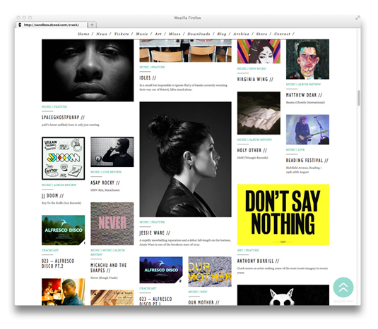
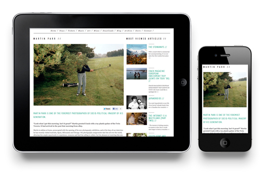
The team at Fiaso worked with D:Coe Design to create a fully responsive design using a WordPress core that focuses on adaptable grid structures to show off a wealth of content, while looking smart on across different browsers and devices.
Faster load times
"The key aim for us was creating a site with lots of great content and a standout design but balancing it with fast load times and easy usability across the board," says Dan Coe, director of D:Coe Design.

Content-heavy pages use a 'lazy' load technique, whereby only the visible content is loaded. This increases page load times and again adds to a much faster overall user experience.
The backend management system works with Masonry to enable the site editors to easily add, edit, and manage large amounts of content.
It's a vast improvement on the old site, and is a great example of how print and online can combine to meet the ever-changing needs of a cutting-edge audience.
What do you think of CRACK's new site? Does it work well on your mobile device? Let us know in the comments!
Liked this? Read these!
- The art of magazine covers
- 30 web design secrets to boost your skills!
- 101 CSS and JavaScript tutorials

Thank you for reading 5 articles this month* Join now for unlimited access
Enjoy your first month for just £1 / $1 / €1
*Read 5 free articles per month without a subscription

Join now for unlimited access
Try first month for just £1 / $1 / €1
Get the Creative Bloq Newsletter
Daily design news, reviews, how-tos and more, as picked by the editors.

The Creative Bloq team is made up of a group of art and design enthusiasts, and has changed and evolved since Creative Bloq began back in 2012. The current website team consists of eight full-time members of staff: Editor Georgia Coggan, Deputy Editor Rosie Hilder, Ecommerce Editor Beren Neale, Senior News Editor Daniel Piper, Editor, Digital Art and 3D Ian Dean, Tech Reviews Editor Erlingur Einarsson, Ecommerce Writer Beth Nicholls and Staff Writer Natalie Fear, as well as a roster of freelancers from around the world. The ImagineFX magazine team also pitch in, ensuring that content from leading digital art publication ImagineFX is represented on Creative Bloq.
