Speaker slims down site layout to boost speed
Well known as a speaker on the web design circuit, Anna Debenham reinvents her personal site as leaner and faster. Check out what it looks like now...

Some web designers, especially those who are well-known within the industry, feel the need to make some kind of design statement when they redesign their personal sites; often incorporating clever effects, animations and transitions as a nod to their audience.
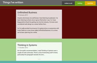
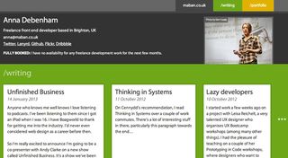
Anna Debenham, a front-end developer based in Brighton, England who's well known within the web design community as a regular conference speaker and writer for the likes of .net, 24 Ways and A List Apart, has gone down a strikingly different route. The latest redesign of her personal website puts the focus not on aesthetics but performance - resulting in a stripped-back aesthetic that's refreshing in its simplicity.

"I wanted to produce a design that didn’t rely heavily on images, gradients, web fonts or anything that would increase the size of the page," she explains. Consequently, the design brings focus to the words themselves.
Metro influence
Although unintentional, her website shares similarities with Microsoft’s Metro UI (or whatever it's called at the moment), with a colourful, typography-led design.
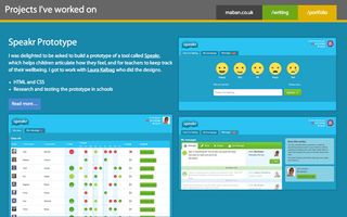
Debenham has also created a mini-site, which is an excellent resource for those wanting to learn about browser support on game consoles. It was built using Twitter's Bootstrap.

Of course, the site is beautifully responsive and a joy to browse on smartphones. It's fascinating to see designers and developers adapting their designs to meet the unique demands of the web in this way.
Homepage requests/size: 10/403 kB mobile, 10/404 kB desktop
This showcase was originally published in .net magazine issue 237.
Liked this? Read these!
- How to create an app: try these great tutorials
- Brilliant Wordpress tutorial selection
- Download the best free fonts
Have you seen a great example of a personal site? Let us know about it in the comments!

Thank you for reading 5 articles this month* Join now for unlimited access
Enjoy your first month for just £1 / $1 / €1
*Read 5 free articles per month without a subscription

Join now for unlimited access
Try first month for just £1 / $1 / €1
Get the Creative Bloq Newsletter
Daily design news, reviews, how-tos and more, as picked by the editors.
The Creative Bloq team is made up of a group of design fans, and has changed and evolved since Creative Bloq began back in 2012. The current website team consists of eight full-time members of staff: Editor Georgia Coggan, Deputy Editor Rosie Hilder, Ecommerce Editor Beren Neale, Senior News Editor Daniel Piper, Editor, Digital Art and 3D Ian Dean, Tech Reviews Editor Erlingur Einarsson, Ecommerce Writer Beth Nicholls and Staff Writer Natalie Fear, as well as a roster of freelancers from around the world. The ImagineFX magazine team also pitch in, ensuring that content from leading digital art publication ImagineFX is represented on Creative Bloq.
