Working at a design studio, under constant pressure to deliver top-class creative to tight deadlines, you need every tool you can get. And while you might not think of iStock's library of royalty-free images as a tool, that's exactly what it is.
Because whether you're exploring ideas (seeking out visual inspiration); pitching to clients (putting together moodboards, slideshows and presentations); concepting and prototyping (building mockups and wireframes); or at the business end of your project (creating and refining the finished designs), iStock's low-cost, high-end images can really help out.

Rick Banks, director of London branding and typography studio Face37, for instance, finds the library's commercial templates very useful in planning his presentations.
"iStock by Getty Images is awesome for pulling together a presentation for a client," enthuses Banks, whose work has won numerous design awards. "Their various billboard and advertising templates are great for creating realistic mock-ups."

London-based Alphabetical, ranked as one of the UK's top 30 design studios of 2015 by Computer Arts magazine, also makes use of iStock, says its co-founder and creative partner Bob Young.
"We find iStock by Getty Images can be really useful for textural-based images," he explains. "It can sometimes be the more subtle visual resources that can help lift a design."
But how does this all work in practice? To give you a better idea of how iStock can help you bring your design to life, we'll walk you through a typical graphic design project using their high-end, low-cost imagery.
Fictional brief
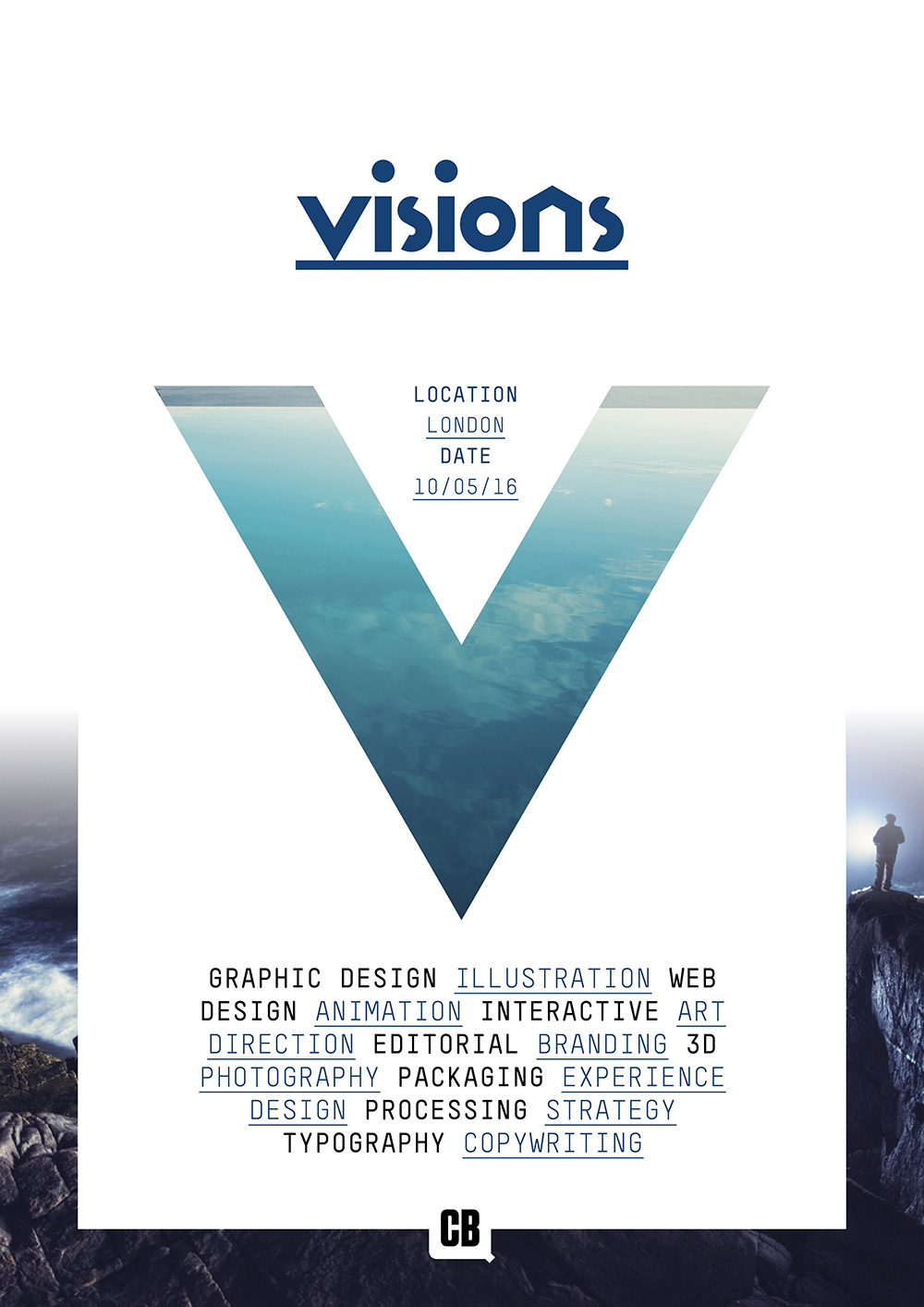
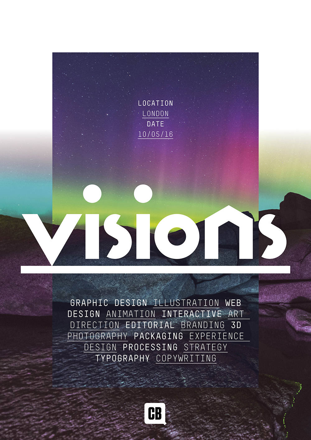
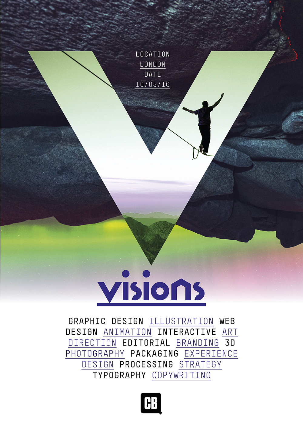
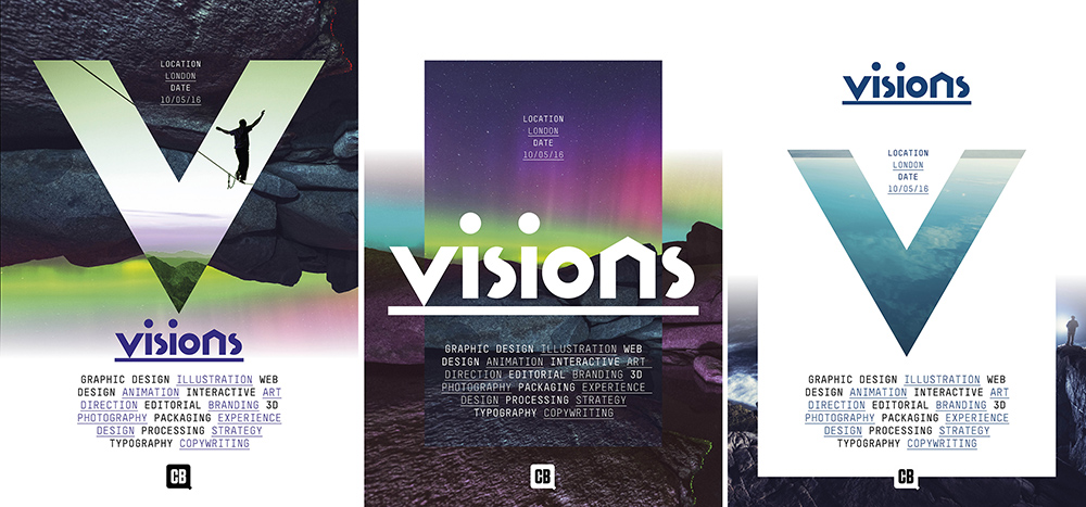
Our fiction brief is to create a set of graphic posters for a design festival that utilises stock photography. The client wants the posters to have a slightly abstract, almost surreal feel to them.
So the first stage is clearly to set about sourcing some appropriate visual assets.
iStock by Getty Images has an abundance of great imagery to choose from but for this project we focus on seeking out some of their more atmospheric images, including mountain scenes and images of the Northern Lights. iStock's smart search functionality makes it easy to find suitable images quickly.
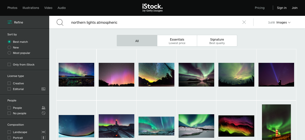
Here are the images we end up choosing for our design:


We now go about setting up a simple grid in InDesign and start adding the basic design elements to the posters before experimenting with the stock images that we've picked.
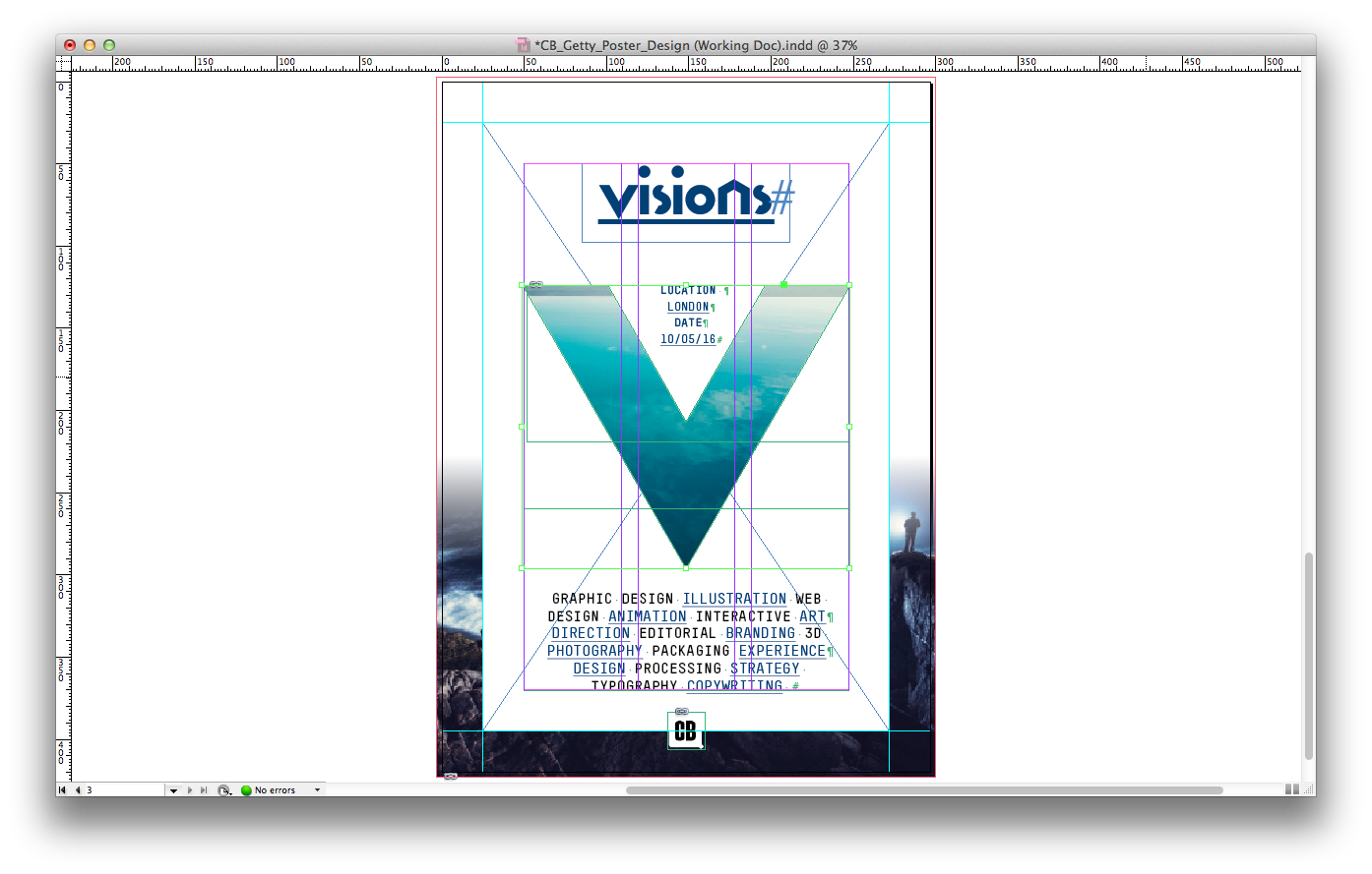
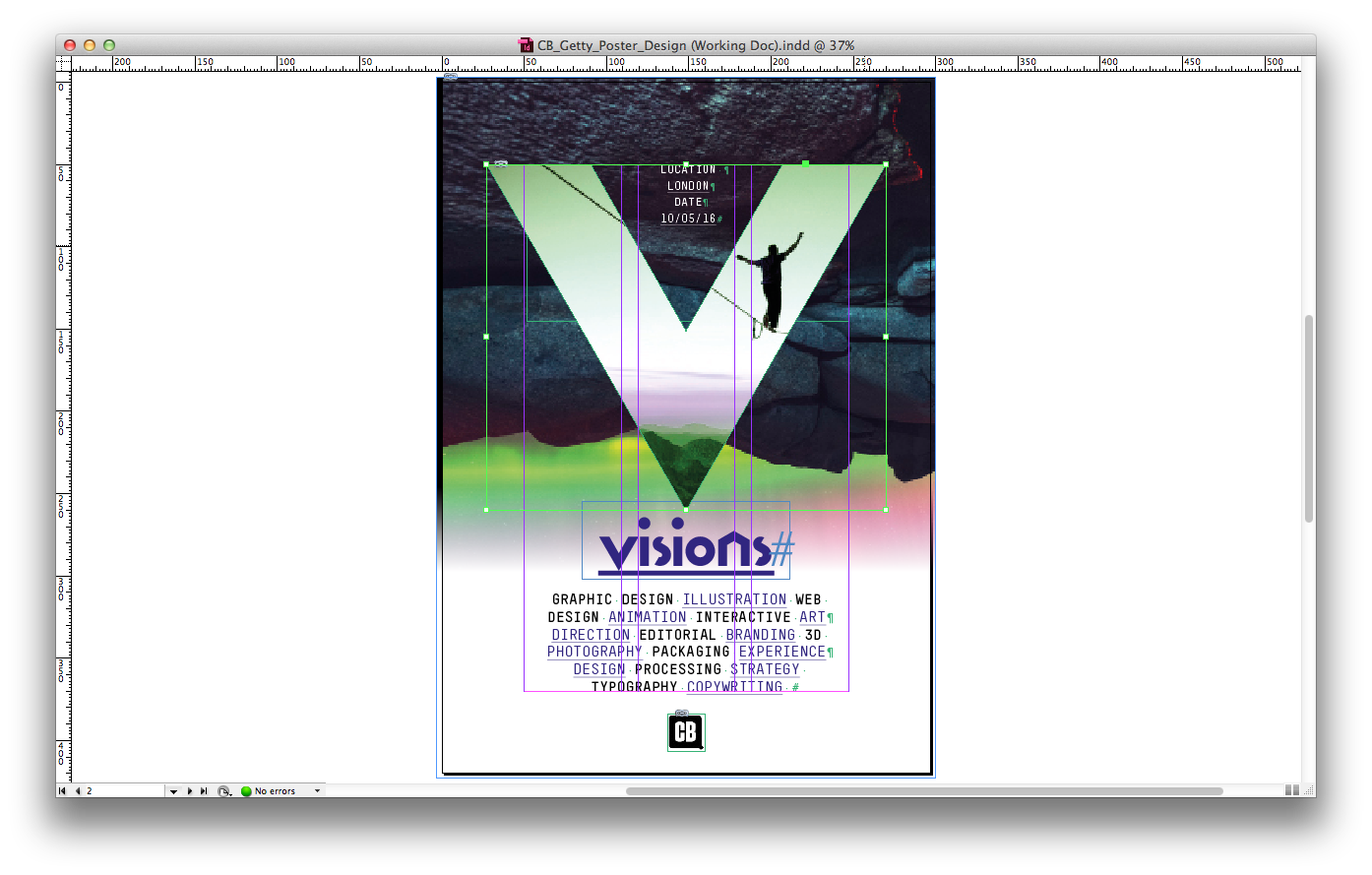
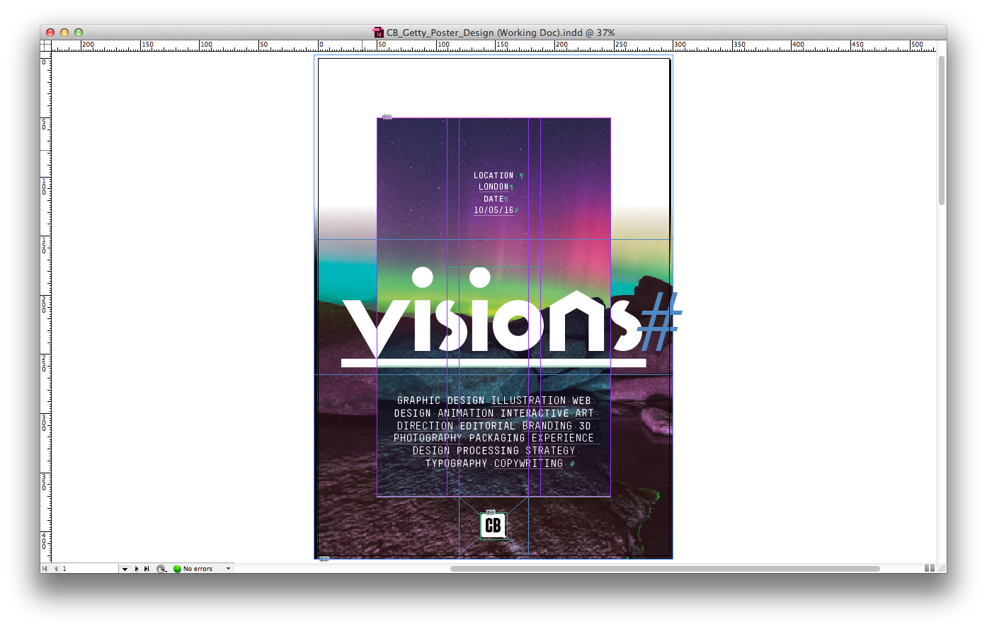
We re-size and crop the imagery within InDesign until we're happy with the desired effect and interplay between the images.
As these images are so strong, there is very little editing to do afterwards other than adjusting the hue and saturation of two of them within Photoshop to create contrasting colour schemes.
Voila! In a short time, we've created three stunning looking poster designs to present to the client, using the kind of high-end visuals iStock is famous for.
So why not follow our example and boost your design toolkit, by signing up for an iStock account today?
Sign up to Creative Bloq's daily newsletter, which brings you the latest news and inspiration from the worlds of art, design and technology.

Tom May is an award-winning journalist specialising in art, design, photography and technology. He is the author of the books The 50 Greatest Designers (Arcturus) and Great TED Talks: Creativity (Pavilion). Tom was previously editor of Professional Photography magazine, associate editor at Creative Bloq, and deputy editor at net magazine.
