Project diary: how Designworks rebranded history
As the Benevolent Society’s 200th anniversary approached, the charity faced an identity crisis. It turned to Australian agency Designworks to give it a much-needed refresh
Despite being Australia’s oldest charity, the Benevolent Society found itself without a clear purpose and role as it approached its 200-year anniversary. Designworks’ job was to give it a new identity by transforming the organisation and redefining its purpose.
THE DESIGN BRIEF
Annika Weis, Design director
The Benevolent Society is one of Australia’s most important charities. It makes a crucial difference to people in dire need, helps change lives and gives people in desperate situations a real sense of hope. Benevolent is also a very progressive charity: it’s non-religious and is the only charity in Australia that supports same-sex fostering for children. Despite these positives, Benevolent is largely unknown and as its 200-year anniversary approached, it was also facing a crisis of identity. For a long time it managed the Sydney Royal Women’s Hospital, but when the hospital was absorbed back into the public sector, Benevolent’s centre of gravity went along with it.
It’s fair to say that Benevolent also had something of a presentation problem. When it first came to us, it used a shocking, gritty tone in its communications, which made it feel downbeat and negative, no matter how compelling its communications were. The result of this was that the charity wasn’t perceived very well, and it faced a major challenge in trying to engage with people in a more positive way.

Another challenge was the Benevolent Society’s focus. While most charities tend to home in on one or two issues, the Society’s nature meant it worked across a broad and diverse range of social problems: from helping children and families to thrive, to providing care for elderly people – as well as those dealing with mental health and well-being issues. It also has its 200-year heritage to live up to. Although the client was open to the idea of a name change, ultimately we decided not to, because ‘benevolent’ is such an ownable word, and it played to the charity’s strengths as an established organisation.
WORK IN PROGRESS
Derek Samuel, Creative director
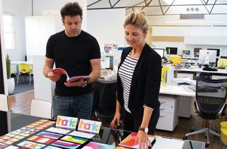
The first thing we did when we were approached to do the work was to ask lots of questions. We listened to staff , donors, stakeholders and many of the people who’d benefited from Benevolent’s work.
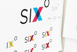
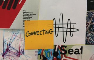
From this we came up an idea based around ‘six degrees of separation’ – a concept that’s all about connections and connectedness that also helps express the diverse nature of Benevolent’s work. This in turn led to the overlapping concept you see in the finished branding – the overlapping sections representing the parts of the charity’s work where change happens.

Once we’d established the core identity, the brand’s typography and colours soon followed. For us, the Benevolent world is all about colour, freshness and vibrancy, so we used a rounded typeface that works really well at different weights. The middle weight is bubbly, friendly and affectionate – perfect for the charity’s communications with the public – while the lighter weight feels more authoritative, especially when used with bold background colours.
As much of the brand system uses transparent overlays, one of our biggest issues was how to achieve a vibrant, friendly look while working with a multiplying effect. We experimented with colours to see which mixed together well, and went on to use the wordmark to create a set of supergraphics that the Benevolent Society could use.
CONCLUSION
Annika Weis
The impact of the work we’ve done for the Benevolent Society project has been overwhelming – it’s rejuvenated an organisation that has been around for 200 years. The rebrand has created a modern platform for the charity that enables it to launch communications across a broad range of media. On a purely practical level, creating typographically-based supergraphics enabled us to create a system for Benevolent that doesn’t need to rely on great photography – a real boon to big charities with limited marketing budgets. Like a lot of things, a few limitations help breed creativity and the typography is where we feel this identity really works well.
The Benevolent Society itself has certainly been very pleased with the results so far. Two of the main reasons for rebranding the charity were to build awareness and to raise charitable funds. We’re really pleased to able to say that our rebranding work has done both and has given Benevolent a platform to continue doing so in future. To give you some idea of how successful the project has been: on day one of the press campaign, Benevolent received a single donation of AUD$10,000 from somebody who, prior to the rebrand, had never even heard of the charity.

Although our work on the project finished in February, the campaign rollout is an ongoing process that continues to bring in funds from new sources and make everyone care about the charity again. All of this means, of course, that the charity is able to help more people in need – something we feel very privileged to have been able to take part in.
Our work for Benevolent has been very rewarding from a branding agency perspective, too. It’s been great to see design outcomes that directly affect people in a positive way and we’ve also enjoyed seeing how design thinking can work, and how great ideas can inform that. We’re also very proud to have given Benevolent an identity that ties the whole organisation together.
How to be a creative director: top career advice
AT A GLANCE
Designworks used its ‘Define, Design, Deliver’ approach to make sure the project met its brief
Get the Creative Bloq Newsletter
Daily design news, reviews, how-tos and more, as picked by the editors.

Thank you for reading 5 articles this month* Join now for unlimited access
Enjoy your first month for just £1 / $1 / €1
*Read 5 free articles per month without a subscription

Join now for unlimited access
Try first month for just £1 / $1 / €1
The Creative Bloq team is made up of a group of design fans, and has changed and evolved since Creative Bloq began back in 2012. The current website team consists of eight full-time members of staff: Editor Georgia Coggan, Deputy Editor Rosie Hilder, Ecommerce Editor Beren Neale, Senior News Editor Daniel Piper, Editor, Digital Art and 3D Ian Dean, Tech Reviews Editor Erlingur Einarsson and Ecommerce Writer Beth Nicholls and Staff Writer Natalie Fear, as well as a roster of freelancers from around the world. The 3D World and ImagineFX magazine teams also pitch in, ensuring that content from 3D World and ImagineFX is represented on Creative Bloq.
