The 10 most beautiful Apple products (and the 5 ugliest)
We look at Apple's biggest design and aesthetic hits – and the ones we'd rather never see again.
Apple doesn’t have a monopoly on producing beautiful tech hardware, but surely even the most rabidly anti-Apple observer would agree that it’s been responsible for some of the most arresting, engaging, cute, beguiling and just all-round beautiful designs in history.
What follows, then, is my list of some of the most important among them. It was a wrench to leave out so many stunning and important designs, but since nobody’s ever heard of a list of things on the internet that wasn’t ten items long, I had to make some tough decisions.
Unlike Abba, though, Apple hasn’t just pumped out hit after dependable hit. Along the way we’ve seen some designs that, shall we say, history has not remembered kindly – in fact, history, if you could do us a solid and just forget about them entirely, that’d be swell – and so let’s remember, revile – and maybe even reconcile – its flops with equal fervour.
01. Apple IIc
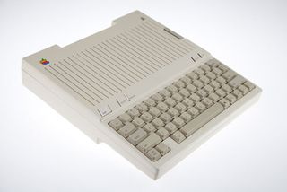
Early in its history, Apple contracted Frog Design to come up with a design language for its hardware; it would become known as Snow White, and emphasised stripes for ventilation and to make the case seem smaller, subtle textures and other specifics.
The Apple IIc – or '//c' as it's often written – was the first bit of hardware to use it, and to this day it looks not just pretty but also inviting and friendly, especially with its cheery, eager little monitor perched over it. Although nobody would mistake it for a modern computer, there's a timeless retro-futurist quality to the IIc and its era of hardware that is utterly compelling.
02. Macintosh Classic
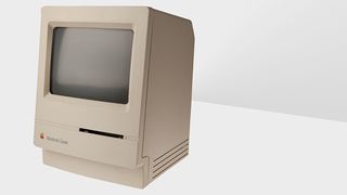
The chunky shape of the original Macintosh – all thick chamfers and beige-and-brown plastic – has a certain historical appeal, and I know that many Macheads hold the powerful SE/30 dear, but for me, the ultimate expression of the original all-in-one Mac is the Classic.
Clean, essential, completely considered from every angle, and with that sense of playfulness and anthropomorphism that so characterised Apple's early hardware.
Get the Creative Bloq Newsletter
Daily design news, reviews, how-tos and more, as picked by the editors.
03. Siri on the HomePod
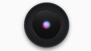
The HomePod itself might not be a design to get terribly over-excited about – it’s well-executed, for sure, and with its soft, textured exterior and diminutive size, it does feel like a product for your living room rather than an office. But can I, please, take a moment to get a little uncomfortably close to you and talk in a distressingly intense way about Siri on the HomePod.
Siri is Apple’s voice assistant, and it lives in iOS devices and Macs, but it also lives in the HomePod. Say “Hey, Siri; play some relaxing music” and it will oblige. But when you activate it with that “Hey, Siri”, and while it’s parsing your request, a little circle on top comes to life with a pretty, shifting pattern of pink and green and blue and white.
Under the top surface there’s a simple little array of 19 LEDs and a diffuser that creates this pattern, but I was careful in my choice of words when I said ‘comes to life’; it feels genuinely organic and lifelike, and does a really good job of humanising this AI tech – even if there are slight echoes of HAL 9000.
04. eMate
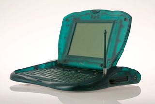
This peculiar little beast, which ran the Newton OS designed for Apple's MessagePad PDAs, and which was sold exclusively to the education market, was the first time Apple used translucent plastic. It's a spectacularly friendly and characterful machine, and that sense of personality extends to the audio design too.
When you tap items on-screen, you don’t get the same click sound every time, you get a cheery burble of 'bik', 'bok', 'beek' sounds. So sweet.
05. iMac G4
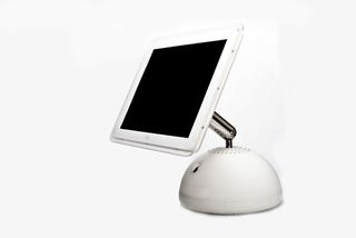
Apple's current design language produces inscrutable slabs of metal and glass, but its earlier designs were much friendlier and approachable. This beauty of a machine is a great example of how something can still look smart and professional at the same time as being cheerful; just like we anthropomorphised the original Macintosh with it’s 'chin', so too does this Mac look like a cute little friend when you push the monitor down and tilt it up towards you.
It reminds me, these days, of Luxo Jr, the little Pixar lamp. That screen tilt and rotate mechanism – something you can adjust with a fingertip but which hold its position perfectly – is still unequalled, and every computer Apple has made since the iMac G4 has been a step backwards for ergonomics.
06. PowerBook G4
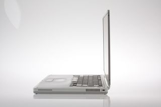
In these days of laptops you can nearly shave with, the idea that a computer being a full inch thick was ever praiseworthy is amusing, but when the first PowerBook G4 came out, it was breathtakingly svelte.
What's more, it looked like nothing that had come before, had a bezel around the screen that even today looks astonishingly slim, and was, excitingly, made of titanium – which earned it the nickname 'TiBook'. The fact that its sleek, desirable shell contained a genuinely powerful computer only added to its appeal.
07. iPod
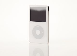
While the first three generations of Apple's iconic music player get points for introducing the world to the iPod, it was with the fourth generation and later that the basic design was reduced to its essence.
That Click Wheel, which acted not just as a touchpad but as a four-point button for playback control, is nothing short of genius, and this beautiful, simple, but life-changingly wonderful device is an object lesson in how simplifying a design makes it stronger, not weaker.
08. Airpods
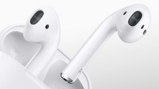
There’s a line from Apple co-founder Steve Jobs: "Design is not just what it looks like and feels like. Design is how it works." And on that count, the AirPods are one of the best-designed products in Apple’s entire history. It’s not just what they look like, how that warm, chunky pebble of a case feels in your hands, or the delight in dropping the AirPods into the case and snicking it shut, but they really do feel magical.
They are an intensely pleasing thing to own; they seem only to be fun, and though, yes, you still have to keep them charged, and yes, there are occasional issues getting them to swap between devices, they really don’t seem to come bogged down with anything like the same level of background anxiety of other tech products. And that’s a beautiful thing.
09. iPhone 5
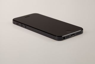
You could pick the original iPhone or the stunning, dense iPhone 4, but for me it's the iPhone 5 that looks the best – especially this black version. I'm totally on board with the bright colours of the iPhone 5c, or the Champagney gold Apple is using more and more, but the stealth styling of the black iPhone 5 takes some beating for a particular brand of masculine beauty.
Its almost military appearance makes it look like a prop from a film set it the near future, a feeling compounded by how light it feels when you hold it.
10. Apple Watch Hermès Series 4
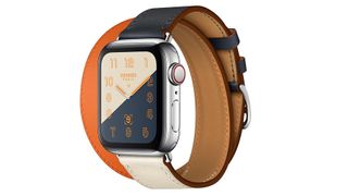
Apple these days is very good at colour – witness the confident choices in its silicone iPhone cases, as well as its Sport Bands for the Apple Watch – but it took iconic fashion house Hermès, working in partnership with Apple on the most recent iteration of its smart watch, to create something that I think is genuinely special. The mix of dusty navy, cream and the classic Hermès orange in this colour combination looks stunning, I think, and I dearly wish I owned one.
Now: 5 of the ugliest Apple products ever made...
01. Macintosh Color Classic
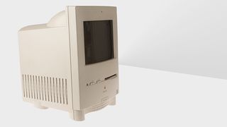
While the Macintosh, the SE/30, the Classic, Classic II and Performa 200 all looked balanced and considered, the Color Classic – the last of the iconic compact Macs built around a 9-inch screen – was an abomination.
Sure, you get a colour screen, which was a big deal, but look at that styling! The proportions have been completely destroyed, the case bulges in unnatural place as if it's been injected with steroids, and the whole effect is utterly jarring to the eye. Do not like.
02. Power Macintosh G3 (All-in-One)
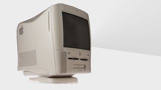
Happily for the general population, this monstrosity was limited to education markets, though what the poor kids had done to warrant having it thrust upon them is anyone's guess.
It's a hideous bastard love-child of traditional beige boxes and the just-around-the-corner swooping styling of the iMac and Blue and White Power Mac G3 – or to put it more kindly, it was a 'transition' design – and the styling is incredibly uncomfortable. It was nicknamed the 'molar', and since it sets out teeth on edge that seems entirely appropriate.
03. Performa 6400
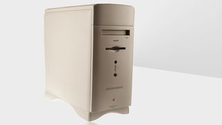
At first glance, there's nothing terribly wrong with this design, but the more I look at it, the more I get annoyed by the unnecessary layer of 'design' that's slathered all over it. You can see what they were going for – soften the sharp edges of traditional tower designs and it looks friendlier and more modern – but actually it ends up just looking like someone took a perfectly good, honest block of wood and then not been able to stop themselves when they started to sand off the edges.
And that silly-looking foot! And that daft-looking, top-heavy protuberance above the floppy drive! (It was really a spare drive bay, but does rather look like the bulging forehead of a porpoise.) Ugh.
04. Apple Keyboard
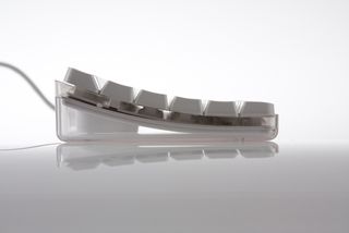
When you took this new keyboard out of its box in 2003 you might have been forgiven for thinking it was very attractive. And it was, at that point. But oh my; give it a few months. I don't care how fastidious you were about keeping clean and not eating at your desk, it drew crumbs, dust and hair to it like a very picky black hole. Except it wasn't black; the case was clear, so what you ended up with was a perfect window into all the disgusting crap that had accumulated under the (now also grubby) keys.
More than once I've given one of these a blow to dislodge this gunk only to be rewarded with a faceful of antique detritus and a deep feeling of resentment and sorrow. This keyboard was pretty for about a fortnight, but every one you see in the wild now looks stomach-turningly bad; let's make them extinct.
05. iPhone 6 Smart Battery Case
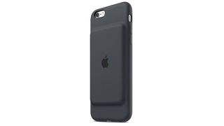
I have to come clean: I have an ulterior motive in including this design here. I know for a lot of people it’s utterly hideous – and feels like Apple barely designed it at all, just slapping a rectangular battery on the back of its normal silicone case – but I actually like it. I like the balls-out, screw-you-edness of the approach (quite as well as acknowledging the technical constraints the designers were operating within, including leaving wireless antennas free), and I like how it feels in the hand; the hump gives a little extra place for your pinkie to rest when holding it. It’s Brutalist architecture made out of soft-touch silicone, and I think we could do well to try to rehabilitate some design choices and vernaculars that are often called ugly.
Many of the images in this post were kindly supplied by Jonathan Zufi, the author of one of my favourite indulgent books about Apple design, Iconic. Jonathan took many hundreds of photos for Iconic – some of which, above, have never been published before – and spoke to some terrific people in the Apple industry about its enduring design prowess. If you love Apple’s hardware a tenth as much as I do, I urge you to treat yourself to a copy. Oh god, that Special Edition!
Read more:

Thank you for reading 5 articles this month* Join now for unlimited access
Enjoy your first month for just £1 / $1 / €1
*Read 5 free articles per month without a subscription

Join now for unlimited access
Try first month for just £1 / $1 / €1
Christopher has written and edited a range of publications, including Apple-specialist titles MacFormat, Mac|Life and iPad User. His work has also featured in the BBC, Computer Arts, Digital Camera Magazine, PhotoRadar, Practical Photoshop, Macworld and TechRadar. He is currently head of podcasts at DC Thomson and has spoken at various design and tech events.
