126 years of Wimbledon programme design
A look back at the design of the official Wimbledon programme, from 1877 to the modern era.
The first and oldest tennis tournament, Wimbledon is 137 years old this year. And those lucky enough to get a ticket will be carrying at least one of three things; a glass of Pimms, a carton of strawberries and cream or a copy of this year's Wimbledon programme, which they'll keep for years to come.
The first Wimbledon programme was created as early as 1887, and for its first 40 years, the programmes consisted entirely of text with the court map, placed on the back cover, as its only illustration. Illustrations didn't appear on the front cover until the 1940s.
In more years, the tournament developed its own visual identity in tennis fanatics' hearts, which was conveyed through its programmes and ticket designs. Colour was introduced in the 1950s as printing technology advanced. The Wimbledon branding as we know it was first seen in the 1980s, and the same puple and green details are still being used 30 years on. Let's start at the beginning…
1887
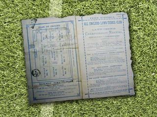
The first Wimbledon programme was released in 1887 when the tournament celebrated its 10th birthday. As printing technology was basic at the time, the design is very simplistic. The programme uses white card stock, upon which is printed blue text, basic illustrations, and a decorative border around the edge.
1894
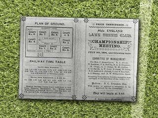
We see very minor design changes between the 1887 programme and the one pictured above from 1894. The use of borders and page separators has increased and more attention has been applied to the design of the overall layout. The programme also uses a varied typeset with serif, sans serif and calligraphic style fonts all in use.
1909
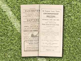
Another small design leap forward can be seen in this, our first programme from the 20th century. The programme consists of a simple, monochrome design with decorative borders and typesets.
1922
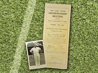
We're a decade on, but this entry from 1922 shows that the Wimbledon programme has not really been developed further yet.
Get the Creative Bloq Newsletter
Daily design news, reviews, how-tos and more, as picked by the editors.
1932
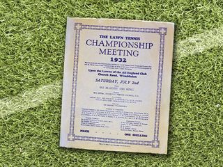
Ten years later, we see the design of the Wimbledon programme begin to evolve once more. This new design sees the return of a solid blue colour scheme of the 1887 programme. However, inside the content and complexity has been radically expanded - this is the first programme that resembles a full-blown magazine.
1948

The 1940s saw another significant change in programme design, particular of the covers. Information such as fixtures were out and photography was in. This new standard layout for the front cover is still essentially being used today.
1952
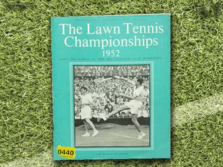
In the 1950s, Wimbledon introduced vibrant colours to the programme design, mainly used in blocks as seen above. Calligraphy fonts were out in favour of a slightly lighter version of the serif font used on earlier programmes.
1969 and 1974
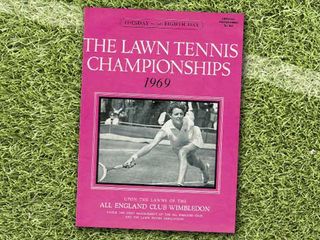
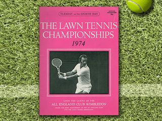
In the 1960s and 1970s the design of Wimbledon programmes more or less followed on from where the 1950s had left off. As time went on, the front cover was occasionally tweaked in terms of font styles, colours and sizes, but not a great deal changed.
1983
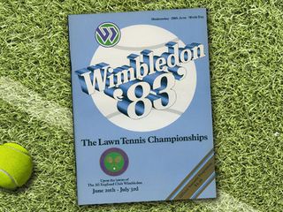
The 1980s saw another radically design change, with the front cover photograph removed and replaced with the common name for the tournament, Wimbledon, placed on the front cover instead. A shortened version of the year was used, removing the 19- prefix, and we saw the introduction of 3D text.
1990
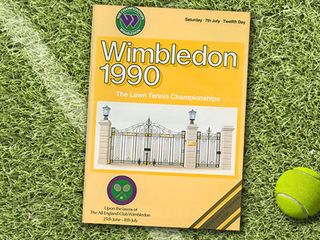
Technological advancements in the 1990s allowed Wimbledon to provide full colour illustrations from the middle of the decade onwards. The gates of the Lawn Courts at Wimbledon are featured on the 1990 programme shown above.
2007
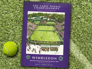
In 2007 the Wimbledon programme went through another restructuring process, with changes in font sizes and positioning of the 'Wimbledon' and 'Lawn Tennis Championships' event titles. A large colour illustration of centre court, without the roof that was still being developed, was placed in the centre of the front cover.
2013
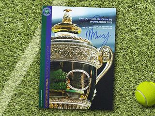
In 2013, the Wimbledon programme was again significantly redesigned. Block colours were slimmed down and changed into borders on the left hand side, with the logo overlaid towards the top. The border colours were now coordinated with the green and purple of the logo. Large colour photography is again prominent on the front cover. This copy was signed by Scottish player Andy Murray, who went on to win the trophy.
Words: Shout Digital
Shout Digital is a full service digital agency, headquartered in Newcastle upon Tyne, working for clients including St Ermin's Hotel.

Thank you for reading 5 articles this month* Join now for unlimited access
Enjoy your first month for just £1 / $1 / €1
*Read 5 free articles per month without a subscription

Join now for unlimited access
Try first month for just £1 / $1 / €1
The Creative Bloq team is made up of a group of design fans, and has changed and evolved since Creative Bloq began back in 2012. The current website team consists of eight full-time members of staff: Editor Georgia Coggan, Deputy Editor Rosie Hilder, Ecommerce Editor Beren Neale, Senior News Editor Daniel Piper, Editor, Digital Art and 3D Ian Dean, Tech Reviews Editor Erlingur Einarsson and Ecommerce Writer Beth Nicholls and Staff Writer Natalie Fear, as well as a roster of freelancers from around the world. The 3D World and ImagineFX magazine teams also pitch in, ensuring that content from 3D World and ImagineFX is represented on Creative Bloq.
