The startup's guide to brochure success
If you’re looking to create a professional marketing brochure for your startup, here are 10 tips that will help you do so quickly and simply.
If you're running a startup company, time and money are both likely to be in short supply. Leaflet design, brochure printing and marketing, although they might be some of your top priorities, are things that are all too easy to push to the end of the to-do list while you focus on your core business.
If you're looking to create an effective, professional marketing brochure for your startup, but need that's something quick and simple to create, here are 10 tips that will help you learn how to design a brochure to fit your needs.
01. Keep it short
Let's face it - if you're a startup company, you haven't got lots of cash to spend on brochure printing, or enough time to create an elaborate 72-page glossy brochure. And your clients are busy people too. So keep your brochure short. Eight pages ought to do it, 12 at the most.
02. Make a plan
Before you start, it's absolutely vital to plan out what you want your brochure to do. What's it for? To inform people of your services? To increase brand awareness? To showcase your products? To communicate one particular service that you offer?

Write down your goal and make sure you don't get sidetracked into including things that aren't directly related. You can always make a lengthier, more detailed brochure further down the track when you've got more time.
03. Have a clear structure
Let's say your brochure is to be eight pages long. One page will be the front cover, so you've got seven other pages (if you include the back) in which to sell your startup. Use post-it notes for each page of information you want to include and rearrange them on a board, wall or table until you've come up with the structure you want. Your pages might include:
- About us
- Our services
- Our products
- What makes us different
- Pricing
- Facts and figures
- Market research
- Large, full-out image
- Call to action
- Contact and social media details
- Link to your website through URL and QR code
Think about how much space each element should take up and cut out anything that doesn't add value. Don't forget that if you're using a professional brochure printing company, you can use double spreads too.
Get the Creative Bloq Newsletter
Daily design news, reviews, how-tos and more, as picked by the editors.
04. Maintain your brand
As well as the words you use, the look and feel of your brochure needs to promote your company image and say something about your philosophy and outlook. Whether you're running a vibrant, dynamic new publishing venture or starting up a sleek and sophisticated wine bar, the images, colours and typescripts you choose need to be on brand and remain consistent throughout the brochure.
Luckily, you probably sorted out much of this when you designed your logo, chose your company colours and created your website, so you’ve already got a formula to follow. If all your printed and web collateral looks as though it belongs together, you're well on your way to making a cohesive branding statement and building a loyal following.
05. Use a clean design
All companies are different, obviously, but whether your startup is going for the crisp white approach or for full-on technicolour, your design still needs to look fresh and clean.

Use plenty of white (or blue, or orange...) space around blocks of text, make sure your headings are clear and your body text is easy to read. Don't overpower your audience by giving them too much visual information on any one page.
06. Keep it accurate
It should go without saying, but spelling and grammatical mistakes or inconsistencies (e.g. between UK and US spellings) can ruin what would otherwise be a great brochure, and make your company look unprofessional. After all, if you can make a mistake with your own brochure printing, you could make a mistake with your clients' projects. If you can't afford a professional proofreader, at least get a couple of other people to go through your text with a fine-tooth comb. Check, check and check again.
07. Keep it compelling
Your writing needs to be concise, so avoid flowery language and lengthy descriptions. Your first paragraph is particularly important - if it's interesting enough, readers will be compelled to read on. Make sure your vocabulary choice and sentence length are relevant for your target audience, avoid jargon and use a professional but conversational tone.
Use a couple of impact statstics if possible. A surprising or even shocking fact is memorable, creates a talking point and has the added advantage of taking up very little space within your brochure.
08. Think big
Big ideas, big images, big statements, big text. Just because you've got to fit a lot of things into a small space doesn’t mean that you should use a tiny font or choose several smaller pictures instead of one large one.

If you are using a professional brochure printing company, you will be able to use full-bleed images and feature full-colour pages to make a real statement. Your readers can always contact you to find out more information, after all!
09. Use pictures of people
When shown a page of text that also contains a real-life photograph of a person, a reader's eyes will always be drawn to the image first, in particular to the eyes of the person in the photo. The mood of the person in the picture has been shown to have an impact on sales and branding, and even where they're looking is important.
If you're savvy, you can use this to your advantage by including images of happy people enjoying your products or services. If you want to draw attention to a particular block of text or headline, make sure the person in the photograph is looking that way and your readers will look there too.
10. Be inspired
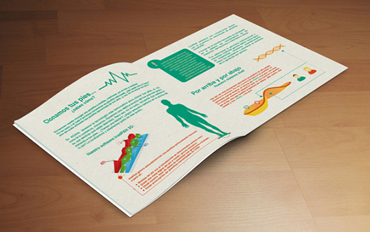
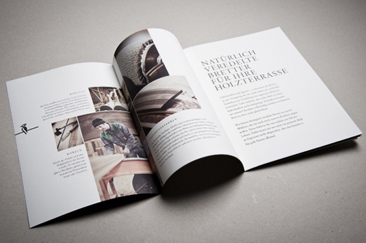
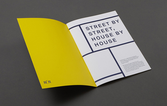
Keep your eyes open to examples of brochures and marketing materials that you see around you. Browse the internet for great ideas, as well as taking note of those ideas that don't work so well. The images scattered through this feature should give you some inspiration when it comes to brochure printing.
By following the above tips, you should be able to create an effective and beautiful brochure for your startup in no time at all. You might even manage time for a cup of coffee and a biscuit.
Words: Simon Tilbrook
Simon Tilbrook is the owner of Swallowtail Print, a premium brochure printing and design firm focused on delivering maximum value to their clients. Further bio on Simon can be found here, and for more design and printing tips connect on Google+.
Liked this? Read these!
- Free graffiti font selection
- Illustrator tutorials: amazing ideas to try today!
- Free Photoshop actions to create stunning effects
- The ultimate logo design guide
Have you seen a great example of brochure printing and design? Let us know in the comments below!

Thank you for reading 5 articles this month* Join now for unlimited access
Enjoy your first month for just £1 / $1 / €1
*Read 5 free articles per month without a subscription

Join now for unlimited access
Try first month for just £1 / $1 / €1

The Creative Bloq team is made up of a group of art and design enthusiasts, and has changed and evolved since Creative Bloq began back in 2012. The current website team consists of eight full-time members of staff: Editor Georgia Coggan, Deputy Editor Rosie Hilder, Ecommerce Editor Beren Neale, Senior News Editor Daniel Piper, Editor, Digital Art and 3D Ian Dean, Tech Reviews Editor Erlingur Einarsson, Ecommerce Writer Beth Nicholls and Staff Writer Natalie Fear, as well as a roster of freelancers from around the world. The ImagineFX magazine team also pitch in, ensuring that content from leading digital art publication ImagineFX is represented on Creative Bloq.
