8 reasons every digital designer should have a physical portfolio
Even if your work is mostly made of pixels, you still need something printed on paper. Here's why.
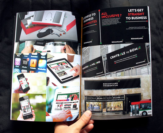
Technology has made it easier than ever to show your work to potential clients, but it can also act as a hindrance when meeting a client in person. You don't want to huddle around a computer screen with your client as you access your portfolio online - and your client doesn't want that, either. They want something quick and easy that will help them make a decision on whether or not to work with you.
That's not to say that digital design portfolios don't have their uses; they just shouldn't be your only method of attracting new clients. Having a print design portfolio - even if you're primarily a digital designer - can help you broaden your client base and create a sense of legitimacy for your business. Here are eight reasons why they're a good idea...
01. To help you stand out
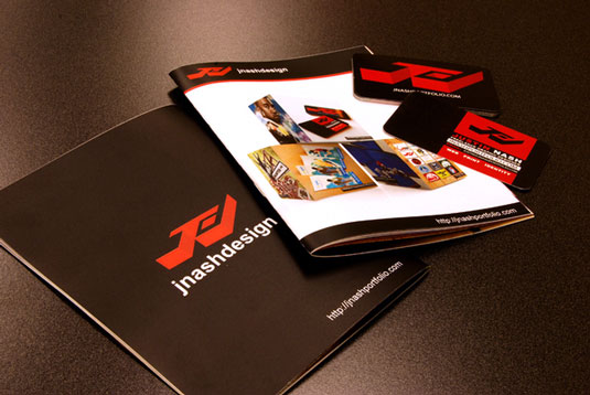
Chances are you won't be the only designer that your client is considering, so you'll want your printed design portfolio to stand out above the others. Websites tend to run together after a while and are less memorable, especially if your site has a design similar to someone else's. With a physical portfolio, you have a much more distinctive identity and you won't be accidentally confused with another designer because a client can easily look at your two portfolios side-by-side.
Additionally, using a custom designed presentation folder or binder allows you to better establish a brand identity by creating a concurrent design between both your web and print portfolios, as well as other materials such as business cards.
As a freelancing designer, you are your own brand, so it's important that your identity is memorable and effective. When you showcase strong, consistent branding in your designs, it shows potential clients that you can do the same for them. Don't forget to keep the principles of print design in mind when designing for the web.
02. It's instantly accessible
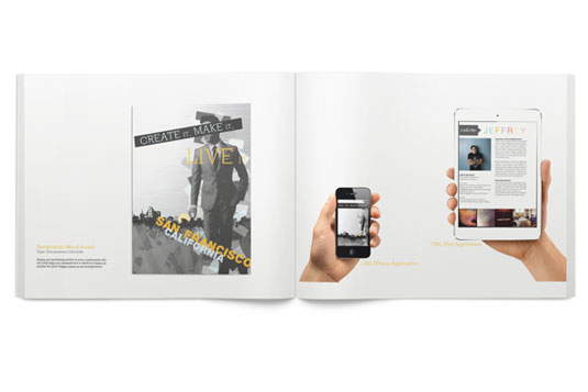
Online portfolios require a computer, tablet or smartphone (as well as access to the internet and electricity) to be viewed. Conversely, a physical portfolio can be viewed anytime and anywhere.
You also have to consider your potential client base: not all of them will be technologically savvy. In fact, many hire digital designers because of that very reason. These potential clients may find it difficult to navigate your online portfolio or may have the wrong computer monitor settings to properly experience your work.
Get the Creative Bloq Newsletter
Daily design news, reviews, how-tos and more, as picked by the editors.
This could cause them to miss crucial aspects of your portfolio due to a technology or user-based error. Being especially creative and unconventional with your online portfolio design may even make it more difficult for some users to properly experience. Meanwhile, a physical portfolio allows you to be as creative as possible and remain accessible to all audiences.
03. It shows you've made it
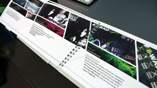
If you bring a portfolio to a meeting, it shows that you took the time and effort to prepare instead of just showing up empty handed with nothing more than a URL to rattle off. When you bring support materials, it instantly sends a message to the client that you came ready with designs to show off.
When you give them a copy of your portfolio at the end of the meeting, it acts as a sort of present of goodwill. It shows them that you cared enough about getting their business to spend your own time and money.
04. You have total control over how it looks
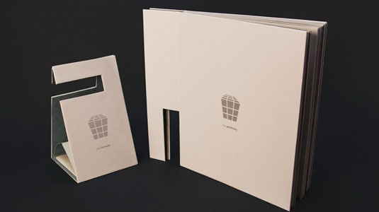
You can't be completely sure how your portfolio is going to look on your client's computer, since their browser, monitor and display settings are out of your control. These statistics from W3Schools illustrate this variety. Conversely, with a physical portfolio, you can control every aspect of how it looks, including the shape of the portfolio itself.
You can physically arrange your printed portfolio so that your best work is at the front, with other impressive designs spread throughout. This way, your best examples are visible even when the client is just flipping through the pages. You can also custom tailor your portfolio for each individual client by making sure to include the works that will be the most appropriate and relevant to their brand identity.
With a website, on the other hand, your potential clients are free to click on links in a random order or links that take them away from your portfolio. This makes it difficult to show off your best work, because you cannot as easily control the way in which your client views your website or which designs they look at first. With a physical portfolio, you have a greater degree of control because, like a book, there is a logical beginning, middle and end.
05. It minimises distractions
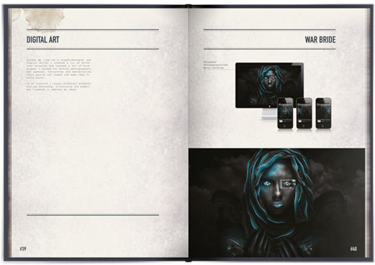
Online portfolios have to compete for the attention of your clients over everything else that is available to them on the internet. If your portfolio isn't engaging enough, your potential clients will wander off to check their emails or social media feeds, never returning.
Navigating away from a website is easy, and websites are often looked at while multitasking. When it comes to a physical portfolio, there is more of a commitment on a client's behalf to actually spend a few minutes with your work, free from distractions. That ultimately means a better understanding of what you could bring to a project.
06. You can feel it
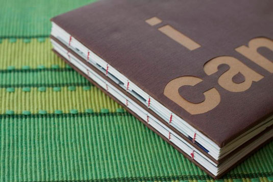
Since digital designs cannot be touched, many digital designers underestimate how important the physical feel of a design can be. The ability to explore something new with your hands creates a stronger sense memory in your brain because it's receiving information from both your eyes and your hands.
Choosing the right imprint method can help you further establish a tactile connection with your audience. Thick stocks, embossed design elements, textured coatings and custom die-cuts help add tactile interest to your portfolio. Texture should be a consideration even in the most mundane cases; a glossy picture of your digital design will feel much better than something printed out on standard white printer paper.
07. It leaves a lasting impression
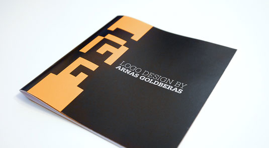
After viewing a website, many people just bookmark it and move on to something else. It can be difficult to get a potential client to revisit your website in order to reconsider your portfolio. However, physical portfolios cannot be clicked away - they must be disposed of completely, which means they tend to stick around longer in your potential client's homes and offices.
Since physical portfolios stick around for a longer period of time and are easy to transport between locations, there's a greater chance of a client “stumbling upon” your portfolio at a later date and deciding to hire you, even if they didn't hire you the first time around.
08. It can be combined with digital
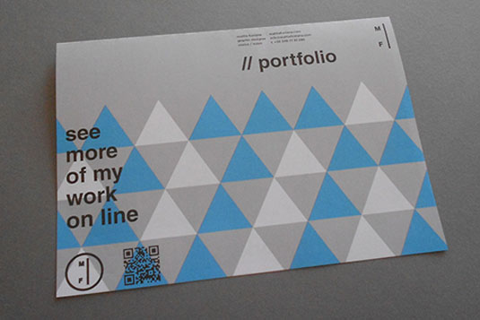
Having both a physical and digital portfolio is the best route to go because it gives your client the most options and makes you seem more flexible as a designer. Keep in mind that there should be a consistent brand identity across both platforms, and that each portfolio can play off of the other's strengths and weaknesses.
You can use your digital portfolio to include the works you couldn't fit into your physical portfolio, or to offer more detailed information about work you've done in the past. Using QR codes or NFC technology, your clients can link directly from your physical portfolio to your online portfolio.
Including a die-cut media slit in your folder's pocket allows you to include digital on a CD, DVD or USB card. This adds further value, as your clients get to view your files digitally but still experience the thoughtfulness of a physical gift. Likewise, a disc or USB memory stick is harder to part with than it is to click away from a website. Chances are that your client may stumble upon your digital files at a later date and hire you.
Conclusion
It can be difficult for digital designers to translate their work into a physical portfolio, but that problem can be minimized by finding the right printer and maintaining a working relationship with them. Your printer can provide you with tips, examples, ideas and even additional design help so that your physical media is as impressive to clients as your digital.
By establishing this relationship, you also open yourself up to the possibility of winning more contracts in the future. Sometimes printers have clients who need something printed but don't know how to design it themselves. A good relationship with your printer could lead to referrals or perhaps even working directly for the printing company.
Liked this? Read these!
- Create the perfect design portfolio: pro tips
- Top-quality WordPress portfolio themes
- Great places to find free print design templates
What format does your portfolio come in? Let us know in the comments below!

Thank you for reading 5 articles this month* Join now for unlimited access
Enjoy your first month for just £1 / $1 / €1
*Read 5 free articles per month without a subscription

Join now for unlimited access
Try first month for just £1 / $1 / €1

The Creative Bloq team is made up of a group of design fans, and has changed and evolved since Creative Bloq began back in 2012. The current website team consists of eight full-time members of staff: Editor Georgia Coggan, Deputy Editor Rosie Hilder, Ecommerce Editor Beren Neale, Senior News Editor Daniel Piper, Editor, Digital Art and 3D Ian Dean, Tech Reviews Editor Erlingur Einarsson, Ecommerce Writer Beth Nicholls and Staff Writer Natalie Fear, as well as a roster of freelancers from around the world. The ImagineFX magazine team also pitch in, ensuring that content from leading digital art publication ImagineFX is represented on Creative Bloq.
