13 presentation folder designs to inspire you
These attention-grabbing presentation folders designs strike the perfect balance between functional and beautiful.
Designing a presentation folder that stands out but still looks business-like is a real creative challenge. You need something that's functional and doesn’t distract from the actual presentation, but also attention-catching enough that it will be remembered. To inspire your own creations, here are some inspiring presentation folder designs that have caught our eye recently...
- Also check out these innovative business cards
01. Ivy Hotel
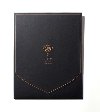
Los Angeles-based CRU Agency created a design for San Diego's Ivy hotel that looks deceptively plain and simple, but is actually quite smart and very elegant. You can tell just looking at the ornate logo that this hotel is very high-end.
02. Lewis & Arnold
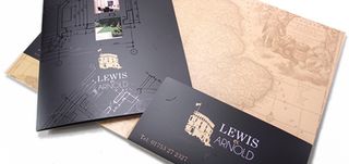
Showcase Creative created this eye-popping design for Lewis & Arnold that makes great use of the Spot UV technique, which causes the company’s name, logo, and 'blueprint' to have a high-impact, glossy sheen that jumps out and grabs you.
03. Serpentine Cut Corporate Folder
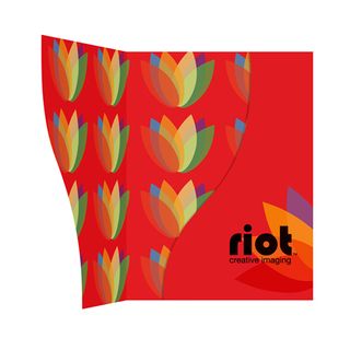
Created for visual communications agency Riot Creative Imaging by CF Folder Designers, this sleek design is bold but deceptively simple on the outside, and a riot (no pun intended) of colour on the inside.
04. Baneron Corporate Design
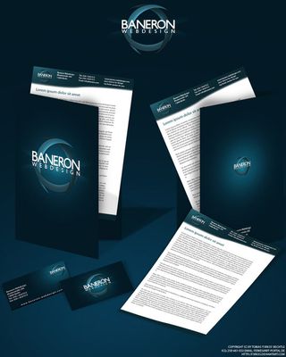
How important is a good, bold logo? It absolutely makes this folder, and Tobias Bechtle’s decision to go with a clean, empty background allows it to stand out that much more.
05. Realty Austin
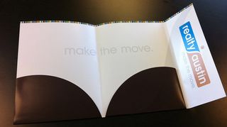
If you’ve never been to Austin, TX, it's a vibrant, creative, colorful city. So it may seem strange that the bulk of the interior of Realty Austin’s folder is just white space, but I think it’s brilliant. It really makes you take notice of the one huge call to action in the centre - "make the move", and the rainbow-colored border on the top hints at all Austin has to offer.
06. London4yoo Folder

Tasked with making a folder for a company that's about seeing all different corners of London on the web, GraphicTank offers just that: London. The city spreads out before you on the page in a light, ethereal manner that just begs you to look deeper.
Get the Creative Bloq Newsletter
Daily design news, reviews, how-tos and more, as picked by the editors.
07. Accrete Presentation Folder
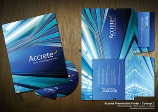
Something about this design from Discovery Design for training provider Accrete just pops. Maybe it's the soothing shades of blue. Or the sharp lines and corners. Whatever it is, it makes you sit up and take notice.
08. Cidma Group Corporate Folder
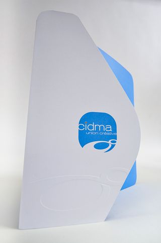
Gill Cad clearly likes to challenge our expectations of shape. This design for home and building consultantcy The Cidma Group surpasses the one above in terms of how far it's willing to stray from the norm, and this very inventiveness makes it a winner.
09. Zarqa Projects Folder
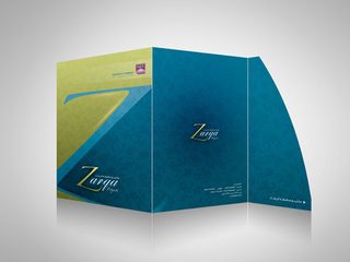
Designer Aljonaidy keeps the design relatively simple here, but what he does incredibly well is to pick the right colours and focus on QIT company Zarqa's logo, even going so far as to make the 'Z' a part of the overall look of the folder.
10. Hartland Builders Presentation Folder
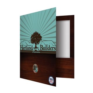
Though relatively simple, this design gets so many things right. It makes the fantastic logo the focus, really selling the sunny, happy community this company can create. That great in and of itself, but when coupled with the dark wood finish on the bottom half of the cover, it creates a sense of strength and permanence.
11. Laptop folder
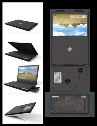
Now this is how you create a presentation folder that stands out. Msalah's design looks so much like a real laptop computer that you might even be tempted to open it up and start hitting keys. And the functionality fits the design, too, with a 'disk drive' that holds a real CD or DVD.
12. Tensports folder
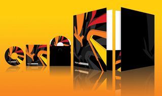
With a design that looks like a random tagger left his mark, this folder by Workstation for sports channel Tensports has a real vibrancy.
13. University of Arts Presentation Folder

This design may be, as creator Horhew says, just a "homework assignment", but the decision to use a "doodling" style gives it a cool, artsy vibe that really works.
Words: Darryl Tott
Darryl Tott is a blogger for Showcase Creative, a presentation media printer that provides high quality short-run presentation folders and printed ring binders based in Camberley, UK.
Liked this? Read these!
- Great examples of doodle art
- The ultimate guide to designing the best logos
- Useful and inspiring flyer templates
Have you seen an inspiring example of a presentation folder design? Let us know in the comments below!

Thank you for reading 5 articles this month* Join now for unlimited access
Enjoy your first month for just £1 / $1 / €1
*Read 5 free articles per month without a subscription

Join now for unlimited access
Try first month for just £1 / $1 / €1
The Creative Bloq team is made up of a group of design fans, and has changed and evolved since Creative Bloq began back in 2012. The current website team consists of eight full-time members of staff: Editor Georgia Coggan, Deputy Editor Rosie Hilder, Ecommerce Editor Beren Neale, Senior News Editor Daniel Piper, Editor, Digital Art and 3D Ian Dean, Tech Reviews Editor Erlingur Einarsson and Ecommerce Writer Beth Nicholls and Staff Writer Natalie Fear, as well as a roster of freelancers from around the world. The 3D World and ImagineFX magazine teams also pitch in, ensuring that content from 3D World and ImagineFX is represented on Creative Bloq.
