9 steps to stunning magazine design
Human After All's Danny Miller explains the key stages that went into designing Weapons of Reason.
Weapons of Reason is a four-year publishing venture by London-based design agency Human After All and D&AD, and a stunning example of magazine design.
We've already gone behind the scenes on the making of the first issue of Weapons of Reasons. Here, Human After All CEO Danny Miller provides a masterclass in magazine design by tracing the nine stages that went into the creation of Weapons of Reason…
01. Nail your concept
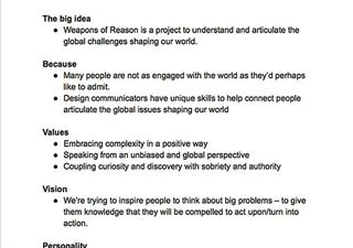
Armed with the (somewhat earnest) idea of creating a 'magazine to save the world', we began by discussing why exactly our magazine should exist, looked at other magazines of a similar nature, and decided what we had to add to the conversation and how we could bring value to our audience.
02. Identify a framework

We believe that creative people love boundaries, so we devised an eight-issue framework, releasing two issues of the magazine per year over four consecutive years. This meant we had to consider the entire project – including the theme of each issue – from the very outset.
03. Plan the branding and tone of voice
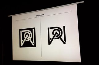
Once the core guidelines that defined the personality of our magazine had been codified, our creative team went on to produce a preliminary 'look-and-feel' document to explore the visual language of the magazine. Every design decision was made for a reason.
04. Commission the editorial
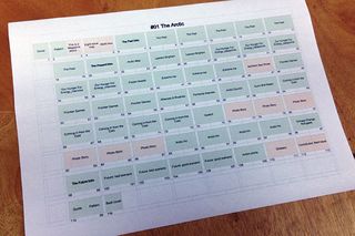
Guided by a crack team of consultants, we assembled an editorial team who set out to interview Arctic experts, NASA scientists, Nobel Peace Prize laureates, politicians, locals and many more in between to create original content encapsulating the breadth of issues surrounding the Arctic in 2014.
05. Promote your publication
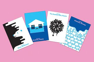
To form an emotional connection with potential collaborators and partners, our team devised four postcards depicting Arctic issues. We then sent them all out (handwritten) to a few hundred key people and contacts. We also included a promo postcard in the October Stack magazines subscription.
06. Design its online presence
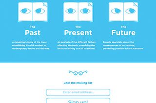
We created a very simple scrolling website to succinctly explain the project, allowing people to sign up for more information or pre-order a copy of the magazine. Using a reduced colour palette, we distilled everything down to the core facts.
07. Consider the cover carefully

Weapons of Reason is almost exclusively illustrative, as it gives us control over the tone in which we tell stories. Our cover needed to be the primary example of this aesthetic, so we commissioned leading visual thinker Adrian Johnson, and carefully briefed him on our approach to telling the story of the Arctic.
08. Don't neglect the grid
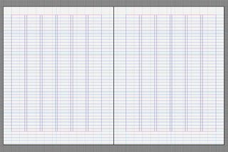
We've always been slightly obsessed with having a tight grid, in which our guides, document and baseline grids intersect. This requires a bit of proportional mathematics, but once locked, it provides a solid underpinning to our page structure throughout the magazine design.
09. Develop your graphics
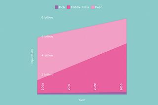
We've produced a great deal of data visualisation work for YouTube, Facebook and The World Economic Forum. Working on Weapons of Reason offered us a chance to use this experience in our magazine design but push it even further by taking a highly reductionist approach to the graphics.
Words: Anne Wollenberg
This article first appeared in Computer Arts issue 234, a branding special that exclusively reveals the strategy secrets from the world's biggest agencies.
Liked this? Read these...
- First real alternative to Photoshop launched... and it's free!
- The 13 best magazine covers of 2014
- Create a perfect mood board with these pro tips and tools

Thank you for reading 5 articles this month* Join now for unlimited access
Enjoy your first month for just £1 / $1 / €1
*Read 5 free articles per month without a subscription

Join now for unlimited access
Try first month for just £1 / $1 / €1
Get the Creative Bloq Newsletter
Daily design news, reviews, how-tos and more, as picked by the editors.
The Creative Bloq team is made up of a group of design fans, and has changed and evolved since Creative Bloq began back in 2012. The current website team consists of eight full-time members of staff: Editor Georgia Coggan, Deputy Editor Rosie Hilder, Ecommerce Editor Beren Neale, Senior News Editor Daniel Piper, Editor, Digital Art and 3D Ian Dean, Tech Reviews Editor Erlingur Einarsson and Ecommerce Writer Beth Nicholls and Staff Writer Natalie Fear, as well as a roster of freelancers from around the world. The 3D World and ImagineFX magazine teams also pitch in, ensuring that content from 3D World and ImagineFX is represented on Creative Bloq.
