A designer's guide to printing a poster
Follow these top tips to achieve poster printing perfection.
09. Check your spelling!

Luke Woodhouse advises that you to "spellcheck, spellcheck, spellcheck. Then get your mum to spellcheck it and anyone else who will read it for you. There's nothing more soul-destroying than a typo, and they're easy to miss if you're too close to your masterpiece." And that goes for the big words as well as the small ones – its not uncommon to caught up in checking the small print, only to miss a glaring error in the headline.
10. Set the correct bleed
What is bleed? It's simply a little margin (usually 3 or 5mm) around the edge of your poster design that, depending on how the printer cuts the paper down, may or may not be shown in the finished result. It's essentially your room for error and ensures there isn't a random white line on the edges of your printed poster.
Programs such as InDesign and QuarkXPress make it easy by showing you guides, so you can see where the bleed starts and finishes. Always ask the printer you're using (or check your own printer settings) to determine how much bleed is required for your poster printing.
11. Consider the trim
The trim is the edge of the final printed output. To prevent text or logos being chopped off the final output, they should be placed with some breathing space around them. Design elements should be no closer to the trim edge than 3-5mm, depending on the size of the poster.
12. Run a pre-print check
Always run a pre-print check. This will bring up any issues, such as RGB files being used or fonts used that aren’t embedded. In InDesign this is known as a 'pre-flight'. The programme can package up all your print files and links ('File > Package') into one folder, which will spare you any missing font nightmares.
13. Get your blacks right

Ben Powell suggests: "When printing posters using black, there are so many different types of black you can use (RGB, Photoshop, neutral rich, registration, flat, designer, and so on).
"My tip would be to avoid RGB black as this is primarily used for the web/digital and will look washed-out and grey in print. Which black you should use will depend entirely on your printing process and what paper stock you're using, especially if you're printing solid blacks.
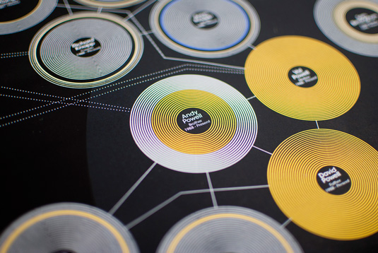
"When I designed a recent infographic piece, I spent days printing various different blacks on different stocks of paper to get the most accurate black whilst making sure the colours didn't bleed into each other; a really lengthy but worthwhile process. Always leave plenty of time to test your blacks – it can completely ruin a fantastic poster design if you don't."
Related articles:

Thank you for reading 5 articles this month* Join now for unlimited access
Enjoy your first month for just £1 / $1 / €1
*Read 5 free articles per month without a subscription

Join now for unlimited access
Try first month for just £1 / $1 / €1
- 1
- 2
Current page: Bleed rules, vectors, and final checks
Prev Page Colour theory, resolution and printingGet the Creative Bloq Newsletter
Daily design news, reviews, how-tos and more, as picked by the editors.

The Creative Bloq team is made up of a group of art and design enthusiasts, and has changed and evolved since Creative Bloq began back in 2012. The current website team consists of eight full-time members of staff: Editor Georgia Coggan, Deputy Editor Rosie Hilder, Ecommerce Editor Beren Neale, Senior News Editor Daniel Piper, Editor, Digital Art and 3D Ian Dean, Tech Reviews Editor Erlingur Einarsson, Ecommerce Writer Beth Nicholls and Staff Writer Natalie Fear, as well as a roster of freelancers from around the world. The ImagineFX magazine team also pitch in, ensuring that content from leading digital art publication ImagineFX is represented on Creative Bloq.
