Edge Magazine: The 20 best covers of all time!
Since 1993, Edge magazine has created some of the best cover designs in publishing history. Here, we pick our favourite 20.
This week, Edge published every single one of its covers from the mag's birth in 1993 right up to present day on its website. From Mario to Evil Dead and Nintendo to Xbox, Edge has been there from the beginning, with its cover designs constantly evolving. We were so impressed with their workmanship and the exquisite design throughout the years that we decided to pick our favourite 20. Do you agree with our choices?
- Check out the full list on the Edge website.
Issue 18 (1995)
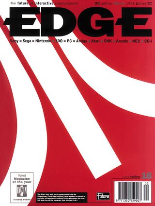
In 1995, Edge had only been going for two years but had already solidified themselves as a forerunner in games publishing; you only need to look at that shiny 'Magazine of the year' stamp from the Industry awards! Rob Abbott was responsible for this Atari cover. The striking contrast between the red and white logo make it a stand-out issue.
Issue 35 (1996)
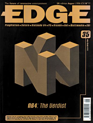
Remember when the N64 came out? Edge certainly does with this cover from August of 1996. The clever Escher style design was the work of Art Director Terry Stokes, who continued to work on Edge for a number of years. We loved the grainy nature of the colour palette which makes the most important aspect stand out - the N64 of course!
Issue 90 (2000)
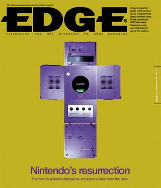
Once again we're met with a Nintendo cover but this time Terry Stokes has decided to go with a far more controversial approach. Laying out the console to tie in with the brand's 'resurrection' was a bold move that we think totally paid off. A stunning and simple effort that ticks all the boxes in brilliant print design.
Issue 105 (2001)
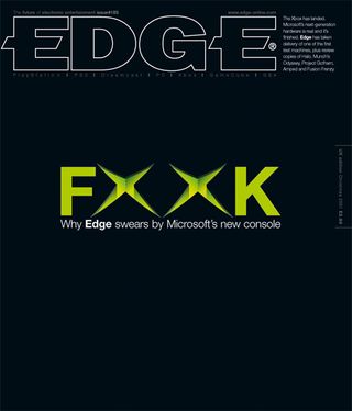
Now, this is a cover that would certainly catch your eye if it was placed in your local newsagents. This issue from 2001 marked the release of the Xbox and what better way to showcase the excitement than with a token swear word? Terry's daring cover design and witty word play continued to showcase his awesome art director abilties.
Issue 109 (2002)
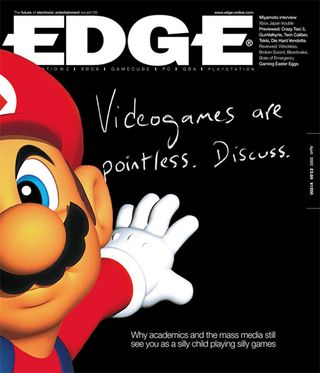
Mario has been known to grace the cover of Edge a fair few times but it's this particular design from Terry Stokes that we think works particularly well. As one of the most well-known faces in video games, Mario was the perfect choice to lead this issue's debate. The simple chalk font is also a nice touch.
Issue 113 (2002)
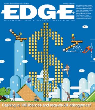
In this issue, Terry Stokes seems to have decided to steer away from his usual less-is-more approach and instead present us with this awesome mish-mash of beloved video game characters. Using the universally known platform level lay-out as well as carving the dollar sign out of coins is a clever and eye-catching way to showcase an important issue.
Issue 122 (2003)
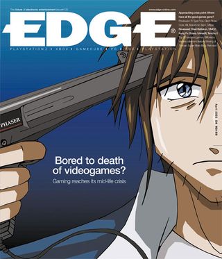
This is Terry Stokes' last cover design in this list and it's important to note his incredible influence upon Edge's design history. The main focal point was always the central image with no frills or fuss; the content only given away in the top left hand corner. This striking cover is the perfect example of how Stokes manages to tie in an iconic video game image with each headline perfectly.
Issue 128 (2003)
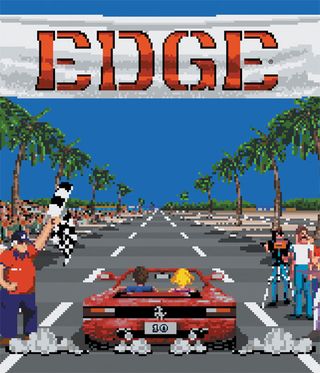
Even though 'Outrun' was released by Sega in 1986, Art director Darren Phillips decided to put it on this cover from 2003. Apart from the title, there's clearly no need for any text or headlines. The image speaks for itself and we love that the guys have even tied in the title to fit in with the pixelated approach.
Issue 135 (2004)
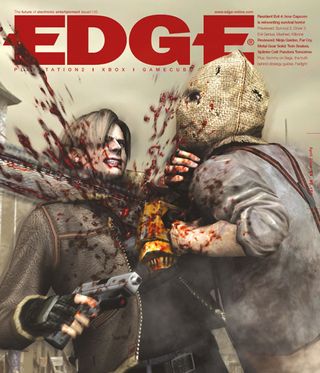
At the time of release, this image from Resident Evil 4 sparked enough controversy to earn Edge its very first black bag. Fair enough really, as an evil bagged-up zombie ploughing his chainsaw into Leon is not for the faint hearted (or the unsuspecting children in WHSmiths). It's great to see Darren Phillips keeping the type to a minimum and using each image as the main focal point. Well, you can't really ignore this one!
Issue 148 (2005)
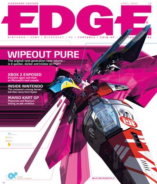
In this issue, we can see that the design of Edge has started to change with the times and designer Darren Phillips has started to incorporate more text into the cover. This issue from 2005, showcases the return of Wipeout on the PSP and its iconic racer. We love that it seems to be bursting through the fourth wall.
Issue 177 (2007)
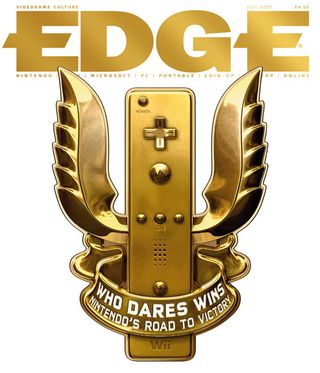
Edge has always been keen a supporter of Nintendo and this issue from 2007 is no different. Darren Phillips is once again responsible for this stunning showcase of the Nintendo Wii, with the impressive image proving that less is more. We love the attention to detail, especially the extensive shadow work on the controller.
Issue 181 (2007)
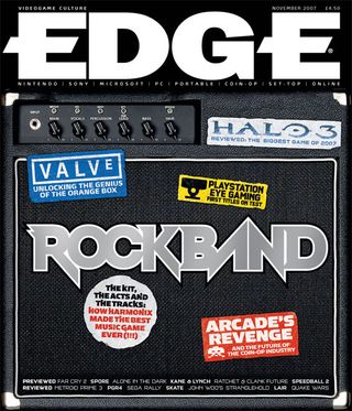
Rockband was one of the surprise hits in the video game world and Andrew Hind's take on the franchise in this issue is a fantastic display. Using a photo of an amp showcases just what the game is about; the content on the stickers allows them to fit in perfectly with the issue's theme and style. A perfect mix of imagery and font.
Issue 184 (2008)
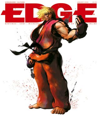
With no text or headlines, this issue designed by Darren Phillips is an absolute design feat. Celebrating the release of Street Fighter 4, the iconic image of Ken is all you need to intice the reader. The stunning illustration is a gorgeous interpretation of the infamous character. Plus, he's welcoming you into the issue, which is an extremely clever way to catch the eye.
Issue 186 (2008)
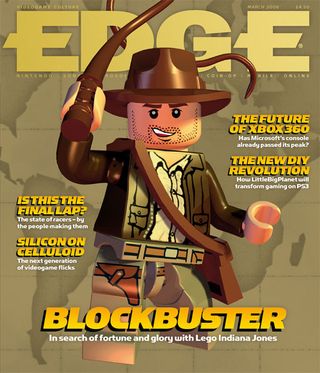
The LEGO games franchise continues to thrive and this Indiana Jones number was only one of the success stories. Andrew Hind was in charge of this one, with Indie the only image the issue needed. We love that the font used is reminiscent of the movie's infamous type and the subtle map design in the background.
Issue 208 (2009)
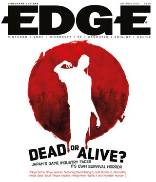
Darren Phillips continues to thrive with his Edge designs and this issue from 2009 is one of our favourites. Using the image from Dead Rising 2 to mimic the flag of Japan rounds up the issue's content perfectly. The simple black, white and red colour scheme is perfect for the issue. Oh, and did you notice the creepy zombies in the red circle?!
Issue 213 (2010)
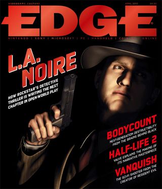
Rockstar had already propelled itself to games royalty thanks to the Grand Theft Auto releases so it came as no surprise that Edge would feature their latest offering 'L.A. Noire' on the cover of this issue back in 2010. We love Darren's ability to alter the style of each issue to fit in perfectly with the content. The film poster style red font is a really nice touch!
Issue 226 (2011)
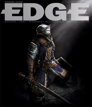
This issue back in 2011 only needed this image from Dark Souls to pack a punch in print design. Darren Phillips is once again the man behind the cover and this time, he has opted for no text at all (apart from the title of course!) The title's gorgeous silver colour goes hand-in-hand with the light coming from the top right hand corner. A perfect image that really shows off the talent of games designers.
Issue 229 (2011)
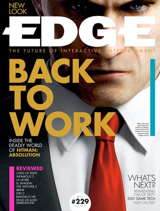
This issue designed by Mark Wynne was a defining moment in Edge's design history. It had a new look, with the strap line changing from a list to 'The future of interactive entertainment'. With many fans to please, this design was a bold move for the magazine. Once again opting for an image of an iconic video game character, the eyes of Agent 47 pierce through the page perfectly.
Issue 231 (2011)
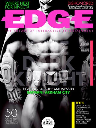
When featuring a character as big as Batman on the front cover, it's important to make him stand out from the crowded news stand. Mark Wynne manages to do so exquisitely, with the pop of neon fonts clashing with the subtle Batman reference. The main focal point of the Batsuit is an interesting and unique portrayal of an infamous face.
Issue 240 (2012)
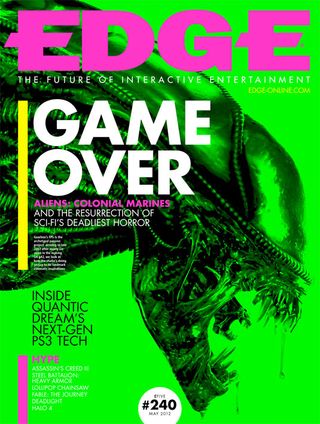
Lastly, we have this incredible cover from 2012, designed by Andrew Hind. Again, it's always going to be difficult to feature a well-known image that will make readers want to pick up your issue. The guys at Edge certainly got past that with the eye-popping neon background, complimented with neon pink, yellow and a bold white.
Which Edge cover is your favourite and why? Let us know your thoughts in the comments box below!

Thank you for reading 5 articles this month* Join now for unlimited access
Enjoy your first month for just £1 / $1 / €1
*Read 5 free articles per month without a subscription

Join now for unlimited access
Try first month for just £1 / $1 / €1
Get the Creative Bloq Newsletter
Daily design news, reviews, how-tos and more, as picked by the editors.
The Creative Bloq team is made up of a group of design fans, and has changed and evolved since Creative Bloq began back in 2012. The current website team consists of eight full-time members of staff: Editor Georgia Coggan, Deputy Editor Rosie Hilder, Ecommerce Editor Beren Neale, Senior News Editor Daniel Piper, Editor, Digital Art and 3D Ian Dean, Tech Reviews Editor Erlingur Einarsson and Ecommerce Writer Beth Nicholls and Staff Writer Natalie Fear, as well as a roster of freelancers from around the world. The 3D World and ImagineFX magazine teams also pitch in, ensuring that content from 3D World and ImagineFX is represented on Creative Bloq.
