15 evocative examples of retro poster design
No matter what exciting visions modern technology brings, people will always look to the past. For a blast of faux-vintage inspiration, check out these retro poster designs.
Take from the Latin prefix meaning 'backwards' or 'in past times', the word 'retro' describes anything stylistically inspired by trends of the past. Retro poster design has a strong pull for many artists, keen to revisit and reinvent the designs of yesterday.
Here's a collection of 15 brilliant retro poster designs that employ faded colours, evocative textures and distinct typography that combines the best of vintage design and a modern outlook...
For even more poster design inspiration, see our pick of the best poster design around.
01. Retro Space Shuttle
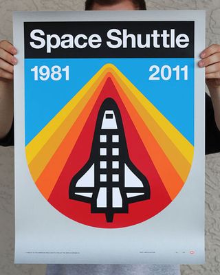
Here, designer Aaron Draplin decided to print his homage to the late NASA Space Shuttle Programme with this pair of brilliant retro posters. Two versions of the original design have been produced: one with a silver background (sold out), and a 'Nighttime Re-entry' variant that showcases a contrasting palette.
02. Orient Calls
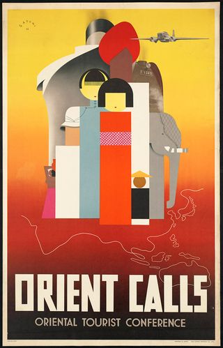
Type in the search term travel posters into Google and you'll be presented with thousands of examples of vintage designs. But this 1936 Orient Calls design by Mune Satomi caught our eye. Not a computer in sight, this beautiful composition and colour palette was entirely hand crafted.
03. Vintage Heroes
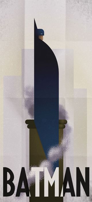
Comic book lover and avid gamer Grégoire Guillemin often creates superhero inspired designs and these minimalist vintage posters have hit the right spot when it comes to inspirational graphic design.
The likes of Batman, the Green Hornet and the Silver Surfer are all included in the retro re-imaginings. The gorgeous typography teamed with the brilliantly sketched superhero illustrations have had us falling head over heels for the series.
Get the Creative Bloq Newsletter
Daily design news, reviews, how-tos and more, as picked by the editors.
04. Ennio Morricone
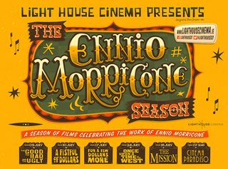
Illustrator Steve Simpson recently applied his distinct playful, painterly style, to this eye-catching poster design for The Light House Cinema in Dublin. The brief was create artwork to promote a season of films celebrating the work of composer, orchestrator and conductor Ennio Morricone. The Italian maestro was responsible for the scores featured in many classic films, including A Fistful of Dollars and The Good, the Bad and the Ugly.
05. Switzerland
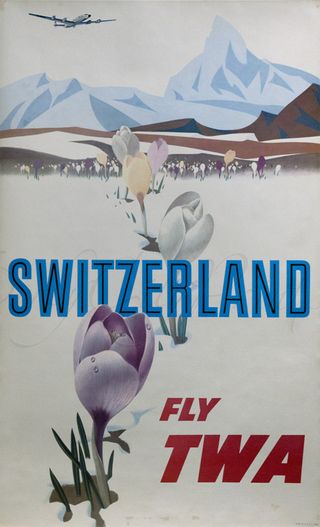
An iconic design created by American artist David Klein - the man who illustrated dozens of posters for Howard Hughes' Trans World Airlines (TWA) in the 1950s and '60s. Klein designed numerous posters advertising travel in the US and abroad and in 1957, his New York piece became part of the permanent collection of the MoMA (Museum of Modern Art) in NYC. View the full collection of Klein's work here.
06. Network
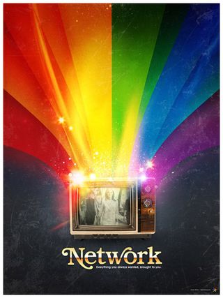
James White, founder of Signalnoise Studio, is a visual artist, designer and speaker based in Canada. He makes posters and all manner of other cool stuff - a perfect example being this Network poster. White spent time researching the history of television broadcasting, commenting on his website: "My poster design reflects the typical viewers’ impression of broadcasting, the idealistic world where everything is okay."
07. Bullitt
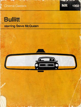
Graphic design Wayne Dalhberg is the brain behind this awesome Bullitt poster design. Dalhberg's simple, yet highly effective concept incorporates the film's famous car chase scene, featuring Steve McQueen in his Mustang Fastback GT wrapped up in an oversize rearview mirror.
08. Festival Internacional Cine de Montana
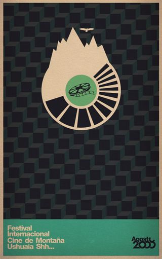
We love this vintage-style design by art director and designer Horacio Lorente. The talented artist created a series of posters for the Festival Internacional Cine de Montana event back in 2008. Using a simple, clever concept and the event's logo, he lets the design do the talking. Lorente's talent has attracted clients in NY, London, and Buenos Aires, and in 2010 he was selected as one of the top 10 creative talents from Argentina by Computer Arts Magazine.
09. Drive
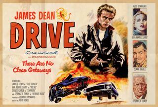
Illustrator and deisgner Peter Stults recently published a set of retro poster designs with a twist. His awesome 'What if' series explores what if movies we're all familiar with were made with a different slice of time? Who would be in it and direct it? Our favourite was this Drive poster, with James Dean as the lead male role. Other designs include alternate posters for Pulp Fiction, Groundhog Day, and 2001: A Space Odyssey.
10. Space Mountain
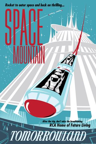
The career of illustrator Greg Maletic has seen him work as a designer for theme park industry. One of his concepts was this awesome Space Mountain design, on which he comments on his website: "Design-wise, I was on shaky ground: the style is Disneyland serigraph circa 1958, yet this ride didn’t open until 1975. Ultimately, I decided to live with the '50s/'70s contradiction."
11. Inspire/Create
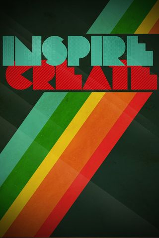
This vibrant retro poster by designer Chris Tarampi looks like it's stepped straight out of the '70s. The Pac-man-like block font and colour combination creates the aged style perfectly. Currently attending the Academy of Art University in San Francisco, Tarampi specialises in typography, graphic and visual design.
12. Reservoir Dogs
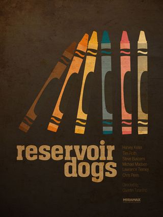
Many artists have reworked famous movie posters with their own interpretations. But one of the coolest we've seen is this retro-style Reservoir Dogs piece, by illustrator and designer Ibraheem Youssef. The inclusion of Crayola crayons to depict each character is not only genius but takes many of us on a nostalgia trip to childhood. Youssef creates a series of alternate Tarantino designs, which, when published, took his Flickr page views from 2,000 to 32,000 in a day!
13. Flow
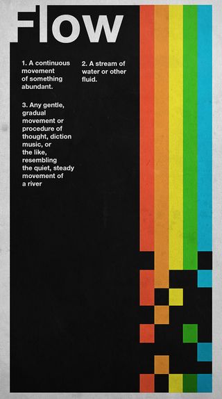
Inspired by James White's retro style, artist Leigh Hunt produced this cool Flow print. Commenting on his Flickr page, he says: "I was under influence of Helvetica, swiss design, ISO50 and James White when I created this." A fan of drawing from the past, Hunt's online portfolio features a series of retro-inspired poster design
14. Comrades of Steel

Vancouver-based artist Zachary Mallett specialises in 3D lighting and compositing. But his skillset also extends to design and illustration as is evident in this retro-style Comrades of Steel poster. Mallett's talent has attracted the attention of many big clients, including Nikelodeon, NBC, and Ford Motors.
15. Rock 77
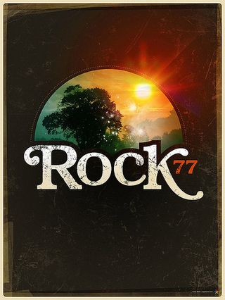
Another from James White, the concept for this beautiful poster came about after the artist created a t-shirt design to wear at a Queens of the Stone Age concert. White developed the initial design into this Rock 77 poster design, commenting online: "I had a good time working with the elements of this piece as it’s been a while since I’ve used some straight up photography in my work, especially natural elements."
Like this? Read these!
- Beautiful examples of spirit bottle labels
- Brain-scrambling examples of trompe l'oeil
- Giclee printing: a designer's guide
Have you seen any awesome examples of retro poster design? Let us know in the comments below...

Thank you for reading 5 articles this month* Join now for unlimited access
Enjoy your first month for just £1 / $1 / €1
*Read 5 free articles per month without a subscription

Join now for unlimited access
Try first month for just £1 / $1 / €1
The Creative Bloq team is made up of a group of design fans, and has changed and evolved since Creative Bloq began back in 2012. The current website team consists of eight full-time members of staff: Editor Georgia Coggan, Deputy Editor Rosie Hilder, Ecommerce Editor Beren Neale, Senior News Editor Daniel Piper, Editor, Digital Art and 3D Ian Dean, Tech Reviews Editor Erlingur Einarsson and Ecommerce Writer Beth Nicholls and Staff Writer Natalie Fear, as well as a roster of freelancers from around the world. The 3D World and ImagineFX magazine teams also pitch in, ensuring that content from 3D World and ImagineFX is represented on Creative Bloq.
