The designer's guide to modern poster design
In a predominantly digital world, the international poster scene is changing – but founding editor of Eye magazine Rick Poynor thinks the traditional poster can still pack a considerable punch.
At Notting Hill Gate tube station in 2010, building workers made a remarkable discovery. Sealed behind a brick wall, in a disused passageway, they found two entirely forgotten and surprisingly well-preserved displays of posters dating from the late 1950s.
There were hand-painted ads for Pepsodent toothpaste, the Royal Blue coach company and the Ideal Home Exhibition, as well as posters for the latest films, including a particularly arresting image with giant red and blue feet, for The Horse's Mouth starring Alec Guinness.
For more inspirational poster design, see our pick of the best and for a bit of fun take a look at the horror posters that look shockingly familiar.
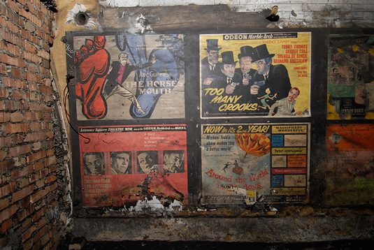
Photographs of this time capsule excited a buzz of enthusiasm and delight on the internet. None of the posters was a masterpiece, but as a set they were a wonderfully vivid reminder of a time when the culture of the poster in public spaces still flourished in Britain.
These colourful, lighthearted designs belonged to the long tradition of what was then called commercial art, although graphic design was becoming defined as a profession in those years. Rather poignantly, Transport for London decided to leave the posters in place, sealing them up again in the underground passageway for safe-keeping until a decision is one day made about what to do with them.
These colourful designs belonged to the long tradition of what was then called commercial art
Of course, there are still posters on the Underground, but only rarely today are they a source of much graphic interest. In the streets outside, the graphically integrated poster design long ago lost its position in the UK to the advertising hoarding where 'campaign' thinking dominates, photography is the first choice for imagery and typographic invention is rare. For anyone who loves the poster, the situation was already disheartening before innovations in digital communication made the static, flat, printed rectangle seem even more of a dodo.
A lost cause?
Michael Johnson of johnson banks laments the poster's public decline on his Thought for the Week blog. "The trouble is," he notes, "whilst a decade ago, we were designing poster sets for all manner of clients because that was a powerful way to communicate in classrooms, corridors or train stations... there seems to be much less interest now. Why spend 20 grand or more on a poster set (with its incumbent postage issues) when you can put the information on a website for half that?"
Get the Creative Bloq Newsletter
Daily design news, reviews, how-tos and more, as picked by the editors.
But the poster refuses to expire. Partly this is because many graphic designers want to keep it alive. There is no better expression of the spirit of graphic design and what it has been in the past than the poster, and equally there's no more concentrated and demanding challenge to the designer's raw ability to invent and manipulate graphic form.
The street poster might be a lost cause in Britain where designers adapted long ago to its diminished relevance. Tellingly, high-profile commissioners tend to call in fine artists these days when they need inspirational posters to promote, for instance, the Olympics. But in other countries where adequate regular provision is made to display posters, the medium still flourishes, though there can be no guarantees of permanent survival if communication priorities were to change.
There is no better expression of the spirit of graphic design than the poster
Of course, the best place to gauge the persistence of the poster has always been at the big international festivals of posters and graphic design. These include the Festival International de l'Affiche et du Graphisme held annually in Chaumont, France, the Warsaw International Poster Biennale, the Golden Bee in Moscow, and the International Biennial of Graphic Design in Brno in the Czech Republic.
The most sobering aspect of these events, if you are British, is that, time after time, they receive barely any submissions from the UK, confirming that being internationally recognised for poster design simply isn’t an ambition now for British designers and design agencies.
The major participating countries tend to be Japan, China, Poland, Germany and Russia, with strong showings from Iran, France, Switzerland and even the US. Most of these posters come from the cultural sector (theatres, art galleries, concerts and festivals) or from social campaigns and causes.

Conceptual latitude
The poster is the graphic medium that is closest to art and it is likely to struggle in any setting where marketing considerations take priority. To achieve the most striking graphic imagery, the designer needs to be free to interpret the material with a high degree of aesthetic and conceptual latitude. Prescribed systems of any kind, based on set typefaces and formats or sponsors' logos, are in the end almost invariably restrictive.
It would be worrying to be able to say that we can see dominant trends in poster design because this would suggest that posters were becoming formulaic and predictable. The posters exhibited at international festivals tend to be highly divergent in style, and this is the best indication of vitality and invention.
Nevertheless, many contemporary designers question the long-held conviction stemming from the poster's origins in advertising that a poster design should present a simplified message in an easily graspable graphic form for immediate consumption. Many posters now fracture and distort the content or present the viewer with a playfully complex field of elements to explore and decipher.
The poster is the graphic medium that is closest to art
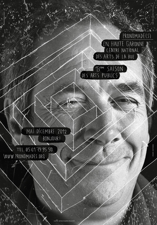
In France, there is a tradition of artful poster-making and regional arts centres often employ designers to create highly individualistic poster identities for their temporary seasons of concerts, performances and exhibitions. The design team Helmo - Thomas Couderc and Clément Vauchez - has a regular relationship with Pronomade(s) en Haute- Garonne, the national centre for the arts of the street, in the southwest of France. In 2011, Helmo designed a series of quirky posters with a circular viewing area onto which the studio collaged different kinds of imagery - photographs, cartoons, pie charts and engravings.
The visual theme in 2012 was a complete change of direction - a series of black-and-white photographs of faces seen through frameworks formed of spindly white line drawings of buildings, winding roads, or a stadium. In one of the strangest images in this charmingly eccentric series, a tiny, sketched figure is caught at the centre of a labyrinth over a genial-looking middle-aged man's winking eye. The handwritten lettering floats down the poster in a series of gently rounded black panels.
Beyond the sphere of subsidised civic culture, there are two areas where the poster is making a comeback and neither has much to do with the commercial concerns or marketing agendas of mainstream design.
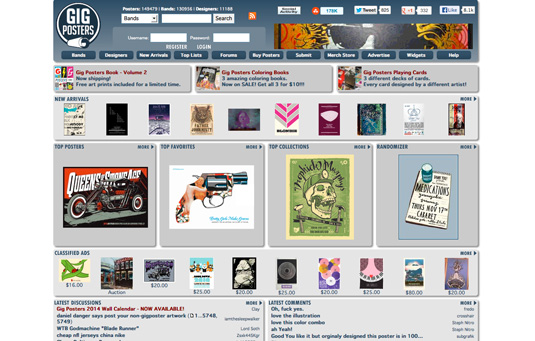
The first of these is the rock music gig poster, which is usually printed in silkscreen for maximum visual impact. The website GigPosters, a tremendous resource, has alphabetically organised contributions by hundreds of poster designers from the US and elsewhere, and shows how digital platforms can help to give a new lease of life to a seemingly moribund form of analogue communication. The phenomenon is most fully established in the US where poster designers or artists - either term seems equally valid - such as Art Chantry and Frank Kozik have long been cult figures.
The energy of this movement has spread to the UK. In July 2011, the Flood Gallery opened in Greenwich Market in London, selling posters by American designers such as Kii Arens, Rob Jones, Vahalla Studios, and Burlesque of North America. "The posters are special, collectable yet affordable, and are a gateway drug for music fans wishing to bring more art into their lives and on their walls at home,” states the gallery on its website. It’s an exciting space, dense with vibrant new images, and well worth a visit.
British poster designers have responded with initiatives of their own. Poster Roast and the Brighton Rock Artists Group are collectives of poster artists formed to make their creative activities more visible. The UK Poster Association aims to support and promote the work of UK poster artists such as Luke Drozd, Adam Pobiak and Jemma Treweek.
Since November 2012, it has maintained a permanent gallery at the Black Heart pub in Camden. "This time around, the poster is both advertisement and artifact, acting as a unique artistic interpretation of a band’s music and limited edition merchandise," says the UKPA’s mission statement. "Today's gig poster art has its own superstars, and artist collectives are springing up all over the world."
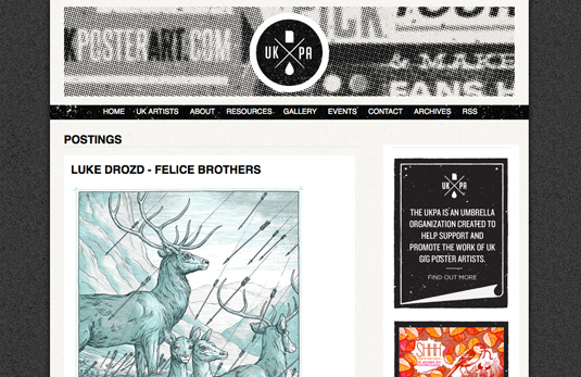
The appeal for this new wave of designer-illustrators, inspired by an earlier generation of 1960s and 1970s poster artists, is the creation of tangible, ownable, non-digital tokens of the music’s power: "A gig poster serves as a memento of a fan’s experience at a live gig in a way that cannot be downloaded or shared digitally," it adds.
Collectable yet affordable
The other area where the poster shows renewed signs of life is in the sphere of activism and protest, and in the expression of public concern about a gamut of issues that includes climate change, Palestine, child labour, women's rights, exploitation of migrant workers and nuclear power.
The Occupy movement provoked a flood of posters by designers infuriated by gross inequalities, the effects of the economic downturn on ordinary people and the urgent need for radical reform. R Black, already successful as an American rock poster artist, was a willing convert to the cause, as he explained: "Revolution, like art and artists, is full of passion; it's impulsive and crazy, it hates to obey the rules and wants to piss off the status quo." Many of the Occupy poster designs could be downloaded from specially set up websites for anyone to print out and use in demonstrations.
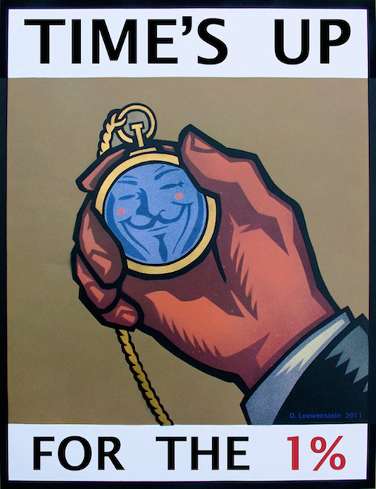
In a similar online development, the UK-based charity Green Thing, which claims to have reached more than 11 million people in 209 countries or territories, has been running a weekly series of posters, 'Do the Green Thing', intended to encourage an environmentally sound lifestyle. Contributing designers include the illustration duo Huntley Muir and Pentagram's Marina Willer, Angus Hyland, Domenic Lippa and Harry Pearce.
It's possible to buy the inexpensive posters, which tend to be highly direct in idea and execution, as the cause perhaps requires, and the proceeds go into funding the charity. Again, this shows how a symbiotic relationship between networked communication and local output on paper can work to give new relevance to a medium once thought to be passé.
Digital posters proliferate
It is highly unlikely that the paper poster is destined for any kind of large-scale public revival in Britain. In the London Underground, for so long one of the poster’s last strongholds, 'digital escalator panels' now colonise the spaces where framed posters used to hang.
These screens are often programmed in unison to display multiple copies of the same moving image so that an advertiser can monopolise the entire viewing area. This is a heavy-handed, advertising-led approach to communication and, so far, the DEPs have not offered opportunities for graphic invention: the visual aesthetic, like the content, is closer to TV commercials. In the near future, 'poster'-like advertising screens of this kind will no doubt proliferate in public places.
It's highly unlikely that the paper poster is destined for any kind of large-scale public revival in Britain
Meanwhile, local authorities take an increasingly hard line on fly-posting, which they see as an unsightly public nuisance rather than a healthy, alternative form of visual culture. With communal display space no longer accessible to many without breaking the law, the highly designed poster is becoming a private statement that people choose to make by displaying them on their walls like art works.
Some critics mourn the loss of the poster as an urgent message aimed at a mass audience and encountered by chance in the street. "When did posters become such wallflowers?" asks design writer Alice Twemlow on the Design Observer website. The true essence of the poster, she argues, is "the invisible but palpable contract between a designer, the commissioning institution, organization or company that funds a poster's distribution, and the viewing public who engages with it." Without this contract and reason to exist, the poster is drained of its full meaning and social power and becomes only a husk.
One way or another, the poster must live on
That may be so, but many designers still recognise the test of vision and skill posed by the poster and many viewers still love them. It would be a body blow to graphic design if the medium were to disappear entirely and a sign that the discipline was severely reduced. One way or another, the poster must live on.
Words: Rick Poynor
Rick Poynor is the founding editor of Eye magazine and a co-founder of Design Observer. He is a visiting professor in Critical Writing at the Royal College of Art, and his books include Obey the Giant: Life in the Image World and No More Rules: Graphic Design and Postmodernism, which was recently reissued.
Liked this? Read these!
- Inspiring examples of vintage posters
- Discover the best Olympic poster designs
- How to design a poster: pro tips
What are your thoughts on the power of the poster? Let us know in the comments!

Thank you for reading 5 articles this month* Join now for unlimited access
Enjoy your first month for just £1 / $1 / €1
*Read 5 free articles per month without a subscription

Join now for unlimited access
Try first month for just £1 / $1 / €1

The Creative Bloq team is made up of a group of design fans, and has changed and evolved since Creative Bloq began back in 2012. The current website team consists of eight full-time members of staff: Editor Georgia Coggan, Deputy Editor Rosie Hilder, Ecommerce Editor Beren Neale, Senior News Editor Daniel Piper, Editor, Digital Art and 3D Ian Dean, Tech Reviews Editor Erlingur Einarsson, Ecommerce Writer Beth Nicholls and Staff Writer Natalie Fear, as well as a roster of freelancers from around the world. The ImagineFX magazine team also pitch in, ensuring that content from leading digital art publication ImagineFX is represented on Creative Bloq.
