32 impactful poster designs
Classic and contemporary posters, from film and art, to sports and politics.

Poster design has been a powerful tool to engage and inform audiences for centuries, whether it's a poignant campaign, inspirational design or playful film promo. With simple art often creating iconic imagery, poster design continues to be relevant even in today's digital age.
It first took off in the 1870s as a means of communication for advertising and promotion, predominantly black and white. The introduction of Jules Cheret's three-stone lithographic printing process in around 1880 led to the development of striking, colourful designs, birthing the vibrant era of poster design we know today.
Here, we've compiled a selection of our favourite posters, from classic designs to contemporary genre-bending creations. Film buffs should also check out our collection of the best film posters, and if you're looking to create your own designs, take a look at our picks for the best laptops for graphic design and the best graphic design software.
Contemporary poster designs
We'll start with some inspiring modern poster designs. If you're more interested in delving into the archive further back, skip to the best classic poster designs.
01. The Guardian

Created by BBH in 2016 for the Guardian, this campaign focuses on the fact that the paper asks questions that others can’t, in contrast to many other major news outlets that are owned by shareholders who can influence content.
“The Guardian’s campaign celebrating their independence features a series of provocative lines, written in the iconic and instantly recognisable Guardian Egyptian Bold font,” says Ciara Stonley, a creative at agency syn. . “It is heavily graphic, resulting in a completely clear and unapologetic message; in my opinion, everything that makes up the perfect printed ad.”
02. UK Election 2024

This naughty series of posters created by Saatchi and Saatchi aimed to encourage young people to register and vote in the general election last year. It’s based on research commissioned for the campaign, which found that 40% of 18-24 year-olds think people who vote regularly are more attractive.
“The headline is prominently and unapologetically used across the top and bottom of each poster, and uses a series of differently executed Xs across the campaign to reflect an X in a voting form,” says Ciara. “It is provocative and bold, resulting in a confident and effective campaign capturing the attention of young voters.”
03. London 2012

This abstract design for London 2012 uses the recognisable Olympic rings made to look like marks from cups of tea – a nod to the host country's favourite tipple – without losing their role as a symbol of unity and inclusivity.
Get the Creative Bloq Newsletter
Daily design news, reviews, how-tos and more, as picked by the editors.
Several of Britain’s best-known artist, including Tracey Emin, Bridget Riley, Chris Ofili and Howard Hodgkin, were invited to propose designs for the official poster, with the final poster created by Rachel Whiteread.
04. MSI Reproductive Choices

In response to last year's vote by MPs on the amendment to the Criminal Justice Bill of women in England and Wales no longer facing criminal investigation for ending their own pregnancy, global sexual and reproductive health provider MSI Reproductive Choices partnered with Uncommon Creative Studio to create this striking poster. Illustrated by Noma Bar, the image depicts a woman behind bars, in the shape of the female reproductive system.
The text reads: "In many countries around the world, women can face prosecution for having an abortion. UK Parliament has the opportunity to change that in England and Wales. Join our fight for global reproductive choice. Choice Choice." It ran across online, social and press, including The Guardian and The Times in 2024.
05. Back to the Future

It can be hard to find new angles for something that's already been the subject of tons of posters, but DKNG found one with their Back to the Future poster for Mondo. The poster focuses on the DeLorean time machine like many that came before it, but it zooms in closer on the detail through the gull-wing doors and throws in a few easter eggs. The neon 80’s colour palette sets the perfect mood.
06. Go Vote

Posters usually aim to get attention, and this poster certainly achieves that. Based on Barack Obama's phrase "Don't boo, vote", it promoted voting in the 2016 US elections with a simple minimalist concept that the eye can't ignore. The poster was designed by San Francisco-based graphic designer and illustrator Viet Huynh
07. Lost & Found by Alva Skog

Swedish illustrator Alva Skog created this vibrant poster for a commission by Lost & Found market – a big vintage market in Barcelona. Skog was asked to create images of a man and a woman drinking Estrella beer and wearing something they had bought at the market. Her response was to draw the characters so you can't tell which is the man and which is the woman.
The bright block colours are deliberately chosen because Skog feels that colours can feel gendered. "I try to find a balance between the pinks, blues and greens in my work," she told Computer Arts.
The message lies in the detail, says Skog. "The addition of painted nails and a ring on one character, as well as earrings and what could be interpreted as a more feminine-looking top on the other, make it difficult to distinguish whether either whether either is male or female."
08. Typografische Monatsblätter by Fatih Hardal

Fatih Hardal is a graphic and type designer who is inspired by Swiss designers and designs from the past. This selection of posters includes work created for the Typografische Monatsblätter (a journal that celebrates Swiss typography), plus typographic experiments printed on transparent paper using silkscreen.
09. Sometimes Always

Sometimes Always, a graphic design studio based between São Paulo and Berlin, recently unveiled a striking series of posters for São Paulo fashion boutique Cotton Project’s AW 2019 collection, named Contra. Studio founder Gabriel Finotti says the collection "explores the counterculture spirit behind the rise of surfing and rock climbing" – sports that he states have "questioned a conservative and consumerist society" through participating in more "libertarian and hedonistic lifestyle" pursuits since the 1950s. The images use only black and white, with a typographic focus alongside imagery shot by Brazilian photographer and director Hick Duarte.
Gabriel adds that the aesthetic draws on a "magical moment" in the history of the sports: "a golden age" defined by neither money nor social status but "driven by a group of young people living on the edge of society, questioning morals and venturing into the unknown."
10. Annik Troxler for Jazz Festival Willisau
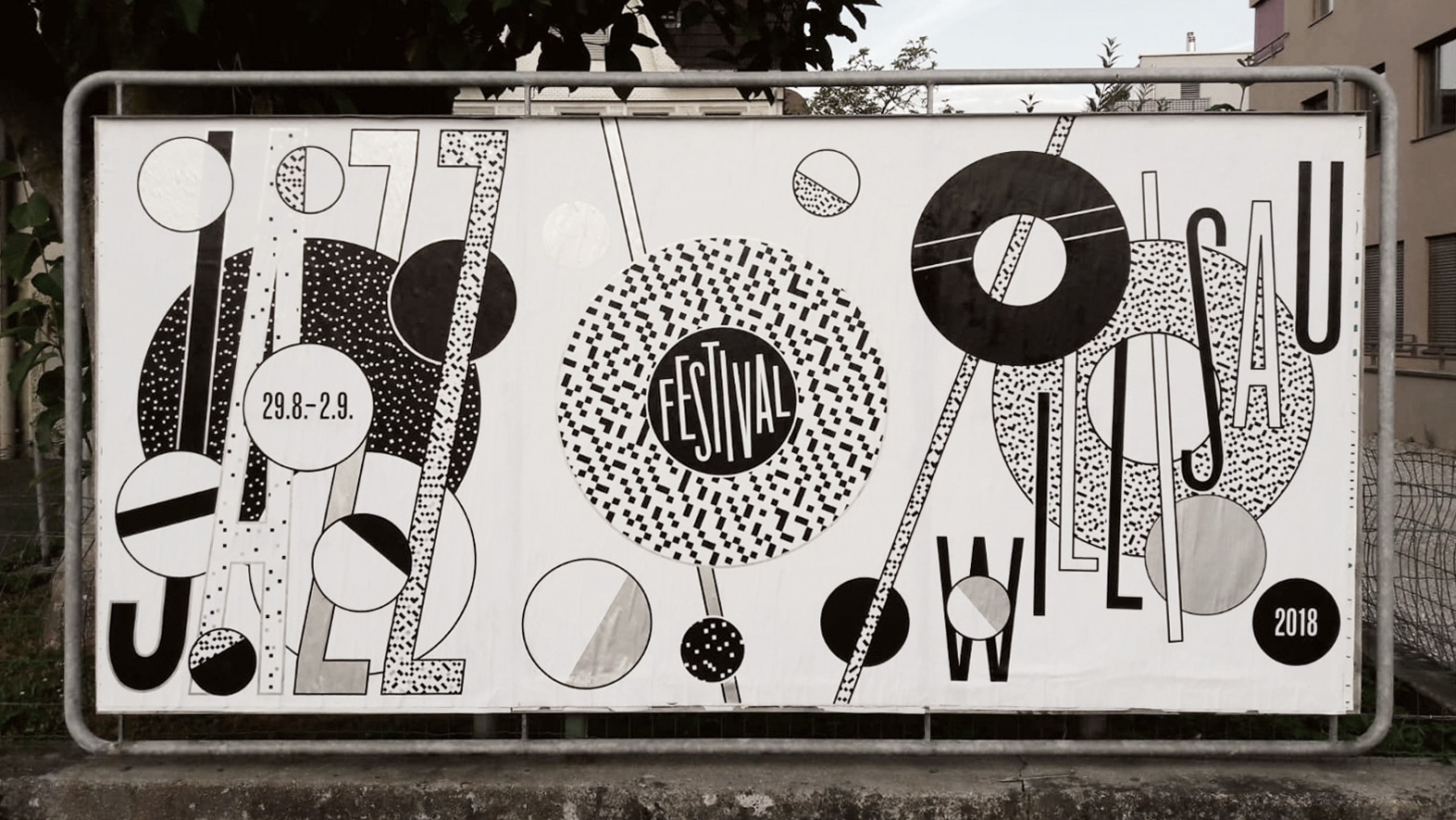
Swiss designer Annik Troxler created the visual identity for the 2018 Jazz Festival Willisau, and her poster designs combine playfulness with a strict coherence and attention to functionality.
In developing her design vocabulary for this project, Troxler referred to the systems of rhythms and forms in music, creating shapes and typographic elements. Troxler’s intention was to make movement ‘visible’ by using a simple device: circle elements rotating with and against each other on different layers of the surface.
The design identity began with an accident. “As I zoomed in on an area a ‘pixel pattern’ appeared. I immediately knew that I wanted to make something out of it using varying densities, brightnesses and typography,“ explains Troxler.
Annik Troxler’s works are usually vibrant and colourful, but for this identity, she chose black and white with silver accents. “I think the shapes and patterns have more impact in black and white – but when I added silver to the silkscreen, it gave the image the elegance of reflective light.”
11. Noise x GIF Fest identity
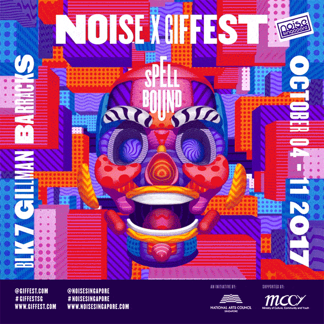
Noise x GIF Fest is Singapore’s biggest GIF festival. When it came to crafting the event’s loud identity, local studio BÜRO UFHO realised the design would need to work as both a static piece of print as well as an animation. “It was pretty much set from the start that the poster would have to be an animated GIF,” laughs BÜRO UFHO creative director Jun T.
The team created 13 different logo variations, which, when played as a sequence, create an illusion of movement. Meanwhile, textures move across the event’s poster to produce a sense of depth and animation. “We also constructed the face in 3D,” adds Jun T, “resulting in a looping GIF poster that’s in line with the theme and concept.”
12. The Evil Dead

Illustrator Olly Moss is well known for his clever, minimalistic poster designs. As well as this officially licensed screenprinted poster for a 2010 screening of The Evil Dead, he’s also created posters for the Harry Potter posters, The Jungle Book, Star Wars Trilogy and more.
13. It Follows
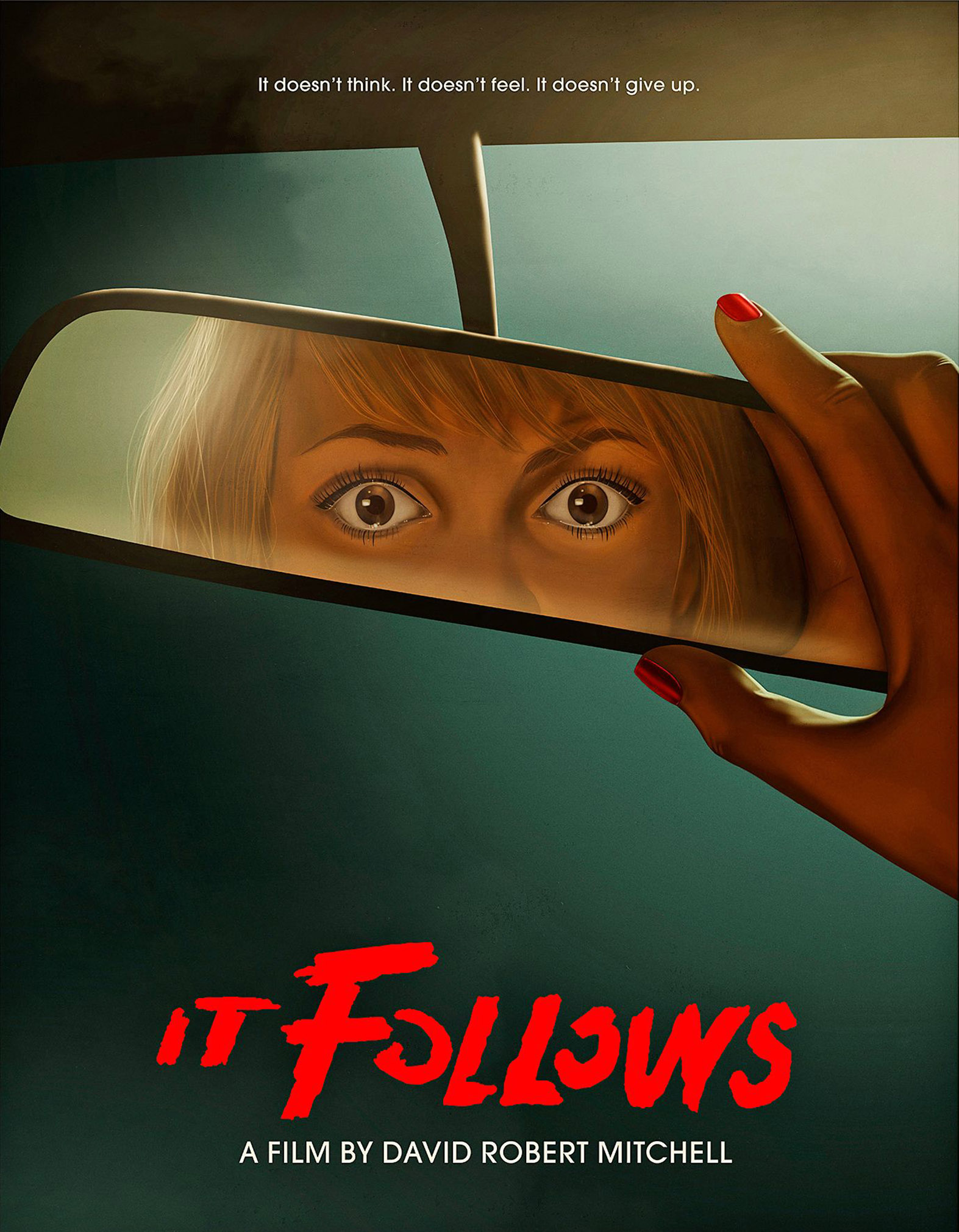
Everyone knows that making a character stare directly out of a movie poster is a sure-fire way to grab the attention of passers-by. Brilliantly illustrated by Akiko Stehrenberger, this poster for 2014 horror hit It Follows ramps up the intensity by framing the figure's eyes in the reflection of a car windscreen mirror. Stehrenberger has crafted posters for a huge range of indie and commercial releases, and it's easy to see why he's in such demand.
14. The Lobster
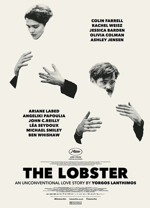
Who couldn't stop and stare at this one? An unconventional poster design for an unconventional film, artist Vasilis Marmatakis has captured the characters embracing empty silhouettes of each other. Marmatakis has also crafted the titles for Dogtooth as well as working on a range of other movie posters.
15. Vintage Heroes
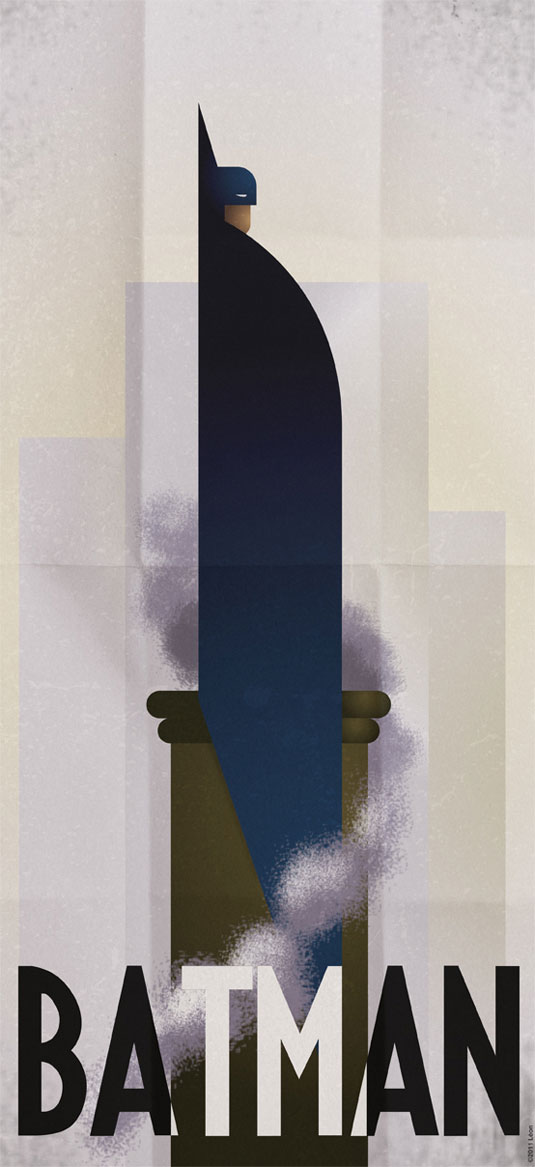
Comic book lover and avid gamer Grégoire Guillemin often creates superhero inspired designs and these minimalist vintage posters have hit the right spot when it comes to inspirational graphic design.
The likes of Batman, the Green Hornet and the Silver Surfer are all included in the retro re-imaginings. The gorgeous typography teamed with the brilliantly sketched superhero illustrations have had us falling head over heels for the series.
16. Barack Obama 'Hope' poster

With his roots in the skateboarding scene, South Carolina-born graphic designer and illustrator Shepard Fairey built a name for himself with his 'Andre the Giant' guerrilla sticker campaigns – but it was his involvement in the 2008 US Presidential election that really catapulted him towards global recognition.
Fairey's now-iconic Barack Obama 'Hope' poster, featuring a four-colour portrait of the then-Senator in red, beige, light and dark blue, also came in 'Change' and 'Progress' versions, and was created in a day. Having started life as a screen-printed poster (which sold out almost immediately), the design spread virally across the United States and the rest of the world as a symbol of what American politics could become.
The revelation the following year that Fairey had based the design on a photograph by Associated Press photographer Mannie Garcia without permission – and later admitted to destroying evidence in the ensuing legal battle with AP – led to community service and a hefty fine. Amongst designers, it's now as much a symbol of copyright infringement as it is a piece of political iconography. But whatever the circumstances of its creation, its influence during the election campaign was enormous.
17. This is Pacifica for Surf City Festival

Make Waves is a series of three-dimensional posters on silk paper with fibreglass coating (shown close up in the article's hero image), created by communication agency This is Pacifica for the international Surf City Festival held in Barcelona.
The process of creating the posters was similar to that of building a surfboard. “To shape the posters, a professional surfboard shaper was invited to create a series of structured casts that allowed him to shape each poster with different waveforms and volumes, transforming a graphic piece that is usually flat into a poster with three-dimensional waves,” explains This is Pacifica creative director Pedro Serrão.
Overall, he describes the collection as “a formal piece of design and the spirit of surf together in a singular and human representation of the sea.”
Classic poster designs
18. Jaws

This is arguably the most iconic film poster of all time. A great white shark rises from the deep, ready to attack its unwitting victim. Designed by Roger Kastel for the 1975 film Jaws, the strength here is in the simplicity of the design that still retains the tension of the moment to create an inspired example of visual marketing. Details such as the rows of jagged teeth give it a visceral, unnerving quality, that manages to trigger thalassophobia (the fear of large bodies of water) in viewers an swimmers alike.
19. The Lure of the Underground
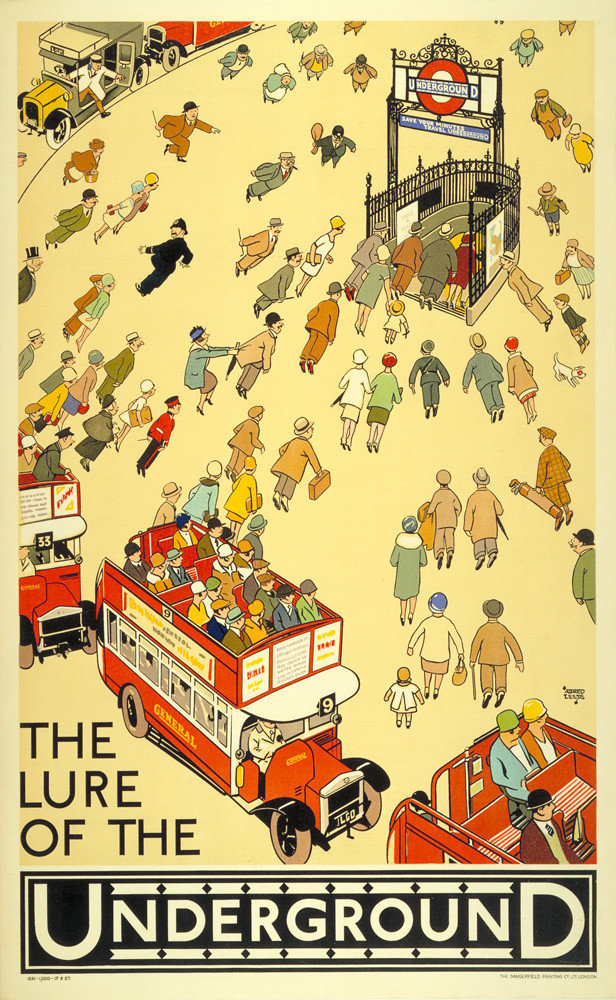
The iconic branding of the London Underground began early in the 20th century when, with dwindling passenger numbers and a shaky public view of the dirty subterranean rail system, Frank Pick saw a need to step up the self-promotion of the tube. Pick totally overhauled the way the Underground marketed itself, even holding public exhibitions of the art produced for Underground advertisement. The result has been that tube posters offer a wonderful reflection of the changing face of graphic design and emerging artistic styles over the last century.
The Lure of the Underground was created by comic strip illustrator Alfred Leete in 1927. We love this example for the individual characters and 1920s styling.
20. 1923 Bauhaus Exhibition in Weimar
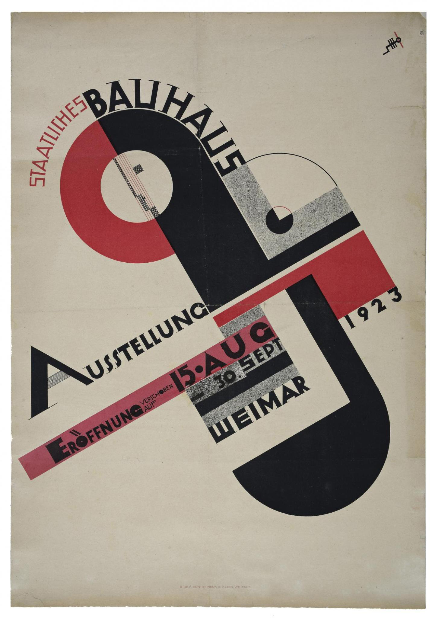
Joost Schmidt’s now iconic poster for the 1923 Bauhaus Exhibition shows a cross comprised of circles and squares, and includes the Bauhaus logo designed by Oskar Schlemmer.
Produced for a competition, the poster had to incorporate the logo, exhibition information, venue details and the date. Schmidt was one of the pioneers of Bauhaus typography, and the original version of this poster was placed in 120 railway stations in Germany.
21. Mass Non-Violent Direct Action
November 17 2011 was an international day of action organised two months after the first Occupy Wall Street demonstration. R. Black’s poster for the event includes a single protester coming forward from the massed ranks – a callback to the Chinese man who blocked the path of a tank in Tiananmen Square in 1989.
“Like many effective protest posters, R. Black’s blocky, constructivist design for Occupy has the stridency and urgency of a brick lobbed through a window,” says Rick Poynor. This memorable poster is all over the internet and, as with many images of this kind, it is far more likely that it was viewed on a laptop or tablet than encountered as a print.”
22. Metropolis
German graphic artist and painter Heinz Schulz-Neudamm designed this art-deco poster for the premiere of Fritz Lang's groundbreaking 1927 sci-fi film Metropolis. Only four known surviving copies of the poster exist, one of which took the record for being the most expensive ever sold, after reaching a record price of £398,000 in London in 2005.
23. Lord Kitchener Wants You
This hugely influential 1914 advertisement by Alfred Leete – often referred to as 'Britons Wants You' – became an icon of the enlistment frenzy in Britain during WWI. The poster features Lord Kitchener, the British secretary of state for war, above the words “wants you”, and set the tone for hundreds of copycat posters the world over.
24. Le Chat Noir
Perhaps one of the most well known posters of all time, this iconic advertisement for the Parisian entertainment establishment, Le Chat Noir, was created by Swiss-born French Art Nouveau painter and printmaker, Théophile Steinlen.
It epitimises the Bohemian, Art Nouveau style and Cabaret culture of late nineteenth century Paris that stemmed from the legendary venue, which, in its heyday, served as an artist salon, music hall and busy nightclub.
25. We Can Do It!

Perhaps one of the most iconic images of the 20th Century, American graphic designer, J. Howard Miller's beloved Rosie the Riveter was designed to boost morale in during WW2. This poster is still used today and re-modelled on everything from modern feminist texts to tattoos as well as spawning numerous parodies. His bold, modern illustrative style, mirrors the comic books popular at the time and defined an era of advertising.
26. Moulin Rouge
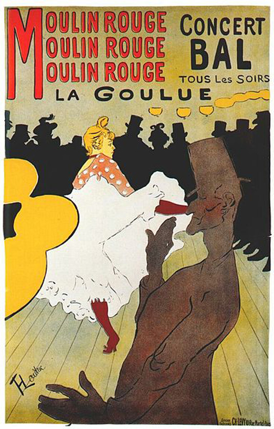
This poster design for the Moulin Rouge is another by French artist Henri Toulouse-Lautrec. When the cabaret opened, Lautrec was commissioned to create a series of posters, with this design being one of his most well known. The piece features images of Moulin Rouge dancer La Goulue and her partner Valentin le Desosse. Lautrec captured La Goulue's provocative kicks and Valentin's lanky frame perfectly in this design.
27. Harper's

It's impossible to talk about American poster design without mentioning graphic artist Edward Penfield. Often referred to as a master of graphic design, it was during a school exhibition that Penfield's work was first noticed by the art editor of Harper's Magazine, the company that he went go on to create no less than 75 poster designs for.
28. Berlin 1936 Olympic Games
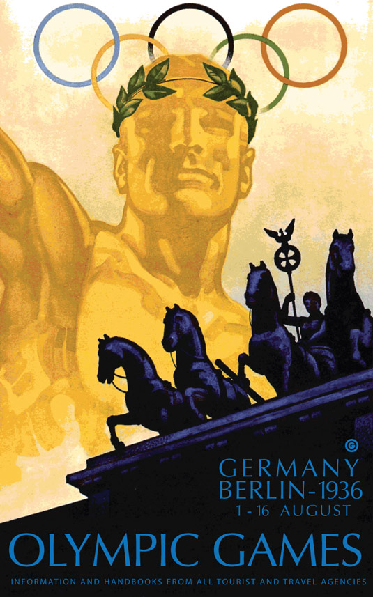
The 1936 Games was dominated by propaganda, as Hitler grasped the opportunity to promote the Nazi line of Aryan racial superiority. Thankfully, the black athlete Jesse Owens won four gold medals and made Hitler look pretty stupid. We can't deny, however, that the poster designed by Franz Würbel was brilliant, showcasing one of Berlin's most iconic landmarks. It made the Führer happy it seems, after 44 of Germany's finest artists had failed.
29. Absinthe Robette
In the late 19th Century, the popularity of Absinthe coincided with the increase of large lithographic advertising posters as a commercial and artistic medium. Some of the greatest artists of that period created posters for the alcoholic beverage, including Belgian posterist Henri Privat-Livemont, who illustrated this iconic Art Nouveau Absinthe Robette image in 1895.
30. Monaco 75
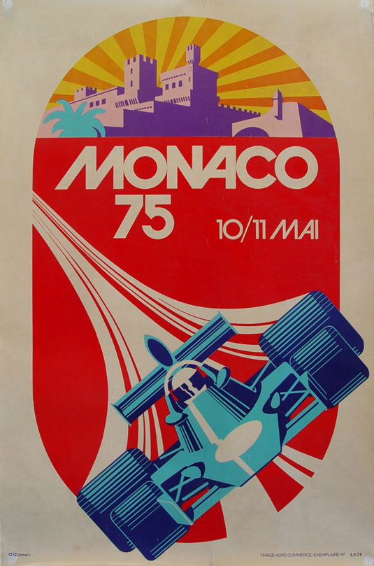
This striking design for the 1975 Monaco Grand Prix was created by talented artist Michael Turner. With minimal type, Turner let his illustration do all the talking, using a vibrant and eye-catching colour palette, the car takes centre stage with the beautiful destination of Monaco in the background.
31. Die Gute Form

The Swiss graphic designer Armin Hofmann was one of the leading figures in the International Typographic Style, also known as the Swiss style, which emerged as the dominant style in poster design after World War II. The use of bold sans serif typefaces and monochrome in this poster is typical of the movement's philosophy of creating striking but clear communication in what was becoming a globalised world.
32. The original Star Wars poster

This Tom Jung poster for the original Star Wars film is another classic movie poster. It's not his best known (see our pick of the best Star Wars posters) but we think it was the most original and evocative design. The asymmetric composition is unsual for a movie poster, arresting our attention, and the illustration encapsulates George Lucas's intention of combining sci-fi, fantasy and adventure. The beefy Luke Skywalker and Princess Leah look like they've walked out of a swords and sorcery flick. Conan the Barbarian anyone?

Thank you for reading 5 articles this month* Join now for unlimited access
Enjoy your first month for just £1 / $1 / €1
*Read 5 free articles per month without a subscription
Join now for unlimited access
Try first month for just £1 / $1 / €1

Rosie Hilder is Creative Bloq's Deputy Editor. After beginning her career in journalism in Argentina – where she worked as Deputy Editor of Time Out Buenos Aires – she moved back to the UK and joined Future Plc in 2016. Since then, she's worked as Operations Editor on magazines including Computer Arts, 3D World and Paint & Draw and Mac|Life. In 2018, she joined Creative Bloq, where she now assists with the daily management of the site, including growing the site's reach, getting involved in events, such as judging the Brand Impact Awards, and helping make sure our content serves the reader as best it can.
You must confirm your public display name before commenting
Please logout and then login again, you will then be prompted to enter your display name.