5 outdoor posters guaranteed to grab attention
Outdoor posters have never been more creative. Check out these brilliant ideas for catching the eye of passers-by.
The buzz in the advertising industry might all be about digital, but physical forms of print advertising, including outdoor posters, continue to be a very effective way to get a message across. Of course, the competition for eyeballs has never been as intense, so today's agencies have to come up with ever-more innovative ways of capturing the public's attention. And these examples do exactly that.
- Read all our poster articles here
01. British Gas
Traditionally used in novelty postcards, the opportunities that lenticular printing offer grab the public's attention are endless - and this current campaign for British Gas grabs the bull by the horns.
Developed and produced by lenticular specialists Hive Associates in conjunction with Posterscope, the poster interlaces two images together, flipping between each other as passers-by view it from different angles.


This cleverly demonstrates to how energy is being used in the home, as the image of an ordinary toaster is transformed into a blue wireframe mesh, revealing the energy travelling through the electrical appliance.
"The use of new lenticular printing technology has allowed us to develop a creative campaign which reinforces the transparency of cost and energy usage that smart meters can deliver," said Chris Hicks, senior project manager for Posterscope. "It's a great example of how using sophisticated printing technology can push the boundaries of Out-Of-Home, allowing us to execute creative ideas in exciting ways.”
- Read our interview with Glen Wilson of Posterscope here
02. IBM

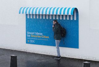
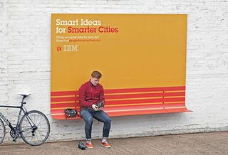
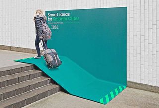
French advertising agency Ogilvy France went the extra mile in this campaign for tech giant IBM. Not only do these outdoor posters grab attention with eye-catching, colourful statements, they also provide a second, practical use.

Created as part of IBM's 'People for Smarter Cities' ethos, they double as a shelter, a seat and a ramp. Adding something as simple as a curve really gives these one-off posters a practical and inventive edge.
Get the Creative Bloq Newsletter
Daily design news, reviews, how-tos and more, as picked by the editors.

03. Adobe Photoshop
To promote its recent Creative Day, Adobe set up this prank at a bus shelter. Hiding in a van across the road, a crack team secretly took photos of members of the public before handing them to Photoshop artist Erik Johansson to work his magic - then the resulting pictures appeared on a special ad panel in the bus shelter.
The images placed complete strangers sharing a kiss on a wedding cake, in movie-style posters and more.
04. Anar Foundation
Here's a really clever use of lenticular printing - to create an anti-child abuse poster that can only be seen by children.
Spanish charity The Anar Foundation developed the poster campaign to give children confidence to call a helpline even if they are with their abuser. When the child sees it, they see the message 'If somebody hurts you, phone us and we'll help you,' while an adult simply sees an image of a frightened child.
05. VIP Mobile: Eco Bus Shelters

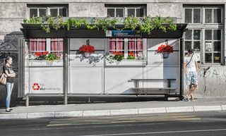
As a part of an environmental campaign for VIP Mobile, Leo Burnett transformed bus shelters in the Serbian capital, Belgrade, turning the front of grey, messy buildings into beautiful, green facades. Making the point that the polluted capital could be transformed into something beautiful with the right environmental policies, the campaign was led by creative director Anja Radulović.
Like this? Read these!
- Illustrator tutorials: amazing ideas to try today!
- Great examples of doodle art
- Brilliant Wordpress tutorial selection
Have you spotted an innovative approach to outdoor posters? Let us know in the comments box below!

Thank you for reading 5 articles this month* Join now for unlimited access
Enjoy your first month for just £1 / $1 / €1
*Read 5 free articles per month without a subscription

Join now for unlimited access
Try first month for just £1 / $1 / €1
The Creative Bloq team is made up of a group of design fans, and has changed and evolved since Creative Bloq began back in 2012. The current website team consists of eight full-time members of staff: Editor Georgia Coggan, Deputy Editor Rosie Hilder, Ecommerce Editor Beren Neale, Senior News Editor Daniel Piper, Editor, Digital Art and 3D Ian Dean, Tech Reviews Editor Erlingur Einarsson, Ecommerce Writer Beth Nicholls and Staff Writer Natalie Fear, as well as a roster of freelancers from around the world. The ImagineFX magazine team also pitch in, ensuring that content from leading digital art publication ImagineFX is represented on Creative Bloq.
