How to create retro B-movie poster art
Tyler Stout's step-by-step tutorial shows how he creates his bespoke movie poster art.

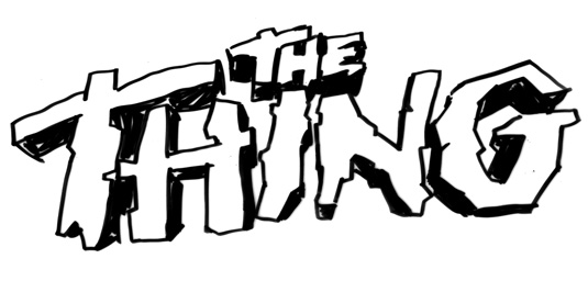
Much of my living comes from doing posters – some commemorative – and recently I was commissioned by the Alamo Drafthouse Theatre in Austin, Texas to design a promotional poster for a screening of John Carpenter's The Thing. These posters are screen printed, often measure 24x36in, and have a print run of 200-300.
Being a huge John Carpenter fan, and of the opinion that The Thing is one of the best movies of all time, I was more than happy to oblige. The main trick is doing a poster that can hold its own against the Drew Struzan original.

I decided that since that poster was a little on the mysterious and minimalist side, I would shoot for the opposite end of the spectrum, showing the entire cast, as well as the environment they were in, and the alien Thing creature itself.
I rewatched the movie a few times just to saturate my mind with its vibe, then researched promotional materials and alternate posters that had been used to promote it back when it was released. I began by drawing the Kurt Russell character, since I knew he would be the focus. I then drew all the secondary characters, as well as the dog and environmental elements.
Usually, the way I work is less than traditional for an artist. While I start out drawing thumbnails and rough sketches for character design and layout, I draw each character separately in my final process to allow for freedom of movement, composition-wise. So a lot of what I draw is never seen, like the bottom halves of each character, since the characters in front overlap. It would save time to just draw it all as one piece, but years of client feedback, saying 'Move this, get rid of that, make that bigger' has made me paranoid. So this is a looser way of working.
The client requirements for this poster included having the name of the movie prominent, as well as the date of the screening and the name of the venue. The rest was up to me...
Gathering reference

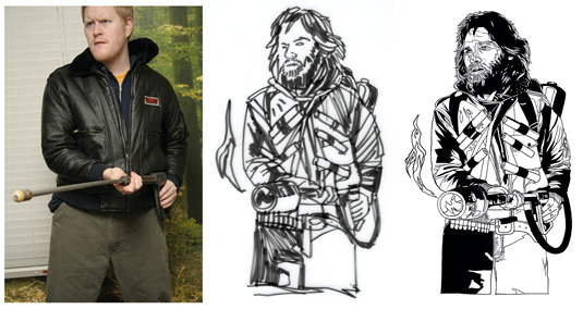
One important part of what I do is to draw realistic representations of movie figures. For this poster, I had to create a drawing of Kurt Russell holding a flamethrower, standing in a hero pose.
If the figure is complex enough, in this case wearing a detailed jacket and holding a detailed weapon, I feel a photo reference would be beneficial, so I take one of myself.
Rough sketching

Next, I do some rough sketches just to make sure that pose is going to be to my liking in the final piece. I mostly do this on vellum with Magic Markers, as it's easy to scan and easy to make changes on. Once I've tweaked the pose to my liking, I begin drawing the final piece, usually digitally to save time.
Next page: preparing for printing and real-life references...

Thank you for reading 5 articles this month* Join now for unlimited access
Enjoy your first month for just £1 / $1 / €1
*Read 5 free articles per month without a subscription

Join now for unlimited access
Try first month for just £1 / $1 / €1
Get the Creative Bloq Newsletter
Daily design news, reviews, how-tos and more, as picked by the editors.

The Creative Bloq team is made up of a group of art and design enthusiasts, and has changed and evolved since Creative Bloq began back in 2012. The current website team consists of eight full-time members of staff: Editor Georgia Coggan, Deputy Editor Rosie Hilder, Ecommerce Editor Beren Neale, Senior News Editor Daniel Piper, Editor, Digital Art and 3D Ian Dean, Tech Reviews Editor Erlingur Einarsson, Ecommerce Writer Beth Nicholls and Staff Writer Natalie Fear, as well as a roster of freelancers from around the world. The ImagineFX magazine team also pitch in, ensuring that content from leading digital art publication ImagineFX is represented on Creative Bloq.
