Clever posters subvert Asian stereotypes
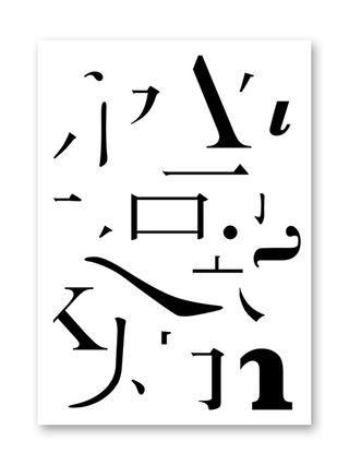
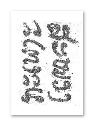
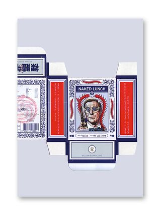
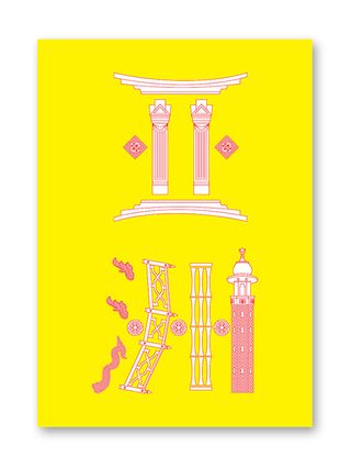
This series of graphic posters created for Kult magazine turns the tables on lazy stereotypes and looks deeper into the cultural norms of Asia.
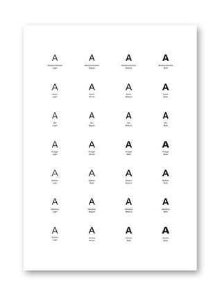
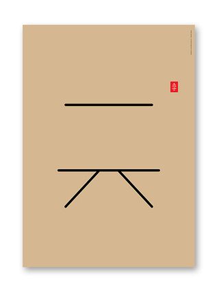
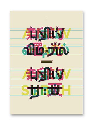
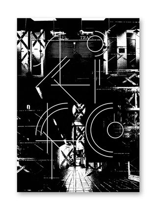
If you're looking to design a poster then this new series from Kult magazine will provide a blast of offbeat inspiration. Using everything from minimalism to realism, photography to typography, this diverse series of posters attempts to get beyond stereotypes and go deeper into what really makes Asian culture tick.
Under the title 'Asian Subconcious', the series features designs from a range of artists ranging from emerging to established talents, with contributors including Foreign Policy Design, Mojoko, Anonymous, Jonathan Yuen and Djohan Johari.
"Drawing influences from Asian architecture, typography, packaging and food, the artists expressed undercurrents of contemporary Asian culture in their designs," the magazine explains. We love the high level of originality and imagination that have gone into these posters, making for an impressive series that speaks with a wide and eloquent design vocabulary.
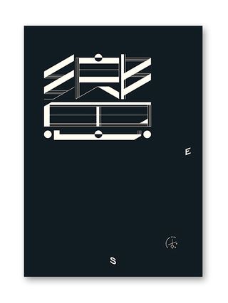
You can purchase these posters on the Kult website.
What do you make of these posters? Let us know in the comments box below!

Thank you for reading 5 articles this month* Join now for unlimited access
Enjoy your first month for just £1 / $1 / €1
*Read 5 free articles per month without a subscription

Join now for unlimited access
Try first month for just £1 / $1 / €1
Get the Creative Bloq Newsletter
Daily design news, reviews, how-tos and more, as picked by the editors.
Sammy Maine was a founding member of the Creative Bloq team way back in the early 2010s, working as a Commissioning Editor. Her interests cover graphic design in music and film, illustration and animation. Since departing, Sammy has written for The Guardian, VICE, The Independent & Metro, and currently co-edits the quarterly music journal Gold Flake Paint.
