Use video to add personality to your portfolio
Get more clients and attention by adding video to your portfolio homepage. Wes McDowell of the The Deeply Graphic DesignCast podcast explains how.
Words: Wes McDowell
Want to make your portfolio website work harder and attract more clients? Then consider this. You aren't just a designer, you are a real, live person - and your personality can go a long way toward helping you reach your goals.
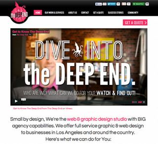
My website recently underwent a site-wide refresh, and I knew I wanted to infuse a bit of my own personality into it. My secret weapon? A compelling homepage video. It worked for me, and it can work for you too. In this article I'll explain how and why.
Why include video on your site?

We are no longer living in the age of faceless corporations. The '80s are over, and Gordon Gekko has seen better days. It’s 2013, and now, more than ever, people want to do business with people. It’s the reason why we buy handmade goods from Etsy, and it's why multi-billion dollar companies have whole teams dedicated to their social media campaigns. They want to seem more human.
Direct your visitors toward the areas of your site you'd like them to hit
Including a welcoming homepage video makes you real. It makes you human. It allows you to reach out and personally thank each potential client for stopping by your site. Even better, it allows you to take control a bit, and actually direct your site's visitors toward the areas of your site you would like for them to hit. What a great opportunity!
I've had lots of great responses from my video, and it’s nice to know that there is a virtual version of me right on my homepage, ready to greet my new potential clients 24 hours a day.
What should you say in your video?

Above all else, you should adopt a welcoming vibe, and make it clear that you are genuinely happy that your visitor decided to visit your site. Explain a little about yourself; what you do, and more to the point, what you can do for your visitor.
Get the Creative Bloq Newsletter
Daily design news, reviews, how-tos and more, as picked by the editors.
But here's the tricky part: don't sell. The purpose of the video is to pique interest, and make your visitors feel welcome, not to function as a sales pitch. So when you talk about what you can do for your visitor, make it friendly, and helpful.
Here's the tricky part: don't sell. The purpose of the video is to pique interest
Ideally, you'd close the video with an invitation for your visitor to check out a certain section of your site - most likely the section where they can check out some of your best work. It’s important to give some kind of direction to your visitors so that they know what to do next. In other words, don't make them think.
What you'll need

Shooting homepage videos doesn't have to be hard or expensive. Chances are you already have everything you need to do a pretty decent job. Here's what you will need:
01. A camera
Cameras come very cheap and very expensive. You don't necessarily even need a dedicated video camera. Most digital cameras on the market today have built-in video capability, and I have even heard that the iPhone takes pretty good video.
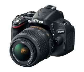
I bought a Nikon D5100 for around $600 because I had a lot of requirements of the camera I was going to buy, and I knew I would be shooting a lot of video on it over the next few years. I also had a very specific vision of what I wanted my video to look like, and this one best fit my requirements for the money.
02. A plan
Do you think you need a script, or would you be more comfortable just winging it? Speaking from experience, I would recommend memorizing certain talking points, and hitting them without sticking to a script. It seems more natural, and under no circumstances do you want to appear stiff or like you are reading something off of cue cards. The whole point here is to connect, and to simulate talking directly to your site's visitors, not talking at them.
03. A microphone
Most cameras you would consider using already have a mic built into them. You can choose to use it or something with better sound quality. It just depends on how much time, effort and expense you want to put into the video. Truth be told, most visitors probably won't notice if your sound isn't perfect, but having better sound is likely to make a better impression.
04. A lighting source
As an ex-photographer, I have always recommended natural lighting. Mine is done facing a window and I think it came out very well. Studio lights are expensive as hell, and you don't need them.
05. A background
The best looking videos generally have a bit of depth to them, yet most people end up shooting against a wall. You can achieve some pretty cool backgrounds in unexpected places so experiment a bit. And if your camera allows for a shallower depth of field (you in sharp focus, your background blurry,) then go for that. I chose to have my workspace in the background, as I thought that was the most appropriate setting.
06. Hosting
Where will your video 'live' on the web? I don't recommend hosting it on your own site. Streaming video can lag if it’s not on a server built for video output. Most people go with YouTube, which is free, and in most cases works just fine. I happen to like the look of the Vimeo player, so I went with that. Both services provide you with simple code that you can use to embed the video on your portfolio site.
Be warned, though: Vimeo will not let you place any kind of business videos on their free hosting plan. You will have to shell out $200 per year for a VimeoPro membership to take advantage.
Final thoughts

Adding a homepage video to your portfolio site is a great step toward building relationships with your potential clients. It will make you stand out from the rest of the sites they visit in their search for a designer, and it can be a powerful way to get your visitors to go where you direct them to go (and do what you want them to do once they're there).
It takes a little planning and effort, but if you do it right, you will be on your way toward attracting more (and better) clients.
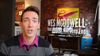
Watch this! The author's own homepage video:
Wes McDowell is the principal and lead designer at The Deep End web design studio in Los Angeles. In addition to working with clients, he also co-hosts a popular podcast, called The Deeply Graphic DesignCast, covering all of the topics that are important to designers.
Now read:
- Create the perfect design portfolio: 30 pro tips
- 20 inspiring examples of design portfolios - click here
- 20 top-quality portfolio WordPress themes
Have you used video on your site? Did it help attract clients? Share your experiences with other designers in the comment section below!

Thank you for reading 5 articles this month* Join now for unlimited access
Enjoy your first month for just £1 / $1 / €1
*Read 5 free articles per month without a subscription

Join now for unlimited access
Try first month for just £1 / $1 / €1
The Creative Bloq team is made up of a group of design fans, and has changed and evolved since Creative Bloq began back in 2012. The current website team consists of eight full-time members of staff: Editor Georgia Coggan, Deputy Editor Rosie Hilder, Ecommerce Editor Beren Neale, Senior News Editor Daniel Piper, Editor, Digital Art and 3D Ian Dean, Tech Reviews Editor Erlingur Einarsson and Ecommerce Writer Beth Nicholls and Staff Writer Natalie Fear, as well as a roster of freelancers from around the world. The 3D World and ImagineFX magazine teams also pitch in, ensuring that content from 3D World and ImagineFX is represented on Creative Bloq.
