10 tips for building a killer portfolio website
Give your work that extra edge online with this illustrated guide to creating a portfolio website that stands out from the crowd.
A portfolio website is the quickest and easiest way of showcasing your work as a designer. Even if you have a physical portfolio, a website is still an expected extra – and it's vital that it makes your work sing.
Not everyone has the web design skills to be comfortable creating a website with a stunning, easy-to-use layout. These tips will help to fill those knowledge gaps and have your website online in no time.
For more portfolio inspiration, check out these stunning portfolio examples. And our pick of the best free graphic design portfolio themes, and paid-for Wordpress portfolio themes will make yours look super professional.
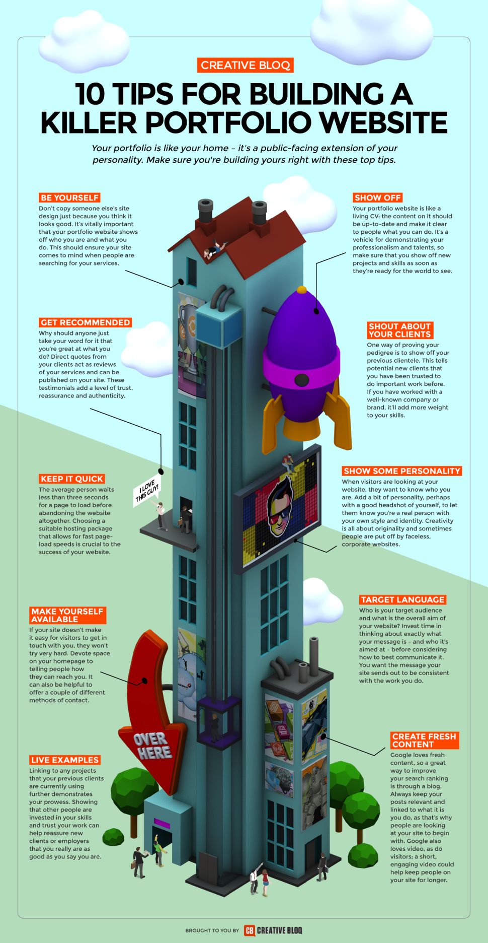
Illustration by Simon Middleweek.
01. Be yourself
Don’t copy someone else’s site design just because you think it looks good. It’s vitally important that your portfolio website shows off who you are and what you do: by creating an original website you’ll help ensure that it comes to mind when people are searching for your services.
Remember, a top website builder can help you create a unique website – we've found the best prices below.
02. Make yourself available
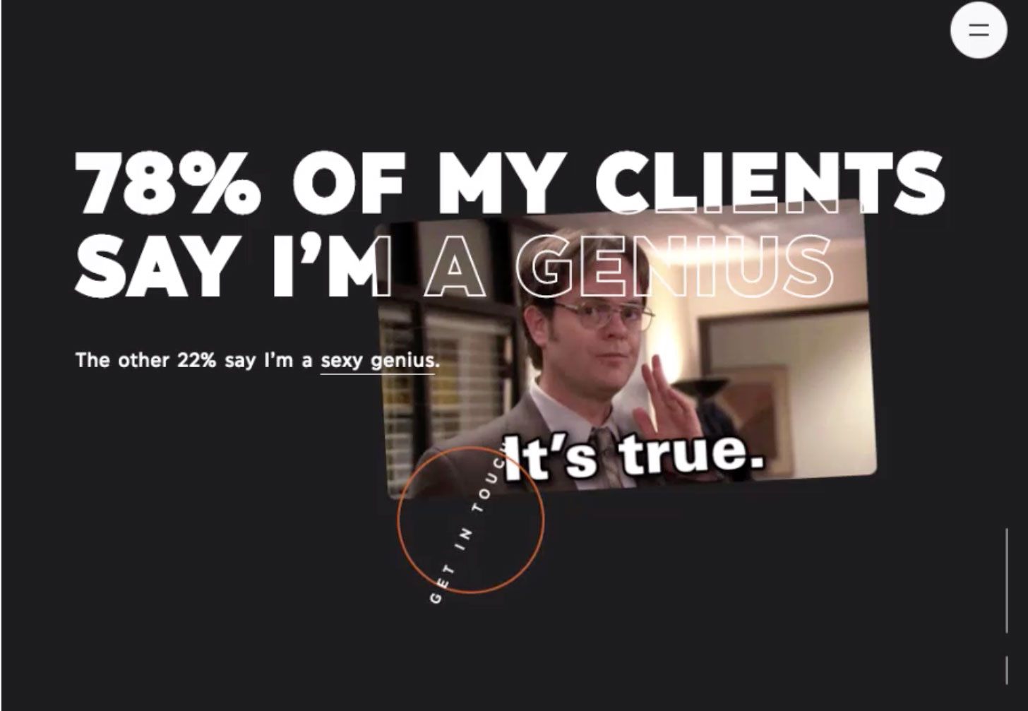
If your site doesn’t make it clear how visitors can get in touch with you, they won’t try very hard to find out. Devote space on your homepage to telling people how they can reach you. Different people prefer different methods of contact, so supply a couple of ways that they can do so – make it easy for them.
03. Show some personality
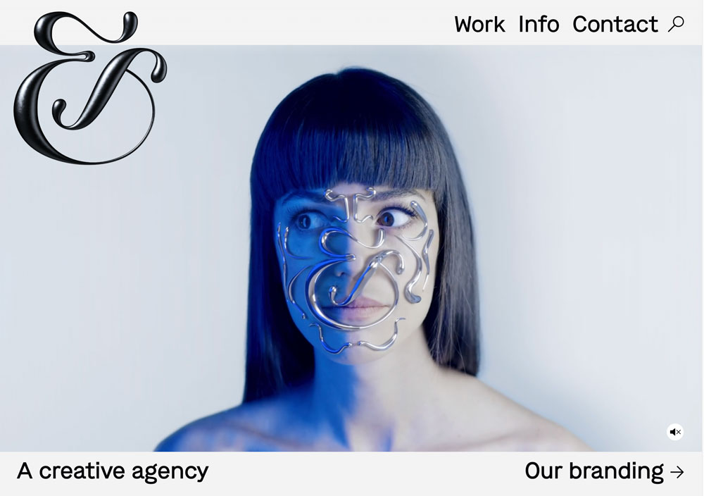
When visitors are looking at your website, they want to know who you are. Add a bit of personality, perhaps with a good headshot of yourself, to let them know you’re a real person with your own style and identity. Creativity is all about originality and sometimes people are put off by faceless, corporate websites.
04. Keep it quick
The average person waits less than three seconds for a page to load before abandoning the website altogether. Choosing a suitable hosting package that allows for fast page-load speeds is crucial to the success of your website. Not every web host is the same so choose carefully to avoid a slow site.
05. Create fresh content
Google loves fresh content, so a great way to improve the search ranking of your site is to keep it up-to-date through a blog. Always keep your posts relevant and linked to what it is you do, as that’s why people are looking at your site to begin with. Google also loves video, as do visitors – a short, engaging video could help keep people on your site for longer.
06. Show off
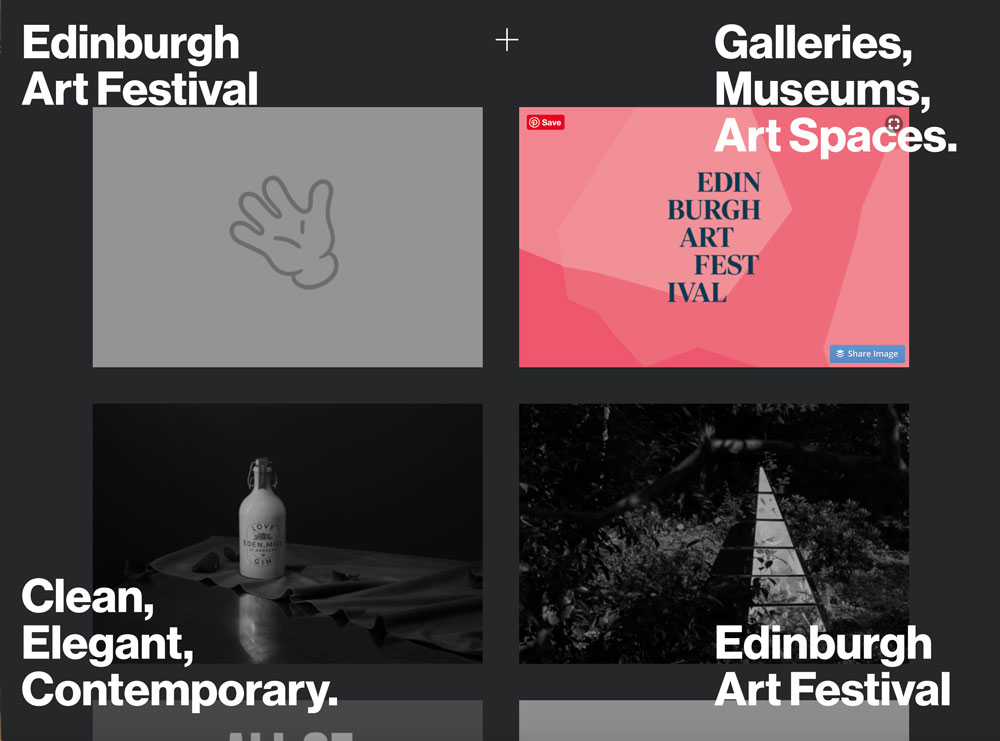
Your portfolio website is like a living CV: the content on it should be up-to-date and make it clear to people what you can do. It’s a vehicle for demonstrating your professionalism and talents, so make sure that you show off new projects and skills as soon as they’re ready for the world to see.
07. Shout about your clients
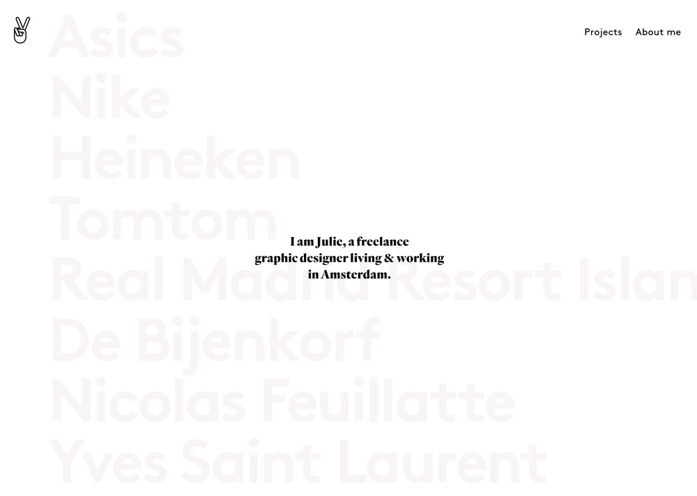
Another way of proving your pedigree is to show off your previous clientele. This tells potential new clients that you have been trusted to do important work before and shows you have a track record. If you have worked with a well-known company or brand, it’ll add more weight to your skills.
08. Get recommended
Why should anyone just take your word for how great you are? Direct quotes from your clients act as reviews of your services and can be published on your site. These testimonials add a level of trust, reassurance and authenticity, further proving your experience and ability to produce top quality work.
09. Live examples
Linking to existing pieces of work that your previous clients are currently using further demonstrates your prowess as a professional. Showing that other people are invested in your skills and trust your work can help to reassure new clients or employers that you really are as good as you say you are.
10. Target language
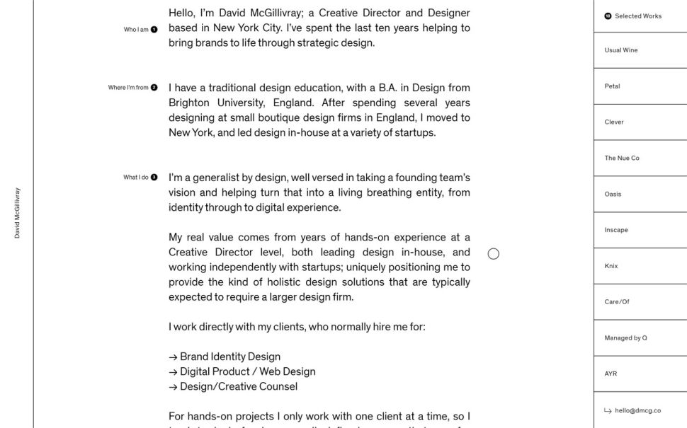
Who is your target audience and what is the overall aim of your website? Your portfolio site should showcase your skills and personality, so invest time in thinking about exactly what your message is – and who it’s aimed at – before considering how to best communicate it. You want the message that your site sends out to be consistent with the work you do.
This article first appeared in The Portfolio Handbook, created by Computer Arts magazine.
Read more:

Thank you for reading 5 articles this month* Join now for unlimited access
Enjoy your first month for just £1 / $1 / €1
*Read 5 free articles per month without a subscription

Join now for unlimited access
Try first month for just £1 / $1 / €1
Get the Creative Bloq Newsletter
Daily design news, reviews, how-tos and more, as picked by the editors.
