10 beautiful paper portfolios to inspire you
In this ever advancing digital age, there's something special about a well put together paper portfolio, as these gorgeous examples show.
Sadly, paper portfolios appear to be a bit of a rarity these days, with many design portfolios existing online only. But, thankfully, there are many designers who still recognise the power of traditional mediums (don't believe us? Check out our collection of awesome paper art). Done properly, a handheld, printed design portfolio can really make your work stand out and leave a long-lasting impression.
Therefore, we scoured the web to find some brilliant examples of paper portfolios. Here are our 10 favourites...
01. Charlotte Allen
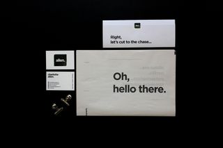
Feeling the need to stand out after finishing university, Charlotte Allen decided to reinvent the traditional resume and portfolio and instead created an informal package aimed at connecting with employers instead of the insides of a recycling bin.
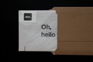
Her deluxe mailer consisted of a 12-page printed portfolio in a tabloid format, along with self-branded business cards and a traditionally formatted CV, all produced to a high quality that she felt was needed to represent herself to design agencies.
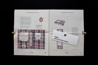
The business cards are 600gsm, printed on Mohawk Superfine stock for a luxury, yet tactile finish. Inside the newspaper is a folded CV, printed on 160gsm white card, while the tabloid itself is 55gsm newsprint, sized at 229 x 280mm, for a full-scale view of her selected projects.
02. Stephen Jones
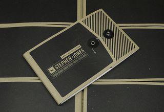
With a fairly common name shared with an 80s hair rocker and a British TV host, Stephen Jones needed a portfolio that would demonstrate his skills and resonate with audiences who truly appreciate and admire something beautifully crafted.
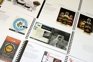
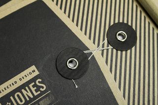
Having worked in print shops ever since he was in high school, Jones was able to test his print production knowledge in creating a die cut and scored package, containing a spiral-bound book showcasing his university work. The effort paid off, getting him an intern post at Chen Design Associates in San Francisco.
03. Dennis Fuentes
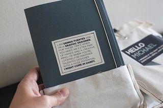
As well as wanting a portfolio to show off his work in a unique, Dennis Fuentes also wanted something that would display his attitude of patience, dedication and craftsmanship when tackling projects.
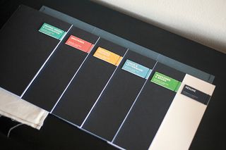
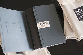
He tackled this with a handmade self-promo mailer consisting of five machine-stitched booklets covering a different category of work, as well as a printed resume, and then brought everything together in a custom fabric envelope, using iron-on transfers to personalise each one with its recipient's name.
04. TeYosh Studio
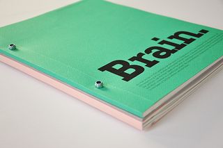
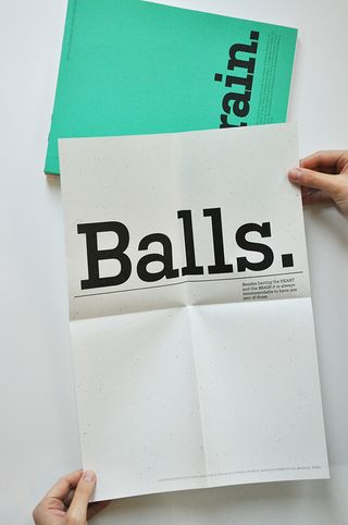
Sofija Stanković and Teodora Stojković make up TeYosh, an animation, concepting and art direction studio in Amsterdam. Having worked together for four years they decided to apply for an MA in design and found themselves having to make a portfolio.
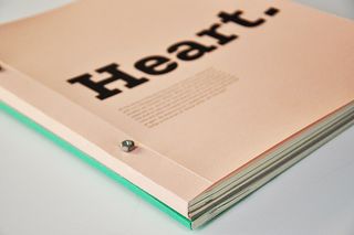
Realising that Stanković is the brain of TeYosh, while Stojković is its heart, they came up with the idea of creating a 132-page printed portfolio, divided into quite different BRAIN and HEART sections representing each of them. And to finish the package off they added an A3 poster pointing out the third element making up TeYosh: BALLS.
05. Lisa Dino
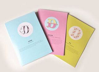
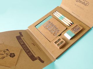
On its own, Lisa Dino's printed portfolio is an impressive and attention-grabbing piece of work, split into three separate categories: illustration, design, and 3D and packaging, or as she prefers to put it, draw, design and do.
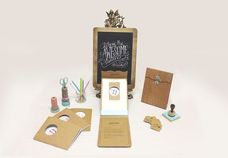
The icing on the cake, however, is the self-promo vehicle she designed to go alongside her portfolio. Made entirely out of cardboard and paper, her creative kit consists of 'The tiny book of big ideas', coloured pencils, an eraser, and a sharpener, all of them placed neatly into allocated slots in her cardboard packaging.
06. ALU
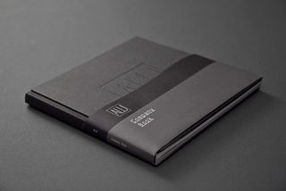
Italian graphic design studio Happycentro was behind this beautiful, handcrafted portfolio for modular merchandising systems company ALU.
"All their products are mainly made in basic materials like aluminum," comments the team. "We then took inspiration from the material soul of these elements to develop ALU's ID. Starting from this basis, we chose to tell the brand through a series of keywords explaining their values."
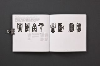
The result was this gorgeous book containing illustrations and typography made with paper cuttings.
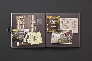
Other pages feature photos, original sketches and moodboards, with a red thread connecting the identity and products through the entire project.
07. Nathan Hinz
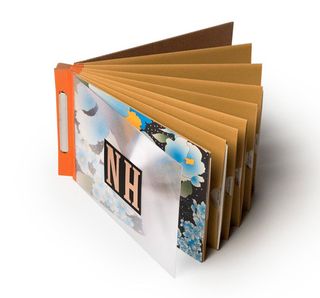
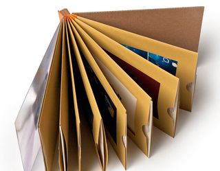
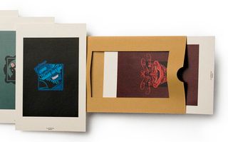
US-based graphic designer Nathan Hinz developed this beautiful, handheld portfolio back in the days before everybody went online. Each page is a window envelope, which displays an image and info of a project.
Hinz comments on Behance: "It allowed for a quick overview and served as a rich presentation in one book. It's completely handmade, mostly with found materials, my favorite being the spine made from orange duct tape I have never been able to re-find, sadly."
08. Dyla Rosli
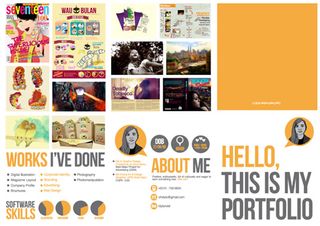
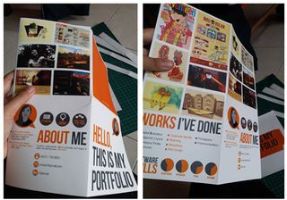
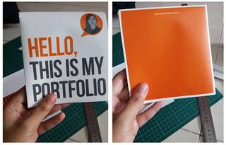
Dyla Rosli is an intern graphic designer based in Kuala Lumpur, Malaysia. In order to assist in her search for work, she developed this cool paper, infographic portfolio.
Using matt laminated art paper, Rosli selected her best work and carefully placed images of each into this template, along with illustrations detailing her skills and personal information.
09. Emil Kozole
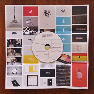
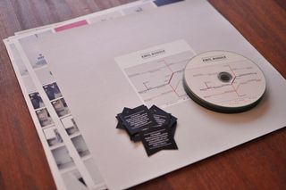
Working in both print and digital formats, designer Emil Kozole created this printed presentation to support the CD with his work on. Knowing that many discs are overlooked, Kozole made sure the print part of his portfolio stood out.
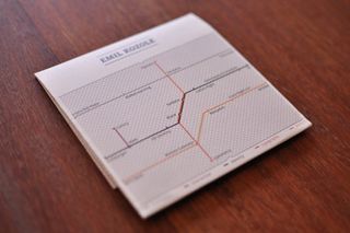
Covering different areas of expertise, the designer divided the page into different categories and then, using transportation systems as inspiration, illustrated the cover with different coloured lines, with projects being each stop. If lines meet, it means projects fall into more than one category. On the reverse, each project has a photo and description.
10. Another day
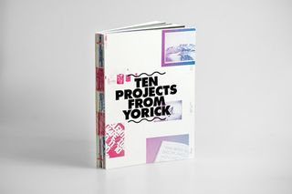
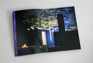
Another day is the graphic design studio of Yorick de Vries. Last year, de Vries created this colourful paper portfolio featuring a selection of his best projects from 2005 to 2012. Printed on three different paper stocks, the book is made up of three parts.
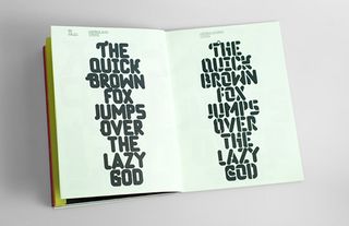
The first features just information, the second showcases project images and the final section covering examples of the designer's custom made typefaces. More like a catalogue than a book, this gorgeous, handbound portfolio is 227 pages of full colour prints. Awesome.
Additional words: Creative Bloq staff
Related articles:

Thank you for reading 5 articles this month* Join now for unlimited access
Enjoy your first month for just £1 / $1 / €1
*Read 5 free articles per month without a subscription

Join now for unlimited access
Try first month for just £1 / $1 / €1
Get the Creative Bloq Newsletter
Daily design news, reviews, how-tos and more, as picked by the editors.
Jim McCauley is a writer, performer and cat-wrangler who started writing professionally way back in 1995 on PC Format magazine, and has been covering technology-related subjects ever since, whether it's hardware, software or videogames. A chance call in 2005 led to Jim taking charge of Computer Arts' website and developing an interest in the world of graphic design, and eventually led to a move over to the freshly-launched Creative Bloq in 2012. Jim now works as a freelance writer for sites including Creative Bloq, T3 and PetsRadar, specialising in design, technology, wellness and cats, while doing the occasional pantomime and street performance in Bath and designing posters for a local drama group on the side.
