How to make a cohesive online design portfolio
Sam Kapila shares a few ideas on how to make your work shine in an online design portfolio.
Creating an online portfolio is hard work for a designer. We can be our own toughest clients, and making a collection of diverse projects look like they belong together is tricky. However, it is possible to create a folio that is interesting, cohesive, highlights your strengths and shows who you are as a designer.
Firstly, be consistent. For example, each project thumbnail on your main portfolio page should be treated consistently from project to project, even if one is a website and another is an icon set. Use similar image sizes, or angles and lighting if the thumbnails are photos.
The 'less is more' philosophy can help entice the viewer to click on the thumbnail for more detail. Go for a dramatic crop that focuses on the most visually strong part of a project. This works extremely well when showing larger-scale online branding and patterns. Choose an appealing and moody photographic treatment or show a simple, well-crafted logomark on a light, complementary background colour.
Typography sets the tone, so when picking typefaces err on the side of minimalism. The typography should support the work, rather than distracting the viewer. Consider sticking to one extensive type family rather than mixing in too many different tones.
These few steps towards consistent presentation and thoughtful storytelling can help us better present our work and show the world who we are as designers.
Here are three examples of great portfolios that embody these techniques:
01. Alice Lee

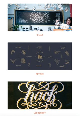
Alice Lee puts the focus on her work and keeps everything else simple. The design reflects her attention to detail, playful design choices and versatility.
02. Bethany Heck

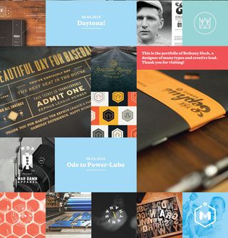
Bethany Heck isn’t afraid to show details, zooming into binding on books, and metallic lettering on thank you cards. Her unusual crops and angles add mystery.
03. Fuzzco

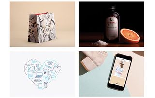
Fuzzco presents its work so thoughtfully. All thumbnails, whether they’re for logos or online magazines, have been crafted to connect with the next, and each one becomes part of the project itself.
Words: Sam Kapila
Sam is a designer living in Texas and an instructor at The Iron Yard, an international, immersive coding school. This article originally appeared in issue 274 of net magazine.
Liked this? Read these!
- 10 quick tips to improve your design portfolio
- Illustrator tutorials: amazing ideas to try today!
- Great examples of doodle art

Thank you for reading 5 articles this month* Join now for unlimited access
Enjoy your first month for just £1 / $1 / €1
*Read 5 free articles per month without a subscription

Join now for unlimited access
Try first month for just £1 / $1 / €1
Get the Creative Bloq Newsletter
Daily design news, reviews, how-tos and more, as picked by the editors.
The Creative Bloq team is made up of a group of design fans, and has changed and evolved since Creative Bloq began back in 2012. The current website team consists of eight full-time members of staff: Editor Georgia Coggan, Deputy Editor Rosie Hilder, Ecommerce Editor Beren Neale, Senior News Editor Daniel Piper, Editor, Digital Art and 3D Ian Dean, Tech Reviews Editor Erlingur Einarsson, Ecommerce Writer Beth Nicholls and Staff Writer Natalie Fear, as well as a roster of freelancers from around the world. The ImagineFX magazine team also pitch in, ensuring that content from leading digital art publication ImagineFX is represented on Creative Bloq.
