Why you must get the presentation of your portfolio right
With your portfolio, presentation matters – Jason Cranford Teague gives you four top tips.
Your portfolio is the key to any design job. If you don't have one, then you need not bother to apply. You can have all of the fancy schooling, you can know the entire Adobe Creative Cloud product line like your own family, and you may have worked at Ogilvy while moonlighting at Frog, but if you do not show me your design thinking process, you might as well go into chartered accountancy.
Look at these design portfolio examples to inspire you
When I was a young design student in art school, I got my first lesson in how important portfolio presentation is for winning the day. I had been taking classes in 2D design, and getting mostly As with the occasional B+, but I was looking at an A for the semester. It all hinged on my final portfolio grade. But, since I thought that this was just a matter of me turning my work from the previous few months in a case, I was sure that my grade was in the bag. Boy, was I wrong.
I went to check out the final grade posting and was gobsmacked to see a B− next to my name. How could this be, I'd never even gotten a grade below B+ the whole semester. In shock, I went to my teacher – who I was on friendly terms with–and asked what had happened. She told me that, yes, the work had all been A-level, but my portfolio was sloppy. It was unorganized with dog-eared pages that were difficult to flip through. Many of the sketches in pastel had not been spray fixed and nothing was mounted. For this, she had knocked me down an entire grade level for the semester.
This was the most important design lesson in my life. Showing up is not enough. You also have to look good.
For web designers, we no longer have to worry about spray mounting and dog eared pages, but we do have to show our work in a compelling manner that not only represents the work we have done, but the work we are capable of.
01. Be the master of your own domain

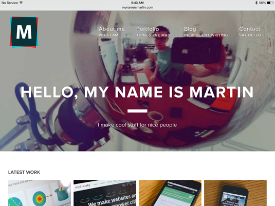
I am almost immediately suspicious of any designer without their own unique URL. Call it snobbishness or call it high-standards, a designer without their own unique URL seems less professional to me. Not that I won't look at someone's site if they are only using a portfolio service (see below), they just go down a bit in my estimation.
Sign up to Creative Bloq's daily newsletter, which brings you the latest news and inspiration from the worlds of art, design and technology.
And having your own domain name is not that difficult or expensive. You can easily register with a domain service, or even, more conveniently, through WordPress. And if you are not a developer, then you can choose a theme to customize with your own design aesthetic.
02. Keep it fresh
Once you have your own domain and have set up a presence on portfolio web sites sites, don't let them go stale. I've passed over more than one perspective employee because their portfolio was more than 3 years out of date.
Plan to check in at least once a year on portfolio web sites to keep everything up-to-date. For your own domain, you should update as often as you can to add new and better projects.
03. Be everywhere you need to be

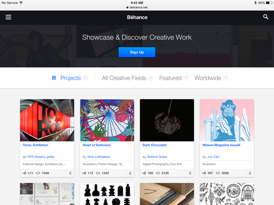
Although I highly recommend keeping a customized web site that shows off your skills as an interactive designer, you also need to maintain a presence on the most trafficked portfolio Web sites like Bēhance, Dribble, and even LinkedIn. LinkedIn may not be a true portfolio site, but it is a place a lot of people begin looking, and you can include things like videos and slide presentations.
The fact is, a lot of employers troll these sites looking for their future Don Drapers and Peggy Olsons. Your personal domain alone may not be so easy to find. You need to maintain some kind of presence in these places to make sure you are seen. But always make sure to have a prominent link on these sites back to your main portfolio.
04. Sweet Sweat the details
As my little parable of a good class gone wrong illustrates, people notice the little things. I am dysgraphic, a condition that means I have a really hard time spotting typos and spelling mistakes. I always have an editor (often my wife) look over my work, so that I can avoid errors which would make me look bad.
Even if you don't have a learning disability like me, it never hurts to have a second (or even third or fourth) pair of eyes look over your portfolio for mistakes or point out problems. They'll be forgiving and tell you what to fix. An employer will just move on to the next portfolio.
Words: Jason Cranford Teague
Jason Cranford Teague is a senior creative director at Capital One. He will be speaking this summer in Barcelona at WebVisions and is available for professional training through Rosenfeld Media.
Like this? Read these...
- 5 things your portfolio must have
- How to start a blog
- Download the best free fonts

The Creative Bloq team is made up of a group of art and design enthusiasts, and has changed and evolved since Creative Bloq began back in 2012. The current website team consists of eight full-time members of staff: Editor Georgia Coggan, Deputy Editor Rosie Hilder, Ecommerce Editor Beren Neale, Senior News Editor Daniel Piper, Editor, Digital Art and 3D Ian Dean, Tech Reviews Editor Erlingur Einarsson, Ecommerce Writer Beth Nicholls and Staff Writer Natalie Fear, as well as a roster of freelancers from around the world. The ImagineFX magazine team also pitch in, ensuring that content from leading digital art publication ImagineFX is represented on Creative Bloq.
