How to paint traditionally in Photoshop
Here's how to paint an underwater figure using simple brush strokes in Photoshop.
08. Connecting elements
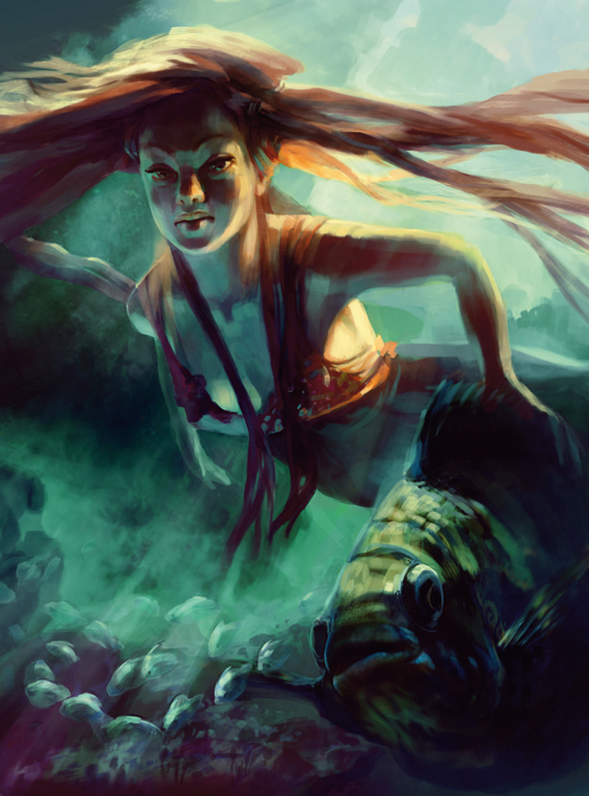
After a while it's good to have an overall look and to connect again with all the elements. I add new layers with Image Adjustments and bring everything up to a similar level of detail.
A more dramatic light source will enhance the image, so I introduce more sun rays in the background. A quick way to paint them is to create a layer above the image, apply Motion Blur with the desired direction, set the layer mode to Screen, adjust Layer Opacity and paint some stripes in a Mask.
09. Apply decorations
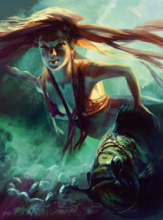
It would be great to highlight some differences in the materials and textures, so I start to add a few details to the main characters – some surface details that will make the fish look more fantasy than real life.
I'm following the same steps as before – just trying to suggest that there might be shiny little elements by adding spots of shadow and light.
10. Correcting odd-looking areas
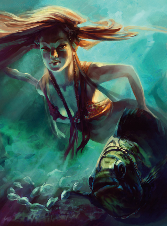
After taking a fresh look at my work in progress, and by flipping the image horizontally, I notice some odd-looking elements. I need to adjust the girl's arm to make it obvious that the elbow is further away from the viewer.
There's slightly too much hair over on the right-hand side, so I arrange it in such a way that it'll emphasise the girl's face. Doing this to the composition reinstates the two diagonals: those of the character herself, and the direction of the light rays.
11. Make a standout element
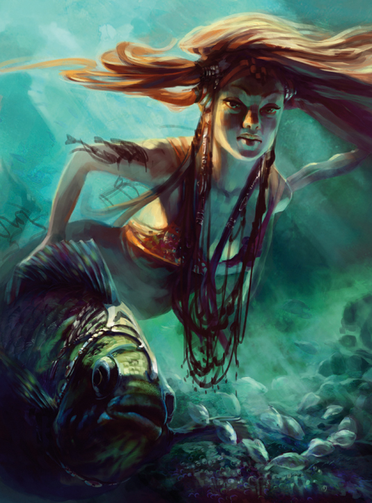
To make this image stand out and to give it a personal touch, I need to exaggerate at least one element. I take the plunge and draw over those decorations to make them big and complicated, while maintaining the rough/hand-made look.
12. Using modules
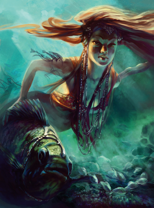
I don't want to spend a lot of time on these decorations, so I paint one module that I then copy and paste on top of the sketch, adjusting it here and there.
I'm looking to achieve a good balance between the girl's body surfaces that are in shadow, but also produce some bounced light in the dark areas and the highlights.
13. Tweaking the main elements
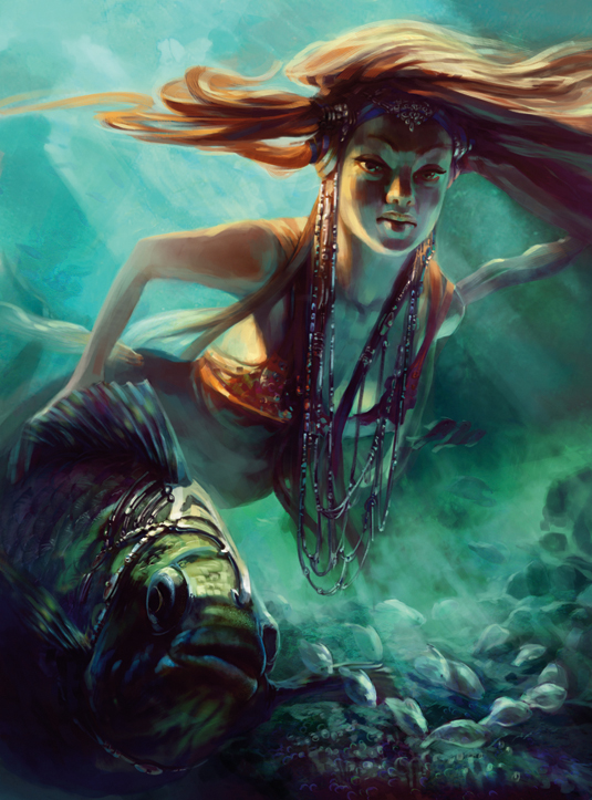
I need to block in and correct all the elements. I still have trouble with the girl's arm – I emphasise the perspective so the pose will look more natural. I polish the back fins and add subtle ones on the side. I move the three fishes from the arm and place them side on.
14. Final adjustments
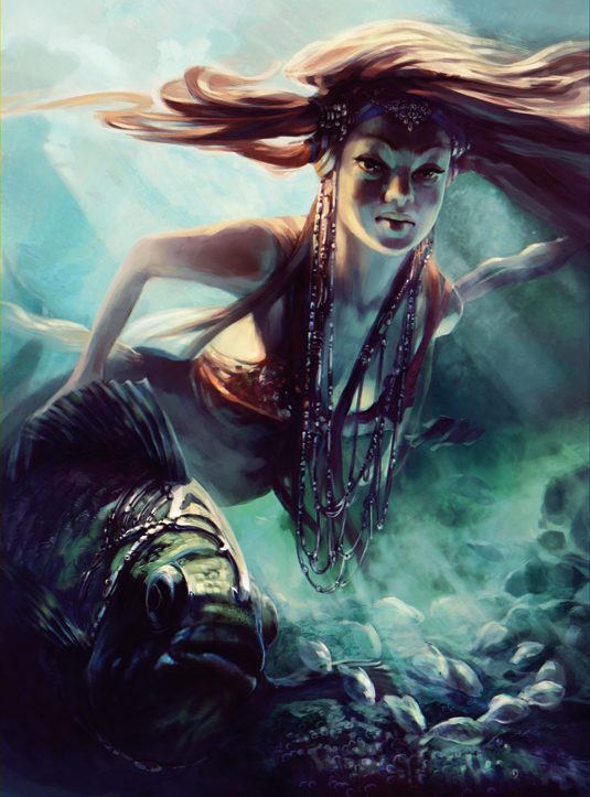
I decide to go with the bright background, which means the girl will pop out more. I add another group of Image Adjustments layers.
I then try out a pass that simulates Chromatic Aberration: to produce this I duplicate the image and I shift the channels one pixel left and right.
I add this on top of my previous picture and mask the area where I don't want to have it – mostly on the girl's face. I'm pretty happy with the result and I hope you've enjoyed the workshop, too.
This article originally appeared in ImagineFX issue 94.
Like this? Read these...
- How to draw scales and feathers like a pro
- How to master the art of drawing hands
- Free Photoshop brushes every creative must have

Thank you for reading 5 articles this month* Join now for unlimited access
Enjoy your first month for just £1 / $1 / €1
*Read 5 free articles per month without a subscription

Join now for unlimited access
Try first month for just £1 / $1 / €1
Get the Creative Bloq Newsletter
Daily design news, reviews, how-tos and more, as picked by the editors.
