Mock up a music player widget in Photoshop
Morgan Allan Knutson explains how to mock up a simple music player widget in Photoshop using vector shapes and layer styles to produce subtle and simple interfaces.
While voice recognition and gesture technologies are advancing exponentially, the need for visual user interfaces will persist into the future. Decades ago, interfaces were often garish and overdone. But consumers expect a quality appearance from today's well-designed and affordable modern software; designers must now make their interfaces beautiful too.
Best practice for interfaces is to keep things simple. The content should be uninhibited and it should be obvious how to use the interface. Shifting paradigms too drastically can be detrimental to a person's immediate understanding of how your application works. It's better to stick to what people know, for example, a triangle for a 'play' icon.
Music widget
In this tutorial you'll make each piece of a fictional music player widget, down to the icons on the buttons and the knob on the progress bar. You'll learn: how to use Adobe Photoshop's layer styles to add smooth and subtle dimensions to sharp interfaces; how to apply barely noticeable gradients that aid in expressing a characteristic of tangibility; how to create helpful and beautiful interaction states for the widget's buttons; and how to design proper hover and pressed-in states while keeping everything crisp.
The widget is in grayscale but you can use these techniques in all of your designs. You can download the support files for this tutorial here.
01. Create a container layer
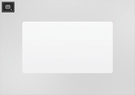
Draw a rounded rectangle with a 6px border radius. Double-click the layer to open its styles dialog and give it a 90deg linear gradient fill of #F9F9FA on the top and #EFEFEF on the bottom. Add a white inner shadow with 2px distance.
02. Add a drop shadow
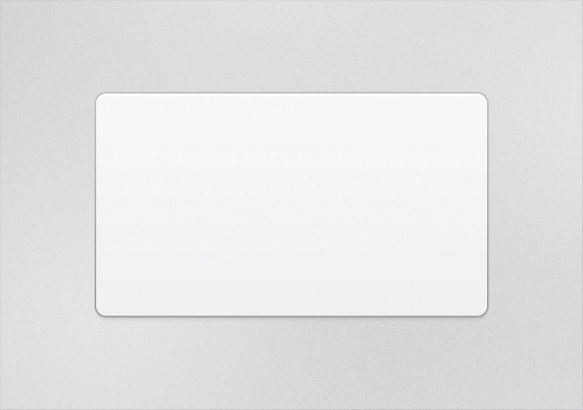
Give the container layer a black 4px drop-shadow with 1px distance and 10% opacity. Now, add a 1px stroke and give it a light-to-dark gradient with a fill of #C8C8C8 on top
03. Isolate the button bar
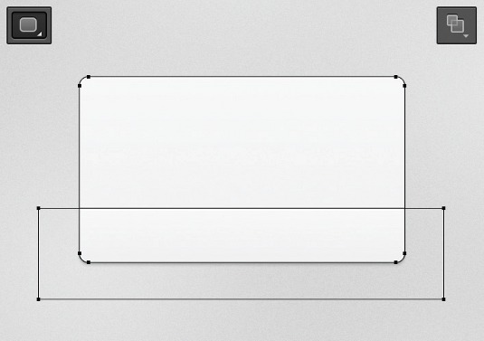
Duplicate the layer, choose the Path Selection Tool (A) and select the rectangle's path. Using the Rectangle Tool (U), hold shift while drawing a rectangle over the existing path. Select Intersect Shape Areas in the options panel to isolate a smaller shape.
Get the Creative Bloq Newsletter
Daily design news, reviews, how-tos and more, as picked by the editors.
04. Create button shapes
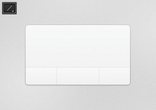
Remove the stroke and drop-shadow, and lighten the gradient to #F0EFEF on top and #F9FAFA on bottom. Use the Line Tool (U) to draw a single #DFDFDF line across the top of the bar. Add two black vertical lines and lower the opacity to 6%.
05. Make a play icon
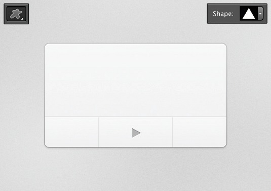
With the Custom Shape Tool (U), draw a sharp triangle and fill it with #BABABA. Rotate it clockwise by 90deg with Free Transform (Cmd+T). Apply a black inner shadow of 1px distance and 1px size at 40% opacity. Apply a white drop-shadow at 1px distance.
06. Make a fast-forward icon
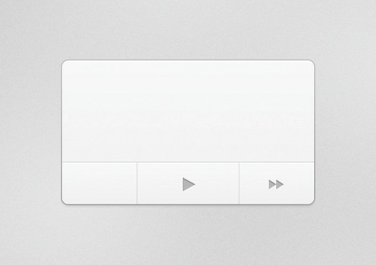
Duplicate the play icon. Use Free Transform to scale it down to approximately 75%. Then, use the Path Selection Tool (A) to select its path. Copy and paste it. Now, hold shift and use the right arrow key to move the new path over to the right.
07. Create a rewind icon
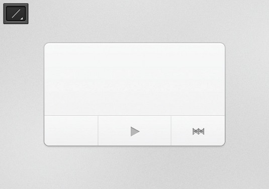
Using the Line Tool (U) again, hold shift and add a 1px vertical line to the icon. Hide your path with Cmd+H. Choose the Move Tool (V), hold opt+cmd and hit the left arrow key to duplicate the layer. Then, Cmd+T, right-click and choose Flip Horizontally.
08. Add text
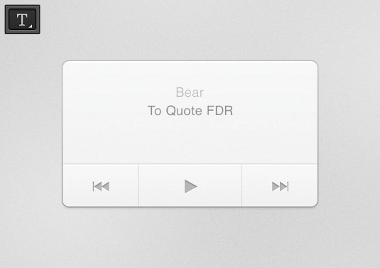
Move the new shape into position and make sure both buttons are symmetrical. Next, add accompanying text for the track title and artist using the Type Tool (T). Set them apart with contrast by making one lighter than the other.
09. Tweak the type style
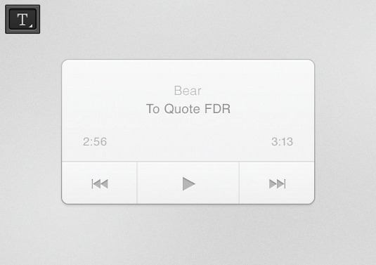
Next, add a bit of depth to the text. On one text layer, add a white drop-shadow at 1px distance. Then right-click the layer and click Copy Layer Style. Select the other type layers, right-click one in the layers palette and click Paste Layer Style.
10. Create a track layer
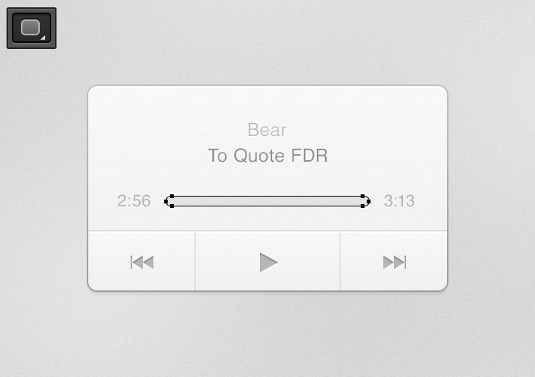
Choose the rounded rectangle tool, give it a radius of 100px, and draw a track in between the timestamps. It needs to appear as a darker trench that the progress bar will fill up. The layer styles will be reversed as the light source is coming from the top.
11. Finishing touches to the track bar
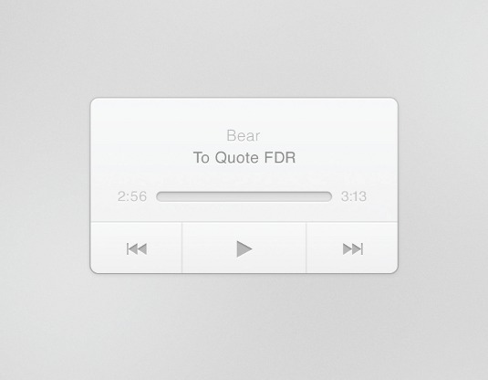
Give the track bar a white drop-shadow at 1px distance and a black inner shadow of 1px distance at 10% opacity. Add a gradient stroke with #8C8C8C on the top and #DFDEDE on the bottom. Finish it with a gradient fill that's #CCCCCC on the top and #E8E8E8 on the bottom.
12. Make the progress bar
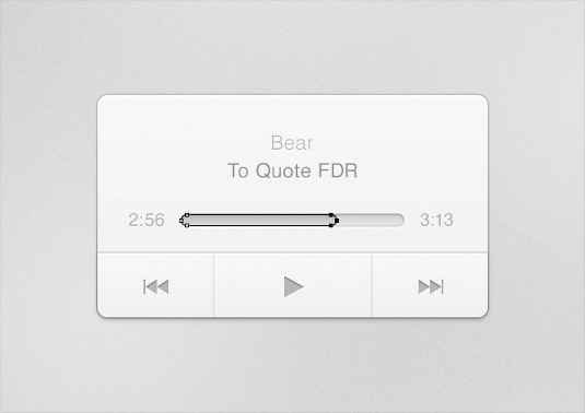
Duplicate the track layer and, using the Direct Selection Tool (A), select the three rightmost anchor points (zoom in or marque). While holding shift, hit the left arrow key to move the right edge of the progress bar into the middle of the track.
13. Back to the first layer
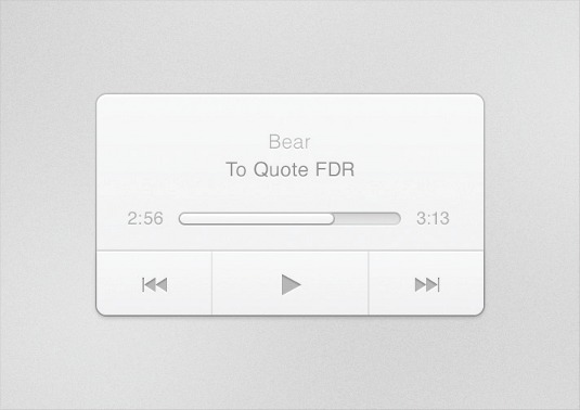
Now the shape of the progress bar is established, right-click on the first layer you made (for the container) and click Copy Layer Style. Then select your new progress bar layer, right-click, click Paste Layer Style and remove the drop-shadow.
14. Create the progress bar knob
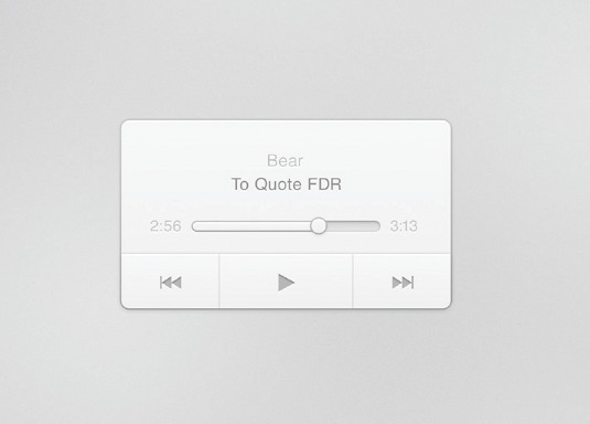
Select the Ellipse Tool (U), hold Shift, and draw a circle for a knob. The layer styles will be in your clipboard from the previous step, so right-click on your ellipse layer and, again, click Paste Layer Style. This time leave the drop-shadow for depth.
15. Add a few button states
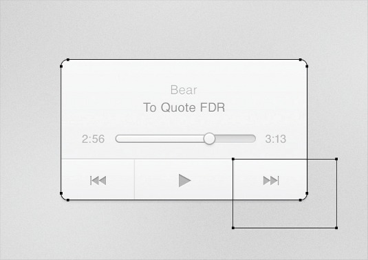
These are useful to give users confirmation that the button is pressed. Select the button bar at the bottom and duplicate the layer. Then, select the leftmost anchor points and, while holding shift, drag them until they reach the left edge of the right divider.
16. Turn the layer into a hover state
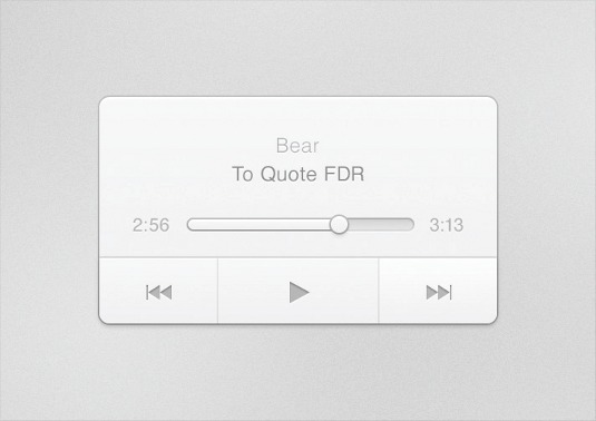
It's best if buttons subtly light up on hover. Change the top of the gradient to white and the bottom of the gradient to #EFEFEF. Remove the inner shadow as it conflicts with the divider. Now duplicate the layer and hide the original.
17. For a pressed-in state
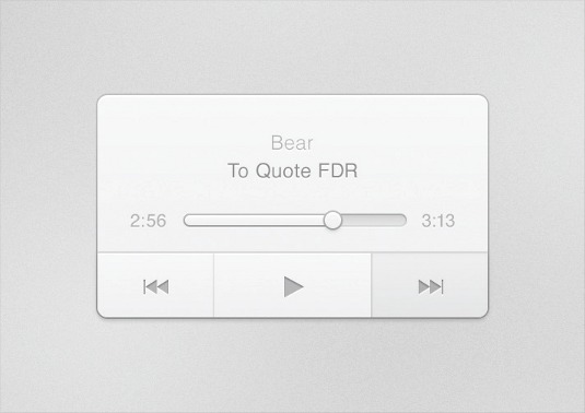
We want the individual buttons to darken and appear as if actually been pressed when a user clicks their cursor. Change the fill to black and reduce the gradient opacity to 95%. Next, add an inner shadow of 1px distance and 3px size at 20% opacity.
18. Add styling
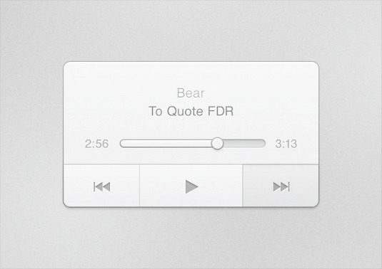
To sharpen the button, add a 100% #D7D7D7 drop-shadow with a 1px distance. Make sure Use Global Lighting is unchecked and change the angle to -90deg. In the layer palette, move the layer underneath the vertical button dividers, but above the button bar divider.
19. Fine tuning
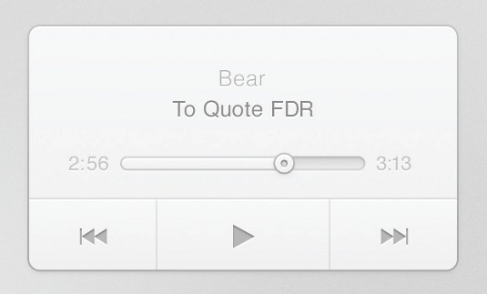
For the icing on the cake, go back to the knob layer and duplicate it. Use Free Transform (Cmd+T) to size it down by 20%, and paste the layer styles from the track layer onto its layer. Then darken its stroke by changing its top gradient colour to fully black.
Words: Morgan Allan Knutson
This article originally appeared in .net magazine issue 239.
Liked this? Read these!
- Photoshop tips, tricks and fixes to try today
- Create a perfect mood board with these pro tips
- Free Photoshop actions to create stunning effects
Any questions? Ask away in the comments!

Thank you for reading 5 articles this month* Join now for unlimited access
Enjoy your first month for just £1 / $1 / €1
*Read 5 free articles per month without a subscription

Join now for unlimited access
Try first month for just £1 / $1 / €1

The Creative Bloq team is made up of a group of art and design enthusiasts, and has changed and evolved since Creative Bloq began back in 2012. The current website team consists of eight full-time members of staff: Editor Georgia Coggan, Deputy Editor Rosie Hilder, Ecommerce Editor Beren Neale, Senior News Editor Daniel Piper, Editor, Digital Art and 3D Ian Dean, Tech Reviews Editor Erlingur Einarsson, Ecommerce Writer Beth Nicholls and Staff Writer Natalie Fear, as well as a roster of freelancers from around the world. The ImagineFX magazine team also pitch in, ensuring that content from leading digital art publication ImagineFX is represented on Creative Bloq.
