How to structure your Photoshop files
Lazy file construction won't win you any friends at work. But follow these simple rules from designer and developer Tammy Coron, and your colleagues will love you.
As a creative developer, I'm often asked what my preference is for receiving creative from my designers. Personally, I prefer to receive a layered file, with mockups, instead of pre-sliced images. This is a personal choice, and I understand it is not the preferred format for everyone. In fact, there seems to be quite a debate within the industry as to the best method for receiving creative.
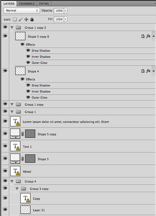
Regardless of your personal choice, though, I believe it is imperative for designers to build and deliver clean files. Too many times I've been handed a file that looks similar to the one below.

It only takes a moment to spot how poorly constructed and disorganised this file is. The naming convention and grouping is non-existent.
Sign of laziness
It’s as if my designer was having an intimate relationship with his copy and paste keys. Using default names like Group 1, Group 2, and Shape 5 copy is unacceptable. Also, leaving elements that are no longer needed, empty groups for example, is just a sign of being lazy.
Sure, we can work under these conditions, but why would you want to? With a few simple modifications, designers can turn a messy file into something that anyone can easily navigate.
Even if you have no intention of sharing your work with others, consider having to come back to one of your files at a later date. Imagine how much confusion you may be able to avoid by following a few basic rules.
How to do it right
Let's start with the grouping. If your design is laid out with a basic header and footer, along with some content and navigation sections, your groups (and their names) should coincide with each other.
Get the Creative Bloq Newsletter
Daily design news, reviews, how-tos and more, as picked by the editors.
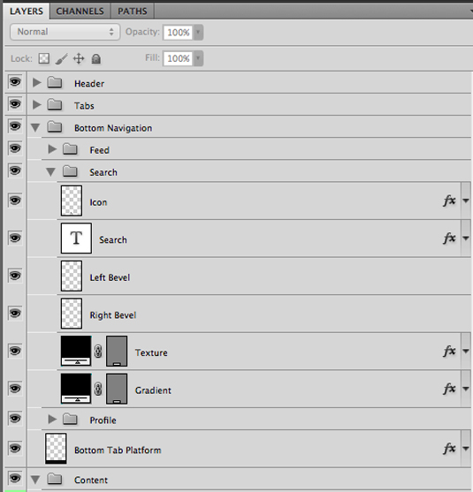
Take a look at the sample below. You can see that our designer is breaking things out based on the overall design. He is giving each group a meaningful name, and he is keeping things together.

By doing this, he creates a structured and organized file that helps to identify the key components of each section or group. It only takes a moment, but it has the potential to save tons of time.
Naming conventions
Another often overlooked, but powerful aspect of layer construction, is naming conventions.
Naming conventions can go a long way. A few minutes of time helps to create an incredibly easy file to navigate. Just remember that when coming up with names, simple is often better.
Name your layers in a consistent and concise way. If you add a layer that pertains to your level bevel, name it that way. If you have an element that is used for the bottom tab platform, why not call it as such. Keep it simple!
Colour-code your layers
One final point I want to mention is the option of colour-coding your layers. While this may not seem like a huge advantage - and admittedly some projects will not require this level of organization - colour-coding can play a useful role.
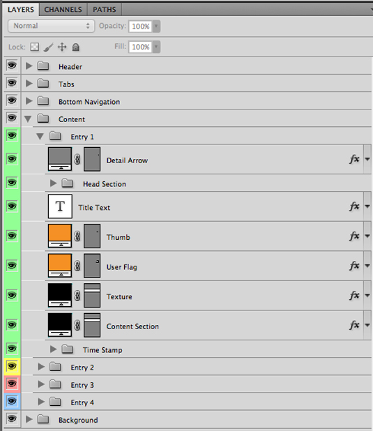
In the example below, my designer has used four distinct colours to help identify the different elements within this file.

When I was slicing this for our project, I was quickly able to see the connections between the groups and their contents thanks to the colour-coding.
With this specific project the colours themselves had meaning and were directly related to the design. Sometimes, this isn’t always the case, but either way, colour-coding is a great way to make important objects stand out.
Structure and organization
As you can see, there are a number of things you can do to make your files more readable for your developers and other designers.
Consider the amount of time you spend developing your design. Now consider spending just a moment of this time on structuring and organizing your layers.
Your developer (and other designers on your team) will love you for it. And let's face it, deep down, we all want to be loved...
Words: Tammy Coron
Tammy Coron is an iOS developer, backend developer, web developer, writer, and illustrator. She blogs at Just Write Code.
Like this? Read these!
- 101 Photoshop tips, tricks and fixes to try today
- The best free web fonts for designers
- Amazing examples of experimental design
Do you have any niggles about how colleagues organise their work? Share your thoughts with the community in the comments below!

Thank you for reading 5 articles this month* Join now for unlimited access
Enjoy your first month for just £1 / $1 / €1
*Read 5 free articles per month without a subscription

Join now for unlimited access
Try first month for just £1 / $1 / €1

The Creative Bloq team is made up of a group of art and design enthusiasts, and has changed and evolved since Creative Bloq began back in 2012. The current website team consists of eight full-time members of staff: Editor Georgia Coggan, Deputy Editor Rosie Hilder, Ecommerce Editor Beren Neale, Senior News Editor Daniel Piper, Editor, Digital Art and 3D Ian Dean, Tech Reviews Editor Erlingur Einarsson, Ecommerce Writer Beth Nicholls and Staff Writer Natalie Fear, as well as a roster of freelancers from around the world. The ImagineFX magazine team also pitch in, ensuring that content from leading digital art publication ImagineFX is represented on Creative Bloq.
