Photoshop's font menu problem solved in this design concept
This designer's vision for improving Photoshop's antiquated font menu aims to help you find fonts faster.
The web is full of design concepts for everything from Google to Netflix, and on first glance they often look like a great improvement on the current sites. But while it's easy to mock up something that looks great, these concepts often break down when you start to question how they would function in real life.
For instance, this Wikipedia redesign looks beautiful. But as our first commenter points out, its appeal is largely dependent on the gorgeous photography used in the mockup - and many Wikipedia articles don't have any images attached to them at all.
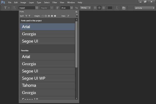
So it's refreshing to see Jacob Miller has taken a completely different approach to redesigning the Photoshop interface. Rather than create a lovely-looking design that falls down when it comes to functionality, he's started with the functionality first - specifically the Font Menu.
And he's come up with an idea that we think could genuinely save designers time and effort...
Before and after
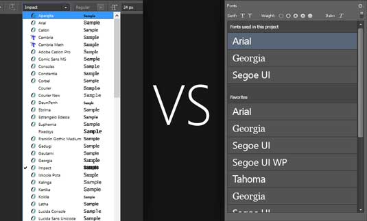
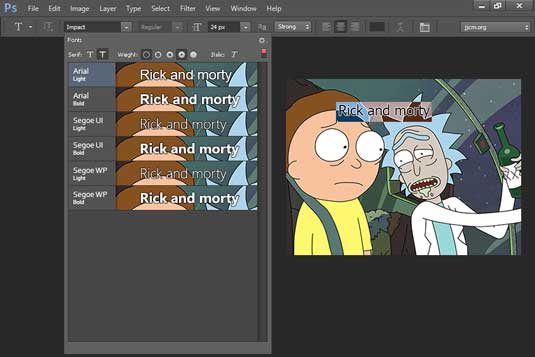
As shown in the 'before and after' screenshot above, Miller's idea is to simplify the font panel so that you don't have to give yourself cramp scrolling through hundreds of fonts to get to the one you want.
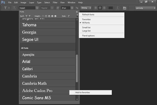
Instead, his redesigned menu brings the fonts you're using on a current project to the top, followed by the fonts you make most use of. Then all other fonts appear below that.
Why it's necessary
The current menu "provides over 130 fonts by default, but extremely few of them are ever useful to an every day designer", Miller argues. "I don't plan on using Microsoft Yi Bati, Wingdings, or Myanmar Text Extralight Script Nueuo anytime soon.
"Looking around for solutions to this, I dove into the land of font managers. Initially they seemed to be exactly what I needed. Except they weren't. Sure I could disable fonts in the font manager, but if they were a system font programs that used them would fail gloriously. Titlebars would be empty. Icons would be without labels."
Rather than wait for a better solution to present itself, he decided to redesign the font panel as he'd like to see it.
Further changes
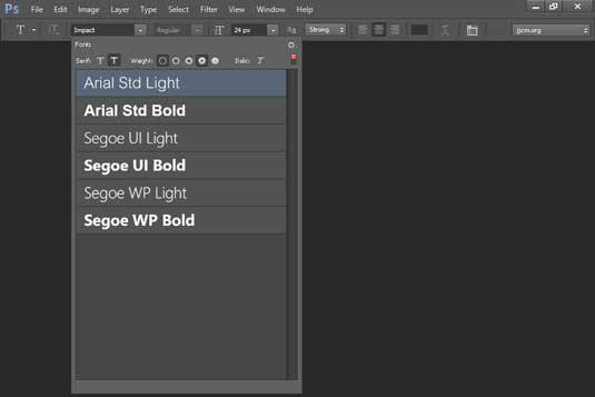
Other changes he's made to the current font menu include the ability to filter fonts, allowing you to choose between showing only serif or sans-serif fonts, weight classes (light, regular, semibold, bold, black), and italics.
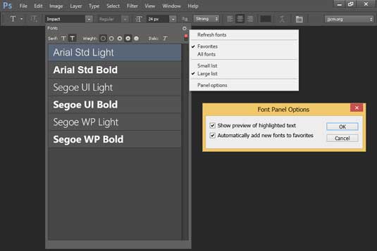
He'd also like the ability to refresh fonts without restarting added to Photoshop. He also suggests any newly installed font should be detected and added to my favorites. "When I'm installing a new typeface, chances are I want to use it right away, he explains. "It's going to be at the top of my priority list."
Miller has made a .psd containing the source for his designs freely available to download and use via this blog post under a under an Attribution 3.0 Unported license.
So what do you think - is this the kind of change Adobe should be making to Photoshop? Let us know in the comments!

Thank you for reading 5 articles this month* Join now for unlimited access
Enjoy your first month for just £1 / $1 / €1
*Read 5 free articles per month without a subscription

Join now for unlimited access
Try first month for just £1 / $1 / €1
Get the Creative Bloq Newsletter
Daily design news, reviews, how-tos and more, as picked by the editors.

Tom May is an award-winning journalist and author specialising in design, photography and technology. His latest book, The 50th Greatest Designers, was released in June 2025. He's also author of the Amazon #1 bestseller Great TED Talks: Creativity, published by Pavilion Books, Tom was previously editor of Professional Photography magazine, associate editor at Creative Bloq, and deputy editor at net magazine.
