Create a fashionable cross-processing effect with Photoshop
Fashion photographers used to develop film in the wrong chemicals on purpose to create striking colour effects. Here’s how to achieve the look in Photoshop.
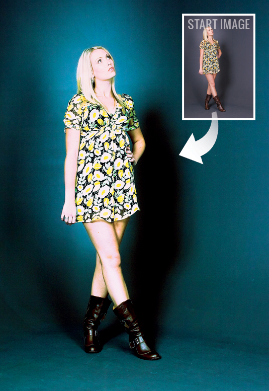
Cross-processing is one of those effects, created in the traditional photographic darkroom, that refuses to die. The slightly psychedelic effect that it produces looks like a throwback to the days of flower power, but the mismatched colours are still much loved by the style press, and the effect can be seen in practically every fashion or music magazine you pick up.
To create the effect in the traditional darkroom, you need to shoot using a roll of colour print film, then, when developing the film, you deliberately work with the wrong chemicals: instead of using the correct print film solution, you use chemicals designed for slide film. The result is a high-contrast image with strange colour casts, featuring purple-pink skin and green-blue shadows. These days, you can recreate the same effect using Curves in Photoshop.
Control the curves
The secret is to use the three colour channels within the Curves dialog, using a different S-shaped curve for the Red, Green and Blue channels to get the strange mis-processed look. Best of all, it’s easy to control the effect, so the results are much less hit-and-miss than the chemical counterpart.
Read on to find out how it’s done with Photoshop CS6 (you can use any version of CS) - there's a sample image for you to use below.
Click here to download image
01. The simple solution
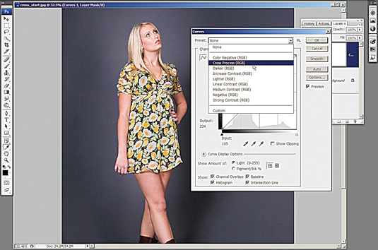
Open cross_start.jpg from the link above, then add a Curves adjustment layer. Next, click on the dialog’s Preset menu (it reads None by default) and choose Cross Process (RGB) from the drop-down menu that appears. This preset makes a good start at creating the effect we’re after.
02. Make the background blue
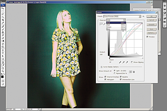
The automated effect gives our shot a green background, but you can tweak this if you like. Choose Blue from the dialog’s Channel menu. Click on the second anchor point from the top of the S-shaped blue line and push it up to the top and to the left. Next click on the bottom anchor point and drag it down slightly. The backdrop will now appear blue.
03. Seeing green
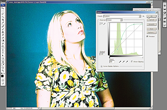
Next, choose Green from the dialog’s Channel menu. You’ll see that the curve has five anchor points – one point at each end and three creating an S-shaped curve in the centre. Move the top two anchor points up a little. This will give the skin tones (the light areas in the image) a slight green tinge.
Get the Creative Bloq Newsletter
Daily design news, reviews, how-tos and more, as picked by the editors.
04. In the pink
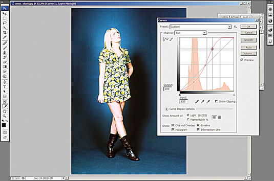
Next, choose Red from the dialog’s Channel menu. Once again, you’ll see an S-shaped curve with five anchor points in the Curves window. Click on the fourth anchor point up and push this upwards as far as it will go. Again, this will target the light skin tones in the image, which will now take on a purple-pink colour.
05. Reduce the brightness
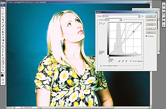
The previous steps have increased the contrast in the image and skewed the colours, but the shot now looks too bright overall. To fix this problem, choose RGB from the dialog’s Channel menu. Now click on a point about three-quarters of the way up the straight black line and drag it downwards slightly.
06. Brush over the face
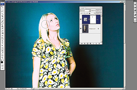
Click OK in the Curves dialog. The result so far is good, but you’ll see that some detail has been lost in the face. Click the Curves layer’s mask thumbnail, then switch to the Brush tool. Set the brush colour to black, Opacity 30%, Width 175 pixels and Hardness 0. Now carefully paint over the model’s face and hair. This will restore detail, reduce brightness and make the face more pink.
This tutorial first appeared in Portrait Photography Made Easy - a bookazine from the makers of PhotoPlus.
Now read:
- 101 Photoshop tutorials
- 20 best Photoshop plugins
- Download 40 free textures
- The 40 best free fonts for designers

Thank you for reading 5 articles this month* Join now for unlimited access
Enjoy your first month for just £1 / $1 / €1
*Read 5 free articles per month without a subscription

Join now for unlimited access
Try first month for just £1 / $1 / €1

The Creative Bloq team is made up of a group of art and design enthusiasts, and has changed and evolved since Creative Bloq began back in 2012. The current website team consists of eight full-time members of staff: Editor Georgia Coggan, Deputy Editor Rosie Hilder, Ecommerce Editor Beren Neale, Senior News Editor Daniel Piper, Editor, Digital Art and 3D Ian Dean, Tech Reviews Editor Erlingur Einarsson, Ecommerce Writer Beth Nicholls and Staff Writer Natalie Fear, as well as a roster of freelancers from around the world. The ImagineFX magazine team also pitch in, ensuring that content from leading digital art publication ImagineFX is represented on Creative Bloq.
