The 15 biggest crimes against Photoshop
We list the cardinal sins that will get you sent straight to Photoshop Hell.
We're all trained and experienced in Photoshop, right? It's always other designers who mess things up on a collaborative design project, isn't it?
If that's honestly true, then we'd suggest you treat the following article as a handy checklist to share with novices (and occasionally, interfering bosses or clients who can't help putting their undeveloped skills to unwanted use on your designs).
But it's also worth having a read yourself, just to make sure. Can you really say you're never guilty of these Photoshop crimes...?
01. Jumping into projects without planning
This is probably the single biggest mistake you can make when working in Photoshop. You need to take the time to plan out your process before you begin any project. This could be in the form of a storyboard, flow chart or mind map. It's tempting to just jump in and start designing, but you'll usually end up repenting at your leisure.
02. Failing to keep notes
If you don't keep notes of what you've done and you need to do a similar task again in the future, you will waste precious time relearning the task.
03. Starting without backing up images
Before you begin any layout it's important to have a backup folder of all original images. That way if anything goes wrong with the image in a design, you can start over if necessary.
04. Using the incorrect resolution
For quality print project, the resolution will usually be 300ppi. For the web it should usually be 96-100ppi. A common beginners' mistake is to use 100ppi for print, but this will create pixelated and washed out images that are essentially useless. You'll find more printing tips here.
Get the Creative Bloq Newsletter
Daily design news, reviews, how-tos and more, as picked by the editors.
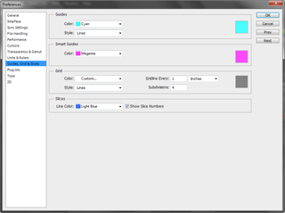
05. Not using Guides and Grids

Get the right placement by making use of Guides and Grids, which you can set to different measurements. In Photoshop CC, click on Edit: Preferences: Guides, Grids and Slices.
06. Lazy naming
To keep track of files, folders, and layers, use descriptive names to help you find them. Names such as Image2 or File3 will rapidly confuse you or anyone else working on the project unless you have an index of what each item is.
07. Not reducing files for the web
Creating big image files for the web will negatively impact download times. Make use of the 'Save for Web' function and reduce file sizes so they upload quickly. Your best options are: PNG-8, GIF, or JPEG. Don't use the full version of PNG because it will bloat your file sizes by 5-10 times. JPEG is a better option.
08. Creating logos in Photoshop
Photoshop isn't the best choice for creating a logo design because it uses bitmaps, which do not scale well. Instead, use a vector based program, as you can scale vectors infinitely. Illustrator CC is the most popular, but there are also other alternatives.
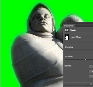
09. Not feathering masks

Feathering an image creates a blended edge which helps images 'fit' into the background. If you don't feather an image, they will look like they have been 'cut out and pasted on' into the new layout. Find out more masking tips in this article.
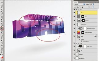
10. Not adding shadows to figures
This makes a masked image look like it's floating in the air. Shadows (created properly) anchor the figure to the ground and the scene.
11. Using too many fonts
Using a multitude of fonts will confuse the viewer. Instead, keep your designs simple with only two or three fonts and make them easy to read. Fancy scripts and calligraphy should be avoided unless they are needed to create a certain effect.
12. Using Photoshop for body copy

While you can create great text effects in Photoshop, it's not designed to be a text editor. Instead, make use of InDesign or Quark Xpress.
13. Letting file sizes get too big
It is easy to open and use many different files within Photoshop. It is also easy to exceed the memory limitations of your computer. The end result can be sluggish performance, system freezes and/or crashes.
14. Not sitting back from your project
If you sit too close to your screen, or zoom in to your work too closely, you lose all perspective. When you sit back and allow yourself to take in the entire layout, you'll see if the design is working - or not.
15. Not checking retouched images sufficiently
This could prove quite embarrassing when the images are delivered. Here are some examples. Many of these images have missing limbs, extra hands and arms, etc.
Words: Nathan Segal

Thank you for reading 5 articles this month* Join now for unlimited access
Enjoy your first month for just £1 / $1 / €1
*Read 5 free articles per month without a subscription

Join now for unlimited access
Try first month for just £1 / $1 / €1
The Creative Bloq team is made up of a group of design fans, and has changed and evolved since Creative Bloq began back in 2012. The current website team consists of eight full-time members of staff: Editor Georgia Coggan, Deputy Editor Rosie Hilder, Ecommerce Editor Beren Neale, Senior News Editor Daniel Piper, Editor, Digital Art and 3D Ian Dean, Tech Reviews Editor Erlingur Einarsson and Ecommerce Writer Beth Nicholls and Staff Writer Natalie Fear, as well as a roster of freelancers from around the world. The 3D World and ImagineFX magazine teams also pitch in, ensuring that content from 3D World and ImagineFX is represented on Creative Bloq.
