Create a realistic sketch effect with Photoshop
With the help of Photoshop's stamp and brush tools, we reveal how you can convert your photographs into stunning pencil sketches!

Photoshop CS6 has a fine collection of filters designed to turn photos into a variety of art styles, including a Colored Pencil filter in its Artistic filter folder, all enabling you to easily create Photoshop sketches.
However, although you can alter attributes such as Pencil Width and Stroke Pressure, the end result is a little too detailed and uniform – giving the shot a computer-generated look that’s similar to other filtered photos. For a Photoshop sketch effect to be more convincing you need the human touch, placing a random variety of strokes that are more detailed in key areas and more abstract in others.
- You'll need Photoshop 3 or higher for this tutorial. And set aside 20 minutes.
We’ll show you how to use the Shadow/Highlights and Curves commands to emphasise key features in a portrait. Along the way you’ll learn how to apply commands in a non-destructive way thanks to Smart Objects, which give you more freedom to experiment with your adjustments. Once you’ve converted the shot into a high-contrast monochrome version, you’ll learn how to define the whole image as a pattern that you can use to scribble in the subject’s facial features in a sketchy and organic way.
The beauty of using a pattern as a source for your scribbling is that you can draw a perfect likeness of your subject without having any drawing skills – yet the end result will still look like a convincing hand-drawn sketch. You’ll also learn how to modify brush tips for a more effective pencil sketch effect, and colour your strokes using Clipping Masks.
Click here to download your start image
01. Increase the contrast
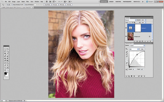
First, grab the source file from the link above. Go to File>Open and browse to the image. To emphasise important areas such as the eyes, go to Layer>New Adjustment Layer>Curves. Click OK in the New Layer box. Now click to place a control point near the middle of the curve and drag it upwards. An Input value of 130 and an Output value of 197 will brighten the mid-tones and highlights in this example. Place another point with an Input of 61 and an Output of 77.
02. Lighten the iris

Click the Curves Adjustment Layer’s white mask. Press Cmd/Ctrl+I to invert it to black. This stops the layer below from being adjusted. Now grab the Brush tool from the Tools Panel. Click the Brush Preset picker in the Options bar. Choose a soft round tip with a Size of 60 pixels. Set Opacity to 100%. Set the foreground colour to white and spray over the irises to lighten them.
03. Fine-tune the eyes
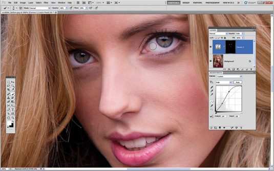
Reduce the brush tip’s Opacity to 46% and spray over the whites of the eye to lighten them in a more subtle way. This gives the eyes more impact, which is a key feature in any successful portrait. Wipe over the teeth to lighten them, too. It’s easy to go too far when lightening eyes, so drag the Curves Adjustment Layer’s Opacity down to about 50% for a more subtle enhancement.
Get the Creative Bloq Newsletter
Daily design news, reviews, how-tos and more, as picked by the editors.
04. Adjust shadows and highlights
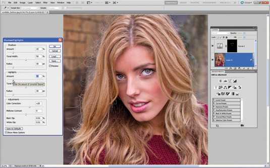
Before we tease out more tonal detail, right-click the padlock next to the background image’s thumbnail in the Layers Panel and choose Convert to Smart Object. This will enable you to make non-destructive adjustments to the shot’s tones. Go to Image>Adjustments>Shadow/Highlight. Set the Shadows Amount slider to 15%. Do the same to the Highlights Amount slider. Hit OK.
05. Boost the contrast
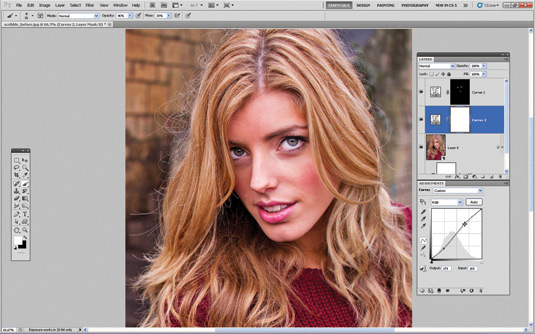
To boost the overall contrast of the shot, create a new Curves Adjustment Layer. Place a control point near the bottom left of the diagonal line and drag it until the Input is 61 and the Output is a darker 51. This creates darker shadows. Place a point near the top right of the curve and set Input to 169. Set the Output of this second point to a lighter 179. This creates brighter highlights.
06. Convert to monochrome
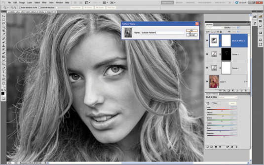
Click the top layer in the Layers Panel. Choose Layer>New Adjustment Layer>Black & White. This enables you to lighten or darken particular colours in the greyscale version of the shot to emphasise particular features. Now drag the Reds up to a value of 46 to gently lighten the skin tones so that darker areas such as the eyes stand out more in contrast. Leave the rest of the sliders at the default settings.
07. Define a pattern

We’re going to turn our high-contrast monochrome conversion into a pattern so that we can scribble back our subject’s facial features as pencil strokes. To do this, click on the Background Layer and go to Edit>Define Pattern. In the Pattern Name window you can stick with the file’s original name, or type in a new descriptive label such as ‘Scribble Pattern’. Now click OK to create your mono portrait pattern.
08. Select the pattern
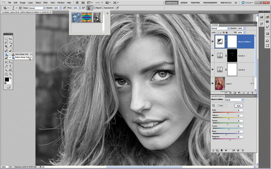
Grab the Pattern Stamp tool from the Tools Panel – it shares a compartment with the more commonly used Clone Stamp tool. To access the pattern you created in the previous step, click the Pattern picker in the Options bar. You should see your Scribble Pattern at the bottom of the default list. Click to select the Scribble Pattern. Its preview will appear in the Pattern picker.
09. Load brush tips
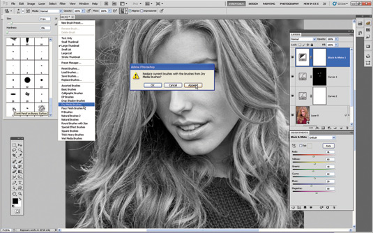
Click the Brush Preset picker in the Options bar. Click the little fly-out icon at the top right to see a list of other brush types. Click to select the Dry Media Brushes. In the Dialog Box that appears, choose Append to add the new brush collection to the existing ones in the Brush Preset picker. Scroll down to choose the third tip from the end – the Conté Pencil on Bumpy Surface.
10. Modify the tip behaviour
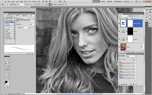
Call up the Brush Panel with the icon in the Options bar. Click on Brush Tip Shape and then drag the Spacing Slider to 60%. Click the Scattering label and drag the Scatter slider down to a value of 20%. You can spray your brush strokes with a mouse, but if you have a stylus then you’ll get more natural-looking pencil strokes by going to Shape Dynamics and setting Control to Pen Pressure. Close the Brush Panel.
11. Create a white background
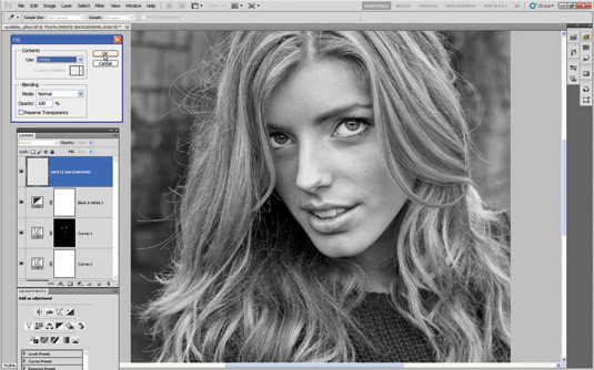
Once you’ve set up your brush tip you’re nearly ready to start sketching. But first, choose Layer>New>Layer. Label it ‘White Background’. Click OK. Make sure that the White Background Layer is at the top of the Layer Stack. Choose Edit>Fill. Set the Use drop-down menu to White. Click OK. Create a new transparent layer and label it ‘Rough Scribbles’.
12. Get scribbling
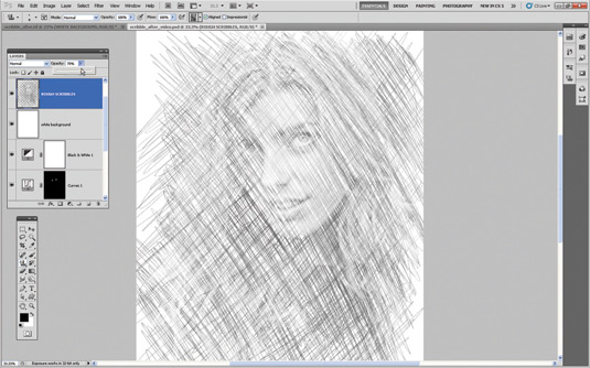
Set the Foreground colour to black. Spray the Pattern Stamp tool over the model’s face. This will reveal bits of the pattern you defined in Step 07. This works in a similar way to scribbling with a pen on a blank notepad to reveal the indentations caused by people writing on previous sheets of paper. Scribble lines in the opposite direction to create a rough cross-hatching effect. Set the Layer Opacity to 70% to create lighter strokes.
13. Make finer scribbles
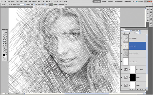
Create a new transparent layer called ‘Fine Scribbles’. Reduce the Size of the Pattern Stamp’s tip to a finer 4 pixels. Scribble more cross-hatched strokes over the model’s face to reveal finer details. When you’re done, create a new transparent layer and place it between the two scribble layers in the Layer Stack. Label the new layer ‘White Paint’.
14. Create patchy effect
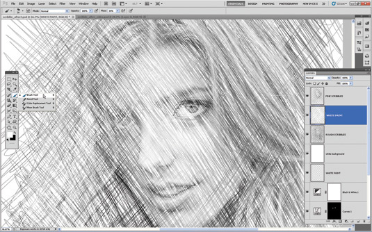
Grab the Brush tool from the Tools Panel. For consistency, click the Brush Preset picker and choose the Conté Pencil on Bumpy Surface tip. Go to the Brushes Panel and use the same attribute settings we used in Step 10. Spray diagonal white strokes on the transparent White Paint layer to hide some of the pencil strokes and create a more patchy and random-looking sketch.
15. Choose a Gradient Map
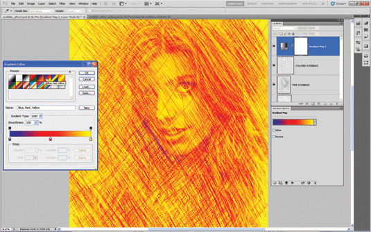
Click on the top layer to target it and then create a new transparent layer. Label the new layer ‘Coloured Scribbles’. Grab the Pattern Stamp tool, set Size to 6 and scribble loosely on the layer. Go to Layer>New Adjustment Layer>Gradient Map. Click OK. Click the greyscale gradient preview in the Dialog Box. In the Gradient Editor click Blue, Red, Yellow. Now click OK.
16. Apply a Clipping Mask
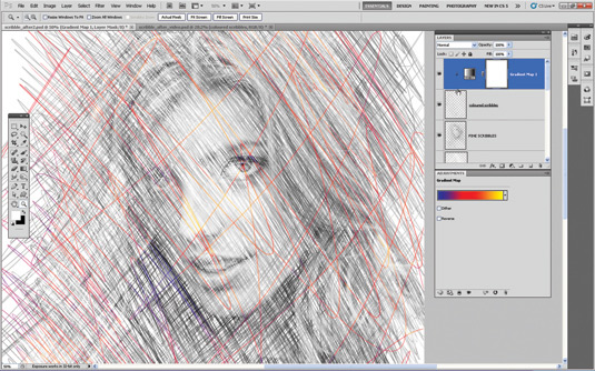
At this stage, the Gradient Map Adjustment Layer is changing the colours on all the layers below. To restrict its influence to the ‘Coloured Scribbles’ layer go to Layer>Create Clipping Mask. Alternatively, place the cursor between the Gradient Map and the ‘Coloured Scribbles’ layer while holding down Alt. Click when you see the icon change to two overlapping circles. Change the Adjustment Layer’s Blend Mode to Linear Light.
17. Add colour and contrast
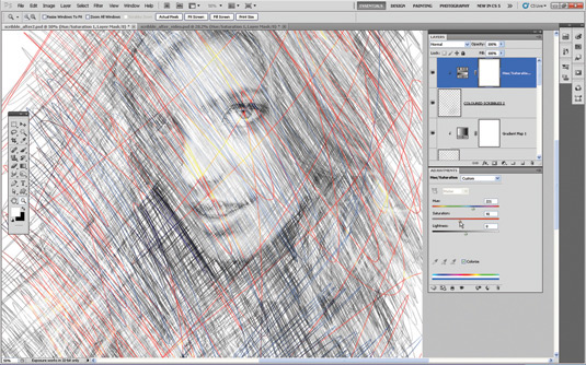
Create a new layer called ‘Coloured Scribbles 2’ and scribble on that. Clip a Hue/Saturation Adjustment Layer to the ‘Coloured Scribbles 2’ layer using the technique covered in the previous step. Tick the Colorize box. Set Hue to 221 and push Saturation up to 48 to add some blue scribbles to the mix. Add a new Curves Adjustment Layer and set the Preset drop-down menu to Strong Contrast to enhance the pencil strokes.
18. Create a texture
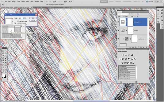
Go to Layer>New Fill Layer>Pattern and click OK. Click the preview,
then the fly-out icon, and choose Artist Surfaces. Append them to the existing patterns. Choose Watercolor. Click OK. Set the Blend Mode to Multiply. If you zoom in to 100% and toggle the Pattern Fill layer on and off, you’ll see the subtle paper texture that it adds to your pencil strokes. That's it! You're done, and hopefully you found this a useful project.
Get Practical Photoshop magazine!
This tutorial first appeared in Practical Photoshop magazine, the number one magazine for lovers of photography and image-editing. Whether you're looking for digital darkroom tips, or want to get creative, you should definitely check it out!
Now check out our massive list of 101 Photoshop tutorials!

Thank you for reading 5 articles this month* Join now for unlimited access
Enjoy your first month for just £1 / $1 / €1
*Read 5 free articles per month without a subscription

Join now for unlimited access
Try first month for just £1 / $1 / €1

The Creative Bloq team is made up of a group of art and design enthusiasts, and has changed and evolved since Creative Bloq began back in 2012. The current website team consists of eight full-time members of staff: Editor Georgia Coggan, Deputy Editor Rosie Hilder, Ecommerce Editor Beren Neale, Senior News Editor Daniel Piper, Editor, Digital Art and 3D Ian Dean, Tech Reviews Editor Erlingur Einarsson, Ecommerce Writer Beth Nicholls and Staff Writer Natalie Fear, as well as a roster of freelancers from around the world. The ImagineFX magazine team also pitch in, ensuring that content from leading digital art publication ImagineFX is represented on Creative Bloq.
