How to create a mixed-media collage
Ciara Phelan shows you how to mix vector imagery with papercraft photography to create a textured collage with real depth.
Retro effects and collage maker tools are very much in vogue at the moment, with people turning to scrapbook-style collages to distribute their photo collections. With this in mind, there are many collage techniques that can be used in design and one such is the mixed-media collage.
This tutorial uses the latest some basic layering and masking techniques, coupled with some paper craft elements that we'll montage together to create an interesting textured collage with lots of depth.
There are several tools in Photoshop that are used by creatives over and over again: I'll take you through some very versatile processes that you can incorporate with these tools into your own workflow. We'll be designing an album cover, but the mixed-media techniques can be applied to any project.
Want to learn more about making a collage? Here's how to make a collage in Photoshop.
01. Get out your scalpel
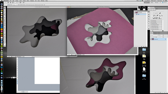
This image is all about experimentation, mixing a variety of elements with lots of different techniques to create depth and layering. Before you even open Photoshop, dig out your scalpel and card for a spot of good old-fashioned papercrafting. Cut out lots of different swirly blobs and layer them using mountboard to create shadow.
02. Add texture
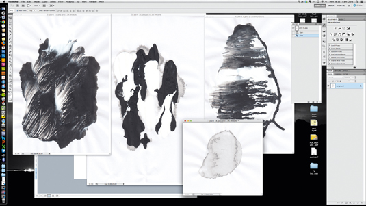
To make the illustration feel less digital, we're going to add organic textures by creating some interesting marks on paper. I decided to experiment with black and white acrylic paint, as I wanted the imagery to feel quite fluid. However, you can use whatever you have to hand - felt tips, pencils, spray paints and so on. Photograph everything.
03. Open a Photoshop document
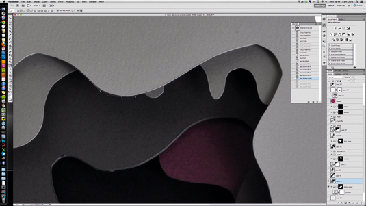
Open a new square Photoshop document; mine is set to 210mm at 300dpi in RGB. It's best to start with the photographic elements and build digital ones on top, so open one of your paper blob images, select the Pen tool and trace around the edge of the top blob. Make sure you stay inside the edge, not outside.
Get the Creative Bloq Newsletter
Daily design news, reviews, how-tos and more, as picked by the editors.
04. Layer mask
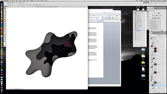
When the path is completed, Ctrl+right-click and select Make Selection... from the pop-up menu. Set the feather radius to 0.3, and hit OK. At the bottom of the Layers panel select a new folder, then at the bottom of the same window select Add Layer Mask. This will create a folder with a mask that you can put the blob photograph layer and other textures into.
05. Enhance shadows and highlights
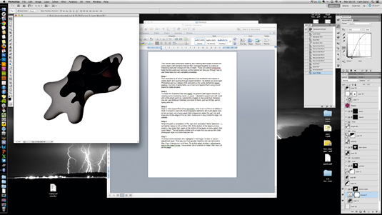
To enhance the shadows and highlights in the image it's best to use an adjustment layer. This way you have greater flexibility and can remove a filter if you change your mind later. To do this, go to Window>Adjustments and, in this case, Curves. I've added lots of shadow to make it feel like a deep pit.
06. Add fluid vector shapes
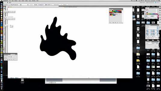
Now it's time to start introducing some fluid vector shapes. Open up Illustrator and create a new A4 document. Select the Pencil tool, and draw some big round blobs. If you have a tablet it will be slightly easier, but a mouse is fine. Fill the blob with black, then copy the shape, move back to Photoshop and paste it in. Using the Magic Wand tool, select the shape and create a group mask as in step 04. Drop a photograph of the paper blobs into this group to create a large swirly mass.
07. Create layers of texture
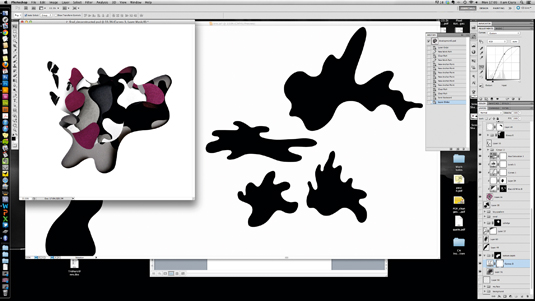
Repeat the above steps to create layers of photographic elements and textures. Don't forget to add adjustment masks to enhance the shadows and incorporate even more depth and shade.
08. Create bespoke brush
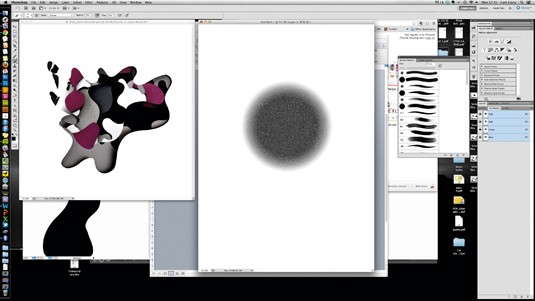
In addition to the layers of texture, I've made some vector blobs with shaded edges that create a gradient effect. This was done with a bespoke brush. To do this, open a new document and use the Radial Gradient tool to create a simple black-to-white gradient. Go to Filter>Add Noise and set this to about 100%, then hit OK. Select the Brush tool then go to Window>Brush Presets. From the drop-down menu at the top-right of the Brush Presets panel, select New Brush Preset.
09. Use bespoke brush
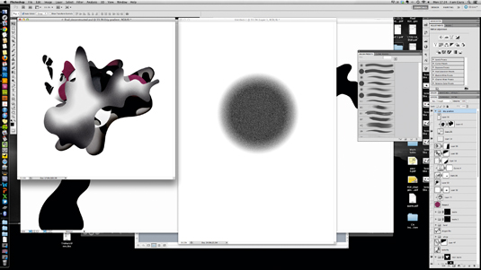
Go back to your main illustration and, using a new vector blob, create a new group mask. Fill this layer with light grey by going to Edit>Fill. Then, using your new bespoke brush, start adding shaded areas in black.
10. Add small areas of texture
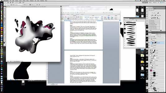
To make the composition more interesting you can add small areas of texture using the paint marks you created earlier. To do this, open the texture you want and drag the layer into the desired group. In the bottom of the Layers panel select Add Layer Mask. A small box will appear next to the image box in the Layers panel. Select this, and then select Brushes. Select black in the palette options, and mask out any of the texture you want to hide. Play around with the opacity to get a good gradient.
11. Layer up the collage
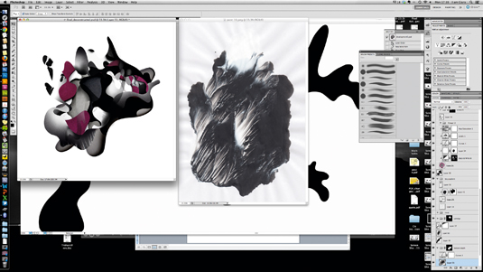
Keep experimenting with these techniques to layer up your collage. Try adding in vectors with gradient areas, and playing around with the opacity settings to make them feel translucent.
12. Add more imagery
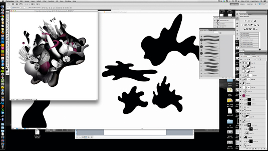
I decided to add some collaged imagery to the illustration to make it feel more interesting. I did this by scanning and cutting out imagery using the Pen tool. I then copied and pasted it in. To make the flowers feel like they are emerging from the depths of the pit, I added a new layer and, using the Brush tool, blended some black over the top.
13. Add a smoke effect
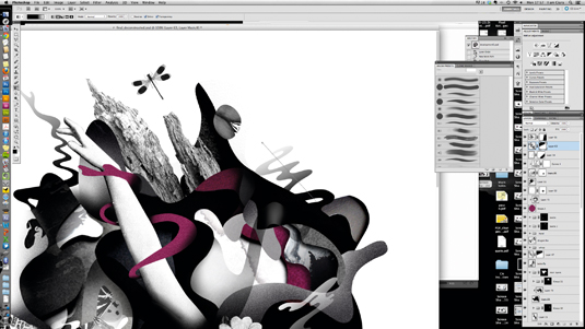
To give the illustration a final touch of depth, add some small wispy vector shapes and cover them with a gradient so that they feel smoky. Create the small wisps in Illustrator and paste them into Photoshop. Add a layer mask, as in step 10. Instead of using the Brush tool, select the Gradient tool and gradient out the mask.
14. Add the face
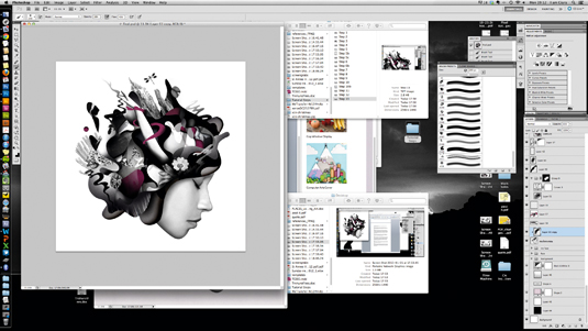
Now the 'hair' is completed, I'm going to add a face. Cut out your desired image using the Pen tool and paste it into position, being careful to create smooth edges. If needed, add a new layer and use the Brush tool to smooth out some of the tones.
15. Add background
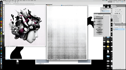
The final touch is to add a slightly textured background. I created mine by photocopying a printed gradient several times so that it degraded. I then pasted this in place and used the Multiply tool to add a layer of colour.
Words: Ciara Phelan
Ciara Phelan is a freelance illustrator working from Open Studio in London.
Like this? Read these!
- Illustrator tutorials: amazing ideas to try today!
- Check out this collection of top Photoshop tutorials
- Discover the 5 best pencils for artists and designers
- How to choose the right drawing tools
- Read our guide to choosing the best photo editor

Thank you for reading 5 articles this month* Join now for unlimited access
Enjoy your first month for just £1 / $1 / €1
*Read 5 free articles per month without a subscription

Join now for unlimited access
Try first month for just £1 / $1 / €1

The Creative Bloq team is made up of a group of design fans, and has changed and evolved since Creative Bloq began back in 2012. The current website team consists of eight full-time members of staff: Editor Georgia Coggan, Deputy Editor Rosie Hilder, Ecommerce Editor Beren Neale, Senior News Editor Daniel Piper, Editor, Digital Art and 3D Ian Dean, Tech Reviews Editor Erlingur Einarsson, Ecommerce Writer Beth Nicholls and Staff Writer Natalie Fear, as well as a roster of freelancers from around the world. The ImagineFX magazine team also pitch in, ensuring that content from leading digital art publication ImagineFX is represented on Creative Bloq.
