Create an Instagram-style collage in 6 simple steps
Learn how to add retro colouring and an array of vintage borders to your images to create an old-school collage.
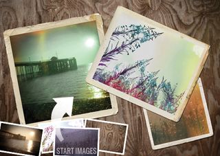
Retro effects and collage maker tools are very much in vogue at the moment. In the age of digital imaging, with cameras and lenses producing crisp, detailed shots, there's something hugely appealing about chemical imperfections and messy borders. Similarly, with clinical digital photo organisation the norm, people are turning to scrapbook-style collages to distribute their photo collections.
You can create these retro effects using smartphone apps such as Instagram, which let you to transform the look and feel of photos in seconds by adding borders and colour shifts to make a digital image look like a battered old print. We'll be using Photoshop Elements instead, which may take slightly longer, but offers you far more control and a greater variety of effects. You can also use Photoshop CC, Photoshop CS6 and most previous versions of CS.
We'll show you how to apply retro effects to several images, then combine them to create an old-school collage. As well as adding borders, you'll learn how to mimic the effect of an old camera leaking light and overexposing the edges of a negative. We'll be using key Photoshop tools such as adjustment layers and the Transform controls, and we'll also be making use of the Content panel, with its host of creative effects.
Click here to download start images
01. Skew the colours
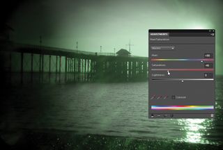
Open the three instagram_start.jpg images and select the pier image. Go to the Layers panel (Window>Layers) and click on the Create New Adjustment Layer button. Choose Hue/Saturation from the drop-down menu, and in the Adjustments panel set Hue to +90 and Saturation to -45.
02. Levels effects
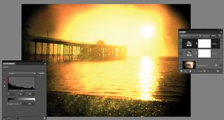
Next add a Levels adjustment layer. Click the RGB drop-down at the top of the Adjustments panel and choose Red, then set the Highlights slider to 60. Next choose Green, and set the Highlights slider to 130. Press Ctrl+I to invert the Levels layer's mask from white to black, so that the effect is hidden.
03. Paint a light leak
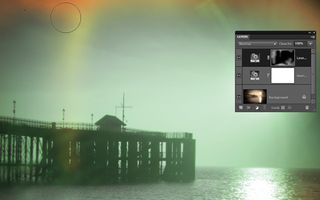
Take the Brush tool, set the Opacity to 50% and make sure the foreground colour is white. Paint over the edges to reveal the Levels adjustment and create a light leak effect. Next go to File>New>Blank File. Set Width to 297mm, Height to 210mm, Resolution to 300 pixels/inch and Background Contents to Transparent, then hit OK.
04. Drop in a frame
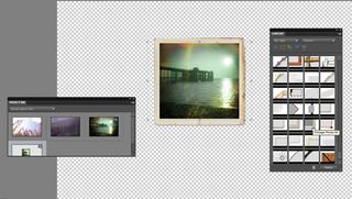
Go to Window to open the Project Bin and the Content panel. In the Content panel, choose By Type and Frames in the two top menus, then scroll to the Vintage frames near the bottom of the list. Drag the Vintage 04 frame onto the image, then go to the Project Bin and drag the pier image into the frame.
05. Add more images
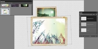
Position the image inside the frame, then hit Enter to apply. Next go to the flower image. Once again, use adjustment layers to skew the tones and experiment with different settings. Go back to the new image, drag in another vintage frame and use the Move tool to resize it, then drag the flower image into it.
06. Fine-tune positioning
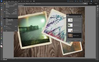
Repeat the process for the third image. Select the Move tool and check 'Show Transform Controls' in the Options bar. Drag the bounding box handles to resize, position or rotate each frame, then hit Enter when you're happy. To add the background image click the empty bottom layer and go to File>Place. Navigate to the instagram_4_start.jpg file and hit Enter.
Words: James Paterson
This tutorial first appeared in PhotoPlus magazine issue 65. To get even more photography tips and inspiration, get the mag every month!
Now read:
- The best Photoshop tutorials
- Check out these essential Photoshop plugins
- Free Photoshop actions to create stunning effects

Thank you for reading 5 articles this month* Join now for unlimited access
Enjoy your first month for just £1 / $1 / €1
*Read 5 free articles per month without a subscription

Join now for unlimited access
Try first month for just £1 / $1 / €1
Get the Creative Bloq Newsletter
Daily design news, reviews, how-tos and more, as picked by the editors.
The Creative Bloq team is made up of a group of design fans, and has changed and evolved since Creative Bloq began back in 2012. The current website team consists of eight full-time members of staff: Editor Georgia Coggan, Deputy Editor Rosie Hilder, Ecommerce Editor Beren Neale, Senior News Editor Daniel Piper, Editor, Digital Art and 3D Ian Dean, Tech Reviews Editor Erlingur Einarsson and Ecommerce Writer Beth Nicholls and Staff Writer Natalie Fear, as well as a roster of freelancers from around the world. The 3D World and ImagineFX magazine teams also pitch in, ensuring that content from 3D World and ImagineFX is represented on Creative Bloq.
