Shoot print work for your portfolio
Effektive's creative director Greig Anderson shares his tips for doing justice to your tactile print projects with photography.
Skills: Select your best work for your folio, create a backdrop and lighting set-up, make good use of RAW format, retouch and crop shots for use online
The days of lugging a large black folio case around to prospective clients and employers like some sort of door-to-door designer are, thankfully, now a fading memory. However, a benefit of this was that you could take out the pieces, flip them over, handle them and give the person you were showing a 'feel' of the quality of work you were capable of.
These days, it's far more likely that your work will be on screen via PDF or on your portfolio website. But how do you showcase your lovingly crafted print work digitally? Well, you need to use photography to show off not just the layout of a piece of work, but also its actual look and feel (textures, finishes, stock, weight, colour) as closely as possible.
The aim of this project is to help you shoot your work more creatively and make it more intriguing. It must be said that I am not a photographer; I am a designer with a digital SLR camera, a tripod, some lenses and some relatively inexpensive studio softboxes (lamps). Where possible, get a professional photographer to shoot your work. However, this is not always possible, so over the following pages I will show you the basic skills we use at Effektive to help you take your print work photography to the next level.
Click here to download the support files (38.3MB)
Step 01
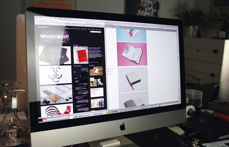
The first step is to decide on a style in which to shoot and present your work. Do a bit of research online and see what kind of photography you find most appealing. Is it clean, simple, direct work shots that you prefer, or something more creative with extra context provided by way of location, textures or background colours? There are many excellent design resource sites and blogs, but try the likes of FormFiftyFive, Visuelle and Bitique for lots of great agencies' work and image styles.
Step 02
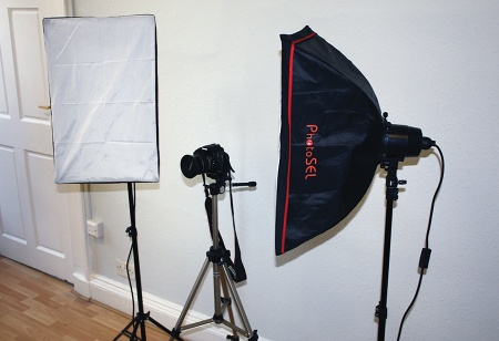
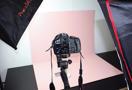
Once you've chosen the style you want, you need to get your equipment organised. These days you don't need to spend a small fortune on top-of-the-range cameras, lenses, tripods and lighting - although getting the best you can will only help the quality of your final images. For the shots we are trying to achieve here we are looking for a clean, studio-shot feel with constant source lighting. We're using a Canon 450D with a selection of lenses (primarily the standard 18-55mm lens), a mid-range high street tripod and some relatively cheap 40x60cm studio softbox lamps.
Get the Creative Bloq Newsletter
Daily design news, reviews, how-tos and more, as picked by the editors.
Step 03

So you have the equipment sorted, now you need to decide how to create the look of your images. There are many ways to do this, and ideally it works well to get a roll of backdrop paper or a muslin that you can drop from a boom stand to create a smooth backdrop and curve behind your work. In this case, though, we have decided to shoot on a selection of flat coloured backdrops to help the work stand out. We have chosen some off-the-shelf sheets of SRA2 coloured mounting board (available from any high-street art store or craft shop), which we will simply use as a variety of coloured backdrops against which to shoot the work.
Step 04
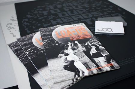
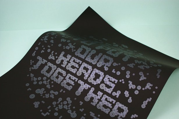
Selecting your work can be one of the hardest parts, so be ruthless. You will be judged on the quality of the work that you select, so make sure it's your best. Think about each project and what details you want to focus on, perhaps the typography, the layout, the stock you used or some special finishes. Each project will react best to being shot in a different way so think creatively about the types of angles, compositions and layouts that will suit each of them. For the example here, we're shooting three of our recent projects: a silkscreened self-initiated print, an exhibition guide for Architecture + Design Scotland, and some foiled business cards for a client called JOQ.
Step 05
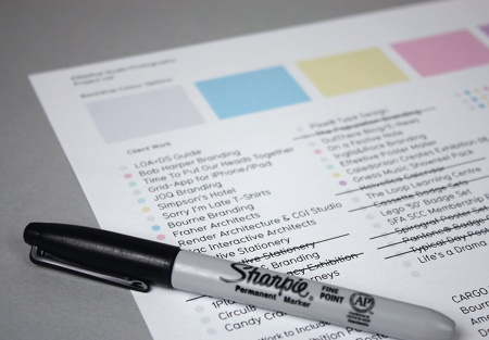
When setting up your shoot, pull together a list of the work you want to shoot and, in this case, the coloured backgrounds you want to shoot on. That way once you have set up your backdrop, lights and tripod, you can minimise the number of times you need to take down and rebuild your set.
Step 06
The lighting on small projects such as these business cards is just as important as it is for larger projects like the posters. Your work needs to be illuminated properly to bring out the details and colours well. You might need to light your work in several ways by moving the lamps around. Something like an exhibition guide - a flat object - needs to be illuminated evenly; an object with low relief, such as our business cards, needs to be cross-lit or angled to bring out the foil stamped debossed details and texture of the stock.
Step 07
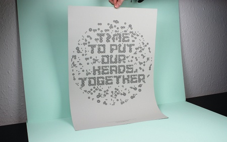
The composition that you choose for your shots will depend on the style you're looking to achieve, but a good tip is to try and bring your work to life by adding some depth and movement. Rather than shooting a flat brochure, for example, try standing it up on its end and flaring out the pages a little to try and capture the format, or pile up business cards in a stack to show the weight of the stock. For the posters we're shooting here, we used Blu-Tack to fix the poster to convey a sense of scale, and held up the other end to achieve a floating effect off of the backdrop.
Step 08
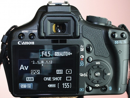
Let's start to take some shots - digital means you can take as many test shots as required to get the right sort of style you're looking for. Try varying your camera settings to see which ones will get you the required results. You should have read the manual by this point, so will know what controls what. For these photographs, we are shooting mostly in RAW mode, which basically means we can still process and edit various parameters of the images before processing the final shots.
Step 09
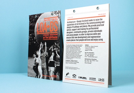
A good tip to guarantee a nice variety of shots is to vary the angle and composition to help the viewer get a real sense of the work you are shooting. Here, we're shooting our exhibition guides standing up, showing the front and back next to each other. It can, on occasion, be good to add a sense of scale to your projects where there is perhaps an interesting format or size. Adding in objects such as pens, pencils and rulers can help to give an item scale, just be careful not to over-complicate the shot and remove focus from your work. Holding work in your hand can help illustrate scale, and turning a page or holding a business card can restore its tactility, and give a feel for the stock and finishes that you've used.
Step 10

Macro mode is ideal for capturing fine, close-up details of your work. You can get specific macro lenses, but in this case we'll just use the macro mode that is built in on the camera - most D-SLRs will have this as standard. Check yours by looking for the menu button with an icon of a flower on it. This effectively switches the camera into a special close-focus mode, and can allow you to get less than 10cm from your subject. Typographic details, special finishes, folds and interesting binding methods look great when shot in macro and can add a real sense of quality and depth to your projects. Here we are using macro mode to showcase the fine silkscreen detail in the posters.
Step 11
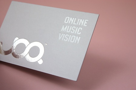
Using macro mode again, we can achieve a great close-up of the metallic silver foil that's been applied to these business cards. When you're shooting a reflective surface like this, try to angle the object to maximise light reflections off the metallic surface, and really showcase the finish.
Step 12
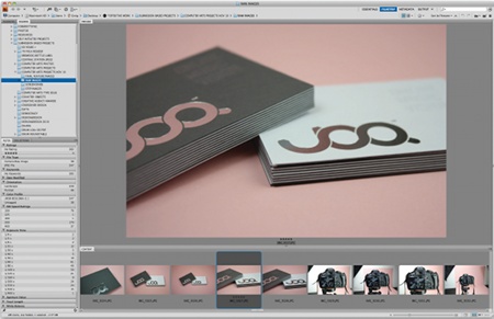
Once you've finished shooting it's time to review the images and select the ones that you think best showcase your projects. Try to pick a range of complementary shots of each piece to build an overall impression of your project, including unusual angles and macro detail shots. Use Adobe Bridge to open and view all your images - a good tip is to star the images that you think capture your projects best. You can then filter all the selected images together and open them in Photoshop for processing. Because some of these are RAW files, you can still adjust various elements before processing the final images.
Step 13
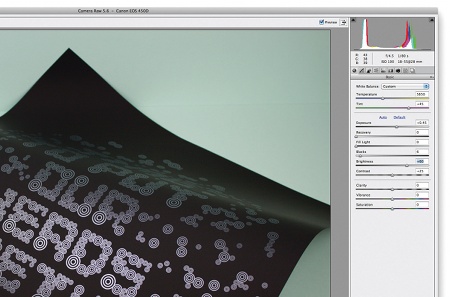
Now that you've filtered down your images, open up the RAW files using Photoshop Camera Raw, where you can make any final adjustments to the temperature, tint, exposure, contrast and various other parameters. You might find that because of the different lighting movements, you will need to adjust some areas to get a sense of consistency throughout your images. Once you're happy with your image, simply click to open it up in Photoshop.
Step 14
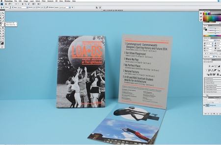
When you come to edit your images, you might find some small spots of dust or areas that you just want to tidy up. You can use the Photoshop Clone Stamp tool to remove these and clean up your image. It's always worth just checking through your images for any spots because you might have missed them when reviewing previously, and there's nothing more annoying than to have someone spot a little mark on your image when they should be looking at your work.
Step 15
You now need to crop your images for use in your portfolio. The way you intend to use the images will determine how you wish to crop them - sometimes cropping an image in a certain way can focus the user onto a particular detail of the work, for instance. Use the Crop Tool (C) in Photoshop to crop your images in a way that enhances the content, resize them and save them as JPEGs in RGB format for screen.
Step 16
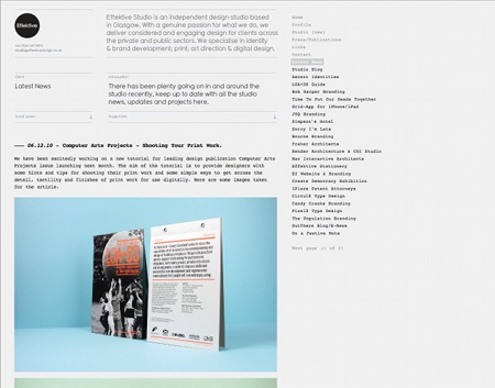
Now that your photoshoot, image selection, editing and retouching are complete, you're ready to use your images to showcase your talents. Whether the images will be used in a PDF folio or uploaded to your website, it's always a good idea to save a variety of sizes, formats and resolutions. You can use your images to promote yourself online through blogs, magazines and social media. Check out the Effektive Design Flickr stream for more behind-the-scenes and finished images from the shoot.
Words: Greig Anderson
Creative director and founder of Glasgow-based design studio Effektive, Anderson specialises in brand development, print, art direction and digital design. www.effektivedesign.co.uk
Liked this? Read these!
- Free Photoshop brushes every creative must have
- Free Photoshop actions to create stunning effects
- The best Photoshop plugins

Thank you for reading 5 articles this month* Join now for unlimited access
Enjoy your first month for just £1 / $1 / €1
*Read 5 free articles per month without a subscription

Join now for unlimited access
Try first month for just £1 / $1 / €1

The Creative Bloq team is made up of a group of art and design enthusiasts, and has changed and evolved since Creative Bloq began back in 2012. The current website team consists of eight full-time members of staff: Editor Georgia Coggan, Deputy Editor Rosie Hilder, Ecommerce Editor Beren Neale, Senior News Editor Daniel Piper, Editor, Digital Art and 3D Ian Dean, Tech Reviews Editor Erlingur Einarsson, Ecommerce Writer Beth Nicholls and Staff Writer Natalie Fear, as well as a roster of freelancers from around the world. The ImagineFX magazine team also pitch in, ensuring that content from leading digital art publication ImagineFX is represented on Creative Bloq.
