How to shoot print work for your portfolio
Showcase tactile projects with more effective photography.

With a bit of photographic know-how, a half-decent DSLR or compact camera (see our best cameras list) and a sprinkling of art-direction flair, there's no reason why you can't shoot pro-quality images of your printed works that will do them justice on screens and online portfolios.
"Don't worry if you're not the most skilled photographer or don't have the best camera on the market," advises photographer Neil Watson.
"These days even the most basic cameras and equipment will get you a long way; any entry-level DSLR or high-end compact camera with an external flash can be used to get great results."
So let's find out how to photograph printed and tangible design projects professionally.
01. Set the stage
"The way in which we photograph our projects is a part of what defines our visual style," says graphic designer Patrice Barnabé. "First of all, be aware that photography, as much as design, can be a victim of trends."
"Remember the trend of holding a giant poster with your fingertips in front of you? Or framing all of your posters? A few years ago everybody was doing it and now it looks completely outdated. Don't be tempted to imitate a photographic trend; instead, find your own way to do it and your pictures will stand the test of time."
02. Consider background colour carefully
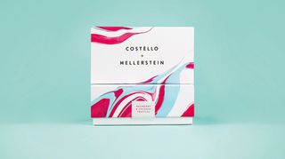
Chris Logan of The Touch Agency likes a neutral colour for the background: "It works well when you have a variety of projects of different size, colour, print finish and scale to accommodate. It also allows for consistency across all of our project shots."
Barnabé warns against creating something too clinical. "When you create your set, make sure it doesn't look like a laboratory. White or pale grey backgrounds can be cold and inexpressive. Don't be afraid to incorporate a colour background that relates to the look and feel of your project; it will help create a cohesive set of pictures."
03. Think about your theme
"You can adorn your set with objects that give an indication of the project theme. For example, if you designed the identity for a flower shop, a few rose petals distributed harmoniously next to your stationery can add a sensible and fun touch."
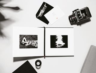
Watson echoes this: "I sometimes like to add props that create a sense of an environment. This could be something as simple as a shadow from a plant, or even a cup of coffee."
But don't go overboard with your accoutrements; Julian Zimmermann of Deutsche & Japaner stresses that it's important to stage the work in a well-balanced way: "Don't over-stage the imagery; let the work shine in the foreground."
04. Lighting matters
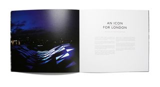
When you've worked out your set or backdrop, you'll need to think about lighting. Watson has a clever technique for creating a miniature studio that works with a DSLR and an external flashgun (also called a speedlight).
"Place a large sheet of white card against a white wall and set up the work you wish to photograph on the card. Attach the external flash to the hotshoe of your camera. Most speedlights have a rotatable head; point this upwards so it is facing the ceiling. Take the picture by standing above your work, looking down onto it so the flash is pointing directly at the wall.
"Shooting with a flash in this way uses the wall to create a softer light source that will make a shadow below the item you are shooting, and shouldn't create too much reflection on it.
"You can also have another sheet of white card balanced against your legs, facing back into the shot, which will act as a fill light, softening some of the shadows at the lower half of the frame." (A fill is a light source used to reduce contrast.)
If you don't know much about lighting and don't have any special equipment, Barnabé recommends natural daylight. "Cloudy days and afternoons are ideal since they create smooth shadows and they reduce high contrast. Create your set next to a big window and reduce the impact of direct light with a translucent white curtain."
05. Get the angle right

Logan recommends a tripod for taking your pictures: "Especially if you want to achieve a consistent vantage point, point of focus or angle – it's much easier to re-arrange the printed matter and get the shot you want once you have the setup locked down."
Watson points out another advantage: "It also means you can shoot a few variations and comp them together afterwards if needed."
There's no harm in hand-held shooting though; Barnabé prefers a variety of angles to keep things interesting: "Don't shoot all your set in the same 45 degree angle – it will end up becoming boring and predictable. Only use a tripod if you want to show different layers of a single piece, such as different spreads of a magazine, or different screenshots of a website."
06. Focus on the finishes
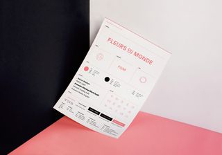
Capturing paper textures and print finishes can be done with close-up shots and some tweaks with your lighting. "Getting foil blocks on printed items to look metallic can be tricky," says Watson.
"Use your tripod, and hold up a small piece of white or black card to create good reflections. Better still, ask someone else to hold the card so you can look through the camera to see how it is affecting the picture; this can give you that light-to-dark effect in the shiny surface that can be retouched back into your main image."
07. Use the right lens
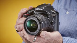
You'll need to switch out your lens for the closer takes. "I use a Canon 60D and use a very basic 18-55mm f/3.5-5.6 lens for most of my shots, and a 50mm f/1.8 for close-up shots when I want to show paper texture, print finishes or small typography," says Barnabé.
"For details and close-ups, choose a wider aperture that will decrease the depth of field – that's the amount of the scene which is in focus. Between f/1.4 and f/2.8 is good. For bigger general shots never go below f/4.0, otherwise you will end up with blurred parts in your picture."
If you're having trouble with blurring or camera shake, Barnabé recommends using the image stabilisation feature of your lens and a shutter speed of at least 1/200.
Following this advice should get you some great results, and with a little experimentation and practice you'll be shooting perfect images with relative ease.
Related articles:

Thank you for reading 5 articles this month* Join now for unlimited access
Enjoy your first month for just £1 / $1 / €1
*Read 5 free articles per month without a subscription

Join now for unlimited access
Try first month for just £1 / $1 / €1
Get the Creative Bloq Newsletter
Daily design news, reviews, how-tos and more, as picked by the editors.
Tanya is a writer covering art, design, and visual effects. She has 16 years of experience as a magazine journalist and has written for numerous publications including ImagineFX, 3D World, 3D Artist, Computer Arts, net magazine, and Creative Bloq. For Creative Bloq, she mostly writes about digital art and VFX.
