Working with photography in design: post-production fixes using Photoshop
Photography in design can be a tricky aspect. Ten world-renowned designers channel their best advice on how to get the most from your photos using Photoshop in post-production.
Including Luke Edge, Roanne Adams and Miika Saksi, these tips will ensure you get the most from photography in your creations.
Don't forget to check out our Photoshop CS6 review
James Kape says...
1. Do - Use RAW format
This way, should you wish to reform proportions of your work, you can do so without sacrificing quality. However, always try to decide the final dimensions as early as possible. It's incredible how big a file can become when working with RAW.
2. Don't - Kill the feeling
I think post-production can be a very important process. However each decision needs to be well-considered because the photograph should transcend and, for some part, carry the quality of your design.
Don't spend hours retouching unless you're deliberately aiming for a 'digital' aesthetic.
Ibon Landa says...
3. Do - Go deep
Always work in 16 bits instead of 8 bits, and treat levels, contrast and brightness using the Levels window. The image suffers less and you will maintain the highest possible quality.
4. Don't - Go too far
Never retouch an image in CMYK. It's really basic, but there are a lot of people who don't know not to do this. You should always retouch your image in the RGB screen mode so the colour stays as close to reality as possible. Finally, just convert it into CMYK format.

Miika Saksi says...
5. Do - Give yourself options
Always start working on the photo at a larger size than your intended final print size. Shrinking it down at the end of the process makes the image quality better and sharper.
Also, it leaves you with far more options to crop the photo on your final layout. And when retouching, make sure you keep your original file on the top layer.
Click the visibility on and off to compare it with what you've done - this helps to keep your work in perspective.
6. Don't - Compound your edits
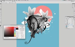
In Photoshop, while post-producing a photo, try to keep adjustment changes and as much stuff as possible on separate layers. This helps if you need to go back a few steps or change something.
You can also easily drag-and-drop the adjustment layers onto another Photoshop file.
Luke Edge says...
7. Do - Keep it real
If you're pressured, shoot in RAW format, because that gives you more latitude in terms of retouching. But I do like photography that captures the moment.
With fashion shoots it's different because there's retouching to be done anyway, but for campaign and editorial I prefer to shoot it as I see it. A lot of the time, all you need to do is just add a bit of contrast and then it's done.
8. Don't - Accept weak stock shots
The problem with stock photography is that you usually get exactly what you see: there's not much consideration given to what happens after you buy the image. Sometimes though, you can comp together images to deliver exactly what you're after.
We recently bought a beach scene with deck chairs but it was landscape and we needed portrait, so we got another shot of a beach, and one of the sky, and combined them.

Roanne Adams says...
9. Do - Get a professional retoucher to help out
We typically hire retouchers from outside the studio to handle the bigger projects, and I would really recommend doing this wherever you can - it really helps.
Quite a lot of the time photographers claim they can retouch as well, but it's highly unlikely. It's far too easy to run into problems with the client not being happy with retouching.
10. Don't - Over-touch
A common problem is when images are too heavily treated, so it's always a good idea to talk to the client about how much retouching they want done.
Do they want the models natural looking? Should the pores in the skin be visible? There's a fine line between fake and 'real but retouched.' So try to match the retoucher's style to that of the client.
Tanner Almon says...
11. Do - Take time with art direction and location scouting
Put a lot of time and effort into both of these before you take your pictures, so that you can keep things nice and simple once you get to working with them in Photoshop.
If I have to do much more than tweak contrast and colour balance once I get into Photoshop I get bummed out, like I hadn't done enough homework. Do your homework and the final product will be much more authentic and, hopefully, rewarding.
12. Don't - Go crazy with filters
The final product is supposed to be a photograph. It's easy to get caught up in all the 'whizz bang' gizmos that Photoshop offers, but moderation is the key if you want your photograph to remain looking like a photograph.
For me, the one feature that would benefit the next version of Photoshop is a 'subtlety' filter.

Paul Hutchison says...
13. Do - Use your eye
Even the best images need a few tweaks, and I do this all by eye. I don't have a set formula, each image is different and depending on the intended use needs different care.
That said, I usually clean up any dirt or imperfections first, taking care not to overdo it, and still keep the image 'real' looking. Next step would be to look at the brightness/contrast and levels.
14. Don't - Let it flood
Always work with a copy of your selected RGB image. All adjustments are made while the image is still in the RGB colour space, and large, solid areas of black need special care so the final image doesn't flood the paper with too much ink.
Each printer has a different process, so I always consult with them and never assume anything.
Tim Green says...
15. Do - Use curves
Always use adjustment layers to their best advantage, particularly the Curves setting.
Playing around with the different levels in RGB mode can produce some very striking and bold effects that are reminiscent of Lomo photography, which is currently enjoying a resurgence of popularity amongst creatives.
16. Don't - Be afraid to layer photos together
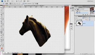
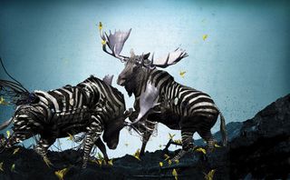
By using the Layer Blending options effectively, you can put a selection of bad photos together, collage them on top of each other and create a great photo and a unique piece of work.
Sometimes layering a selection of different photos of the same topic can surprisingly create a far more interesting look than that of just a straight portrait photograph.

Lambertz & Pietsch say...
17. Do - Burn eyelashes and eye shadows carefully
It's instinctive to always look at the eyes first, but because of the relatively low contrast range of most cameras, there's often not enough detail captured. I often work on the eyes using the Burn tool, with a brush size of 1px or 2px and an exposure of 50-75%.
18. Don't - Over-dodge eyes
When a model's eyes are clear and bright, the whole image feels sharper and better illuminated. As well as burning the shadows, it's also worth lightening them a bit in Lightroom or Photoshop with the Dodge tool.
But never over-do this: it's best to begin the dodge with 10% exposure in the midtones.
Chuck Anderson says...
19. Do - Get a grasp of light
Get a basic understanding of how light works in photography, and how it behaves in everyday life, such as why it reflects off certain surfaces, or how far a light-source needs to be from a surface to reflect in a given way. There are lots of books exploring how light works.
20. Don't - Just jump in
In terms of Photoshop, it's important to understand exactly what you want the photo to do. Is it going to be simple with a dash of light here, or more heavy-handed? Practice helps you to understand that photographs are built up in layers.
And that's all you're being treated to for now. Be sure to check back for updated features. Did you find this useful? Let us know in the comments box below!
This feature was originally published in Computer Arts Projects issue 146.

Thank you for reading 5 articles this month* Join now for unlimited access
Enjoy your first month for just £1 / $1 / €1
*Read 5 free articles per month without a subscription

Join now for unlimited access
Try first month for just £1 / $1 / €1
Get the Creative Bloq Newsletter
Daily design news, reviews, how-tos and more, as picked by the editors.
The Creative Bloq team is made up of a group of design fans, and has changed and evolved since Creative Bloq began back in 2012. The current website team consists of eight full-time members of staff: Editor Georgia Coggan, Deputy Editor Rosie Hilder, Ecommerce Editor Beren Neale, Senior News Editor Daniel Piper, Editor, Digital Art and 3D Ian Dean, Tech Reviews Editor Erlingur Einarsson and Ecommerce Writer Beth Nicholls and Staff Writer Natalie Fear, as well as a roster of freelancers from around the world. The 3D World and ImagineFX magazine teams also pitch in, ensuring that content from 3D World and ImagineFX is represented on Creative Bloq.
