How to use photography in design
Expert advice to help you maximise the potential of photography in design.
Photography in design can be more impactful than graphics or illustration as it communicates the message with a sense of realism, and often packs more of a visual punch, too. However, when your design features photography, some key aspects can get lost in the creation. In this post, eleven top designers share their wisdom of how to maximise the power of photography in design.
If you're still struggling to decide whether you want to use photography or illustration for your project, we've got a handy guide to help you decide over on our 5 reasons to use photography in your designs post. Or check out these photography websites for some killer inspiration.
See our photography cheat sheet for help, and for specific tips on taking portraits, see our guide to portrait photography.
01. Save bad photography
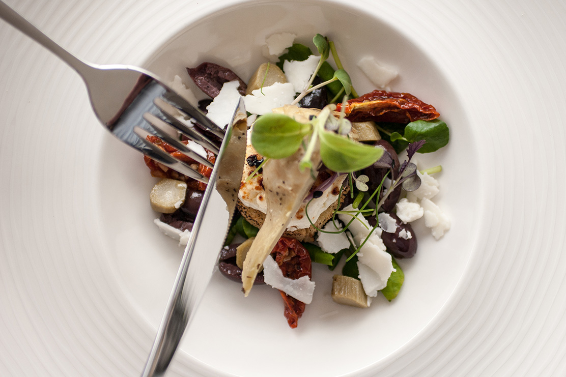
Chris Harman, founder of Made by Parent advises: "Sometimes you're presented with bad photography for a design project, which is usually a hindrance to your final design. I find that creating monotone/duotone versions of photos can help turn a bad image into something a lot more useable."
"For an interesting visual twist on this, save the image as a one – or two – colour GIF for a really nice dot-matrix effect."
02. Use more than Brightness and Contrast
Harman points out that "the Brightness and Contrast tools are often the only adjustments that designers make when looking to enhance the colours and sharpness of an image. Accompany this with the use of the Smart Sharpen tool to add definition and depth."
03. Let it breathe
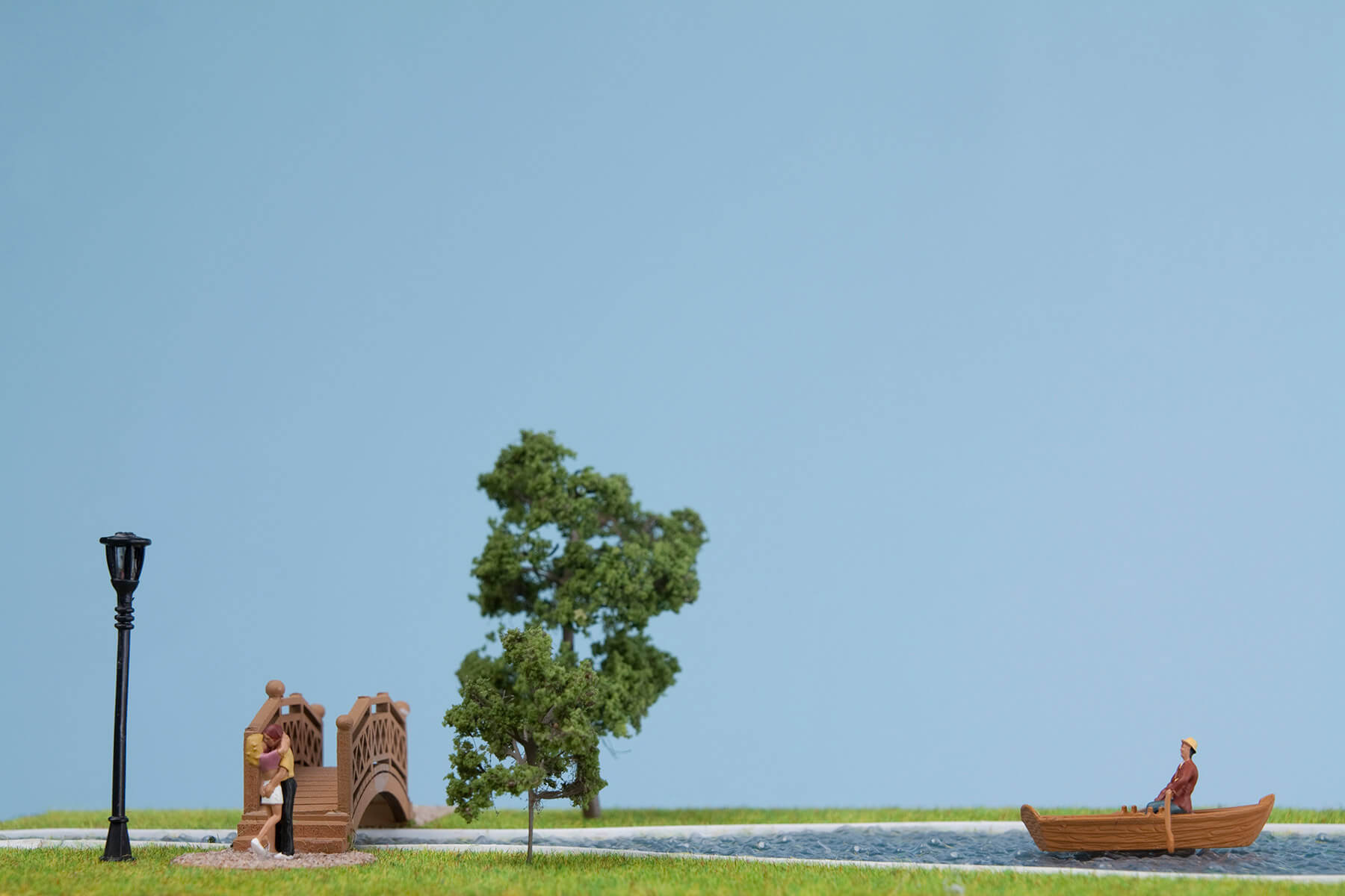
"For me, one of the most important elements to consider when working with photography in design is the appropriate use of white space," says James Kape, director and co-founder of OMSE. "There should always be some room left on the page to avoid your work becoming cluttered.
"Whilst it might seem obvious, sometimes it can be the hardest element to conquer."
04. Don't overthink it
"Selecting which shot you should use can often be the most time-consuming stage within your process, especially when you might have upwards of 100 seemingly identical photos to choose from," Kape advises.
"Try not to spend hours deliberating: often your first thoughts are the ones that make the most sense."
05. Let it go in order to punch it up

Artist Mauricio Guillen says that when you're using a picture as the background of your layout, you should try to lose details. If you go darker and more blurry, your fonts and design will jump out and have much more impact.
Your image won't suffer if you're subtle, because the reader's brain makes up for the details that are missing.
06. Never assume the basics
Guillen thinks you should always double check the basics. He explains: "Always be sure to check the resolution of your images when working with photography in design. New photographers think that in the digital world everything is done on automatic. It's not."
"If at all possible, try to talk to the photographer in advance to ensure that you're both on the same page as far as the technicalities go."
07. Sketch out, then step away
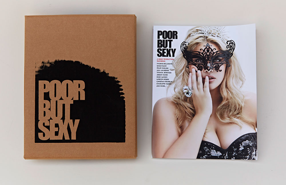
"When I have layout work to do that involves photography and text, I'll start with a few preliminary sketches of how I envision the page to look with the elements," says Ingrid Jones, multi-disciplinary artist and filmmaker, and co-founder of Seednine.
"Then I walk away from the project and go out in search of inspiration. It could be a museum, gallery, book store, or wherever there is visual work that piques my interest. I give myself a chance to get excited about the layout, then begin."
08. Utilise emotion
Jones believes that "photography has an emotional component to it" and advises that you "select images that make you pause – not for shock value necessarily, but because they connect to your theme or story."
"I usually do two or three different versions of a layout before getting to the look and feel I'm after. The trick is not to over-design. Edit yourself, and remember KISS: Keep It Simple, Stupid."
09. Know the limits
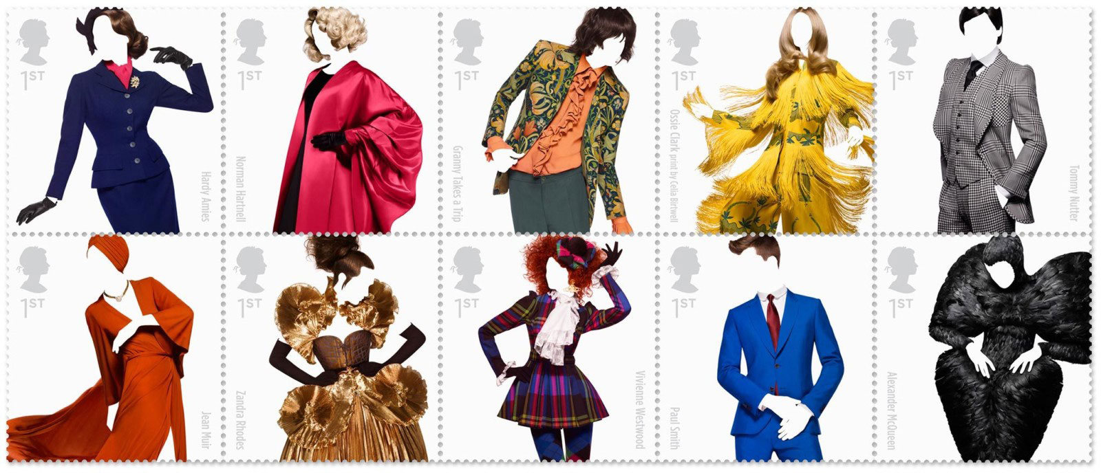
Co-founder of Johnson Banks, Michael Johnson discusses the legality of using photography in design, and explains the restrictions:
"Well, we'd love to be able to crop images more than we can, but sometimes there are copyright restrictions on cropping works of art. When we can we'll look for the best, tightest and most powerful crops. But with a Picasso, you can't crop at all."
10. Don't forget your glue
"When you have multiple images in a single layout, you have to keep searching for a way for them to work together, or you'll have to try and bring in other elements," Johnson says.
"When you're dealing with disparate 'art' style imagery, the other elements (symbols, typefaces, colours and so on) become really important as visual glue."
11. Blow up the images
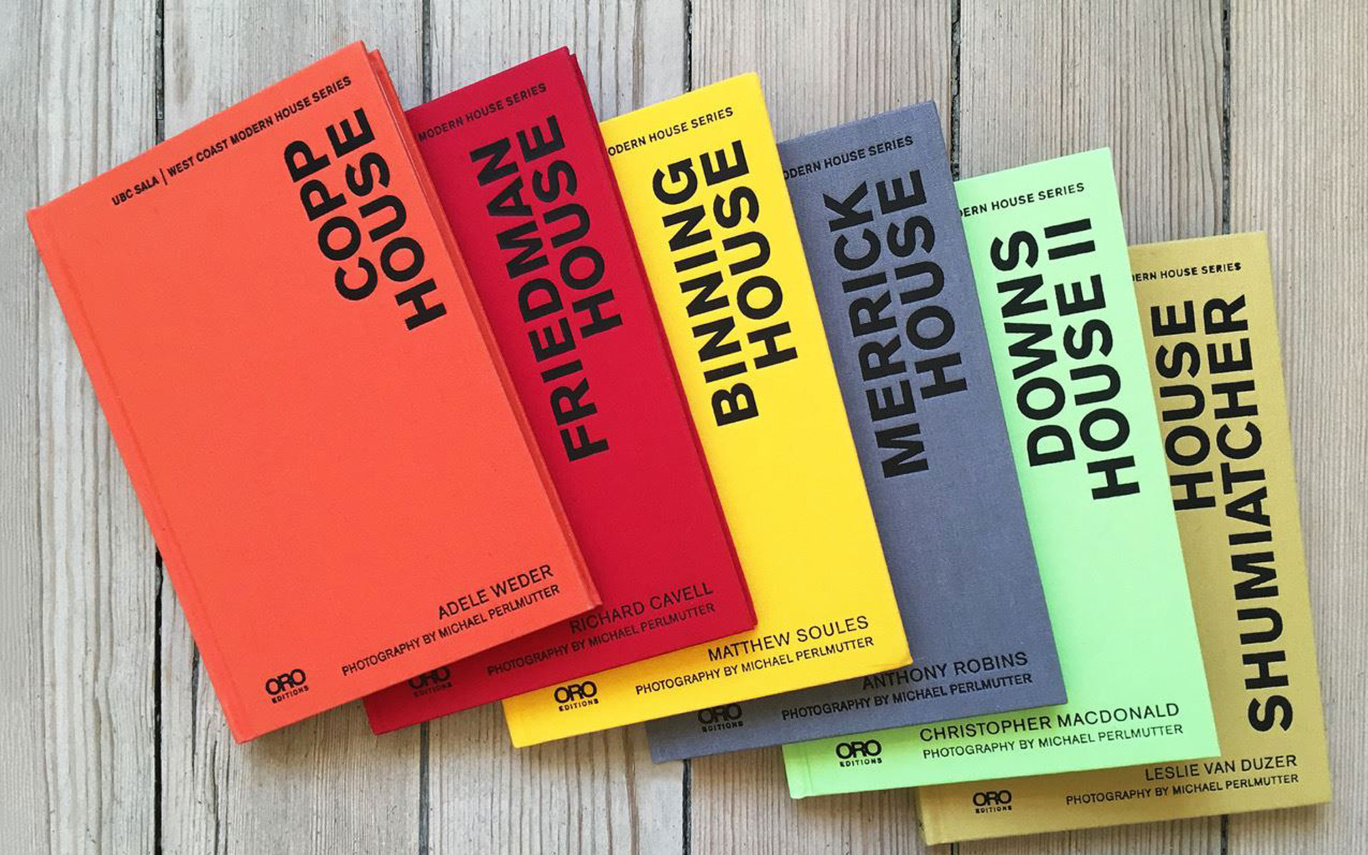
Pablo Mandel, book designer, art director and director of Circular Studio offers his perspective on image size: "If the client doesn't have an in-house marketing department, you'll probably need to spend a lot of time looking for right-sized images, helping them search their archives." He suggests investing in software to enlarge images without losing quality.
"I use Genuine Fractals: if the image is great quality, this software will enable you to do huge enlargements with acceptable results."
12. Don't confuse the eye
"When working with architectural images, for example, design-wise it makes sense not to put day and night shots together as it confuses the reader – unless you're comparing the same view of the building during night and day, of course," Mandel advises.
13. Be bold
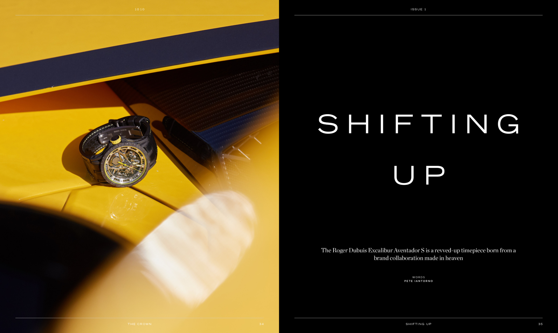
Owner/Creative Director of design studio Six, John Kariolis thinks you should be bold with the way you create designs.
"Be creative with images that are not of a very high-resolution, or have been poorly shot. Edit, crop, manipulate or convert to black-and-white (or duotone) any images that are not of desired quality.
"And print your layouts out at full size: you can't always guarantee that what looks good on-screen will look good on the page."
14. Take your time
"Don't start designing until you have all the imagery you know you'll be using. The quality, size and subject may well dictate the design direction as a whole," says Kariolis.
"Similarly, try to avoid cropping an image in Photoshop before placing it into your design. If you use InDesign to crop the image, it's a lot easier to tailor it on the fly to suit the design as it progresses."
15. Go on shoots
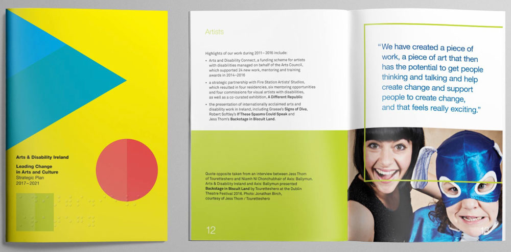
"Good photographers make the designer's job easy, but if the photos are going to be combined with type later, it's always good to be at the shoot to really get what you need," asserts Dave Garavin, co-founder of strategic design firm New Graphic.
"Why? Great photos with no space for text, or where the text fights with the image, do not generally make for great design."
16. Be flexible
"We often use grids for our designs, but sometimes photos demand their own individual space. Break the grid." says Garavin.
17. Have an opinion
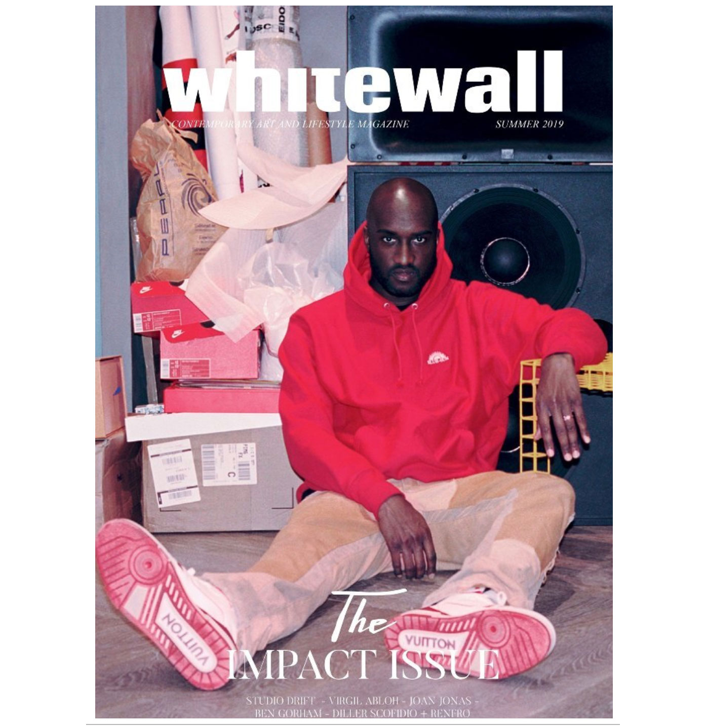
"As a photographer," says Jamie Morgan, "I find a really good art director will help me pick the right image – one that has the right form and shape for the design. It might not be the best photograph from my point of view, but it's best for the job.
"It fits their vision. There are always five or six choices, and it's a matter of opinion about which one works best – and a good art director will always have a very strong opinion."
18. Don't skimp on the photographer's brief
"If my art director has a layout in mind, I work my stuff around it. There are lots of practical things to take into consideration, such as the right cropping and so on," suggests Morgan.
"If there's going to be a lot of type, you can't have a busy background, or if it's for a DPS, you have to make sure the subject is on one side of the spread. I need to know all of that in advance."
19. Adapt and overcome
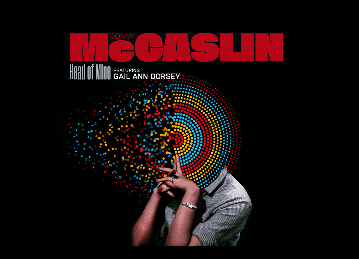
Founder and creative director of Graphic Therapy, David Calderly recommends that you learn to adapt.
"When working for some of the smaller independent record labels, you can be faced with the unexpected introduction of the 'press shots'. Here's a way of unifying said shots: once you've done your surgery and retouching, create a duotone with black and a light PMS grey.
"Take most of the black out of the lighter tones and increase it in darker areas, and then save the preset in case you need any more further down the line. Take your duotone images and convert them to CMYK, finally adding just a small amount of noise to imitate film grain.
"You now have a wonderful four-colour B/W-looking print that complements your other graphics, and can be applied to different shots taken by different photographers, making them seem like they're all from a single shoot."
20. Learn the rules
"You need to know, for example, that monotype fonts are less readable on images than serif or sans-serif typefaces," says Xavier Erni, co-founder of art direction and graphic design studio Neo Neo.
"If you use monotype for long texts your design will be less readable, so if you do it, make sure that's the effect you're going for."
But don't stick to them too tightly, he adds.
"In Swiss graphic design, the rules and grids are often very strict. Trying constantly to comply with these rules can make design a bit monotonous and you don't want that. You must know how to be creative in bypassing the rules sometimes. Like using huge type on an image to make the image unreadable."
This article is from the Computer Arts's archive. Subscribe to Computer Arts.
Read more:

Thank you for reading 5 articles this month* Join now for unlimited access
Enjoy your first month for just £1 / $1 / €1
*Read 5 free articles per month without a subscription

Join now for unlimited access
Try first month for just £1 / $1 / €1
Get the Creative Bloq Newsletter
Daily design news, reviews, how-tos and more, as picked by the editors.

The Creative Bloq team is made up of a group of design fans, and has changed and evolved since Creative Bloq began back in 2012. The current website team consists of eight full-time members of staff: Editor Georgia Coggan, Deputy Editor Rosie Hilder, Ecommerce Editor Beren Neale, Senior News Editor Daniel Piper, Editor, Digital Art and 3D Ian Dean, Tech Reviews Editor Erlingur Einarsson, Ecommerce Writer Beth Nicholls and Staff Writer Natalie Fear, as well as a roster of freelancers from around the world. The ImagineFX magazine team also pitch in, ensuring that content from leading digital art publication ImagineFX is represented on Creative Bloq.
