Paula Scher on learning from design mistakes
"That's a tremendous advantage, to make a terrible blunder, because you learn that way." Graeme Aymer interviews the hugely influential designer and typographer.
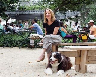
When interviewing Paula Scher, you kind of know what to expect. That is, that she's a prolific writer and she speaks forcefully, with intelligence and dry humour. What's surprising and refreshing is how inspired she is by uncertainty. She's unafraid to "fail utterly". Despite her giant reputation, decades of experience and huge portfolio, there's still so much that can be learned. More than icon, Paula Scher is inspiration.
How has your role at Pentagram changed over the years?
PS: Well, ironically, it hasn't changed over the last 18 years. When you're a partner, you manage a team and your team is like a little business. You do everything you'd do in your own business, which is: be concerned about which projects are in, how they're staffed, who's doing what, relationships with clients and managing jobs. Then you're also dealing with your partners - sort of the central issues to the whole office.
Is that still exciting? Do you ever want to slow down?
PS: Well, whether it's fast or slow isn't of interest to me one way or the other. All that's interesting is the work evolving - does it challenge me and is it forcing me to do things differently?
And is it still doing that?
PS: It depends on the jobs I have in-house at a given moment. I try to force myself to grow by doing things I don't know how to do very well. Sometimes I fail utterly at it; sometimes I make breakthroughs. Right now I'm doing things I don't know how to do, so that's interesting to me.
Is a lot of that your maps?
PS: No, I'm talking about design work actually. I'm working on some interactive materials on websites that I don't know what the hell I'm doing with. So I may stumble onto something interesting.
Pre-Pentagram, what would you consider your greatest success?
PS: When I worked at CBS, from the mid-1970s to near the end when the money ran out, that was a pretty wonderful time for designing because I could make discoveries in a free way - largely because I had a lot of work to do and so much of what I did was terrible. That's a tremendous advantage, to make a terrible blunder, because you learn that way. When you have your own business and you're performing for your clients, you don't try so many things because you can't afford to make those mistakes.
Sometimes I feel sorry for people on my team because I think that they always have to get it right. They've learned how to be perfect, but I don't know that they know how to explore. To get good, you have to get really bad. You have to make some terrible, horrible mistakes.
You've been called an 'unabashed populist'. What do you make of that tag?
PS: I believe that the goal of design is to raise the expectation of what design can be and that, in doing that, you're raising the expectation among people who aren't designers. The point isn't to make something that only sparks interest among, say, the academic community or a targeted group of design aficionados. I would like to raise the expectation of what design can be with people who go to the supermarket and confront any given item. That is what I mean by being a populist.
[Tastemakers] assume that if the population likes it, therefore it's crapola. But Apple proved them wrong. I think I once said I'd rather be The Beatles than Philip Glass - they're both qualitative, it's just that one has a broader appreciation from audiences than the other does.
You've also been called the leader of the New York retro movement. Do you consider yourself retro? And a leader?
PS: Well, it's sort of a narrow definition. I guess you could characterise it that way if you had to make a caricature of it. When I was at CBS Records, I hated the Swiss international style. When I was in art school, I had teachers who praised Helvetica. I now think Helvetica is a completely beautiful typeface, but I never responded to that form of design because it lacked any kind of individual spirit.
What I responded to was... much more illustrative: work that came out of 1960s psychedelia, the music industry and things that were on the street. As a result, I began to search out forms and things that I didn't typically see. Those things I came across in antique stores. I would find a Buckingham pipe tobacco can, or a jar of cold cream that had elaborate Victorian type. And of course I was marrying [Push Pin Studios cofounder] Seymour Chwast and Push Pin had a history of working with decorative fonts, so I began to work that way.
I parted company with Push Pin when I began to use early 20th century modernism, but not Helvetica. I was using Constructivism, Dada, Futurism - those sorts of forms - in my work. It was the amalgamation of Victoriana, Art Deco and Art Nouveau. I taught myself typography that way. My work was highly visible at that time, so that's where that came from.
Was it parody or tribute?
PS: It was all of it. There was a poster I did in 1979 called 'The Best of Jazz'. It was really a problem solver. It was a poster for a compilation of jazz albums that I'd actually designed covers for. The assignment was to get 20 big names on a poster. I'd started arranging them at tangents to each other so it looked constructivist, but... the type is Victorian wood type. The Swatch watch poster was pure parody. It was supposed to look exactly like [the original poster by Herbert Matter].
How did your maps project actually come about?
PS: I've been painting these sorts of opinionated maps... on the backs of pads [since the] late 1980s. At some point I realised they would be terrific big. So I started doing them big, but the act of doing them became important because I was doing it in response to not really using my hands at work. Before the computer, I would be on the telephone talking to a client and I would be cutting up some piece of typography on my desk. I don't do that anymore. I needed to have the ability to craft something, so I picked these really monumental things to do because they seemed like they would actually offer a real challenge.
Do you have a favourite?
PS: I really loved Africa when I did it. That was a black and white painting, and I was very pleased with it. The problem with them, to be honest, is that I started taking on commissions. [For example,] I'm working on these two murals... for four public schools together in one building in Queens. So what I'm really looking forward to doing is finding a way to evolve the maps into something else. I'd like to do a series of drawings, smaller paintings, probably still an information-related topic, but not necessarily maps. I can't right now because I'm fulfilling commissions I agreed to do. It's a little bit frustrating - like having two full-time jobs.
What's next for you as a designer and Pentagram partner?
PS: Ageing and death - what else? I honestly don't know. I've never been more confused about it. I've just entered a new decade and I have to figure out how to deal with it. I don't quite know where I want to take things. I know I want to try things that I've never tried before, but short of that I can't answer it any more broadly. I think that a certain amount of freefall might be a good idea, and a certain amount of repetition of what I know how to do just to make sure that I hold up my end.

Thank you for reading 5 articles this month* Join now for unlimited access
Enjoy your first month for just £1 / $1 / €1
*Read 5 free articles per month without a subscription

Join now for unlimited access
Try first month for just £1 / $1 / €1
Get the Creative Bloq Newsletter
Daily design news, reviews, how-tos and more, as picked by the editors.
The Creative Bloq team is made up of a group of design fans, and has changed and evolved since Creative Bloq began back in 2012. The current website team consists of eight full-time members of staff: Editor Georgia Coggan, Deputy Editor Rosie Hilder, Ecommerce Editor Beren Neale, Senior News Editor Daniel Piper, Editor, Digital Art and 3D Ian Dean, Tech Reviews Editor Erlingur Einarsson and Ecommerce Writer Beth Nicholls and Staff Writer Natalie Fear, as well as a roster of freelancers from around the world. The 3D World and ImagineFX magazine teams also pitch in, ensuring that content from 3D World and ImagineFX is represented on Creative Bloq.
