5 biggest packaging design trends for 2016
The world of packaging is evolving as materials and consumer tastes change, leading to some incredible innovation.
Today's consumer is becoming ever more refined and de-sensitised to marketing messages, which provides both a challenge and an opportunity for brands. Packaging design is arguably as important in terms of product differentiation as logo design, and this hotly contested design space can often foster breakneck innovation.
As with every field of design, there are trends and movements over the years that typify the discipline, and 2016 is no different in that regard. Every business wants to fulfil the needs of their customers, while engaging and exciting them to promote loyalty and growth.
This year's big areas of focus for packaging design centre around the idea of developing relationships with the end consumer, focusing on making the product more personal, appealing on ethical grounds and demonstrating social responsibility.
As well as these feel-good aspects of the consumer:business relationship, packaging also needs to convey quality, establish memorability, provenance and authenticity. All in all, it's a lot to ask of the bits of a product whose principal purpose is to protect the product itself!
Check out our round up of the top trends for 2016 in packaging design, and let us know what you think in the comments below.
01. Simplify!

It's a theme that's common to many fields of design, but perhaps no more so than packaging, that there's a bent toward the idea of simplification. By reducing elements to their core purpose, a clarity of meaning and intention is conveyed, and the inherent beauty of the medium used can really shine. This tends to translate into text-heavy, bold and straightforward messages that quickly communicate the product's benefits or features.
This approach plays well with the end consumers of products, helping to install trust in a brand, and creating a sense of power especially when viewed against competing products on store shelves.
Get the Creative Bloq Newsletter
Daily design news, reviews, how-tos and more, as picked by the editors.
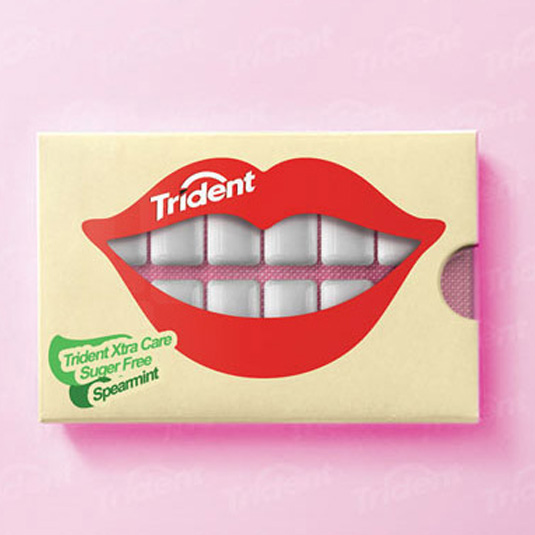
Going back to basics doesn't have to mean a lack of creativity, however, as Trident's innovative packaging shows. Here the product itself is used to convey the purpose and meaning that previously text copy was highlighting. It's arresting, and compels the buyer to smile, which is the company's major selling angle!
02. Patterns and shapes
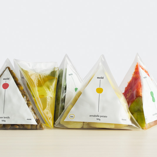
A huge trend for 2016 is the use of repeating geometric patterns and shapes. Pervading all areas of design from websites to clothing, patterns and geometry are also influencing packaging both in the simple aesthetic treatment of labels, and in the dies themselves, resulting in some interesting and quirky packaging that really stands out on the shelves. Look for bold, simple colours and unusual shapes.

A great example of this trend is Anna Trympali's work for Corinne Cosmetics. Anna's designs use a series of monochromatic shapes and patterns to identify different products within the range, while achieving familial resemblance across the entire line.
03. Artisanal becomes vintage
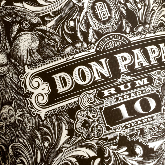
The recent trend towards artisan-style packaging will continue further into truly vintage design. It's not a totally unfounded idea: promoting a product based on its heritage, provenance and authenticity is a time-honoured tradition that works, and the associated vintage aesthetic is hot with retail consumers currently, so it's an obvious choice for brands that want to convey their staying power, artisanal qualities and associate themselves with the glory days of a bygone era.
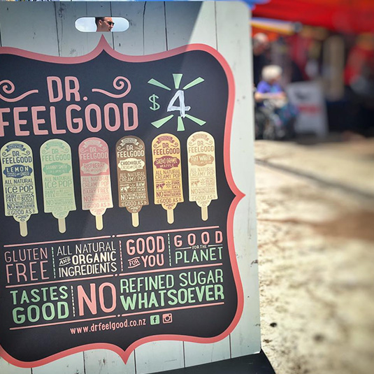
A company's products don't have to be old to benefit from this treatment, as Dr. Feelgood's example shows. Here the NZ-based company uses a vintage approach to help sell the health-orientated differentiators of their product, while conveying core brand values and ethics through the use of recyclable materials such as cardboard rather than plastic.
04. Kerb and keep appeal
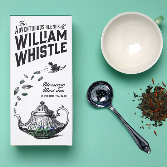
In a world where we already have to separate out waste into plastic, glass, paper, wood and compostable materials, it's no surprise to see a shift toward the idea of product packaging that can be re-used within the home after the product itself has been consumed.
For this purpose, packaging is moving from having simple kerb appeal – the ability to stand out and sell the product on the shelf – into the realms of keep appeal. Product packaging that is aesthetically pleasing, and can work standalone as a piece of home decor is a potentially very marketable product differentiator, so understandably package designers are exploring this idea with fervour.
Even fully-disposable packaging is competing for a place on cupboard shelves, so designers are increasingly looking to make their products look beautiful in the home.
05. Sustainability and carbon footprint
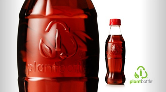
Along a similar vein to the idea that packaging becomes less disposable, there's a growing need felt by consumers to ensure that the products they use cause the smallest possible impact on the environment.
Businesses are feeling pressure from their customers to meet this need, but it also makes sense to act more sustainably. As a result, packaging that reduces the carbon footprint associated with the production, shipping and retail of a product is becoming ever more popular. This includes the like of reusable packaging, and the use of recycled materials to produce packaging, but also the development of bioplastics to replace traditional oil-based plastics.
Coca-Cola has been introducing bioplastics into their production process for a few years, while rival PepsiCo is currently trialing the idea of edible packaging!
Words: Sam Hampton-Smith
Sam Hampton-Smith is a freelance author and front-end designer/developer based in Scotland.
Liked this? Read these!
- We reveal where to find logo design inspiration
- Can you guess the logo in this design quiz?
- The 15 best Adobe Illustrator plugins
- Check out these great examples of negative space
- The beginner's guide to flat design

Thank you for reading 5 articles this month* Join now for unlimited access
Enjoy your first month for just £1 / $1 / €1
*Read 5 free articles per month without a subscription

Join now for unlimited access
Try first month for just £1 / $1 / €1

The Creative Bloq team is made up of a group of art and design enthusiasts, and has changed and evolved since Creative Bloq began back in 2012. The current website team consists of eight full-time members of staff: Editor Georgia Coggan, Deputy Editor Rosie Hilder, Ecommerce Editor Beren Neale, Senior News Editor Daniel Piper, Editor, Digital Art and 3D Ian Dean, Tech Reviews Editor Erlingur Einarsson, Ecommerce Writer Beth Nicholls and Staff Writer Natalie Fear, as well as a roster of freelancers from around the world. The ImagineFX magazine team also pitch in, ensuring that content from leading digital art publication ImagineFX is represented on Creative Bloq.
