6 times brands temporarily changed their packaging
Big brands love to shake up their packaging with limited edition alternative designs. We look at five of the best.
An instantly recognisable piece of packaging design is one of the most valuable tools at a brand manager's disposal. Whether it's through prominently displaying distinctive logos such as the Nike Swoosh or McDonald's Golden Arches, or by harnessing a brand's colours, packaging helps products to get noticed in a sea of competition.
But when a brand is big enough, it can afford to get creative and change its design on occasion, as these five examples reveal.
01. Lacoste Save our Species
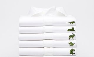
Lacoste's smiling crocodile is one of the most widely recognised brand animals. But what about those species that could do with a little more visibility? Lacoste's latest campaign sees the happy croc being replaced with some of the planet's most endangered species. There are 10 different species, which appear on a line of limited edition polo shirts.
In a smart twist, the number of shirts available with each motif corresponds with the number of that species that still remains in the wild. For example, there are 450 polos with a Anegada Rock iguana logo, and only 30 with a Vaquitas - a type of porpoise. There are 1775 shirts in total going into circulation, with each being sold for 150€ (about $183). Profits from sales will go toward the preservation of its featured species.
The Save our Species campaign kicks off a three-year partnership between Lacoste and the IUCN (International Union for Conservation of Nature), and was launched in collaboration with full-service ad agency BETC.
02. Skittles Give the Rainbow
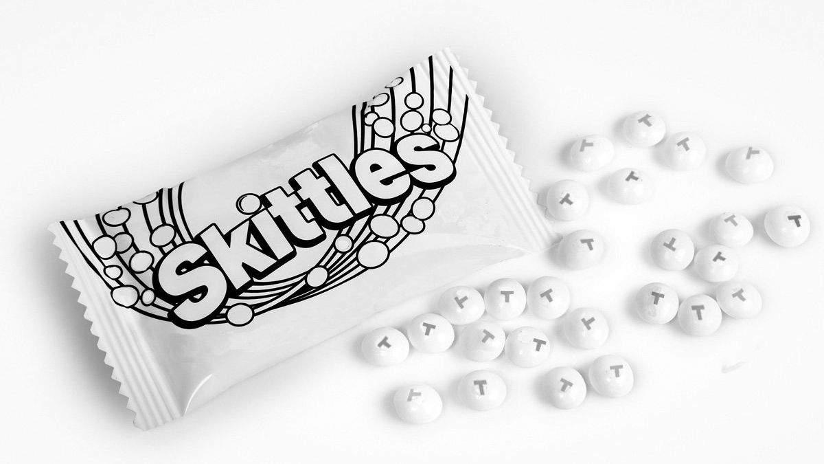
Famed for its spectrum of colours, with a slogan that even reads 'taste the rainbow', Skittles decided to use a monochrome design when it came to celebrating Pride 2016. And it was so successful, the brand repeated this campaign for a whole month for Pride 2017.
The thinking behind this colourless design was that there should only be one rainbow when it comes to celebrating gay Pride, so the sweet brand stepped aside and let the parades take centre stage.
Get the Creative Bloq Newsletter
Daily design news, reviews, how-tos and more, as picked by the editors.
Clever, eye-catching, and progressive, this is a perfect example of a brand tweaking its existing image to accommodate an event. Other brands take note: this is how you do it.
03. Mars Believe
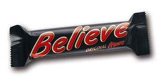
The change from Mars to Believe has been an on-and-off campaign since 2006. Designed to support the England football team in the Euro 2016 tournament in France, the latest Believe packaging was supported by a massive media campaign across digital platforms.
"Our Mars #Believe campaign recognises the importance of genuine consumer engagement around the tournament matches and this is echoed in each element of our approach – from our limited edition packaging, to our TV creative and digital engagement," says Greg Kent, Mars brand manager.
This campaign couldn't stop England crashing out of the competition in a game against Iceland, though.
04. Coca-Cola Share a Coke
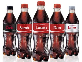
The huge Share a Coke campaign is perhaps one of the most successful product redesigns in branding history. With the Coca-Cola stylings and colourways already immediately recognisable, the soft drinks company decided to focus on a social theme to get its name out there even more.
By replacing the title Coca-Cola on one side of the bottle with one of the top 250 names in that particular country (including generic nicknames and titles to ensure that everyone felt included), consumers felt an unparalleled connection with the iconic brand.
05. KitKat YouTube Break
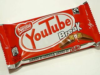
If we were to say "have a break", chances are most of you would immediately respond with a reflex reply of "have a KitKat". However, all that temporarily changed in 2015 as the chocolate finger snack rebranded itself as YouTube Break.
Released as part of a limited run across 600,000 bars in the UK, YouTube Break was run as part of a tie-in between Nestle and Google. With Google tending to name its operating systems after sweet snacks, including the Android 4.4 KitKat, the rebrand suddenly makes sense.
06. Beck's Beer Art
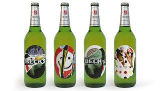
Popular beverage brand Beck's beer supported artists back in 2012 by showcasing four of the world's top talents on the labels of its 275ml Beck's Pilsner bottles.
"We are always looking to support artists who are doing really interesting and ground-breaking work. The work that may go unnoticed at first, but can’t be ignored," said Fabienne Rollot, European marketing director at Beck's.
This temporary redesign is one of many initiatives in the beer's long history of supporting creative talent. Through its Arts Label initiative the brand promoted the likes of Tracey Emin, Damien Hirst and Jeff Koons. A Facebook app accompanied the campaign, which allowed users to create their own artwork.
Related articles:

Thank you for reading 5 articles this month* Join now for unlimited access
Enjoy your first month for just £1 / $1 / €1
*Read 5 free articles per month without a subscription

Join now for unlimited access
Try first month for just £1 / $1 / €1
Dom Carter is a freelance writer who specialises in art and design. Formerly a staff writer for Creative Bloq, his work has also appeared on Creative Boom and in the pages of ImagineFX, Computer Arts, 3D World, and .net. He has been a D&AD New Blood judge, and has a particular interest in picture books.
