Infographics can be useful, fascinating, and, as we've now discovered, downright terrifying. Falling squarely into the latter category is Your Life in Weeks, an interactive infographic that's here to force you to confront your own mortality. Hurray!
Based on your exact age and the life expectancy in your country, the chart will show you how much of your lifespan you've probably already used up. And as you might expect, it's causing an existential crisis or two online. Need cheering up? Many of the best infographics out there aren't quite as morbid as this one.
This author is very much in the red (Image credit: Coruscant Consulting)
All you have to do is input your gender and date and country of birth, and Your Life in Weeks will do the rest. Developed by "one man development studio" Coruscant Consulting, the chart is separated into various colour-coded life stages (school, work, retirement, etc.), and will place a star next to your current age. You can also see the lifespans of various famous figures, from Albert Einstein to William Shakespeare.
Latest Videos From Creative Bloq
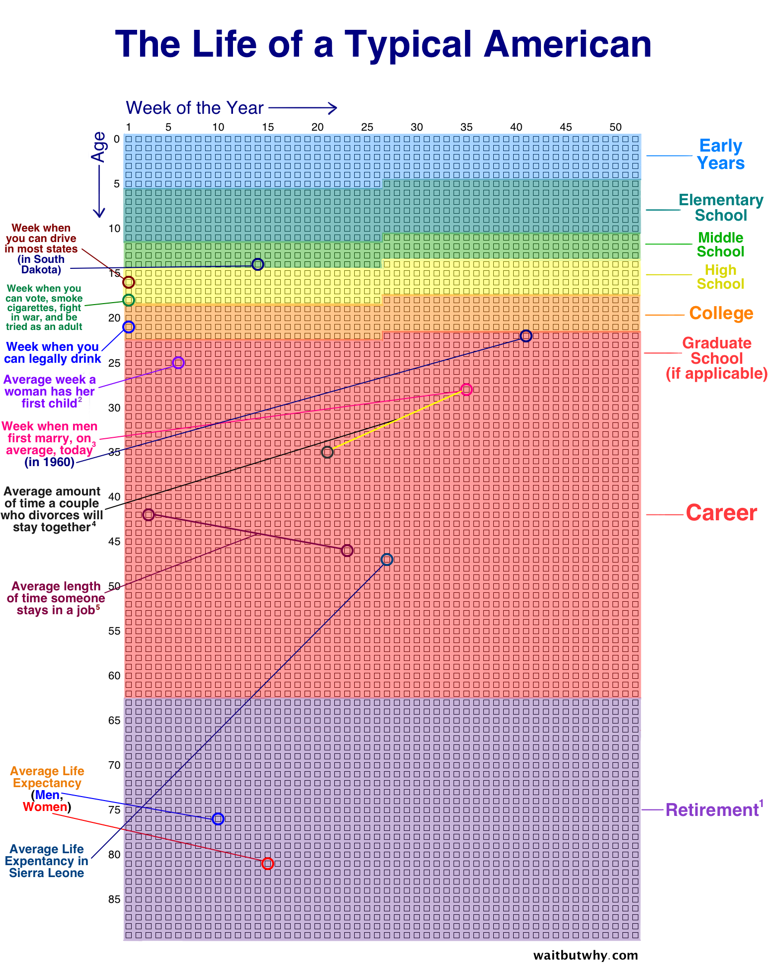
The chart appears to be based on a concept by illustrator Tim Urban, who posted a static version of the design (below) on his blog Wait But Why, complete with typical life events highlighted.
(Click to enlarge) (Image credit: Tim Urban)
But believe it or not, it seems the internet isn't taking kindly to seeing how long it has left. "I don’t like this. Not one bit," one Redditor comments, while another adds, "This makes me honestly really uncomfortable". Perhaps this user puts it best: “As a species, we have probably evolved a degree of psychological ability to be somewhat in denial about our mortality and then a chart comes along like this with its unsettling geometric simplicity and triggers an existential crisis. I think I speak for everyone when I say f*** this chart.”
Daniel John is Design Editor at Creative Bloq. He reports on the worlds of design, branding and lifestyle tech, and has covered several industry events including Milan Design Week, OFFF Barcelona and Adobe Max in Los Angeles. He has interviewed leaders and designers at brands including Apple, Microsoft and Adobe. Daniel's debut book of short stories and poems was published in 2018, and his comedy newsletter is a Substack Bestseller.